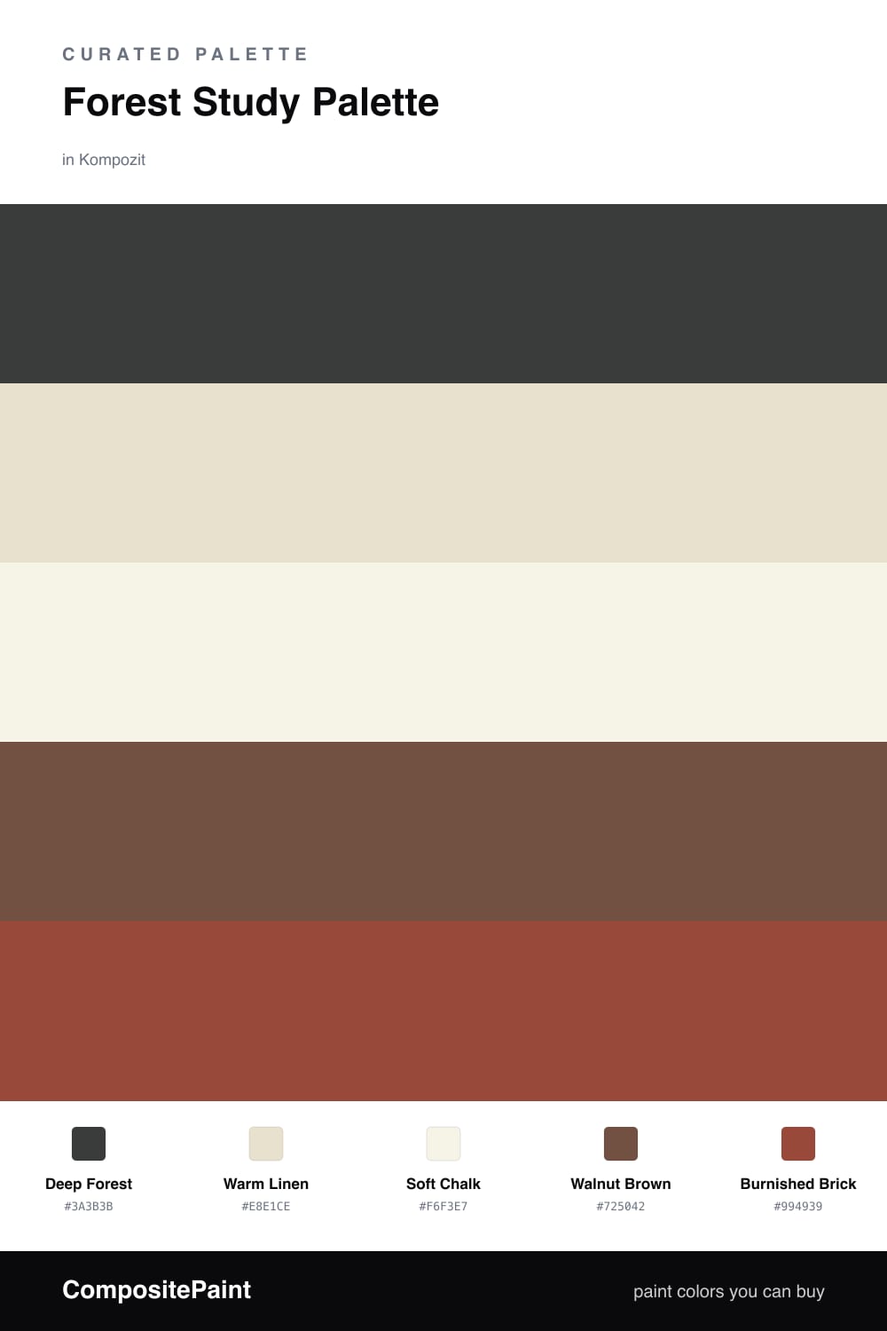
Forest Study Palette — Deep Forest & Warm Linen
A grounding, focused 5-color scheme for a study: deep forest walls, warm linen backdrop, soft trim white, a walnut earth tone, and a burnished brick accent, with every color matched to real paint you can buy.
By Maya Patel · Reviews Editor & Product Tester
A study is the one room where you can go properly deep without second-guessing it. This palette puts a moody deep forest on the walls, the kind of green that reads almost black in a dark corner and softens to pine when the desk lamp comes on. It wraps the room and quiets it down, which is exactly what you want when you are trying to think.
To keep that green from feeling heavy, I surround it with warmth. Warm linen on the built-ins and a cleaner soft chalk on the trim and ceiling give the eye somewhere bright to rest, while a walnut brown desk and shelving ground the scheme in real wood tones. The browns and the green belong together, like a forest floor.
The one spark is burnished brick — a warm, earthy red I would use on a single accent: a reading chair, a strip of shelf backing, or the inside of a cabinet. Keep it to one small surface. Used on more than a corner of the room it fights the calm instead of lifting it.
Buy These Colors
Each color matched to the closest real paint in every brand, by ΔE2000. Kompozit first; take any SKU to the store — these mix on demand.
Questions
Yes, and a study is the room where it works best. A study is small and used in short, focused stretches, so a fully enveloped dark green reads as cozy and calm rather than closed in. Keep the trim and ceiling in the soft chalk white to lift the corners and stop the room from feeling like a box.
Lean on the warm tones around the green. The linen backdrop on built-ins and the walnut desk add light and warmth, and a small dose of burnished brick on a chair or shelf trim wakes the whole scheme up. Good task lighting and a warm bulb matter as much as the paint here.
Similar Palettes
Closest schemes by color — not by label.