CP

Red Dining Room Palette — Spiced Brick & Warm Linen

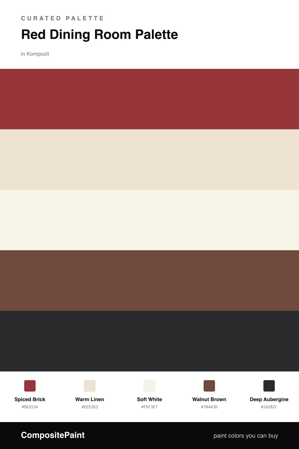
A five-color dining room scheme led by a rich spiced-brick red, softened with warm linen and crisp white, and grounded by walnut and a deep aubergine accent — every color matched to real paint you can buy.

By Emily Roberts · DIY Editor & First-Timer's Guide

Spiced Brick
Walls
Kompozit Romantic Night · 1138
#96353A
LRV 9
Warm Linen
Cabinets or Vanity
Kompozit White Lightning · 0187
#EEE2D3
LRV 77
Soft White
Trim & Ceiling
Kompozit Rapture's Light · 1020
#F6F3E7
LRV 89
Walnut Brown
Wood & Floors
Kompozit Evolution · 0130
#704A3D
LRV 9
Deep Aubergine
Accent
Kompozit Silent Sea · 0515
#2A2B2C
LRV 2
View palette in

A red dining room sounds bold, but it is honestly one of the easiest rooms to get right. This scheme leads with Spiced Brick, a warm earthy red that feels grown-up and cozy rather than loud — the kind of shade that glows once the lights are low and dinner is on the table.

To keep it from feeling closed-in, I paired it with Warm Linen on built-ins or a sideboard and a clean Soft White for the trim and ceiling. That little bit of breathing room is what makes the red feel intentional and 2026-fresh instead of dated.

Finally, Walnut Brown ties in your table and floors, and a touch of Deep Aubergine on a chair, drapery, or a single accent wall adds quiet richness. Lead with the red, let the neutrals do the calm work, and use the aubergine sparingly for that last bit of depth.

Buy These Colors

Each color matched to the closest real paint in every brand, by ΔE2000. Kompozit first; take any SKU to the store — these mix on demand.

Spiced Brick
#9B3A2E · LRV 10 · Walls
Kompozit Romantic Night · 1138 ΔE 5.91
Backdrop Punk Rock · BD-PR ΔE 4.36
Behr Ground Nutmeg · S-H-230 ΔE 3.84
Benjamin Moore Merlot Red · 2006-10 ΔE 1.4
Clare Vintage · PNT100-DP-67 ΔE 11.45
Dunn-Edwards Scarlet Past · DEA150 ΔE 4.96
Farrow & Ball Incarnadine · No. 248 ΔE 5.87
Magnolia Home Brave And Bold · JG-32 ΔE 3.28
PPG / Glidden Blaze · 13-16 ΔE 5.05
Sherwin-Williams Chinese Red · SW 57 ΔE 1.29
Valspar Rambutan · P044 ΔE 2.48
Warm Linen
#EDE3D2 · LRV 78 · Cabinets or Vanity
Kompozit White Lightning · 0187 ΔE 1.54
Backdrop Don't Eat the Yellow Snow · BD-DS ΔE 3.41
Behr Weathered Sandstone · 290E-1 ΔE 1.21
Benjamin Moore Lime White · CW-95 ΔE 1.47
Clare Like Buttah · PNT100-LT-62 ΔE 0.83
Dunn-Edwards Siamese Kitten · DE6121 ΔE 2.33
Farrow & Ball Dimity · No. 2008 ΔE 0.76
Magnolia Home Carter Crème · JG-16 ΔE 1.8
PPG / Glidden Glazed Pears · 1095-2 ΔE 0.97
Sherwin-Williams Steamed Milk · SW 7554 ΔE 0.85
Valspar Honey Moon · 8003-22A ΔE 0.87
Soft White
#F6F2E9 · LRV 89 · Trim & Ceiling
Kompozit Rapture's Light · 1020 ΔE 1.56
Backdrop Tabula Rasa · BD-TR ΔE 1.52
Behr White Flour · OR-W10 ΔE 0.55
Benjamin Moore Pink Damask · 890 ΔE 1.05
Clare Wing It · PNT100-LT-24 ΔE 2.49
Dunn-Edwards Dove's Wing · DE6267 ΔE 0.96
Farrow & Ball Wimborne White · No. 239 ΔE 0.91
Magnolia Home Silos White · JG-107 ΔE 1.32
PPG / Glidden Crumb Cookie · 18-01 ΔE 1.31
Sherwin-Williams White Flour · SW 7102 ΔE 0.82
Valspar Ivory Keys · 8007-4A ΔE 0.62
Walnut Brown
#6B4A33 · LRV 8 · Wood & Floors
Kompozit Evolution · 0130 ΔE 5.32
Backdrop It's a Date · BD-IT ΔE 4.75
Behr Outback Brown · BXC-65 ΔE 1.93
Benjamin Moore Forest Brown · 2105-10 ΔE 3.85
Clare Vintage · PNT100-DP-67 ΔE 12
Dunn-Edwards Chaps · DE6049 ΔE 5.79
Farrow & Ball Preference Red · No. 297 ΔE 13.91
Magnolia Home Mountain Currant · JG-171 ΔE 6.79
PPG / Glidden Bird House Brown · 1072-7 ΔE 4.48
Sherwin-Williams Sturdy Brown · SW 6097 ΔE 2.11
Valspar Cowboy Hat · 3010-8 ΔE 1.61
Deep Aubergine
#3A2630 · LRV 2 · Accent
Kompozit Silent Sea · 0515 ΔE 12.83
Backdrop Hocus Pocus · BD-HP ΔE 12.03
Behr Rich Bordeaux · BXC-87 ΔE 5.6
Benjamin Moore Velvet Cloak · CSP-480 ΔE 2.71
Clare Blackish · PNT100-DP-54 ΔE 15.76
Dunn-Edwards Black · DEA187 ΔE 12.71
Farrow & Ball Pitch Black · No. 256 ΔE 12.57
Magnolia Home Blackboard · JG-05 ΔE 13.01
PPG / Glidden Black Magic · 1001-7 ΔE 13.56
Sherwin-Williams Raisin · SW 7630 ΔE 5.16
Valspar Rare Wine · 1011-9 ΔE 2.46

Questions

Is red too bold for a dining room?

Not at all — dining rooms are one of the few spaces where a warm red really shines, because it feels cozy and makes food and faces look great by candlelight. The trick is to balance it with plenty of soft white and warm linen so the room feels welcoming, not heavy.

How much red should I actually use?

Let the red lead on the walls and keep everything else quieter. Aim for roughly two-thirds red, one-third neutrals and wood, with just a touch of the deep aubergine on a chair or accent piece to add depth.

Similar Palettes

Closest schemes by color — not by label.