CP

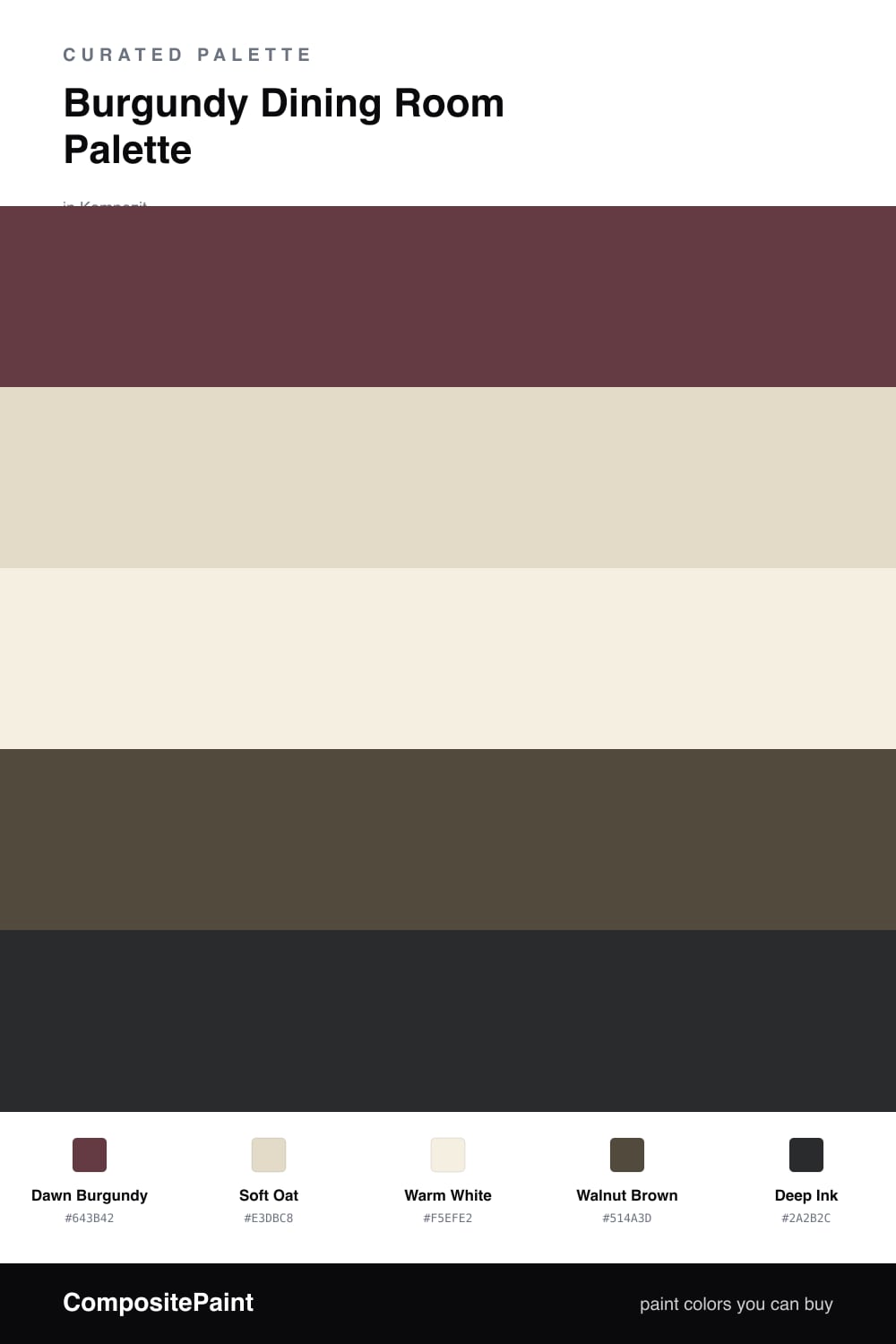
Burgundy Dining Room Palette — Dawn Burgundy & Soft Oat

A warm five-color dining room scheme led by deep burgundy walls, softened with oat and warm white and grounded by walnut and ink, with every color matched to real paint you can buy.

By Jessica Williams · Color Stylist & Interior Editor

Dawn Burgundy
Walls
Kompozit Kung Fu · 0109
#643B42
LRV 6
Soft Oat
Trim & Ceiling
Kompozit White Elephant · 0223
#E3DBC8
LRV 71
Warm White
Cabinets or Vanity
Kompozit Bunny Cake · 0012
#F5EFE2
LRV 87
Walnut Brown
Wood & Floors
Kompozit Deep Shadow · 0445
#514A3D
LRV 7
Deep Ink
Accent
Kompozit Silent Sea · 0515
#2A2B2C
LRV 2
View palette in

There is a moment just after sunrise when deep red looks softest, almost dusty, and that is the feeling behind Dawn Burgundy on the walls. In a dining room it does its best work at night, holding the glow of a lamp or a candle and making the whole table feel close and unhurried.

To keep that depth from turning into a cave, I lift the edges with Soft Oat on the trim and ceiling and let Warm White carry any cabinets or built-ins. Those two paler tones catch the light and give your eye somewhere to rest, so the burgundy reads as cozy rather than dim.

Underneath it all, Walnut Brown ties in the floor and the wood of the table, while a little Deep Ink on a console, a frame, or the chair legs adds the quiet contemporary edge that keeps this 2026 scheme feeling current instead of fussy.

Buy These Colors

Each color matched to the closest real paint in every brand, by ΔE2000. Kompozit first; take any SKU to the store — these mix on demand.

Dawn Burgundy
#5C2A33 · LRV 4 · Walls
Kompozit Kung Fu · 0109 ΔE 5.14
Backdrop Stage Beauty · BD-SB ΔE 10.58
Behr Hawaiian Cinder · S-G-710 ΔE 1.24
Benjamin Moore Bewitched · CSP-450 ΔE 4.13
Clare Blackish · PNT100-DP-54 ΔE 20.55
Dunn-Edwards Mulberry · DEA194 ΔE 9.8
Farrow & Ball Brinjal · No. 222 ΔE 6.07
Magnolia Home By The Fireplace · JG-29 ΔE 5.4
PPG / Glidden Gooseberry · 1048-7 ΔE 7.55
Sherwin-Williams Rookwood Red · SW 2802 ΔE 5.13
Valspar Power Tie · P041 ΔE 2.07
Soft Oat
#E4DAC8 · LRV 71 · Trim & Ceiling
Kompozit White Elephant · 0223 ΔE 1.19
Backdrop Cookies & Cream · BD-CC ΔE 2.53
Behr Varnished Ivory · MQ3-40 ΔE 0.78
Benjamin Moore Spring in Aspen · 954 ΔE 1.92
Clare Greenish · PNT100-LT-68 ΔE 3.9
Dunn-Edwards Cream Wave · DE6198 ΔE 1.67
Farrow & Ball Shadow White · No. 282 ΔE 2.07
Magnolia Home Morning Snow · JG-167 ΔE 1.23
PPG / Glidden Botany Beige · 15-27 ΔE 0.49
Sherwin-Williams Neutral Ground · SW 7568 ΔE 1.01
Valspar Gossamer Green · 8004-23A ΔE 1.83
Warm White
#F3EEE3 · LRV 86 · Cabinets or Vanity
Kompozit Bunny Cake · 0012 ΔE 0.87
Backdrop Jane · BD-JA ΔE 1.45
Behr Snowy Pine · PPU10-13 ΔE 1.49
Benjamin Moore Steam · AF-15 ΔE 1.92
Clare Wing It · PNT100-LT-24 ΔE 2.87
Dunn-Edwards Trite White · DE6204 ΔE 1.18
Farrow & Ball Pointing · No. 2003 ΔE 1.37
Magnolia Home Silos White · JG-107 ΔE 1.98
PPG / Glidden Atrium White · 1020-1 ΔE 0.95
Sherwin-Williams Westhighland White · SW 7566 ΔE 0
Valspar Wings of an Angel · V153 ΔE 0.44
Walnut Brown
#5A4636 · LRV 7 · Wood & Floors
Kompozit Deep Shadow · 0445 ΔE 7
Backdrop It's a Date · BD-IT ΔE 2.21
Behr Moose Trail · N190-7 ΔE 0.92
Benjamin Moore Taupe · 2110-10 ΔE 1.85
Clare Blackish · PNT100-DP-54 ΔE 10.76
Dunn-Edwards Northern Territory · DEA158 ΔE 4.19
Farrow & Ball Mahogany · No. 36 ΔE 7.4
Magnolia Home Wooded Acres · JG-122 ΔE 5.39
PPG / Glidden Racy Raisin · 16-24 ΔE 6.2
Sherwin-Williams Van Dyke Brown · SW 7041 ΔE 1.5
Valspar Buckeye · 8005-8G ΔE 1.9
Deep Ink
#2A2730 · LRV 2 · Accent
Kompozit Silent Sea · 0515 ΔE 6.34
Backdrop Hocus Pocus · BD-HP ΔE 4.59
Behr Beluga · 770F-7 ΔE 10.27
Benjamin Moore Black · PM-9 ΔE 6.39
Clare Blackish · PNT100-DP-54 ΔE 12.56
Dunn-Edwards Black · DEA187 ΔE 8.44
Farrow & Ball Pitch Black · No. 256 ΔE 8.59
Magnolia Home Blackboard · JG-05 ΔE 5.93
PPG / Glidden Black Magic · 1001-7 ΔE 9.88
Sherwin-Williams Tricorn Black · SW 6258 ΔE 6.22
Valspar Dark Kettle Black · 4011-2 ΔE 5.04

Questions

Why is burgundy a good color for a dining room?

It wraps the room in warmth and makes candlelight and conversation feel intimate after dark. Burgundy reads rich without going harsh, so it flatters skin tones, food, and wood furniture all at once.

How do I keep a burgundy dining room from feeling dark?

Lean on the lighter neutrals — paint the trim and ceiling in Soft Oat and let Warm White carry any built-ins, so the burgundy feels enveloping rather than heavy.

Similar Palettes

Closest schemes by color — not by label.