Rust Color Palette — Wren Hollow
A grounded five-color scheme led by deep rust, softened with warm clay neutrals and a quiet sage accent — every color matched to real paint you can buy.
By David Chen · Formulation Lead & Resident Chemist
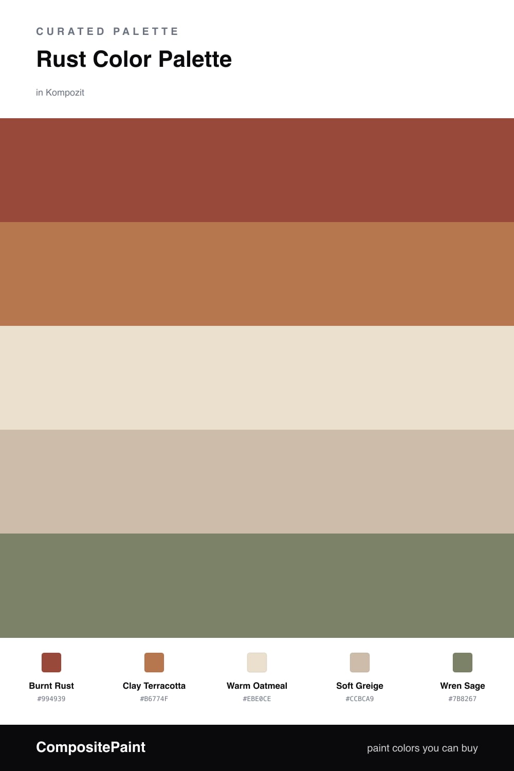
Rust is one of those colors that behaves like a warm metal left out in the weather, and that is exactly the feeling I wanted here. Burnt Rust leads the scheme with real depth, while Clay Terracotta carries the same family a few shades lighter so the room never flattens into a single block of color.
The quiet work happens in the middle. Warm Oatmeal and Soft Greige give your eye somewhere to rest, and they keep the rust from feeling heavy or dated. Think of them as the calm air around a fire rather than the fire itself.
The small surprise is Wren Sage, a muted green that cools things just enough. Use it in tiny doses, a cabinet, a chair, a strip of trim, and it makes the rust look richer by contrast. This is a warm, lived-in palette that feels right for 2026 without chasing a trend.
Buy These Colors
Each color matched to the closest real paint in every brand, by ΔE2000. Kompozit first; take any SKU to the store — these mix on demand.
Questions
Rust is just orange with the brightness pulled out and a little brown folded in, so it reads warm without shouting. That earthy quality is why it sits easily next to wood, leather, and stone.
Let it lead but not blanket the space. Aim for roughly two-thirds rust and clay tones, with the oatmeal and greige doing the breathing room, and save the sage for one small moment.
Similar Palettes
Closest schemes by color — not by label.