Rust Color Palette — Rust Drift
A warm five-color scheme led by deep rust, softened with oatmeal and clay neutrals and lifted by a muted teal accent — every color matched to real paint you can buy.
By Emily Roberts · DIY Editor & First-Timer's Guide
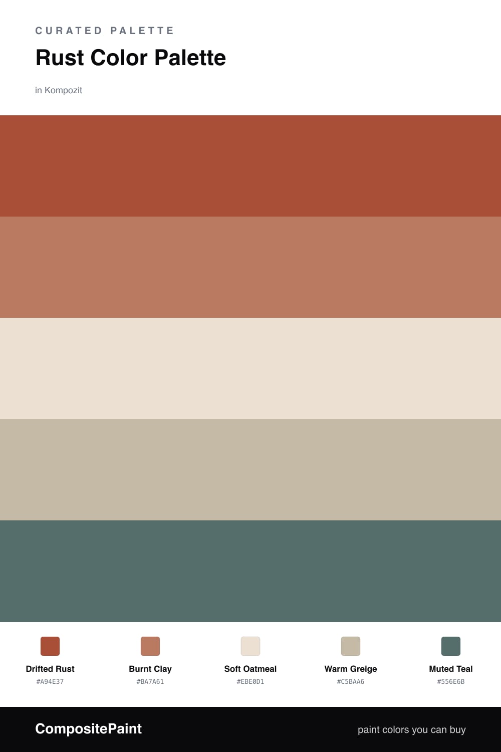
Rust is having a real moment heading into 2026, and it is easy to see why. Drifted Rust brings that deep, sun-baked warmth that makes a space feel settled and grown-up, while Burnt Clay is its softer cousin — same family, just a little lighter and friendlier.
To keep all that warmth from feeling heavy, lean on Soft Oatmeal for your walls and Warm Greige for the in-between pieces. These two quiet neutrals give your eyes somewhere to rest, so the rust always feels intentional and never overwhelming.
Then there is Muted Teal, the small surprise that makes the whole thing click. A touch of dusty blue-green sits opposite rust on the color wheel, so it cools things down and makes the warm tones look even richer. Use it in tiny doses and let rust stay the star.
Buy These Colors
Each color matched to the closest real paint in every brand, by ΔE2000. Kompozit first; take any SKU to the store — these mix on demand.
Questions
Rust is basically a grown-up orange with brown mixed in, so it gives you all the cozy warmth of a sunset without the loudness. That earthy quality is why it reads as calm rather than bold, and it pairs naturally with soft neutrals.
Let it lead, then pull back — think of rust on a feature wall or big furniture piece, with the oatmeal and greige covering most of the room. The teal is just a spark, so save it for a chair, a vase, or a few cushions.
Similar Palettes
Closest schemes by color — not by label.