Terracotta Color Palette — Reed & Clay
A warm five-color scheme led by earthy terracotta and grounded in soft reed and clay neutrals, with a quiet green accent — every color matched to real paint you can buy.
By David Chen · Formulation Lead & Resident Chemist
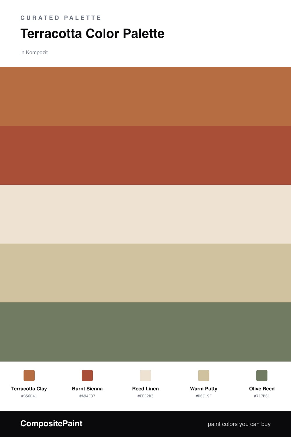
Terracotta is one of my favorite pigments to talk about because it behaves like a slow-burning ember rather than a flame. Terracotta Clay leads this scheme as a soft red-orange, and Burnt Sienna sits just beneath it as a deeper, slightly browner relative. Think of them as two firings of the same clay — one cooler in the kiln, one hotter.
The neutrals do the patient work. Reed Linen is a near-white with a touch of warmth, and Warm Putty bridges the gap between the linen and the clay so nothing feels like a hard jump. That graduated middle is what makes the palette read as intentional instead of busy.
For 2026 I like adding one restrained note of cool, and Olive Reed is that note. A small amount of muted green keeps the warmth honest and stops the room from tipping into pure desert. Let terracotta dominate, keep the neutrals broad, and use the olive as a quiet punctuation mark.
Buy These Colors
Each color matched to the closest real paint in every brand, by ΔE2000. Kompozit first; take any SKU to the store — these mix on demand.
Questions
Terracotta is a low-saturation red-orange, so it carries the cozy warmth of a fired clay pot without the alarm of a true red. The pigment leans earthy rather than candy-bright, which is why it relaxes a space instead of energizing it.
Lean on the linen and putty neutrals for most of the surfaces and let terracotta lead in measured doses. A thin slice of olive green keeps the whole thing feeling current rather than purely Southwestern.
Similar Palettes
Closest schemes by color — not by label.