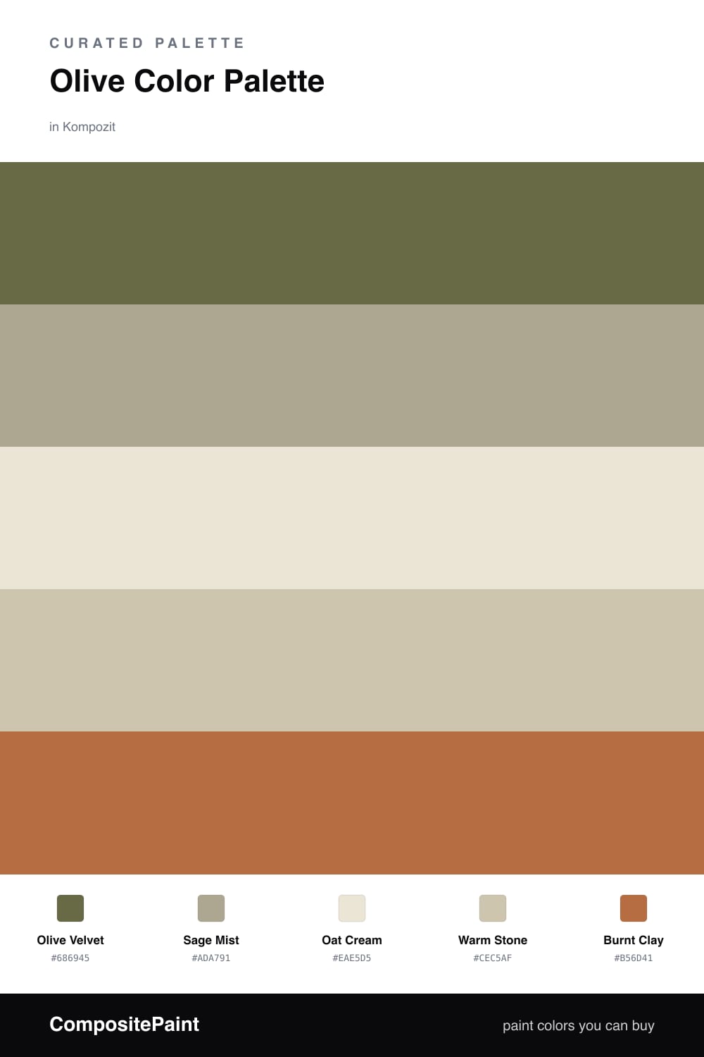
Olive Color Palette — Olive Velvet
A soft, earthy five-color scheme led by a velvety olive, warmed with stone and oat neutrals and lifted by a clay accent — every color matched to real paint you can buy.
By Jessica Williams · Color Stylist & Interior Editor
There is something deeply settled about olive right now. Olive Velvet leads this scheme like a soft, dusty green that has been warmed in the sun, and Sage Mist echoes it a shade lighter so the room never feels heavy. Together they do most of the talking.
Oat Cream and Warm Stone are the breathing space — pale, sandy neutrals that keep all that green feeling fresh and modern rather than retro. They are the colors I would reach for on the larger, quieter surfaces.
Then comes Burnt Clay, a single warm spark of terracotta to wake the whole thing up. Use it sparingly and let it land on the small things you touch, and this palette feels both current and timeless at once.
Buy These Colors
Each color matched to the closest real paint in every brand, by ΔE2000. Kompozit first; take any SKU to the store — these mix on demand.
Questions
Olive carries both green and brown, so it reads like something growing and something grounded at once. That quiet in-between quality is what makes it feel restful rather than cold.
Let it lead and use roughly two-thirds olive and sage, then fill the rest with the oat and stone neutrals. Save the clay accent for small moments — a chair, a cushion, a door.
Similar Palettes
Closest schemes by color — not by label.