Palette

Sage Color PaletteFern Hollow

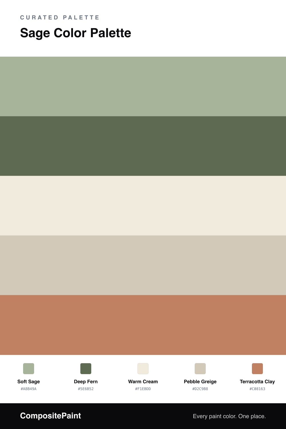
A calm five-color scheme led by soft sage and deeper fern green, balanced by warm cream and greige with a clay accent — every color matched to real paint you can buy.

By Emily Roberts · DIY Editor & First-Timer's Guide
View palette in

Sage is having a real moment right now, and it is easy to see why. This scheme puts a gentle Soft Sage in charge — the kind of green that feels fresh but never loud — and lets it cover most of your space.

To give it some depth, a richer Deep Fern steps in for trim, a back wall, or cabinetry. Then Warm Cream and Pebble Greige do the quiet work in between, keeping everything light and easy on the eye so the green never feels heavy.

The little surprise here is Terracotta Clay. Just a touch of that warm, earthy orange makes the sage look even greener and adds a cozy, lived-in feeling that fits where 2026 interiors are heading.

Buy these colors

Every Color, Matched to Real Paint

Each color matched to the closest paint in every brand we track, by ΔE2000. Tap a swatch for its full guide. Take any code to the store, they mix on demand.

Questions people actually ask

Questions

Why does sage feel so calming on a wall?

Sage is a muted, low-saturation green, so it reads as restful rather than bright. Your eye relaxes because the color sits close to the soft greens we see in nature, like dried herbs and faded leaves.

How much of the accent should I actually use?

Keep the terracotta clay small — think a single chair, a throw, or a vase. Let sage lead across the big surfaces and the clay just warms up the room without taking over.