Greige Color Palette — Greige Tide
A soft five-color greige scheme led by a warm gray-beige, layered with creamy neutrals and a quiet driftwood accent — every color matched to real paint you can buy.
By Jessica Williams · Color Stylist & Interior Editor
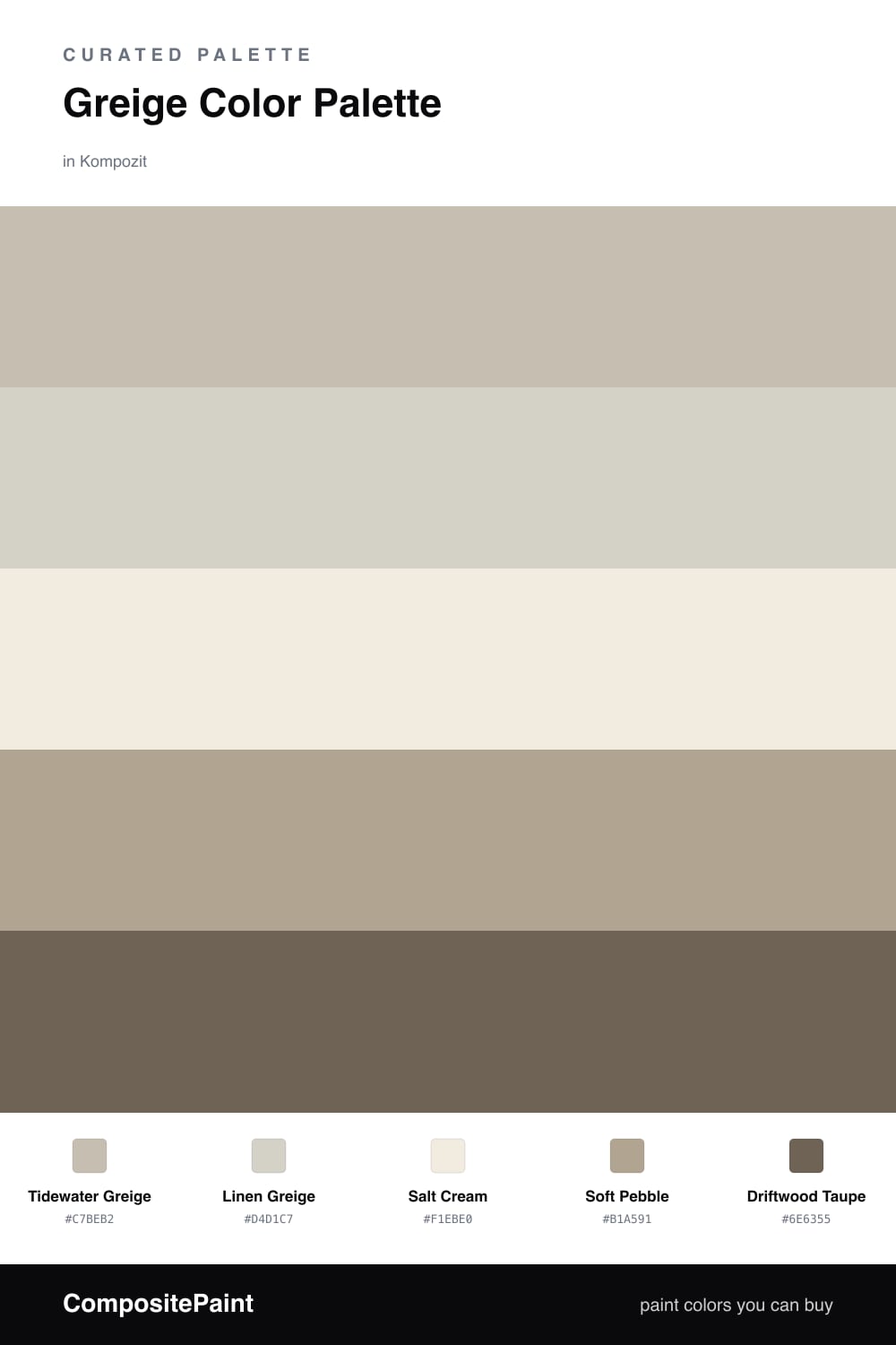
Greige is the neutral I reach for most these days, and Tidewater Greige is the kind of shade that quietly carries a whole room. It is warm enough to feel like a hug and soft enough to disappear behind your furniture and art, which is exactly what you want from a dominant wall color in 2026.
Around it, Linen Greige and Salt Cream keep things light and airy on trim, ceilings, and built-ins, while Soft Pebble adds a touch more depth for a kitchen island, a hallway, or lower cabinets. Together they feel like sand drying in the sun — calm, layered, and never cold.
The one note that makes it sing is Driftwood Taupe. Use it sparingly on a front door, a console, or a single moody accent wall. It deepens everything around it and gives this gentle, tidal palette its quiet anchor.
Buy These Colors
Each color matched to the closest real paint in every brand, by ΔE2000. Kompozit first; take any SKU to the store — these mix on demand.
Questions
Greige sits right between the two — it has the steadiness of gray with a warm beige undertone, so it reads soft and grounded rather than cold or yellow.
Layer in shifts of depth. Let the lightest cream and a deeper taupe bookend your greige, and add texture through linen, wood, and matte finishes so the eye always has something to rest on.
Similar Palettes
Closest schemes by color — not by label.