CP

Beige Color Palette — Canyon Drift

A warm five-color beige scheme led by soft canyon beige, layered with greige, ivory, and clay neutrals plus a smoky bronze accent — every color matched to real paint you can buy.

By David Chen · Formulation Lead & Resident Chemist

Canyon Beige
Dominant
Kompozit Garden Country · 0279
#D6C5A9
LRV 57
Warm Greige
Secondary
Kompozit Roman Ruins · 0225
#C0B5A0
LRV 47
Soft Ivory
Base
Kompozit Pale Quartz · 0362
#EFEADA
LRV 82
Pale Clay
Support
Kompozit Maple Pecan · 0174
#E3D1BB
LRV 66
Smoky Bronze
Accent
Kompozit Alpha Male · 0193
#715A45
LRV 11
View palette in

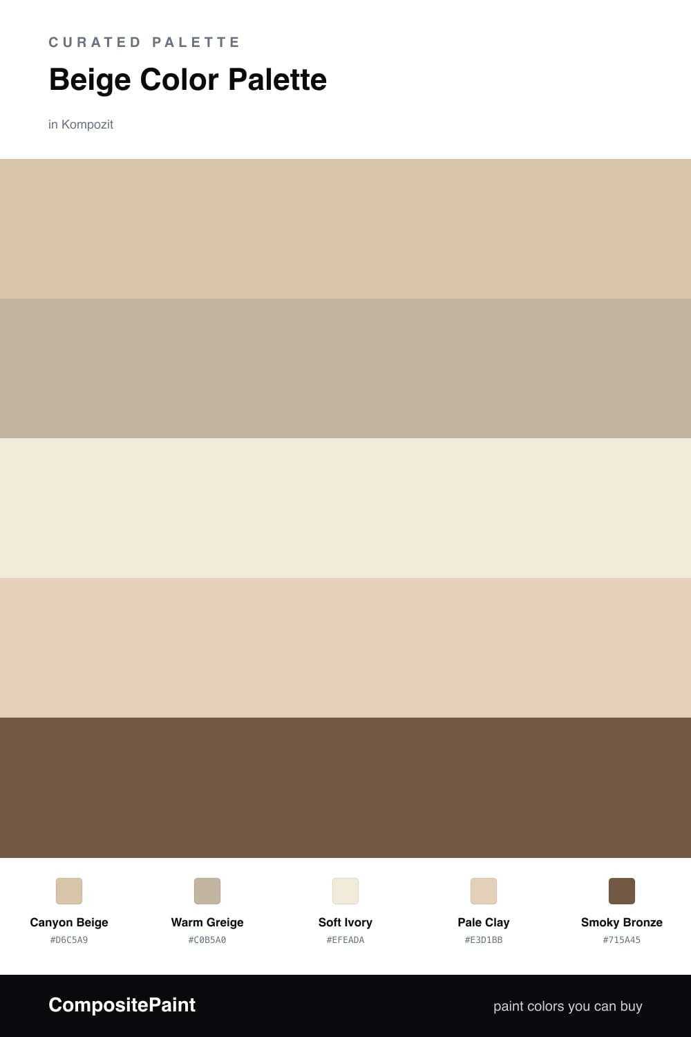
Think of beige the way I think of a good base coat — it is the quiet layer everything else rests on. This scheme builds around Canyon Beige, a soft sandy tone that carries just enough warmth to feel alive rather than builder-grade.

Around it I stacked closely related neutrals so the room reads as one smooth wash. Warm Greige adds a touch of gray for contrast, Soft Ivory lifts the trim, and Pale Clay bridges the two with a hint of pink-brown. They are near enough in value to blend, but each pulls its own undertone, which is what keeps a beige room from going dull.

The one move that makes it feel current is Smoky Bronze. Used sparingly on a door, a frame, or hardware, it grounds all that warmth and gives the eye somewhere to land. That is the 2026 instinct in a nutshell — soft, earthy neutrals with one deeper note doing the heavy lifting.

Buy These Colors

Each color matched to the closest real paint in every brand, by ΔE2000. Kompozit first; take any SKU to the store — these mix on demand.

Canyon Beige
#D8C4A8 · LRV 57 · Dominant
Kompozit Garden Country · 0279 ΔE 1.34
Backdrop Boy Meets Girl · BD-BG ΔE 11.16
Behr Country Linens · HDC-CT-06 ΔE 1.04
Benjamin Moore Adobe Beige · 1128 ΔE 1.13
Clare Meet Cute · PNT100-LT-60 ΔE 8.36
Dunn-Edwards Pale Beach · DE6199 ΔE 1.34
Farrow & Ball Savage Ground · No. 213 ΔE 0
Magnolia Home Plaster · JG-156 ΔE 4.69
PPG / Glidden Birch Beige · 1094-3 ΔE 1.88
Sherwin-Williams Buckram Binding · SW 36 ΔE 0.79
Valspar Gardenia · 3005-10B ΔE 0.5
Warm Greige
#C0B19B · LRV 45 · Secondary
Kompozit Roman Ruins · 0225 ΔE 2.04
Backdrop Rosita · BD-RO ΔE 15.35
Behr Vast Desert · UL170-17 ΔE 1.35
Benjamin Moore Kangaroo · AF-145 ΔE 1.45
Clare Money Moves · PNT100-MD-48 ΔE 9.1
Dunn-Edwards Pigeon Gray · DE6214 ΔE 1.22
Farrow & Ball Jitney · No. 293 ΔE 3.53
Magnolia Home Embossed Letter · JG-106 ΔE 0.28
PPG / Glidden Discover · 1021-3 ΔE 2.3
Sherwin-Williams Khaki Shade · SW 7533 ΔE 1.05
Valspar Moose Mousse · 3003-10A ΔE 3.5
Soft Ivory
#F2EADA · LRV 83 · Base
Kompozit Pale Quartz · 0362 ΔE 1.47
Backdrop Don't Eat the Yellow Snow · BD-DS ΔE 3.06
Behr Ceylon Cream · HDC-CL-17 ΔE 0.98
Benjamin Moore Linen White · 912 ΔE 0.75
Clare Like Buttah · PNT100-LT-62 ΔE 1.56
Dunn-Edwards Salt Box · DE6141 ΔE 1.93
Farrow & Ball White Tie · No. 2002 ΔE 1.19
Magnolia Home Pearly Cotton · JG-33 ΔE 1.95
PPG / Glidden Ivory Tower · 1103-1 ΔE 0.98
Sherwin-Williams Classic Light Buff · SW 50 ΔE 1.04
Valspar Grow · 8003-25A ΔE 0.65
Pale Clay
#E4D2BC · LRV 66 · Support
Kompozit Maple Pecan · 0174 ΔE 0.23
Backdrop Real Real · BD-RR ΔE 4.91
Behr Stone Wash · QE-10 ΔE 0.83
Benjamin Moore Cayman Islands · 952 ΔE 2.08
Clare Turbinado · PNT100-LT-21 ΔE 2.94
Dunn-Edwards Oyster · DEC748 ΔE 0.91
Farrow & Ball Matchstick · No. 2013 ΔE 2.23
Magnolia Home Ella Rose · JG-24 ΔE 5.39
PPG / Glidden Almond Brittle · 1095-3 ΔE 1.56
Sherwin-Williams Patience · SW 7555 ΔE 1.24
Valspar Honey Locust · 8007-10G ΔE 1.36
Smoky Bronze
#6E5B45 · LRV 11 · Accent
Kompozit Alpha Male · 0193 ΔE 2.19
Backdrop Buenos Aires · BD-BA ΔE 4.78
Behr Joshua Tree · N240-7 ΔE 0.93
Benjamin Moore Hope Chest · CSP-1050 ΔE 2.01
Clare Coffee Date · PNT100-DP-53 ΔE 9.19
Dunn-Edwards Log Cabin · DEA162 ΔE 2.03
Farrow & Ball Salon Drab · No. 290 ΔE 4.22
Magnolia Home Mosswood · JG-168 ΔE 5.76
PPG / Glidden Coffee House · 1077-7 ΔE 3.41
Sherwin-Williams Coconut Husk · SW 6111 ΔE 2.84
Valspar Stampede · 3008-9A ΔE 1.25

Questions

Why does this palette feel warm without being heavy?

The four light shades all share a touch of yellow and red undertone, so they read as one warm family. The bronze accent keeps it from feeling flat by adding a little depth in small doses.

How much of each color should I use?

Let the canyon beige lead on the biggest surfaces, use greige and clay as supporting layers, keep ivory for trim, and save the bronze for one or two small moments only.

Similar Palettes

Closest schemes by color — not by label.