CP

Beige Color Palette — Beige Meadow

A soft five-color scheme led by warm beige, layered with sage and oat neutrals and a single muted olive accent — every color matched to real paint you can buy.

By Maya Patel · Reviews Editor & Product Tester

Meadow Beige
Dominant
Kompozit Knit Cardigan · 0329
#D6C8A8
LRV 58
Dry Sage
Secondary
Kompozit Helen of Troy · 0350
#C3B89F
LRV 48
Oat Cream
Base
Kompozit Twill · 0014
#F0E8D3
LRV 81
Soft Taupe
Support
Kompozit Roman Ruins · 0225
#C0B5A0
LRV 47
Muted Olive
Accent
Kompozit Georgia on My Mind · 0361
#746A4B
LRV 15
View palette in

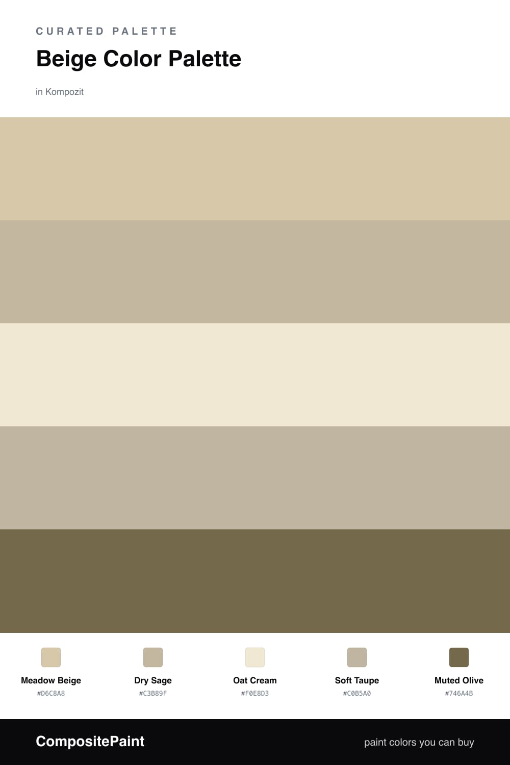
Beige gets a bad reputation for being safe, but a good beige is the most useful color you can own. This scheme leads with Meadow Beige, a warm mid-tone that feels grounded without going yellow, and lets it do the heavy lifting across the biggest surfaces.

The supporting cast is where it earns its keep in 2026. Dry Sage brings a quiet, dusty green that reads as a soft neutral, while Oat Cream keeps the lighter moments from feeling cold. Soft Taupe bridges everything so no edge feels abrupt.

Then there is Muted Olive, the accent that turns this from pleasant to intentional. Use it sparingly — a cabinet, a door, a single wall — and the whole palette snaps into focus. That is the move I would make every time.

Buy These Colors

Each color matched to the closest real paint in every brand, by ΔE2000. Kompozit first; take any SKU to the store — these mix on demand.

Meadow Beige
#D8C7A8 · LRV 58 · Dominant
Kompozit Knit Cardigan · 0329 ΔE 1.49
Backdrop August · BD-AU ΔE 9.2
Behr Sand Motif · PPU4-13 ΔE 3.23
Benjamin Moore Richmond Bisque · HC-177 ΔE 0.81
Clare High Vibe · PNT100-MD-63 ΔE 8.04
Dunn-Edwards Pale Beach · DE6199 ΔE 1.13
Farrow & Ball Savage Ground · No. 213 ΔE 2.1
Magnolia Home Tapestry Thread · JG-105 ΔE 4.27
PPG / Glidden Sanctuary · 1026-2 ΔE 3.29
Sherwin-Williams Believable Buff · SW 6120 ΔE 1.31
Valspar Café Au Lait · M118 ΔE 1.92
Dry Sage
#B7BCA0 · LRV 49 · Secondary
Kompozit Helen of Troy · 0350 ΔE 7.52
Backdrop Underdog · BD-UD ΔE 15.15
Behr Pebble Stone · 750D-4 ΔE 1.09
Benjamin Moore Burgess Green · CW-485 ΔE 2.55
Clare Money Moves · PNT100-MD-48 ΔE 3.24
Dunn-Edwards Tickled Crow · DEC780 ΔE 2.13
Farrow & Ball Vert de Terre · No. 234 ΔE 2.77
Magnolia Home Gold Moss · JG-48 ΔE 3.57
PPG / Glidden Heavy Hammock · 1027-3 ΔE 4.95
Sherwin-Williams Softened Green · SW 6177 ΔE 3.09
Valspar Quiet Waters · P060 ΔE 0
Oat Cream
#EFE7D6 · LRV 80 · Base
Kompozit Twill · 0014 ΔE 1.57
Backdrop Don't Eat the Yellow Snow · BD-DS ΔE 2.7
Behr Rye Flour · HDC-FL13-5 ΔE 1.35
Benjamin Moore Navajo White · 947 ΔE 0.73
Clare Like Buttah · PNT100-LT-62 ΔE 1.35
Dunn-Edwards Rice Bowl · DE6170 ΔE 0.9
Farrow & Ball James White · No. 2010 ΔE 1.96
Magnolia Home Carter Crème · JG-16 ΔE 0.73
PPG / Glidden Elegant Ivory · 1081-1 ΔE 1.67
Sherwin-Williams Restful White · SW 7563 ΔE 0.98
Valspar Double Scoop · V176 ΔE 0.76
Soft Taupe
#C2B19A · LRV 45 · Support
Kompozit Roman Ruins · 0225 ΔE 2.79
Backdrop Rosita · BD-RO ΔE 14.79
Behr Vast Desert · UL170-17 ΔE 0.69
Benjamin Moore Kangaroo · AF-145 ΔE 1.92
Clare Money Moves · PNT100-MD-48 ΔE 9.96
Dunn-Edwards Pigeon Gray · DE6214 ΔE 1.89
Farrow & Ball Jitney · No. 293 ΔE 3.29
Magnolia Home Embossed Letter · JG-106 ΔE 0.92
PPG / Glidden Persuasion · 1077-3 ΔE 2.2
Sherwin-Williams Renwick Beige · SW 2805 ΔE 2.27
Valspar Moose Mousse · 3003-10A ΔE 2.73
Muted Olive
#6E7253 · LRV 16 · Accent
Kompozit Georgia on My Mind · 0361 ΔE 6.95
Backdrop Old Soul · BD-OS ΔE 5.17
Behr Arrowhead · N320-6 ΔE 2.68
Benjamin Moore Pine Brook · 490 ΔE 1.77
Clare Daily Greens · PNT100-DP-61 ΔE 4.6
Dunn-Edwards Secret Path · DE6252 ΔE 3.43
Farrow & Ball Bancha · No. 298 ΔE 3.41
Magnolia Home Landscape · JG-49 ΔE 5.05
PPG / Glidden Gratefully Grass · 1115-7 ΔE 2.16
Sherwin-Williams Sage Green Light · SW 2851 ΔE 6.04
Valspar Olive to the Max · T610 ΔE 5.22

Questions

Why does this palette feel calm instead of flat?

Beige can read dull on its own, so the trick is layering warm and cool neutrals together. The sage and olive add just enough green to keep the beige feeling fresh rather than washed out.

How much of the olive should I actually use?

Keep it small — think roughly one-fifth of the room at most. Olive is the anchor here, best on a single wall, trim, or a few pieces, while the beige and oat carry the rest.

Similar Palettes

Closest schemes by color — not by label.