CP

Taupe Color Palette — Fern & Stone

A calm five-color scheme led by warm taupe, layered with greige and soft white and lifted by a quiet fern green — every color matched to real paint you can buy.

By David Chen · Formulation Lead & Resident Chemist

Stone Taupe
Dominant
Kompozit Village Crier · 0190
#AD9986
LRV 33
Warm Greige
Secondary
Kompozit Moth Wing · 0183
#CCBCA9
LRV 52
Soft Linen
Base
Kompozit Hint of Vanilla · 0001
#EEE8DC
LRV 81
Pale Sand
Support
Kompozit Sandstone Palette · 0273
#D9CCB6
LRV 61
Fern Green
Accent
Kompozit Bowling Green · 0437
#717B61
LRV 19
View palette in

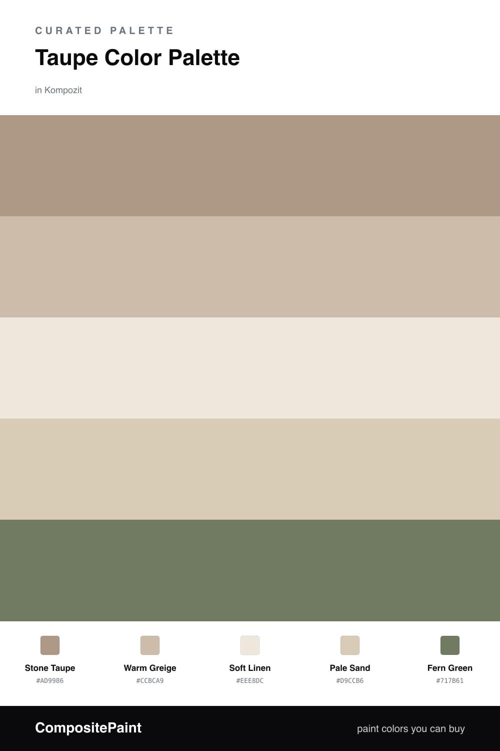
Taupe is one of those shades that does more than it lets on. Up close it reads warm and brown, but step back and you notice the faint grey-green that makes it sit so well next to other muted tones. Here Stone Taupe carries the whole room, with Warm Greige as its closest companion to keep the walls from feeling flat.

Soft Linen and Pale Sand are the breathing space. Think of them as the lighter end of the same family, the colors you would use on a ceiling, trim, or a quiet corner where you want the eye to rest.

Then comes Fern Green, the accent that ties it together. Because taupe leans slightly green to begin with, a soft fern feels like it belongs rather than interrupts. Used in small amounts, on a door or a single piece of furniture, it gives this calm, contemporary scheme just enough life.

Buy These Colors

Each color matched to the closest real paint in every brand, by ΔE2000. Kompozit first; take any SKU to the store — these mix on demand.

Stone Taupe
#A99A87 · LRV 33 · Dominant
Kompozit Village Crier · 0190 ΔE 2.39
Backdrop Anita · BD-AN ΔE 0.96
Behr Chic Taupe · N230-4 ΔE 2.81
Benjamin Moore Creekbed · 1006 ΔE 2.77
Clare Extra Virgin · PNT100-MD-64 ΔE 12.88
Dunn-Edwards Wooden Peg · DE6215 ΔE 1.32
Farrow & Ball Pigeon · No. 25 ΔE 6.95
Magnolia Home Antiquing · JG-128 ΔE 3.45
PPG / Glidden Diversion · 1021-4 ΔE 0.89
Sherwin-Williams Threshold Taupe · SW 7501 ΔE 2.41
Valspar Land of Nod · T589 ΔE 2.34
Warm Greige
#C7BCAA · LRV 51 · Secondary
Kompozit Moth Wing · 0183 ΔE 2.29
Backdrop Boy Meets Girl · BD-BG ΔE 12.34
Behr Celery Powder · PPU8-18 ΔE 2.26
Benjamin Moore Brick House Tan · CW-145 ΔE 1.12
Clare Greige · PNT100-LT-13 ΔE 5.6
Dunn-Edwards Birchwood · DEC752 ΔE 1.62
Farrow & Ball Drop Cloth · No. 283 ΔE 0.65
Magnolia Home Solid Wood · JG-109 ΔE 1.2
PPG / Glidden Stonington · 15-25 ΔE 0.78
Sherwin-Williams Shiitake · SW 9173 ΔE 0.78
Valspar Mother Nature · 8004-26C ΔE 3.81
Soft Linen
#EFE9DD · LRV 82 · Base
Kompozit Hint of Vanilla · 0001 ΔE 0.22
Backdrop Jane · BD-JA ΔE 2.03
Behr Ivory Palace · PPU10-14 ΔE 0.5
Benjamin Moore Stoneware · CSP-245 ΔE 1.52
Clare Like Buttah · PNT100-LT-62 ΔE 2.82
Dunn-Edwards Abstract White · DE6232 ΔE 1
Farrow & Ball James White · No. 2010 ΔE 2.57
Magnolia Home Antique Rose · JG-23 ΔE 0.5
PPG / Glidden Cream Puff · 1078-1 ΔE 0.77
Sherwin-Williams Downy · SW 7002 ΔE 0.8
Valspar Shell White · 7007-12 ΔE 0.54
Pale Sand
#D8CBB6 · LRV 61 · Support
Kompozit Sandstone Palette · 0273 ΔE 0.45
Backdrop Real Real · BD-RR ΔE 2.85
Behr Estate Limestone · QE-27 ΔE 1.4
Benjamin Moore Lace Handkerchief · CSP-220 ΔE 1.35
Clare Flatiron · PNT100-LT-17 ΔE 3.94
Dunn-Edwards Cochise · DEC761 ΔE 1.89
Farrow & Ball Joa's White · No. 226 ΔE 1.34
Magnolia Home Plaster · JG-156 ΔE 1.57
PPG / Glidden Summer Wheat · 14-10 ΔE 1.47
Sherwin-Williams Softer Tan · SW 6141 ΔE 1.4
Valspar Rattan Basket · 3007-10C ΔE 0.56
Fern Green
#6E7A5A · LRV 18 · Accent
Kompozit Bowling Green · 0437 ΔE 2.21
Backdrop Old Soul · BD-OS ΔE 6.06
Behr Spanish Galleon · 760D-6 ΔE 2.39
Benjamin Moore Pine Brook · 490 ΔE 3.36
Clare Daily Greens · PNT100-DP-61 ΔE 2.06
Dunn-Edwards Bonsai · DE5538 ΔE 4.26
Farrow & Ball Green Smoke · No. 47 ΔE 7.72
Magnolia Home Celery Seeds · JG-58 ΔE 2.78
PPG / Glidden Dark Sage · 1124-6 ΔE 2.27
Sherwin-Williams Garden Grove · SW 6445 ΔE 6.17
Valspar Zipline Green · T618 ΔE 4.56

Questions

Why does fern green work with taupe?

Taupe already carries a little green underneath its brown, so a muted fern feels like family rather than a clash. The two share the same soft, dusty quality, which keeps the pairing grounded and easy to live with.

How much of each color should I use?

Let taupe lead on the big surfaces, roughly two-thirds of the room, with the linen and sand softening it. Keep fern green to small doses such as a door, a chair, or trim so it stays a quiet spark.

Similar Palettes

Closest schemes by color — not by label.