CP

Blush Color Palette — Fern & Petal

A soft five-color scheme led by warm blush pink, balanced with creamy neutrals and a fresh fern green accent — every color matched to real paint you can buy.

By Emily Roberts · DIY Editor & First-Timer's Guide

Petal Blush
Dominant
Kompozit Empire Rose · 0069
#E7C5C1
LRV 61
Soft Rose Beige
Secondary
Kompozit Cave Painting · 0147
#D3BAAE
LRV 52
Warm Linen
Base
Kompozit Nilla Vanilla · 0003
#F1EBE0
LRV 83
Greige Mist
Support
Kompozit Hearthstone · 0567
#C7BEB2
LRV 52
Fern Green
Accent
Kompozit Bowling Green · 0437
#717B61
LRV 19
View palette in

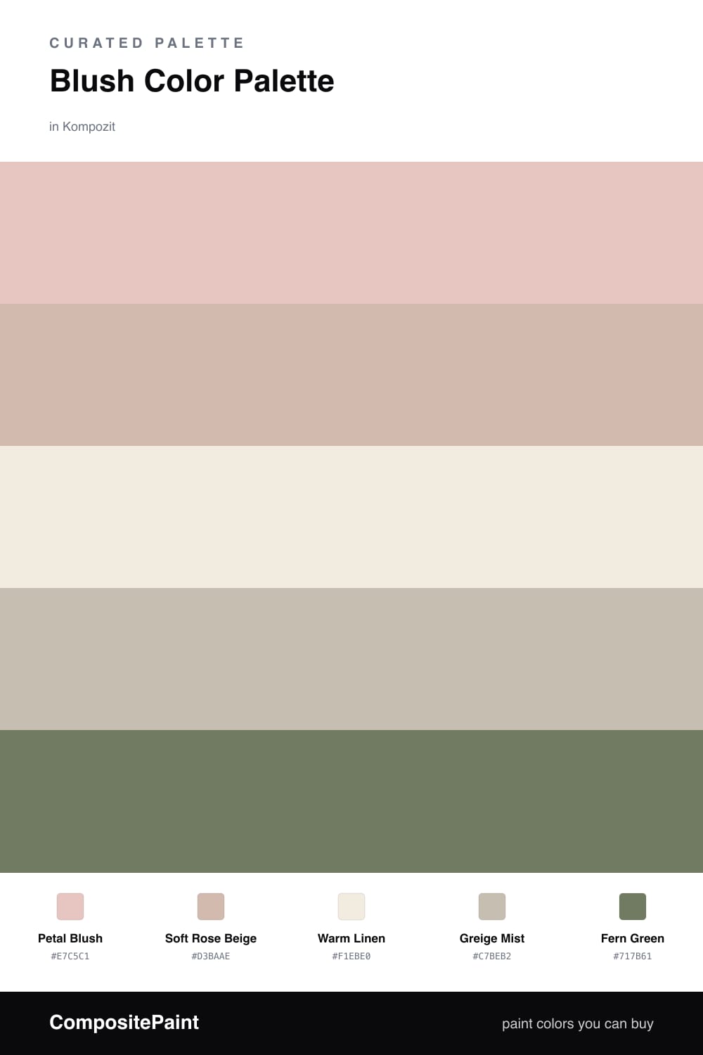
Blush is having a quiet moment again, and this is the grown-up version of it. Petal Blush leads the whole scheme — it is warm and a little dusty, so it reads cozy rather than baby-pink. Soft Rose Beige is its slightly deeper cousin, great for an accent wall or built-ins when you want some depth without changing the mood.

The neutrals are what keep this from feeling sweet. Warm Linen is your trim and ceiling color, bright but never stark, and Greige Mist adds a soft gray-brown that calms everything down. Together they give the blush room to breathe.

Then comes the fun part — Fern Green as the accent. Just a touch goes a long way here: a painted interior door, a velvet chair, or honestly just a few real plants. That little green is what makes the blush look intentional and current, not like a nursery from years ago.

Buy These Colors

Each color matched to the closest real paint in every brand, by ΔE2000. Kompozit first; take any SKU to the store — these mix on demand.

Petal Blush
#E7C7BE · LRV 62 · Dominant
Kompozit Empire Rose · 0069 ΔE 2.5
Backdrop August · BD-AU ΔE 4.15
Behr Tapestry Beige · S210-2 ΔE 1.58
Benjamin Moore Rosetone · 1186 ΔE 1.01
Clare Meet Cute · PNT100-LT-60 ΔE 3.09
Dunn-Edwards Galveston Tan · DE6101 ΔE 3.16
Farrow & Ball Peignoir · No. 286 ΔE 6.35
Magnolia Home Cabbage Rose · JG-26 ΔE 1.73
PPG / Glidden Sultan Sand · 1068-3 ΔE 2.56
Sherwin-Williams Malted Milk · SW 6057 ΔE 5.45
Valspar Harmony · 2001-8C ΔE 1.04
Soft Rose Beige
#D9B8AC · LRV 52 · Secondary
Kompozit Cave Painting · 0147 ΔE 2.86
Backdrop Boy Meets Girl · BD-BG ΔE 2.54
Behr One To Remember · MQ1-23 ΔE 1.69
Benjamin Moore Desert Rose · 2094-50 ΔE 2.96
Clare Meet Cute · PNT100-LT-60 ΔE 3.65
Dunn-Edwards Kraft Paper · DE6109 ΔE 5.9
Farrow & Ball Elephant's Breath · No. 229 ΔE 8.04
Magnolia Home Cinnamon Sugar · JG-133 ΔE 8.34
PPG / Glidden Cinnamon Ice · 1071-4 ΔE 3.75
Sherwin-Williams Classic Sand · SW 56 ΔE 4.49
Valspar Sunset Curtains · 1007-10B ΔE 0.8
Warm Linen
#F2EAE0 · LRV 83 · Base
Kompozit Nilla Vanilla · 0003 ΔE 1.24
Backdrop Jane · BD-JA ΔE 3.01
Behr Jet White · QE-01 ΔE 0.92
Benjamin Moore Winter Sky · 2163-70 ΔE 0.88
Clare Classic · PNT100-LT-12 ΔE 4.61
Dunn-Edwards Tea Biscuit · DE6120 ΔE 1
Farrow & Ball Wevet · No. 273 ΔE 3.78
Magnolia Home Panna Cotta · JG-111 ΔE 3.31
PPG / Glidden Pale Ecru · 1195-1 ΔE 0.52
Sherwin-Williams Shell White · SW 8917 ΔE 1.71
Valspar Polar White · 7003-16 ΔE 2.77
Greige Mist
#CBBFB0 · LRV 53 · Support
Kompozit Hearthstone · 0567 ΔE 1.58
Backdrop Boy Meets Girl · BD-BG ΔE 10.88
Behr Washed Khaki · UL170-8 ΔE 2.04
Benjamin Moore Ashen Tan · 996 ΔE 0.58
Clare Motor City · PNT100-LT-09 ΔE 7.57
Dunn-Edwards Birchwood · DEC752 ΔE 1.26
Farrow & Ball Elephant's Breath · No. 229 ΔE 1.67
Magnolia Home Cinnamon Sugar · JG-133 ΔE 2.86
PPG / Glidden Ashen · 1023-3 ΔE 1.02
Sherwin-Williams Bungalow Beige · SW 7511 ΔE 0.97
Valspar Oatbran · 6006-1B ΔE 1.65
Fern Green
#6F7E5A · LRV 19 · Accent
Kompozit Bowling Green · 0437 ΔE 3.57
Backdrop Old Soul · BD-OS ΔE 6.72
Behr Terrain · MQ6-47 ΔE 1.6
Benjamin Moore Oak Grove · 489 ΔE 3.33
Clare Daily Greens · PNT100-DP-61 ΔE 3.55
Dunn-Edwards Bonsai · DE5538 ΔE 4.53
Farrow & Ball Calke Green · No. 34 ΔE 4.06
Magnolia Home Celery Seeds · JG-58 ΔE 2.59
PPG / Glidden Spinach Salad · 11-16 ΔE 2.28
Sherwin-Williams Garden Grove · SW 6445 ΔE 5.04
Valspar Graceful Green · 6001-6C ΔE 3.04

Questions

Why does fern green work with blush pink?

Pink and green sit across from each other on the color wheel, so the soft fern makes the blush look fresh instead of sugary. Keeping the green muted and a little gray stops the pair from feeling like a holiday clash.

How much blush should I actually use?

Let blush lead — think roughly two-thirds of the room on the walls, with the neutrals filling in and just a small hit of fern on a door, a chair, or some plants.

Similar Palettes

Closest schemes by color — not by label.