CP

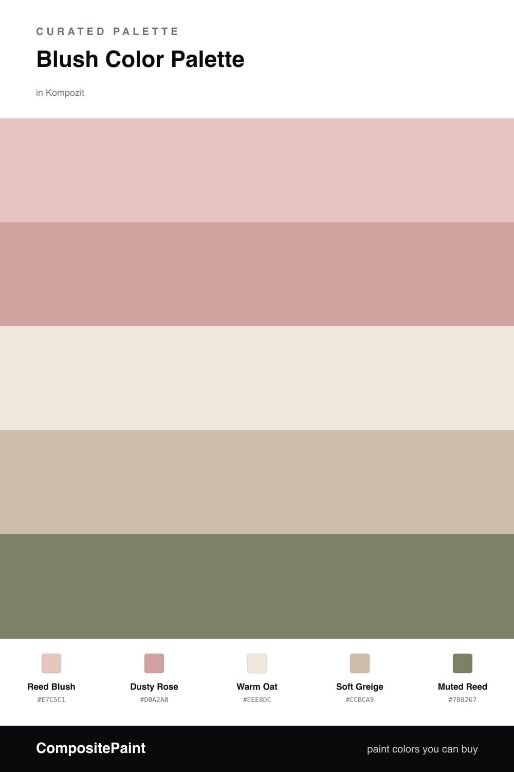
Blush Color Palette — Reed & Rose

A soft five-color scheme led by warm blush, balanced with greige and oat neutrals and grounded by a muted reed-green accent — every color matched to real paint you can buy.

By Maya Patel · Reviews Editor & Product Tester

Reed Blush
Dominant
Kompozit Empire Rose · 0069
#E7C5C1
LRV 61
Dusty Rose
Secondary
Kompozit Ruby Eye · 0071
#D0A2A0
LRV 42
Warm Oat
Base
Kompozit Hint of Vanilla · 0001
#EEE8DC
LRV 81
Soft Greige
Support
Kompozit Moth Wing · 0183
#CCBCA9
LRV 52
Muted Reed
Accent
Kompozit Pendula Garden · 0429
#7B8267
LRV 21
View palette in

Blush is having a quiet, grown-up moment in 2026, and this scheme leans into that. Reed Blush does the heavy lifting as the dominant color, with Dusty Rose stepping in a shade deeper for trim, a feature wall, or cabinetry.

The neutrals are where the balance lives. Warm Oat keeps ceilings and larger surfaces light and airy, while Soft Greige adds a grounded mid-tone so the pinks do not float off on their own.

The move that makes it modern is Muted Reed, a dusty olive-green accent. Used in small doses it cools the warmth just enough and stops the palette from reading too pretty. Lead with the blush, support it with the neutrals, and let the green be the spark.

Buy These Colors

Each color matched to the closest real paint in every brand, by ΔE2000. Kompozit first; take any SKU to the store — these mix on demand.

Reed Blush
#E7C7BD · LRV 62 · Dominant
Kompozit Empire Rose · 0069 ΔE 2.94
Backdrop August · BD-AU ΔE 3.72
Behr Tapestry Beige · S210-2 ΔE 1.26
Benjamin Moore Rosetone · 1186 ΔE 0.97
Clare Meet Cute · PNT100-LT-60 ΔE 2.8
Dunn-Edwards Galveston Tan · DE6101 ΔE 2.7
Farrow & Ball Setting Plaster · No. 231 ΔE 4.84
Magnolia Home Cabbage Rose · JG-26 ΔE 1.68
PPG / Glidden Sultan Sand · 1068-3 ΔE 2.31
Sherwin-Williams Malted Milk · SW 6057 ΔE 5.18
Valspar Misty Loch · 8003-12C ΔE 3.88
Dusty Rose
#CDA194 · LRV 41 · Secondary
Kompozit Ruby Eye · 0071 ΔE 4.84
Backdrop Rosita · BD-RO ΔE 2.31
Behr Autumn Malt · 230F-4 ΔE 2.06
Benjamin Moore Palazzo Pink · 1193 ΔE 2.21
Clare Subrosa · PNT100-MD-76 ΔE 1.3
Dunn-Edwards Musk · DE6088 ΔE 0.44
Farrow & Ball Cinder Rose · No. 246 ΔE 6.61
Magnolia Home Rosy Pink · JG-154 ΔE 6.26
PPG / Glidden Raffia Cream · 1056-4 ΔE 3.07
Sherwin-Williams Cabbage Rose · SW 3 ΔE 2.2
Valspar Adobe Village · V083-3 ΔE 4.47
Warm Oat
#EFE6D8 · LRV 80 · Base
Kompozit Hint of Vanilla · 0001 ΔE 1.44
Backdrop Don't Eat the Yellow Snow · BD-DS ΔE 4.18
Behr Exclusive Ivory · HDC-MD-11 ΔE 1.24
Benjamin Moore Navajo White · 947 ΔE 2.22
Clare Like Buttah · PNT100-LT-62 ΔE 1.57
Dunn-Edwards Finest Silk · DE6127 ΔE 1.44
Farrow & Ball James White · No. 2010 ΔE 3.12
Magnolia Home Antique Rose · JG-23 ΔE 1.41
PPG / Glidden Pearl · 1087-2 ΔE 1.19
Sherwin-Williams Futon · SW 7101 ΔE 1.32
Valspar Antique White · 7002-20 ΔE 0.49
Soft Greige
#C8BCAB · LRV 51 · Support
Kompozit Moth Wing · 0183 ΔE 1.73
Backdrop Boy Meets Girl · BD-BG ΔE 11.55
Behr Rustic Rose · BXC-13 ΔE 2.39
Benjamin Moore Brick House Tan · CW-145 ΔE 1.66
Clare Greige · PNT100-LT-13 ΔE 5.06
Dunn-Edwards Birchwood · DEC752 ΔE 1.06
Farrow & Ball Drop Cloth · No. 283 ΔE 1.22
Magnolia Home Solid Wood · JG-109 ΔE 1.06
PPG / Glidden Stonington · 15-25 ΔE 0
Sherwin-Williams Shiitake · SW 9173 ΔE 0
Valspar Dust Bunny · 2005-10B ΔE 4.43
Muted Reed
#7C8467 · LRV 22 · Accent
Kompozit Pendula Garden · 0429 ΔE 0.99
Backdrop Old Soul · BD-OS ΔE 4.99
Behr Mocha Accent · 720D-5 ΔE 3.05
Benjamin Moore Cedar Path · 454 ΔE 3.83
Clare Dirty Chai · PNT100-DP-52 ΔE 11.72
Dunn-Edwards Wreath · DE5656 ΔE 2.75
Farrow & Ball Calke Green · No. 34 ΔE 3.3
Magnolia Home Olive Grove · JG-09 ΔE 3.29
PPG / Glidden Wright Quiet Green · FLLW618 ΔE 2.73
Sherwin-Williams Artichoke · SW 6179 ΔE 2.14
Valspar Northern Glen · 5007-4B ΔE 1.32

Questions

Why does blush work as the lead color here?

Blush reads as a soft warm neutral once you spread it across a whole wall, so it carries a room without ever feeling sweet. The deeper dusty rose backs it up, the oat and greige keep it calm, and the reed green adds just enough contrast to make it feel current.

How much of the green accent should I use?

Keep it small — think one-fifth of the scheme at most. A single piece of trim, a door, or one upholstered chair in the muted reed is plenty to give the blush something to push against.

Similar Palettes

Closest schemes by color — not by label.