Olive Grove
A deep, grayed khaki-olive from Joanna Gaines' Magnolia Home line, reviewed honestly: the light it actually needs, the rooms it was built to work in, and where the daylight runs out on it.

Jessica has spec'd whites and neutrals for more than 300 rooms and keeps a sample wall of painted drawdowns in her studio. Every color review is checked against real reader rooms in the comments and re-tested when a formula changes. About the testing process →
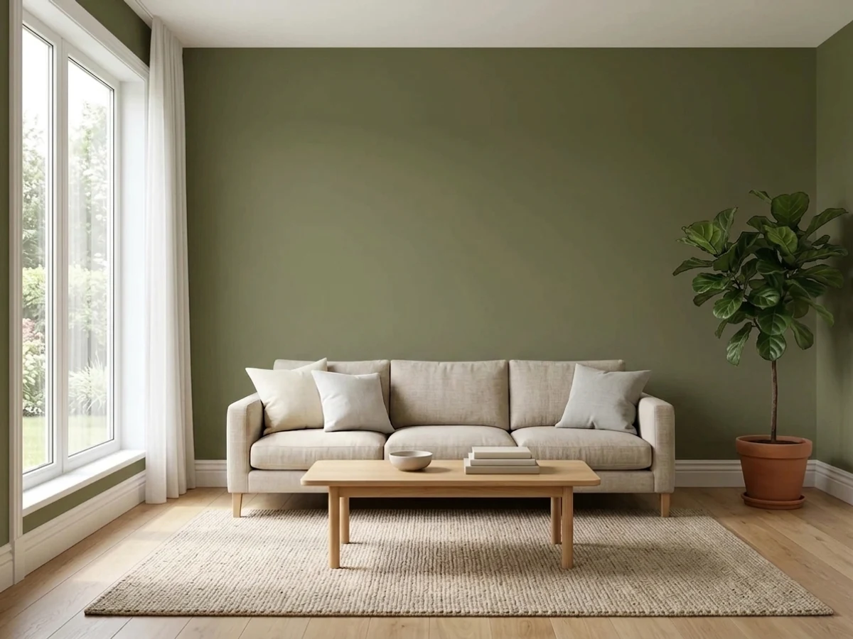
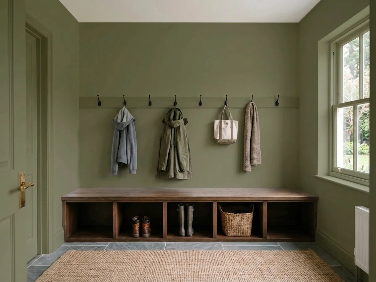
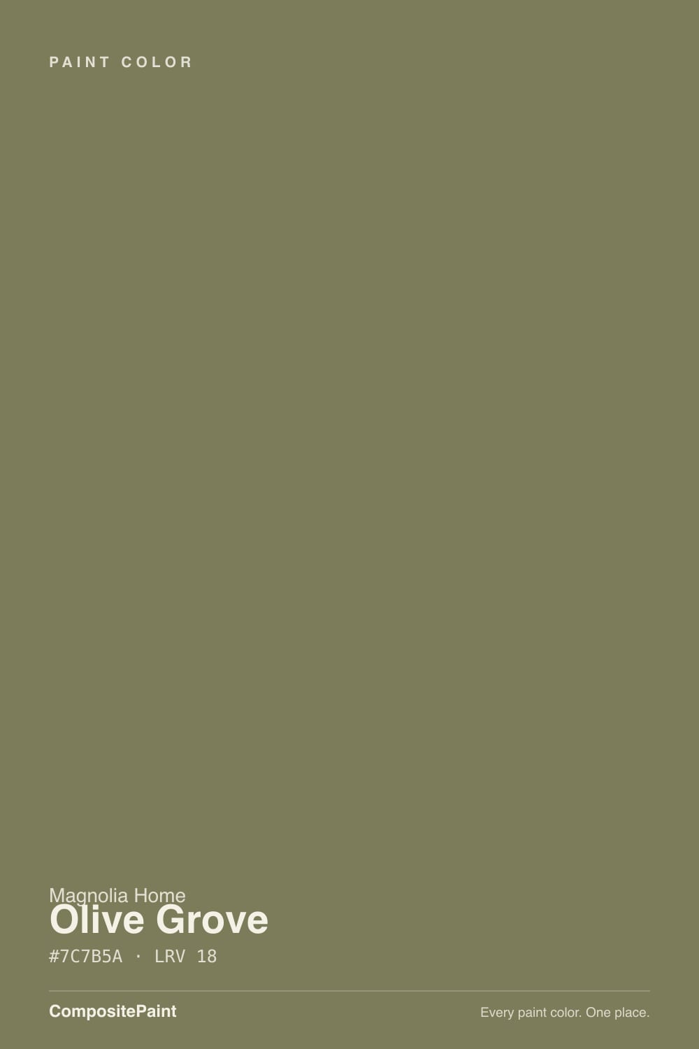
- 1Essex Green6
- 2Vintage Vogue12
- 3Olive Grove21
- 4Evergreen Fog30
- 5Clary Sage41
The Fast Verdict
Olive Grove is not a bright, saturated green — it is a warm, grayed khaki-olive, closer to a dusty army jacket than a garden hedge. At LRV 21 it is deep enough to read as a genuine color statement rather than a pale sage, and Magnolia sells it across almost every surface a house has: walls, exterior siding and doors, even cabinets and trim. Give it warm daylight and wood or brass and it looks grounded and expensive. Put it in a dim room or against cool metals and it goes muddy fast.
Kitchen cabinets and islands · a front door or exterior trim · a sunlit living-room or den accent wall · anyone who wants the modern-farmhouse earthy palette without going full sage-green
Your room is north-facing or dim without warm lamps · you actually want a bright, true grass green · your hardware and stone are cool (chrome, blue-gray marble) · you want a color with a decade of owner reviews to lean on
- A grounded, warm khaki-olive — reads sophisticated, not 1970s avocado
- Deep enough (LRV 21) to hold its color in a bright room, unlike pale sages
- Genuinely sold across walls, exterior, and cabinets — real multi-surface versatility
- Flatters brass, walnut, rattan and butcher block
- On-trend with the earthy-neutral moment without going full statement-green
- Goes flat, muddy and brown-gray fast in dim or north-facing rooms
- Reads murky rather than earthy against cool metals and cool stone
- Not a match if you actually want a bright, true green
- Thin public track record — few owner photos or reviews to check your room against
What Color Is Olive Grove, Really?
Olive Grove is a warm, grayed khaki-olive. In its own hex value, the red and green channels sit almost identical with the blue pulled well below both — the technical signature of a yellow-green muted down with brown and gray until it reads "khaki" more than "green." It is not a cool sage and it is not a bright grass color; it sits closer to a dark olive drab, the kind of green that shows up in canvas jackets and old botanical prints rather than in a spring garden bed.
At LRV 21 it is a genuinely deep color, not a pastel. That depth is the point: paler olive-sages wash out to a foggy green-gray in a bright room, but a color this deep holds its khaki character in full daylight and only starts to lose it once the room goes dim. Magnolia Home — Joanna Gaines' paint line, produced in partnership with KILZ — sells Olive Grove across an unusually wide surface lineup for one color: a Classic interior formula, a Premium interior formula, a dedicated exterior paint, and a trim-and-cabinetry paint. That is a real signal from the brand about intent — this olive is meant to travel from a wall to a front door to a kitchen island, not sit as a one-room accent.
One honest note before the rest of this review: Olive Grove does not have the years of owner photos, forum threads and design-press coverage that a color like White Dove or Sleepy Hollow has built up. We could not find a dedicated design-blog review, a Color-of-the-Year moment, or a viral room built around this specific shade. So this review is grounded in the color's own numbers, Magnolia's own multi-surface positioning, and how deep grayed olives like this one behave generally — not a pile of reader reports. Sample it big, in your own room, before you commit a whole kitchen to it.
Where It Shines
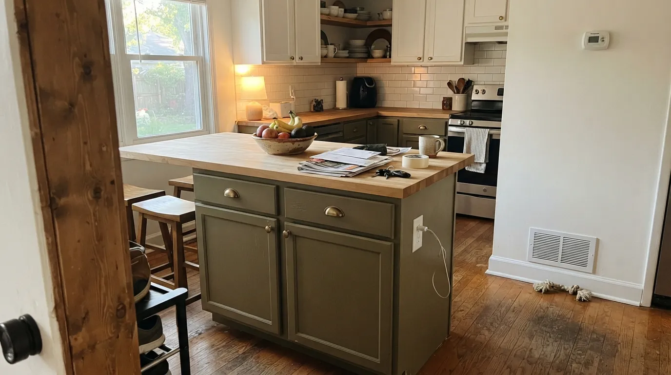
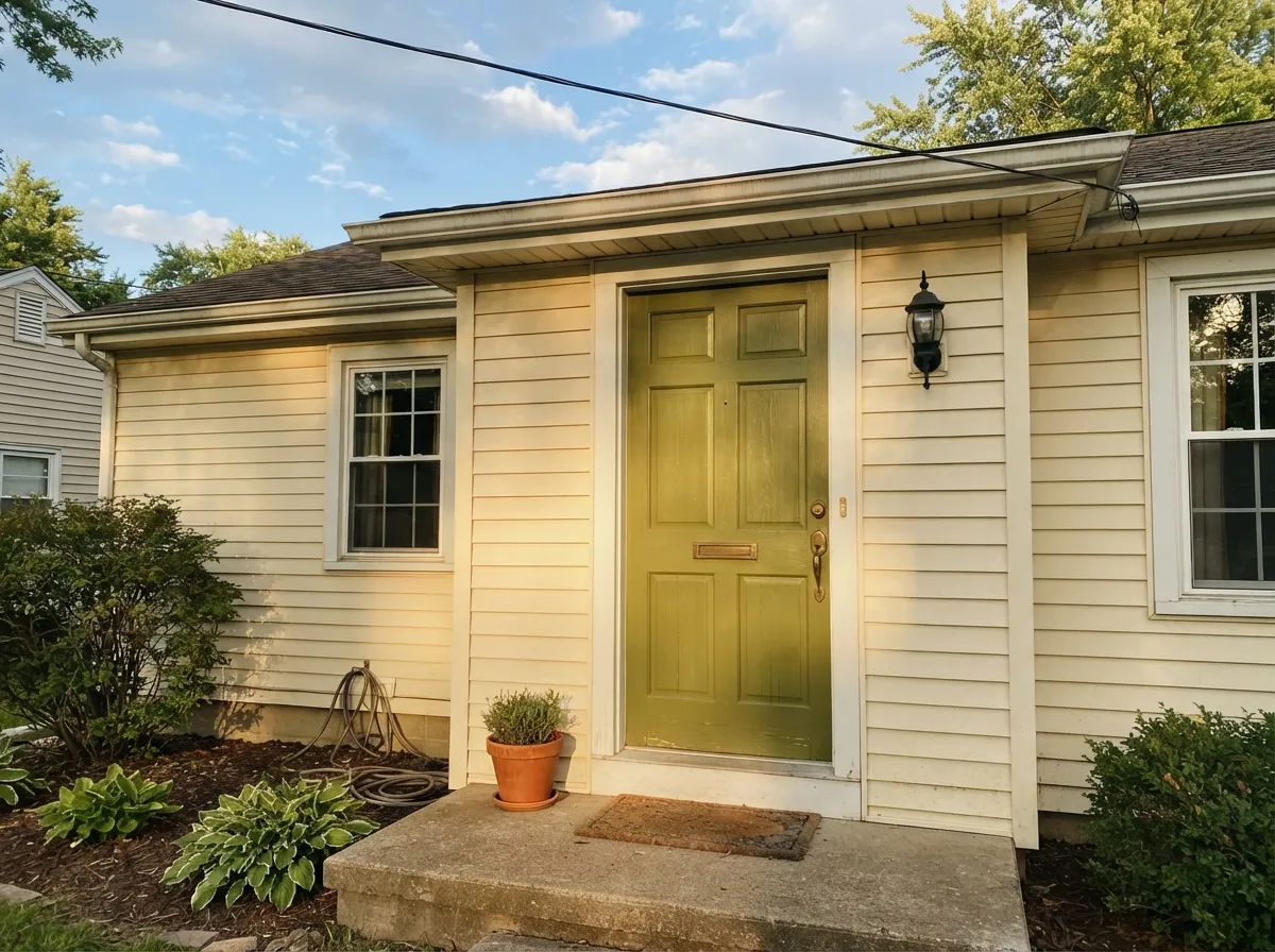
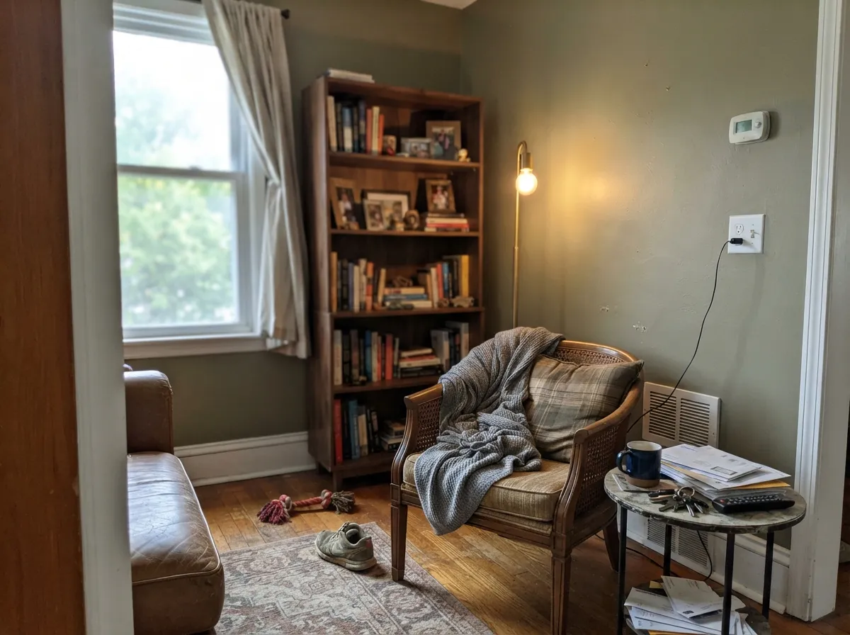
Give Olive Grove real daylight and warm materials and it earns its keep. It is at its best on a kitchen island or cabinet run under warm light, against butcher block, brass, and rattan — the exact modern-farmhouse combination Magnolia built its brand on. Outdoors, on a front door or shutters against a cream or white house, full sun reads it as a confident, grounded green-brown rather than a loud accent color. It photographs best in the late afternoon, when warm light leans into its yellow side.
Where It Fails
The complaints you would expect from a color this deep and this warm all trace back to the same handful of situations. None of them are the paint's fault — Olive Grove is doing exactly what a deep, warm olive does when the conditions turn against it.
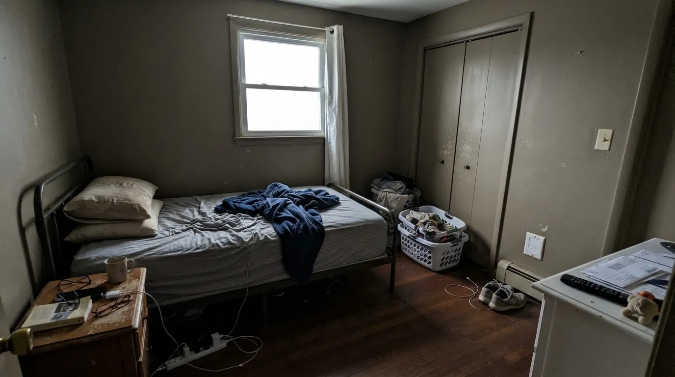
Cool, low daylight strips the warmth out of a deep olive fast. Without direct sun or warm lamps, Olive Grove stops reading as an earthy green and starts reading as a flat, muddy brown-gray — closer to army drab than the farmhouse look it was picked for. If your room is dim, this is not the color to commit a whole wall to; use it in doses (cabinets, a door) where the depth reads as intentional instead of dingy.
Chrome, brushed nickel and blue-gray countertops sit at the opposite temperature from this color and pull it toward murky rather than earthy. Olive Grove wants warm company — brass, black iron, walnut, butcher block. Put it next to cool stone or polished chrome and the khaki starts to look dirty instead of grounded.
If you searched "green kitchen island" and pictured a saturated grass or emerald green, Olive Grove will disappoint you — it is a grayed, brownish khaki-olive, not a bright color. That is the whole design of it, and it is also the single most common mismatch between what a buyer expects from the name and what actually goes on the wall.
Room by Room
This is the combination Magnolia built the color for: an island or lower-cabinet run in Olive Grove against warm upper cabinets or walls, brass hardware, and butcher block or warm wood counters. Satin, urethane-fortified cabinet enamel, and keep the room's daylight warm.
Magnolia offers Olive Grove as a dedicated exterior paint, and a deep olive door against cream or white siding is a genuine modern-farmhouse move. Full sun reads it brighter and more confident than an interior room ever will; pair it with black or bronze hardware.
In a room with real south or west sun, one Olive Grove wall behind a sofa or bookshelf reads grounded and collected rather than heavy. Keep the other three walls a warm neutral so the depth has somewhere to land.
A small, warm-lit office takes a deep olive well — it reads studious rather than gloomy when paired with walnut shelving and a brass or bronze desk lamp. Skip it if the office runs on cool overhead LEDs with no lamp.
With warm wood, brass and a cream countertop it can be a genuinely handsome small-room color. With chrome fixtures and a cool gray or white quartz counter, skip it — the cool company will make the olive look murky rather than earthy.
A deep, warm olive on every wall of a room that does not get consistent good daylight is the riskiest way to use this color. It works far more reliably as a cabinet, a door, or one accent wall than as a whole-room commitment, at least until you have lived with a large sample through a full day of light.
Your Light Is the Risk
South or west sun in the late afternoon leans into the yellow side of the color — this is Olive Grove looking like the marketing photos.
Cool, low light drains the warmth and leaves a flat, muddy brown-gray. Test a large sample here before you commit a whole wall.
Warmer and more olive at the sun hours, quieter and more khaki-gray once the direct light passes.
Warm 2700K bulbs keep the green alive after dark; cool white LEDs push it toward gray-brown — swap the bulb before you swap the paint.
Most complaints about Olive Grove are a light mismatch. Upload a photo of your actual room and see it on your walls — then ask for the same wall in north light or evening lamps before you buy a single sample.
Need It From Another Brand?
Any paint counter can custom-tint Magnolia Home JG-09 directly. If you would rather stay in one brand's own deck, these are the closest stock matches, measured as ΔE2000. Under 2 is a difference you will not see on the wall.
| Brand | Closest color | ΔE | LRV | |
|---|---|---|---|---|
| Sherwin-Williams | Dried ThymeSW 6186 · Sherwin-Williams | 2.8 | 21 | Color page → |
| Behr | Cactus GardenPPU11-18 · Behr | 1.0 | 22 | Color page → |
| Benjamin Moore | Cedar Path454 · Benjamin Moore | 3.0 | 23 | Color page → |
| Valspar | Ginkgo Tree5006-4B · Valspar | 1.1 | 22 | Color page → |
| PPG / Glidden | Lottery WinningsPPG1129-6 · PPG / Glidden | 1.3 | 22 | Color page → |
| Glidden | Lottery WinningsPPG1129-6 · Glidden | 1.4 | 21 | Color page → |
Similar Magnolia Home Colors
The nearest shades to Olive Grove within Magnolia Home's own range, ranked by perceptual color distance — useful when you want the same look a touch lighter, darker, or warmer.
WCAG 2.1: AA is 4.5 : 1 for normal text, 3 : 1 for large text, AAA is 7 : 1.
Olive Grove vs the Colors You're Also Considering
Every Olive Grove sample board has the same rivals on it. The numbers show the real lightness gap — then it comes down to which risk you would rather live with.
Pick this if you'd rather buy the same tone off the shelf at Target, Walmart or Ace instead of ordering online.
Backdrop BD-OS · LRV 18Old SoulPick this if you like this exact khaki-olive but want it from a boutique, direct-to-consumer paint brand instead of a mass-retail one.
Pick this for the deeper, more khaki version, or if your painter isn't set up in Benjamin Moore.
Benjamin Moore HC-112 · LRV 22Tate OlivePick this for a slightly lighter, more historical brown-olive with decades of a paint-store track record behind it.
Celery Seeds (JG-58), LRV 19, is very close in depth but reads a touch cooler and greener, with less of the yellow warmth. If you want the olive to feel more like a straight green and less golden, Celery Seeds is the pick; Olive Grove is the warmer, earthier of the two.
Elemental (JG-129) shares the same LRV of 18 but leans brown rather than green. Side by side, Olive Grove clearly looks like a green and Elemental looks like a warm taupe-brown. Choose Elemental if you actually want a neutral and Olive Grove if you want visible olive.
Remote Trail (JG-165), LRV 17, is darker in feel and distinctly more brown and tan. It is the choice when you want an earthy, almost khaki wall, while Olive Grove keeps a stronger green identity at nearly the same darkness.
Olive Grove Coordinating Colors
The rule for coordinating with Olive Grove is temperature: stay warm and it looks earthy; go cool and it looks murky. Warm whites and creams, black-iron or bronze accents, and one or two other deep warm neutrals are the partners that keep showing up around this color.
Olive Grove Across Magnolia's Product Lineup
One genuinely useful fact about this color: Magnolia doesn't sell it as a single wall paint. Olive Grove is offered as a Classic interior paint, a Premium interior paint, a dedicated exterior paint, and a trim-and-cabinetry formula — the same color, matched to reformulated bases meant for each surface. That is a wider surface lineup than most single colors get, and it is the brand telling you directly how it expects the color to be used: not as one accent wall, but as a color that can carry a cabinet run, a front door, and a piece of exterior trim in the same house.
Practically, that means you can build a whole scheme — cabinets, a garden shed, a front door — in one matched color without hunting for a cross-brand equivalent for each surface, which is a real convenience most single-collection paint colors don't offer.
Olive Grove With Wood Tones and Metals
This is a warm color, and it wants warm company. Walnut, rattan, cane, warm oak and butcher block all sit comfortably against it — the shared warmth is what keeps the olive from reading dingy. Unlacquered brass, black iron and bronze hardware are the metals that flatter it; they add contrast without fighting its temperature.
Cool company is the one real mismatch: chrome, brushed nickel, and blue-gray or white cool-toned stone counters all sit at the opposite temperature and can make the olive look murky rather than earthy. If your kitchen or bath is already built around cool metals and cool stone, that is reason enough to sample carefully before committing this color to a large surface.
Three Ready Palettes Built on Olive Grove
A color is never alone on the wall. These are complete combinations in the 60-30-10 pattern, with the reason each one holds together. Every one opens in the visualizer.
White Dove keeps the room's daylight warm instead of stark, which is exactly the light Olive Grove needs to look green instead of muddy. Wrought Iron gives the kitchen its one true dark note so the olive reads as a deliberate color choice, not the darkest thing in the room.
Try this palette in your roomA cream siding lets a deep olive door read as an intentional color statement instead of getting lost. Kendall Charcoal shutters add contrast without competing with the door for attention — the house keeps one clear focal point.
Try this palette in your roomNatural Cream keeps most of the room bright so the office never feels closed-in, while one Olive Grove wall gives the desk zone real depth. Urbane Bronze ties in walnut furniture without pushing the room fully dark.
Try this palette in your roomOlive Grove FAQ
Is Olive Grove more green or brown?
Both, evenly — it's a khaki-olive: a warm yellow-green muted down with brown and gray. It is not a true grass or emerald green; think canvas jacket or old botanical print, not garden hedge.
What kind of light does Olive Grove need?
Warm daylight, or warm lamps at night. In a bright, warm-lit room it reads as a confident earthy olive. In a dim or north-facing room without lamps, it goes flat and muddy fast — sample it big in your actual room before committing.
Can I use Olive Grove on kitchen cabinets?
Yes — Magnolia sells it as a dedicated trim-and-cabinetry paint. It's genuinely one of the color's best jobs: an island or cabinet run under warm light, brass hardware, butcher block or warm wood counters. Use a satin, urethane-fortified cabinet enamel.
Does it work as an exterior color?
Yes, Magnolia sells an exterior formula in this color. It works best on a front door or shutters against a cream or white house rather than as the main siding color, and full sun reads it more confident and less muddy than most interior rooms will.
What white or trim color goes with Olive Grove?
A warm white or cream — White Dove or Swiss Coffee — keeps the room's light warm, which is what this color needs to read green instead of murky. Avoid a stark, cool white trim; it will fight the olive's warmth.
Will Olive Grove look dated, like 1970s avocado green?
Less likely than a brighter green would. Avocado green was saturated and yellow-leaning; Olive Grove is grayed and khaki, which reads more like a grounded neutral than a trend color. That said, any deep color statement carries more repaint risk than a plain neutral — this one just carries less than a bright green would.
Have you painted with Olive Grove?
Rate it — one tap helps the next reader decide.
Ask a Question