Taupe Color Palette — Opal Drift
A soft five-color scheme led by warm taupe, layered with greige and cream and lifted by a muted opal teal — every color matched to real paint you can buy.
By David Chen · Formulation Lead & Resident Chemist
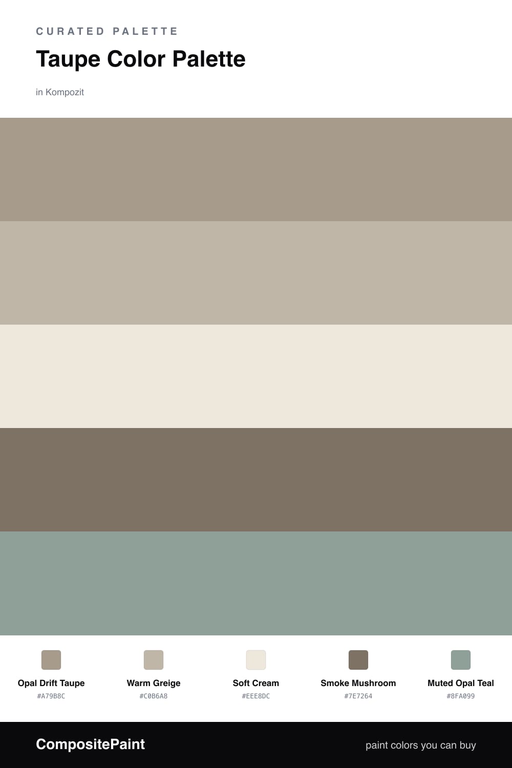
Think of taupe as the solvent that everything else dissolves into. Opal Drift Taupe leads here because it is neither warm brown nor cool gray but the quiet middle, and that middle is exactly what makes a 2026 room feel grounded instead of trendy. It reads soft in morning light and a touch deeper at dusk, which is the whole appeal.
Around it I have layered Warm Greige and Soft Cream to keep things light and breathable, with Smoke Mushroom stepping in as a slightly darker support for trim, a console, or a grounding lower wall. These three move together like a single tone shifting brightness, so the eye relaxes.
The one surprise is Muted Opal Teal, a desaturated blue-green that picks up the faint cool undertone hiding inside the taupe. Keep it small and let it glint. That little bit of contemporary contrast is what turns a safe neutral palette into one that actually feels considered.
Buy These Colors
Each color matched to the closest real paint in every brand, by ΔE2000. Kompozit first; take any SKU to the store — these mix on demand.
Questions
Taupe sits right between gray and brown, so it borrows the calm of one and the warmth of the other. That balance lets it carry a whole room without ever feeling cold or heavy, and it gives every other color a steady place to land.
Treat it as a spark, not a wall. A roughly 80/20 split works well — taupe and the neutrals do the quiet work, while the teal shows up in a chair, a vase, or a single piece of art to wake the scheme up.
Similar Palettes
Closest schemes by color — not by label.