Taupe Color Palette — Taupe Cove
A soft five-color scheme led by warm taupe and layered with greige, creamy white and a muted clay accent — every color matched to real paint you can buy.
By Maya Patel · Reviews Editor & Product Tester
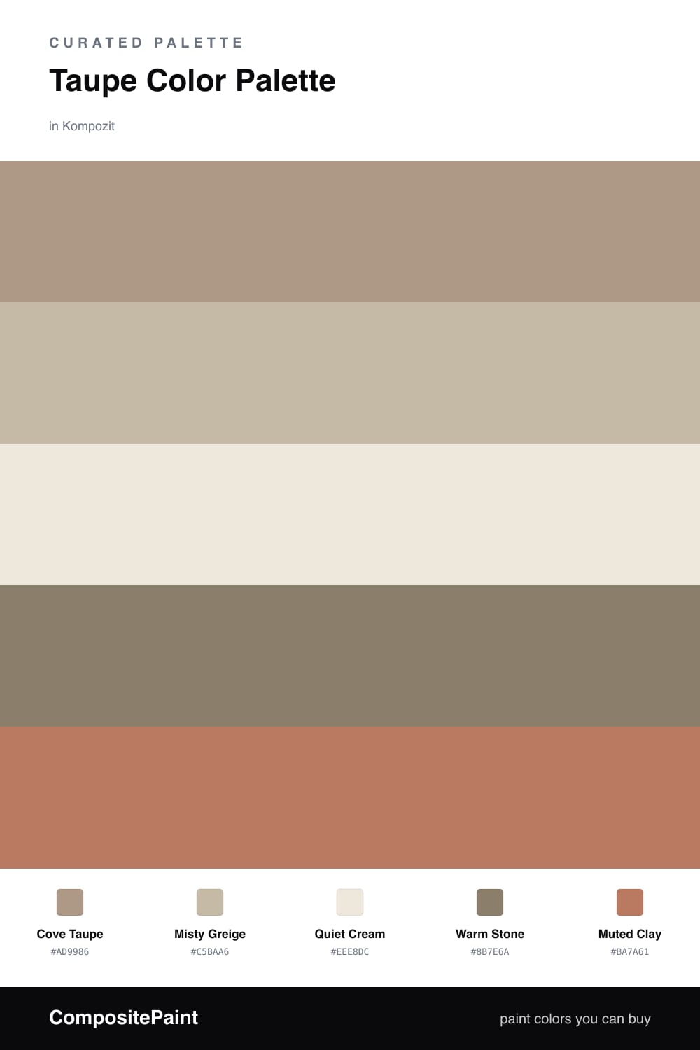
Taupe is having a real moment in 2026, and it is easy to see why. It reads warmer and more grounded than the cool grays everyone leaned on for years, but it never tips into heavy brown. Here Cove Taupe does the heavy lifting as the dominant tone, soft enough for walls in almost any light.
I built the rest of the scheme to support that lead rather than compete with it. Misty Greige is a half-step lighter for trim or a second wall, and Quiet Cream keeps ceilings and woodwork from closing in. When you want weight, Warm Stone is the deeper anchor for a built-in or a kitchen island.
The one spark is Muted Clay. It is the only color here that draws the eye, so keep it small and intentional — a front door, a stool, a band of cabinetry. Used that way, the whole palette feels calm and current without going dull.
Buy These Colors
Each color matched to the closest real paint in every brand, by ΔE2000. Kompozit first; take any SKU to the store — these mix on demand.
Questions
Taupe sits right between gray and brown, so it stays warm without going beige. That balance lets it carry a whole room while the lighter and darker neutrals fill in around it.
Add contrast in two ways — pull in the deeper Warm Stone for grounding and let the Muted Clay accent bring a little life. A small dose of clay on a door or a chair is plenty.
Similar Palettes
Closest schemes by color — not by label.