Color spec
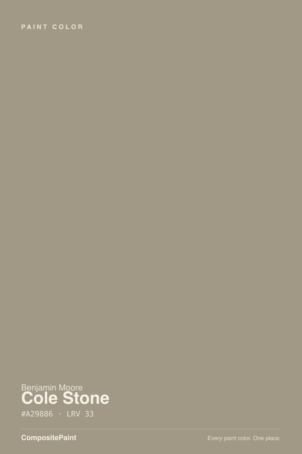
| Brand | Benjamin Moore |
| Name | Cole Stone |
| SKU | CW-60 |
| Hex | #A29886 |
| RGB | 162, 152, 134 |
| HSL | 39°, 13%, 58% |
| LRV | 33 |
| Undertone | warm red-orange tone |
| Family | Neutral |
About Benjamin Moore Cole Stone
Cole Stone sits in the mid-range at LRV 33, so it shifts visibly through the day — lighter and more open in morning light, deeper and moodier after dark. Its orange undertone is the part to watch: it gets picked up by whatever sits next to it, so test it against your trim, floor and the room's main light before committing. South-facing rooms will pull it lighter and warmer, while north light cools it down.
Cole Stone is versatile enough for full rooms but has enough depth to anchor a space, so it suits living rooms, bedrooms and cabinetry alike. Greige-leaning neutrals like this are the safe whole-home choice when you want warmth without committing to a color.
Closest matches by brand
17 brands within ΔE 5The closest matches per brand by ΔE2000, computed against each brand's full deck. Only colors within ΔE 5 (close enough to substitute on a wall) are shown — brands with no real match are left off. Tap any swatch for its full single-color spec; tap the brand title to browse all neutral from that brand.
Sherwin-Williams
Behr
Valspar
PPG / Glidden
Glidden
Dutch Boy
HGTV Home by Sherwin-Williams
Dunn-Edwards
Magnolia Home
Diamond Vogel
Hirshfield's
Rodda
C2 Paint
Portola Paints
Annie Sloan
Backdrop
Kompozit
Similar Benjamin Moore colors
closest in the Benjamin Moore deckThe nearest shades to Cole Stone within Benjamin Moore's own range, ranked by perceptual color distance — useful when you want the same look a touch lighter, darker, or warmer.
Coordinated palette
Generated by hue-rotating #A29886 in HSL space. Pair Cole Stone with one accent and one neutral — the swatches below are starting points, not final picks.
Accessibility (WCAG contrast)
WCAG 2.1: AA = 4.5:1 normal text · AA Large = 3:1 large text · AAA = 7:1 normal text.
Benjamin Moore Cole Stone Equivalents at Other Brands
Matching Cole Stone from a different paint counter? Below is the single closest color in each major US deck and how close it really is. Remember that any paint store can also custom-tint Benjamin Moore CW-60 directly — these equivalents are for when you'd rather stay inside one brand's own deck.
Sherwin-Williams Equivalent of Cole Stone
At Sherwin-Williams, the closest color to Cole Stone is At Ease Soldier (SW 9127) — very close at ΔE 2.99, though not an exact twin. It sits at the same lightness (LRV 32 vs 33) and carries a warm yellow undertone; sample both side by side if the room gets strong natural light. See the full At Ease Soldier swatch →
Behr Equivalent of Cole Stone
Behr's nearest match is Bridle Path (ECC-43-2), visually identical in normal room light (ΔE 1.18). It runs slightly darker (LRV 31 vs 33) and carries a warm red-orange undertone, so it substitutes for Cole Stone without repainting risk. See the full Bridle Path swatch →
Valspar Equivalent of Cole Stone
At Valspar, the closest color to Cole Stone is Tornado Watch (6002-2A) — very close at ΔE 2.06, though not an exact twin. It sits at the same lightness (LRV 33 vs 33) and carries a warm red-orange undertone; sample both side by side if the room gets strong natural light. See the full Tornado Watch swatch →
PPG / Glidden Equivalent of Cole Stone
At PPG / Glidden, the closest color to Cole Stone is Gray By Me (PPG1008-4) — very close at ΔE 2.12, though not an exact twin. It sits at the same lightness (LRV 32 vs 33) and carries a warm red-orange undertone; sample both side by side if the room gets strong natural light. See the full Gray By Me swatch →
Glidden Equivalent of Cole Stone
At Glidden, the closest color to Cole Stone is Brushwood Tan (20YY 31/106) — very close at ΔE 2.12, though not an exact twin. It runs slightly darker (LRV 31 vs 33) and carries a warm red-orange undertone; sample both side by side if the room gets strong natural light. See the full Brushwood Tan swatch →
Dutch Boy Equivalent of Cole Stone
At Dutch Boy, the closest color to Cole Stone is Dusky Gray (439-3DB) — very close at ΔE 3.4, though not an exact twin. It sits at the same lightness (LRV 32 vs 33) and carries a warm red-orange undertone; sample both side by side if the room gets strong natural light. See the full Dusky Gray swatch →
HGTV Home by Sherwin-Williams Equivalent of Cole Stone
HGTV Home by Sherwin-Williams has no exact twin of Cole Stone. The nearest is Domaine (HGSW 3443) at ΔE 3.89 — close, but the difference shows next to trim and in side light. It runs slightly darker (LRV 31 vs 33). Compare large swatches before substituting. See the full Domaine swatch →
Dunn-Edwards Equivalent of Cole Stone
At Dunn-Edwards, the closest color to Cole Stone is Sorrel Felt (DET624) — very close at ΔE 3.29, though not an exact twin. It runs slightly darker (LRV 31 vs 33) and carries a warm red-orange undertone; sample both side by side if the room gets strong natural light. See the full Sorrel Felt swatch →
Magnolia Home Equivalent of Cole Stone
Magnolia Home's nearest match is Antiquing (JG-128), visually identical in normal room light (ΔE 1.33). It sits at the same lightness (LRV 33 vs 33) and carries a warm red-orange undertone, so it substitutes for Cole Stone without repainting risk. See the full Antiquing swatch →
Diamond Vogel Equivalent of Cole Stone
At Diamond Vogel, the closest color to Cole Stone is Trenton Taupe (H113) — very close at ΔE 2.01, though not an exact twin. It runs slightly darker (LRV 31 vs 33) and carries a warm red-orange undertone; sample both side by side if the room gets strong natural light. See the full Trenton Taupe swatch →
Hirshfield's Equivalent of Cole Stone
At Hirshfield's, the closest color to Cole Stone is Rain Barrel (H0113) — very close at ΔE 3.29, though not an exact twin. It sits at the same lightness (LRV 32 vs 33) and carries a warm red-orange undertone; sample both side by side if the room gets strong natural light. See the full Rain Barrel swatch →
Rodda Equivalent of Cole Stone
At Rodda, the closest color to Cole Stone is Anise (CA155) — very close at ΔE 2.31, though not an exact twin. It sits at the same lightness (LRV 32 vs 33) and carries a warm yellow undertone; sample both side by side if the room gets strong natural light. See the full Anise swatch →
C2 Paint Equivalent of Cole Stone
C2 Paint's nearest match is Sea Salt (C2-890), visually identical in normal room light (ΔE 1.24). It sits at the same lightness (LRV 32 vs 33) and carries a warm red-orange undertone, so it substitutes for Cole Stone without repainting risk. See the full Sea Salt swatch →
Annie Sloan Equivalent of Cole Stone
At Annie Sloan, the closest color to Cole Stone is French Linen (FRENCH LINEN) — very close at ΔE 3.09, though not an exact twin. It sits at the same lightness (LRV 34 vs 33) and carries a warm red-orange undertone; sample both side by side if the room gets strong natural light. See the full French Linen swatch →
Backdrop Equivalent of Cole Stone
At Backdrop, the closest color to Cole Stone is Anita (BD-AN) — very close at ΔE 3.08, though not an exact twin. It sits at the same lightness (LRV 33 vs 33) and carries a warm red-orange undertone; sample both side by side if the room gets strong natural light. See the full Anita swatch →
Kompozit Equivalent of Cole Stone
Kompozit has no exact twin of Cole Stone. The nearest is Orestes (0379) at ΔE 4.18 — close, but the difference shows next to trim and in side light. It sits at the same lightness (LRV 32 vs 33). Compare large swatches before substituting. See the full Orestes swatch →