CP

Sage Color Palette — Sage Drift

A calm five-color scheme led by soft sage and grounded by warm neutrals with a single clay accent, every color matched to real paint you can buy.

By David Chen · Formulation Lead & Resident Chemist

Drifting Sage
Dominant
Kompozit Big Fish · 0435
#99A38E
LRV 35
Eucalyptus Mist
Secondary
Kompozit Arbor Vitae · 0427
#BBC3AD
LRV 53
Warm Linen
Base
Kompozit Onion Skin · 0418
#EBE8DC
LRV 81
Greige Stone
Support
Kompozit Silky Green · 0358
#C7C0A9
LRV 53
Soft Clay
Accent
Kompozit Autumn's Hill · 0038
#BA7A61
LRV 25
View palette in

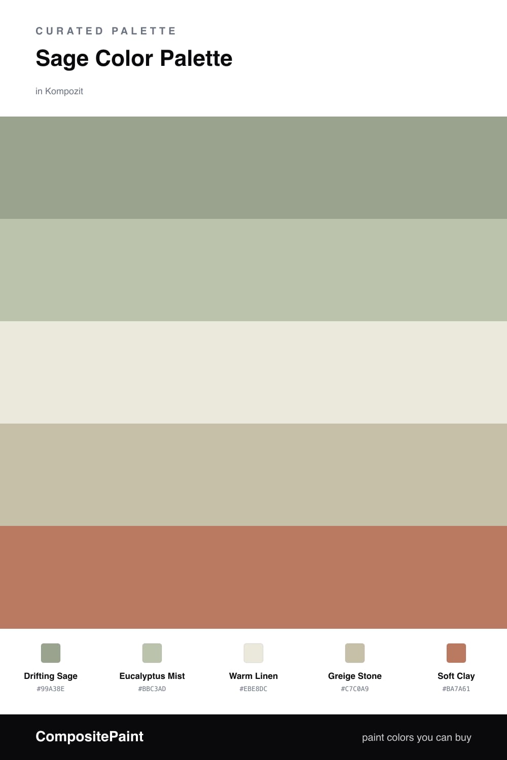
Think of sage as the color that already met you halfway. It is green softened with gray, the way fresh herbs look after they have dried a little, and that built-in restraint is exactly why it works so well as a lead color in 2026. Here Drifting Sage carries the scheme, with Eucalyptus Mist a shade lighter for trim or a second wall so the green has somewhere to breathe.

The neutrals do the quiet structural work. Warm Linen is the bright, airy base that keeps everything from going heavy, and Greige Stone bridges the gap between the greens and the warm side of the palette so nothing reads as cold.

Then comes the one spark. Soft Clay is a dusty terracotta, used sparingly on a chair, a pot, or a single door. It is the warm note that makes the sage look intentional rather than sleepy, the small contrast that pulls the whole drift together.

Buy These Colors

Each color matched to the closest real paint in every brand, by ΔE2000. Kompozit first; take any SKU to the store — these mix on demand.

Drifting Sage
#9CA68C · LRV 36 · Dominant
Kompozit Big Fish · 0435 ΔE 1.91
Backdrop Le Freak · BD-LF ΔE 2.58
Behr Clary Sage · PPU11-07 ΔE 1.75
Benjamin Moore Greenwich Village · 445 ΔE 2.99
Clare OMGreen · PNT100-MD-58 ΔE 5.77
Dunn-Edwards Meadowood · DEC777 ΔE 3.08
Farrow & Ball Breakfast Room Green · No. 81 ΔE 2.93
Magnolia Home Clean Slate · JG-75 ΔE 6.2
PPG / Glidden Edamame · 1030-4 ΔE 1.37
Sherwin-Williams Coastal Plain · SW 6192 ΔE 3.19
Valspar Sprig of Sage · 8004-28D ΔE 5.53
Eucalyptus Mist
#B7BFA8 · LRV 50 · Secondary
Kompozit Arbor Vitae · 0427 ΔE 1.13
Backdrop Underdog · BD-UD ΔE 13.45
Behr Pebble Stone · 750D-4 ΔE 2.3
Benjamin Moore Aganthus Green · 472 ΔE 1.58
Clare Money Moves · PNT100-MD-48 ΔE 2.6
Dunn-Edwards Tickled Crow · DEC780 ΔE 2.01
Farrow & Ball Vert de Terre · No. 234 ΔE 3.06
Magnolia Home Gold Moss · JG-48 ΔE 4.89
PPG / Glidden Coastal Crush · 1129-4 ΔE 2.63
Sherwin-Williams Softened Green · SW 6177 ΔE 3.11
Valspar Sweet Clover · 8003-30C ΔE 2.94
Warm Linen
#EDE7D9 · LRV 80 · Base
Kompozit Onion Skin · 0418 ΔE 1.46
Backdrop Don't Eat the Yellow Snow · BD-DS ΔE 3.69
Behr Exclusive Ivory · HDC-MD-11 ΔE 1.93
Benjamin Moore White Down · 970 ΔE 0.8
Clare Like Buttah · PNT100-LT-62 ΔE 2.37
Dunn-Edwards Ball of String · DE6190 ΔE 0.96
Farrow & Ball James White · No. 2010 ΔE 1.81
Magnolia Home Antique Rose · JG-23 ΔE 0.49
PPG / Glidden Edelweiss · 14-23 ΔE 0.46
Sherwin-Williams Futon · SW 7101 ΔE 1.57
Valspar Dover White · 7007-1 ΔE 0.5
Greige Stone
#C9BFAD · LRV 53 · Support
Kompozit Silky Green · 0358 ΔE 2.84
Backdrop Boy Meets Girl · BD-BG ΔE 12.73
Behr Still Moment · MQ6-59 ΔE 1.02
Benjamin Moore Ashen Tan · 996 ΔE 1.57
Clare Greige · PNT100-LT-13 ΔE 5.91
Dunn-Edwards Birchwood · DEC752 ΔE 1.97
Farrow & Ball Drop Cloth · No. 283 ΔE 0.55
Magnolia Home Solid Wood · JG-109 ΔE 1.61
PPG / Glidden Hideaway · 14-26 ΔE 2.15
Sherwin-Williams Sandbar · SW 7547 ΔE 1
Valspar Snake Charmer · 8004-23B ΔE 1.91
Soft Clay
#B07A5E · LRV 24 · Accent
Kompozit Autumn's Hill · 0038 ΔE 3.12
Backdrop Anita · BD-AN ΔE 14.3
Behr Campfire Blaze · HDC-AC-06 ΔE 2.85
Benjamin Moore Lenape Trail · 1222 ΔE 1.13
Clare Fire Sign · PNT100-DP-74 ΔE 7.94
Dunn-Edwards Saddle Brown · DE5264 ΔE 2.99
Farrow & Ball Red Earth · No. 64 ΔE 6.46
Magnolia Home Work Worn Wood · JG-35 ΔE 4.93
PPG / Glidden Treasure Hunt · 16-16 ΔE 5.31
Sherwin-Williams Spiced Cider · SW 7702 ΔE 0.73
Valspar Terra Cotta Trail · 2005-7B ΔE 1.71

Questions

Why does sage feel so easy to live with?

Sage sits right between green and gray, so it reads as a quiet neutral rather than a strong color. That muted, dusty quality lets it shift with the light and pair with almost any warm tone next to it.

How do I keep this palette from looking flat?

Lean on the contrast in value, not in hue. Let the pale linen open up the space, keep sage as the main color across walls or cabinets, and use the small dose of clay to add warmth and stop the greens from feeling cold.

Similar Palettes

Closest schemes by color — not by label.