CP

Beige Color Palette — Beige Frost

A soft five-color scheme led by warm beige, cooled with frosty greige and a quiet sage accent — every color matched to real paint you can buy.

By Emily Roberts · DIY Editor & First-Timer's Guide

Frosted Beige
Dominant
Kompozit Mission Hills · 0363
#E2DAC3
LRV 70
Warm Linen
Secondary
Kompozit Bleached Meadow · 0376
#EAE5D5
LRV 78
Cool Greige
Base
Kompozit Hearthstone · 0567
#C7BEB2
LRV 52
Soft Taupe
Support
Kompozit Sedge · 0226
#B1A591
LRV 38
Misted Sage
Accent
Kompozit Silverado Ranch · 0421
#A7A89B
LRV 39
View palette in

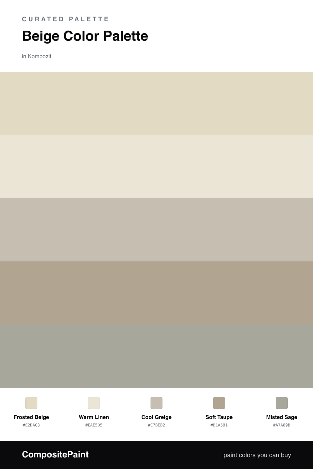
If you love beige but worry it can look a little flat or yellow, this is the palette for you. Frosted Beige leads the whole scheme, and because it carries a hint of gray, it feels cool and current instead of golden. Think of it as beige that learned a few new tricks for 2026.

Around it, Warm Linen keeps things soft and bright, while Cool Greige and Soft Taupe add just enough depth so the room never feels washed out. These three do the quiet background work — walls, trim, larger furniture — and they all blend without any one of them shouting.

Then comes the fun part. Misted Sage is your spark, a gentle gray-green that makes the whole palette feel alive. Use it in small doses and let the beiges do most of the talking. The result is calm, fresh, and the kind of neutral that actually has a personality.

Buy These Colors

Each color matched to the closest real paint in every brand, by ΔE2000. Kompozit first; take any SKU to the store — these mix on demand.

Frosted Beige
#E3D8C5 · LRV 69 · Dominant
Kompozit Mission Hills · 0363 ΔE 2.48
Backdrop Cookies & Cream · BD-CC ΔE 2.54
Behr Chartreuse Frost · MQ3-17 ΔE 1.5
Benjamin Moore White Sand · 964 ΔE 1.37
Clare Neutral Territory · PNT100-LT-20 ΔE 2.68
Dunn-Edwards Exclusive Ivory · DE6191 ΔE 1.08
Farrow & Ball Shadow White · No. 282 ΔE 2.34
Magnolia Home Morning Snow · JG-167 ΔE 1.09
PPG / Glidden Bone White · 1085-2 ΔE 0.45
Sherwin-Williams Lotus Pod · SW 7572 ΔE 2.14
Valspar Gentle Lamb · V177 ΔE 1.26
Warm Linen
#EDE6D7 · LRV 80 · Secondary
Kompozit Bleached Meadow · 0376 ΔE 1.23
Backdrop Don't Eat the Yellow Snow · BD-DS ΔE 3.4
Behr Natural Linen · W-F-120 ΔE 1.19
Benjamin Moore White Down · 970 ΔE 0.99
Clare Like Buttah · PNT100-LT-62 ΔE 1.86
Dunn-Edwards Antique White · DEW351 ΔE 1.09
Farrow & Ball James White · No. 2010 ΔE 1.94
Magnolia Home Carter Crème · JG-16 ΔE 1.23
PPG / Glidden Little Lamb · 1112-1 ΔE 1.48
Sherwin-Williams Ivory Lace · SW 7013 ΔE 0.87
Valspar Double Scoop · V176 ΔE 0.91
Cool Greige
#C9C1B4 · LRV 54 · Base
Kompozit Hearthstone · 0567 ΔE 1.07
Backdrop Boy Meets Girl · BD-BG ΔE 12.39
Behr Armadillo · N230-3 ΔE 0.87
Benjamin Moore Cumulus Cloud · 1550 ΔE 2.23
Clare Motor City · PNT100-LT-09 ΔE 5.91
Dunn-Edwards Birchwood · DEC752 ΔE 2.92
Farrow & Ball Elephant's Breath · No. 229 ΔE 2.71
Magnolia Home Anatolian · JG-127 ΔE 2.71
PPG / Glidden Great Gray · 15-28 ΔE 1.01
Sherwin-Williams Colonnade Gray · SW 7641 ΔE 1.41
Valspar Clay Figurine · M341 ΔE 0.97
Soft Taupe
#B0A593 · LRV 38 · Support
Kompozit Sedge · 0226 ΔE 0.78
Backdrop Nuevo · BD-NU ΔE 7.62
Behr Garden Wall · 730D-4 ΔE 1.34
Benjamin Moore Rocky Beach · CSP-190 ΔE 0.78
Clare Mellow Mood · PNT100-DP-78 ΔE 12.8
Dunn-Edwards Hickory · DEC759 ΔE 4.52
Farrow & Ball Light Gray · No. 17 ΔE 1.45
Magnolia Home Quaint Cottage · JG-114 ΔE 2.74
PPG / Glidden Aldabra · 14-28 ΔE 2.66
Sherwin-Williams Ethereal Mood · SW 7639 ΔE 0.95
Valspar Ashen Gray · 6004-1C ΔE 2.58
Misted Sage
#A3AC97 · LRV 40 · Accent
Kompozit Silverado Ranch · 0421 ΔE 4.99
Backdrop Le Freak · BD-LF ΔE 0.89
Behr Garden Wall · 730D-4 ΔE 2.43
Benjamin Moore Weekend Getaway · 473 ΔE 1.95
Clare Mellow Mood · PNT100-DP-78 ΔE 6.76
Dunn-Edwards Shaggy Barked · DEC771 ΔE 8.12
Farrow & Ball Light Gray · No. 17 ΔE 11.31
Magnolia Home Weathered Windmill · JG-15 ΔE 7.37
PPG / Glidden Wandering Willow · 1031-3 ΔE 3.55
Sherwin-Williams Willow Tree · SW 7741 ΔE 3.18
Valspar Stormy Day · V097-3 ΔE 1.11

Questions

What makes this palette feel cool instead of yellow?

The trick is balance. The beiges here have a little gray and green underneath, so they read fresh and frosty rather than golden or dated.

Where should I use the sage accent?

Keep it small — a door, some cabinetry, or a few throw pillows. A touch of Misted Sage wakes up all that soft beige without taking over the room.

Similar Palettes

Closest schemes by color — not by label.