Bay Water
A gray-green named for open water, reviewed honestly: where it reads as a calm sage, the light that turns it drab, and the trim white that actually works.

Jessica has spec'd whites and neutrals for more than 300 rooms and keeps a sample wall of painted drawdowns in her studio. Every color review is checked against real reader rooms in the comments and re-tested when a formula changes. About the testing process →
- 1Sage Green22
- 2Evergreen Fog30
- 3Bay Water41
- 4October Mist47
- 5Soft Fern57
The Fast Verdict
Bay Water is a quiet gray-green that Behr markets on a coastal name, but there is no blue in it on the wall — this is a sage, close cousin to eucalyptus, not a seaside teal. At LRV 41 it sits in the medium-light band, so it holds its green in decent daylight and only turns flat and gray-drab when the light goes cold and dim. Buy it for the calm-green mood, not the water in the name.
Bedrooms and reading nooks · powder rooms and vanities · exterior front doors, shutters and porch ceilings · dining rooms with warm wood and brass · anyone who wants green that reads calm, not leafy or minty
You actually want blue or teal — the "Bay" name is the only water in this color · your room runs on cool white LEDs with little daylight · you want a bright, saturated mint or emerald · your floors and trim are heavy honey oak or gold-warm builder wood
- A genuinely calm, sophisticated gray-green — reads sage, not leafy or minty
- LRV 41 holds its color without going dark or murky in normal daylight
- Confident on exterior doors, shutters and porch ceilings against white siding
- Restful in bedrooms and spa-like in bathrooms next to brass and marble
- Pairs cleanly with warm wood, white trim and near-black accents
- The "Bay Water" name promises blue and delivers green — a routine, avoidable disappointment
- Cools toward flat, drab gray under north light or cool white LEDs
- Yellow undertone clashes with honey oak, gold brass-heavy trim and warm builder wood
- Thinner real-world review trail than Sherwin-Williams' better-documented sage lineup — sample before committing
What Color Is Bay Water, Really?
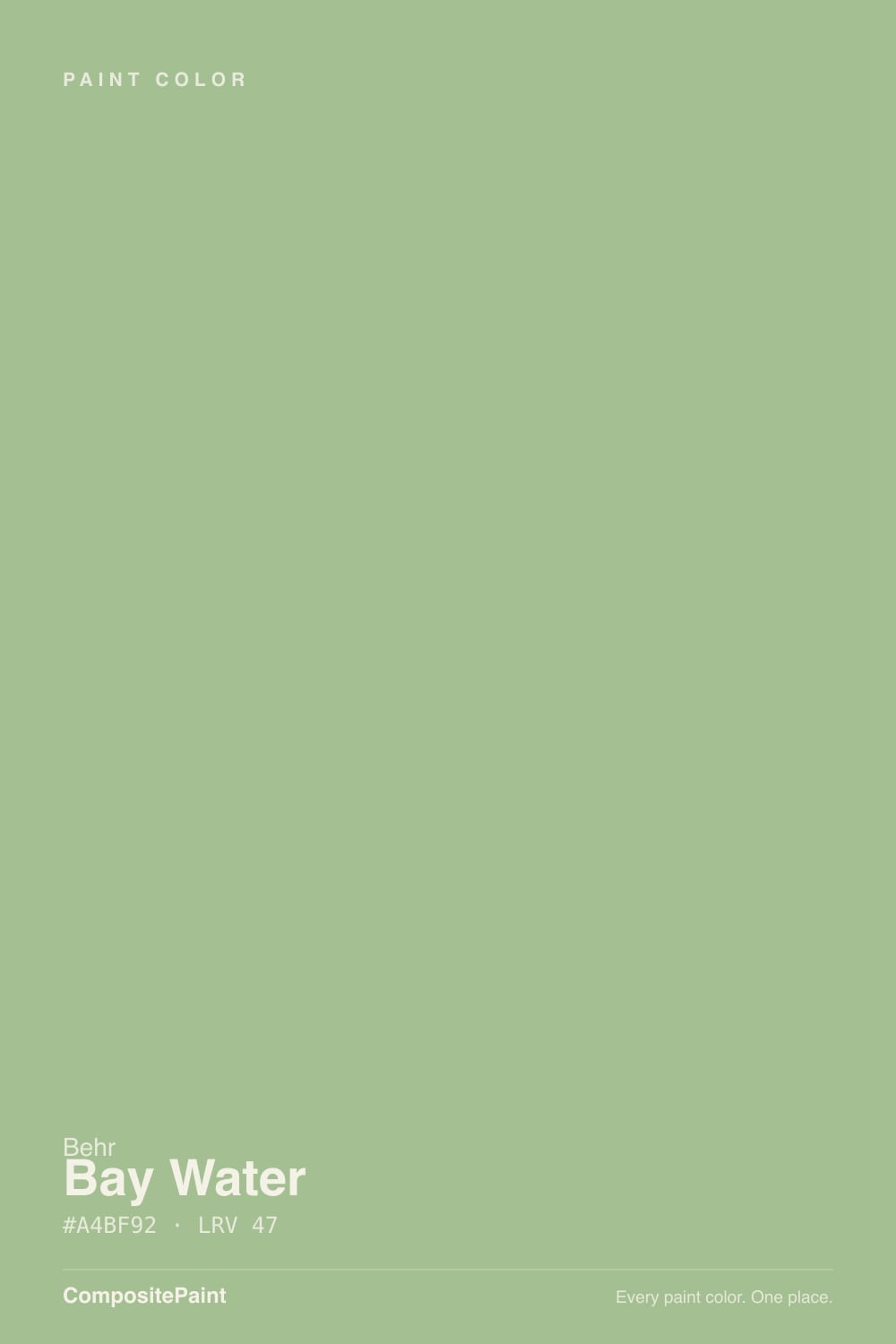
Behr's own line on Bay Water is a "calming gray-green," inspired by protected coastal water and pitched as a color that feels like a safe harbor. On the chip that reads poetic; on four walls it is simply a green — muted, medium-depth, with a gray cast pulling it away from anything you'd call teal or blue. Buyers who order it by the name expecting a water-blue are the single most predictable disappointment with this color, and it has nothing to do with the paint failing — the paint is exactly what it says on the can, once you know the can is lying about the water part.
At LRV 41 it sits right in the medium-light band: light enough to keep a room from feeling closed in, dark enough to hold real color instead of washing pale. That depth is doing real work here — a paler sage tips toward a chalky mint in bright rooms, but Bay Water keeps its gray-green identity through most lighting conditions and only loses it when the light turns genuinely cold and dim. Its closest sibling by the numbers is Sherwin-Williams Rainwashed, also LRV 41 — same weight, more blue in the mix.
Undertone in one line: gray-green first, a whisper of yellow underneath — never a true blue despite the name. Different third-party color databases describe that undertone differently (some call it teal-leaning, others call it eucalyptus-warm), and that split is itself the tell: this is a color whose identity moves with the light, more than most sages its LRV.
Where It Shines
Give it real daylight and it settles into a genuinely sophisticated sage — not leafy, not minty, closer to dried eucalyptus. It is at its most confident outside: on a front door or shutters against white or cream siding, with a black or charcoal accent nearby, it reads as a deliberate, current color choice rather than a faded one. Indoors its best rooms are the ones that ask for calm rather than energy — a bedroom, a powder room, a dining room with warm wood and brass — where the gray in it reads as quiet sophistication instead of murk.
Where It Fails
Almost every regret story with a color like this follows one of three scripts, and all three are predictable before the first coat goes on. None of them are the paint's fault — but if your room or your expectations match one of these, sample bigger before you commit a whole room.
"Bay Water" promises a coastal blue-green; the paint delivers a gray sage with a yellow undercurrent and no real blue in it. If you actually want the water color the name implies, look at Sherwin-Williams Rainwashed instead — same LRV, genuinely blue-green.
Gray-green colors are the most vulnerable in the deck to cold light: it strips out what little warmth is in the undertone and leaves a flat, slightly drab gray with the green barely readable. Warm 2700K bulbs and any real daylight are part of this paint job, not an accessory to it.
The yellow underneath the gray-green amplifies against already-yellow wood, and the combination pushes both toward a muddy olive nobody asked for. Walnut, white oak, black-stained wood and cool-toned metals are safer partners; a room already saturated in honey and gold is the one honest no.
Room by Room
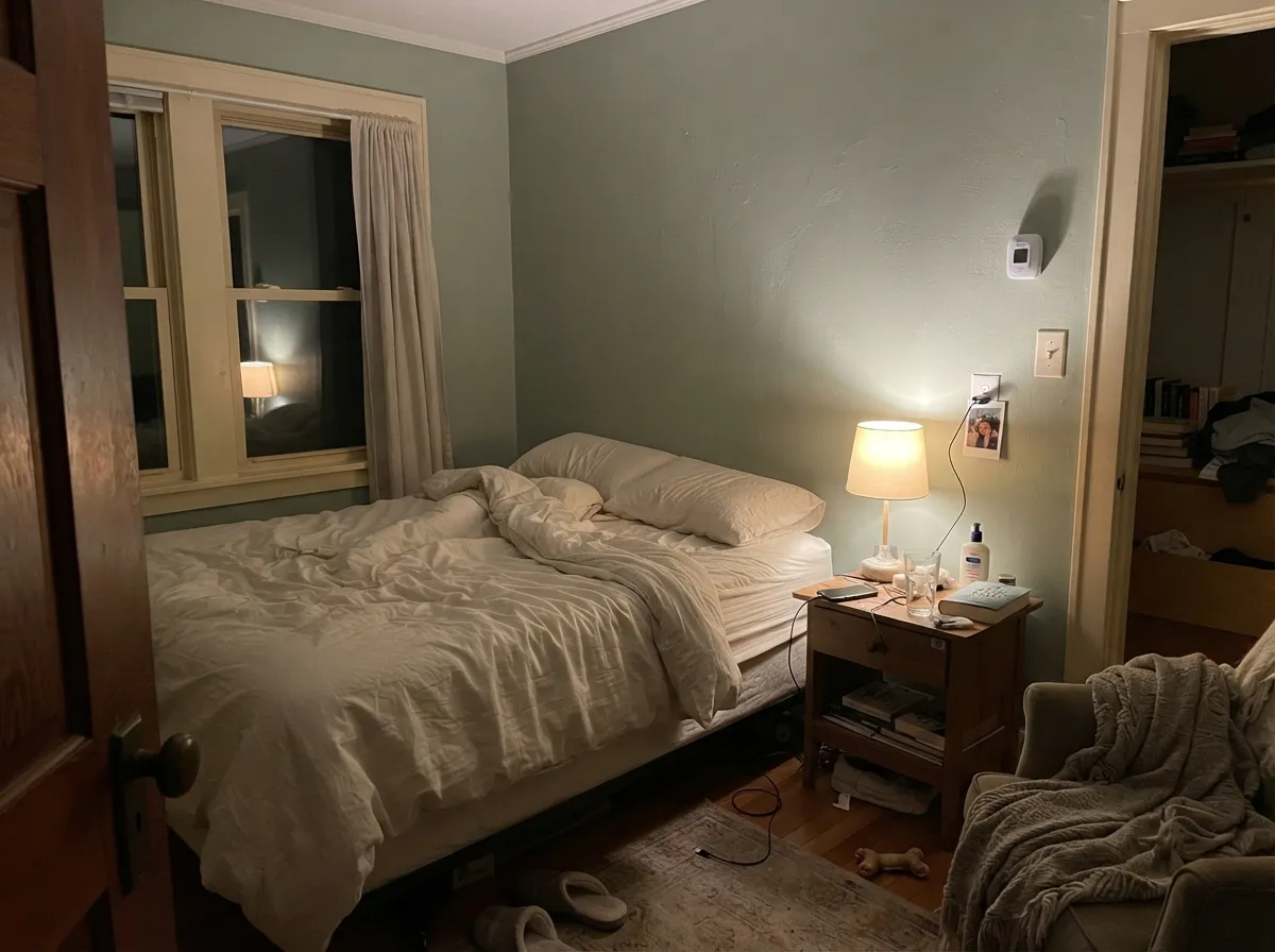
Calm, gray-green, restful — exactly the register a bedroom wants. Matte or eggshell hides texture and deepens the color slightly; keep the bulbs warm and it stays a quiet sage instead of drifting gray at night.
Reads as a soft spa green next to white tile, marble or brass fixtures. Small rooms take a medium-depth color well, and Bay Water doesn't compete with fixtures the way a saturated green would.
A walnut table, brass chandelier and warm evening light bring out the best in it. Under cool overhead LEDs at a bright dinner party it can look flatter than the sample promised — dim the lights and it recovers.
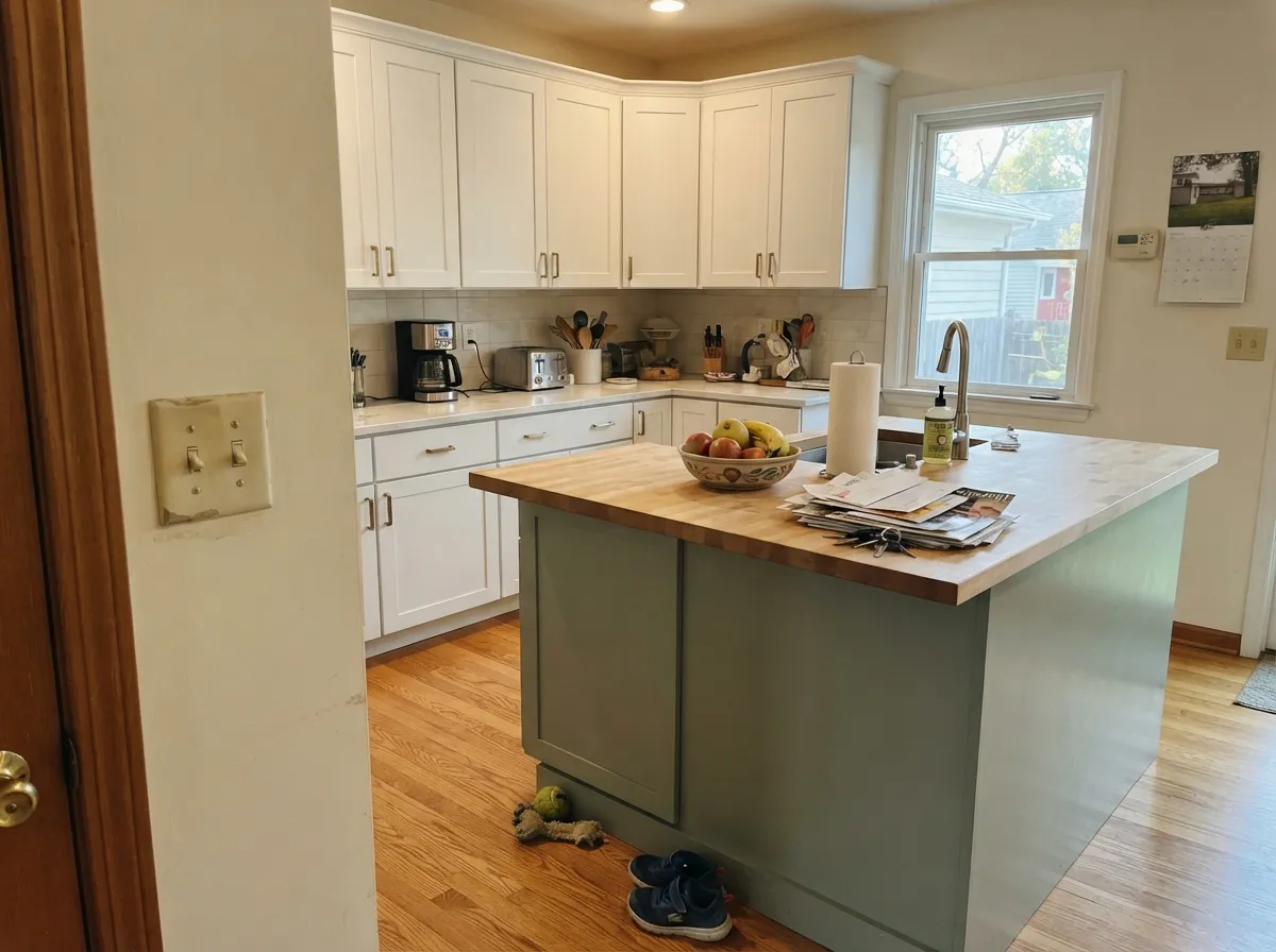
A green island or a run of lower cabinets under white perimeter walls is the safe, current version of this trend. A full kitchen of Bay Water cabinets over honey oak floors is the one combination to sample carefully first — the yellow in both fights.
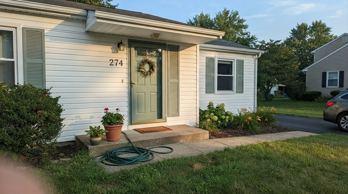
This is where the color is most confident. Against white or light siding with black or charcoal trim it reads as a deliberate, grown-up green, not a faded blue. Satin or semi-gloss for the door and shutters; full sun brightens it a step brighter and greener than the indoor swatch.
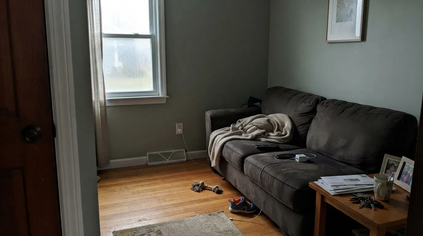
Fine in a closed room with consistent warm light. In an open floor plan that swings between bright south windows and a dim north corner, the color will visibly shift room to room — decide if that variability bothers you before committing four open walls to it.
Your Light Is the Risk
Full, warm daylight is where the sage reads truest — settled, gray-green, a little eucalyptus. This is the light to sample in first.
Cold, dim light strips the warmth out of the undertone and leaves a flat, drab gray with barely any green left in it. Fine if you half-wanted gray; disappointing if you bought it for the green.
Cooler and quieter in the morning, warmer and more clearly green by late afternoon. The swing is real but gentle — most owners read it as the color "waking up," not changing.
2700K warm bulbs keep the sage alive after dark. Cool white LEDs push it toward a dull, slightly institutional gray — swap the bulbs before you consider repainting.
Most complaints about Bay Water are a light mismatch. Upload a photo of your actual room and see it on your walls — then ask for the same wall in north light or evening lamps before you buy a single sample.
Need It From Another Brand?
Any paint counter can custom-tint Behr S380-4 directly. If you would rather stay in one brand's own deck, these are the closest stock matches, measured as ΔE2000. Under 2 is a difference you will not see on the wall.
| Brand | Closest color | ΔE | LRV | |
|---|---|---|---|---|
| Sherwin-Williams | Clary SageSW 6178 · Sherwin-Williams | 1.5 | 41 | Color page → |
| Benjamin Moore | Estate SaleCSP-795 · Benjamin Moore | 1.1 | 41 | Color page → |
| Valspar | Cool Pine8003-30D · Valspar | 1.0 | 40 | Color page → |
| PPG / Glidden | Photo GrayPPG1029-4 · PPG / Glidden | 1.6 | 41 | Color page → |
| Glidden | Always Avocado90YY 40/158 · Glidden | 1.4 | 40 | Color page → |
| Dutch Boy | Greywood423-3DB · Dutch Boy | 4.1 | 38 | Color page → |
Similar Behr Colors
The nearest shades to Bay Water within Behr's own range, ranked by perceptual color distance — useful when you want the same look a touch lighter, darker, or warmer.
WCAG 2.1: AA is 4.5 : 1 for normal text, 3 : 1 for large text, AAA is 7 : 1.
Bay Water vs the Colors You're Also Considering
Every Bay Water sample board has the same rivals on it. The numbers show the real lightness gap — then it comes down to which risk you would rather live with.
Pick this when you want the green to read clearly as green, not a color that keeps changing which family it belongs to.
Sherwin-Williams SW 6211 · LRV 47RainwashedPick this if you want the color to actually lean blue — Rainwashed is the watery, more surprising sibling at the same LRV.
Pick this for more gray in the mix and a touch more depth — Bay Water sits calmer, Clary Sage sits greener.
Sherwin-Williams SW 6178 · LRV 41Clary SagePick this for a truer, less gray-muted sage with one predictable lighting weakness instead of two undertones pulling at once.
Pick this for a deeper, more gray-cast green that reads calmer and doesn't lean as hard on warm partners.
Benjamin Moore HC-114 · LRV 56Saybrook SagePick this for a lighter, warmer, unmistakably green sage — but it needs warm company to look its best.
Pick this for walls — Bay Water is lighter (LRV 41 vs 30) and reads calm across four walls instead of concentrated on cabinetry.
Sherwin-Williams SW 9130 · LRV 30Evergreen FogPick this for cabinets specifically — it's the deck's best cabinet sage, deeper and more saturated than Bay Water.
Inside Behr's own range the differences come down to which way the green tips. Scotland Road 450F-4 at LRV 47, hex #95C198, holds the same lightness but leans bluer and cooler. Sagey 420F-4 at LRV 46, hex #9ABF82, is more yellow and reads closer to olive. Spartan Stone 780D-5 at LRV 45, hex #AAB795, is the grayest and most muted of the group, and Roof Top Garden S390-4 at LRV 49 is a touch lighter and fresher.
Across brands the matches are extremely tight. Dunn-Edwards Praying Mantis DE5591 at deltaE 0.83 and Valspar Heartland Frosty 5008-5C at deltaE 0.85 are effectively the same color. Diamond Vogel Glendale 0758 at deltaE 1.02 and Sherwin-Williams Seawashed Glass SW 9034 at LRV 48, deltaE 1.18, are visually identical in normal room light. Benjamin Moore Central Park 431 at LRV 44, deltaE 2.91, is very close but darker, so sample first.
Bay Water Coordinating Colors
The rule for coordinating with Bay Water: warm off-whites, near-blacks, and other gray-greens work; stark cool whites and honey-gold wood fight it. It pairs cleanly with brass, walnut and white oak, and reads best in doses rather than saturating a whole open floor plan. These are the partners that keep showing up in rooms and exteriors that work:
The Name Says Water, the Paint Says Green
Behr markets Bay Water on protected coastal water and the feeling of a safe harbor — evocative language for a color that, on the wall, is a gray-green sage with no real blue in it. That gap between the name and the paint is not a defect; it's a naming choice, and it means the color's biggest real-world risk isn't the light or the wood tones, it's ordering by name alone and expecting a water-blue.
Third-party color databases don't fully agree on how to describe the undertone either — some call it teal-leaning, others call it warm and eucalyptus-like. Take that disagreement as useful information rather than noise: this is a color that shifts identity with the room's light more than most sages at its depth, which is exactly why a real sample, not just the chip or the name, belongs on your wall before you commit to a gallon.
Bay Water With Wood Tones and Floors
Mid-tone walnut and white oak are the easy, flattering partners — enough contrast in warmth and value that the green reads intentional rather than washed-out. Black-stained wood and matte or unlacquered black hardware are the other safe lane, giving the gray-green a crisp, current edge.
Honey oak and heavily yellow-gold trim are the one honest caution. The yellow underneath Bay Water's gray-green amplifies next to already-yellow wood, and the pairing can drift toward a muddy olive that neither side intended. If the honey floor is staying, sample a large piece of the paint directly above it before painting the whole room, or lean on a cooler neighbor like Rainwashed instead.
Three Ready Palettes Built on Bay Water
A color is never alone on the wall. These are complete combinations in the 60-30-10 pattern, with the reason each one holds together. Every one opens in the visualizer.
A warm off-white trim keeps Bay Water's yellow undertone from feeling murky, and one near-black accent piece gives the calm green a grounding note without turning the room cold.
Try this palette in your roomThe classic white-house, green-door combination; black shutters give the sage enough contrast to read as a deliberate exterior choice, not a color that faded from something bluer.
Try this palette in your roomSwiss Coffee keeps the room light while the island carries the color; one Iron Ore door is the modern move that keeps a green island from feeling too matchy with the rest of the kitchen.
Try this palette in your roomBay Water FAQ
Is Behr Bay Water blue or green?
Green — a gray-green sage, despite the water-themed name. There is a whisper of yellow underneath, never a true blue. If you want the actual blue-green the name implies, Sherwin-Williams Rainwashed at the same LRV is the closer match.
Is Bay Water good for a bedroom?
Yes — it's arguably its best indoor room. The gray-green is calming rather than energetic, and it holds its color well under warm lamplight. Keep the bulbs at 2700K; cool white LEDs flatten it toward drab gray.
What trim white goes with Bay Water?
A warm off-white like Behr Swiss Coffee or Whisper White keeps the pairing soft; a stark cool white tends to make the green look muddier by contrast. On exteriors, a brighter white siding plus black or charcoal shutters is the more forgiving combination.
Does Bay Water work on a front door or shutters?
It's one of the color's strongest jobs. Against white or cream siding with a black or charcoal accent, it reads as a confident, current exterior green rather than a faded blue. Satin or semi-gloss holds up better outdoors than flat.
Does it clash with honey oak floors?
It can. The yellow underneath the gray-green amplifies against already-yellow honey oak, and both sides can drift toward a muddy olive. Walnut, white oak, black-stained wood and cooler metals are safer partners; sample a large piece over your actual floor before committing a whole room.
Is Bay Water good for kitchen cabinets?
In doses, yes — an island or a run of lower cabinets under lighter perimeter walls is the current, low-risk version of a green kitchen. A full room of Bay Water cabinets over honey oak floors is the combination to test carefully first.
Have you painted with Bay Water?
Rate it — one tap helps the next reader decide.
Ask a Question