Greige Color Palette — Amber Quiet
A calm five-color scheme led by soft greige and warmed with a single amber accent, layered over gentle neutrals — every color matched to real paint you can buy.
By Jessica Williams · Color Stylist & Interior Editor
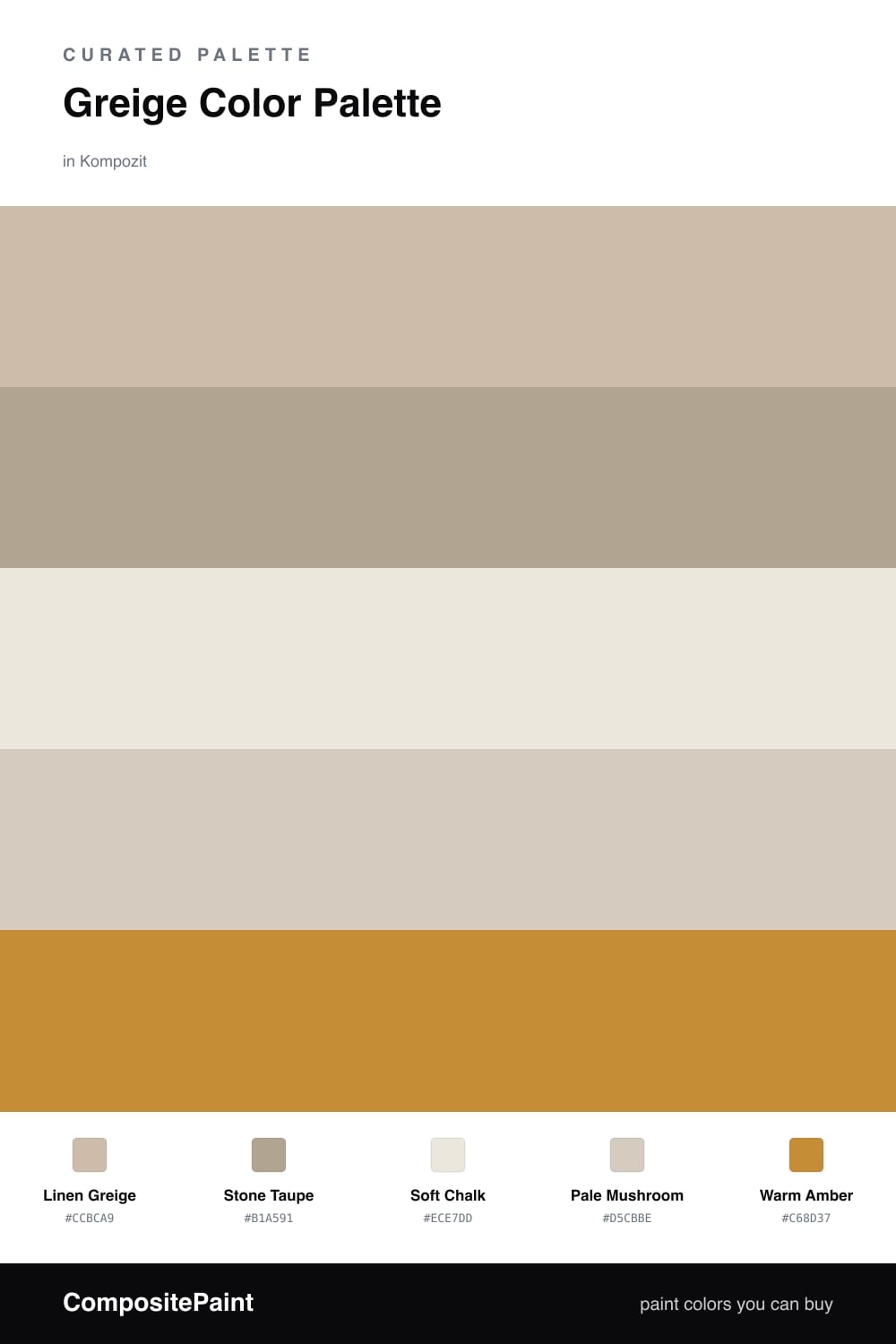
Greige is the color I reach for when someone wants a room to feel calm without feeling cold. This scheme puts Linen Greige front and center, with Stone Taupe going a shade deeper for contrast you can feel more than see.
The neutrals do the quiet work. Soft Chalk keeps the light moving on ceilings and trim, while Pale Mushroom bridges the gap so nothing looks abrupt. Together they give greige room to breathe, which is exactly what makes it feel current in 2026 — soft, lived-in, never trying too hard.
Then there is Warm Amber. Just a touch of it warms the whole palette, like late afternoon sun caught on a wall. Use it sparingly and let the greige lead, and the room will feel both grounded and gently alive.
Buy These Colors
Each color matched to the closest real paint in every brand, by ΔE2000. Kompozit first; take any SKU to the store — these mix on demand.
Questions
Greige sits halfway between gray and beige, so it reads warm in soft light and cool in bright light. That quiet shift keeps a whole room feeling settled instead of flat.
Keep it small. Let the greige tones cover most of the space and bring in amber only on a few touches — a chair, a lamp, a door — so it glows rather than competes.
Similar Palettes
Closest schemes by color — not by label.