CP

Taupe Color Palette — Reed & Linen

A soft, layered five-color scheme led by warm taupe with greige, linen, and a quiet sage accent — every color matched to real paint you can buy.

By Emily Roberts · DIY Editor & First-Timer's Guide

Reed Taupe
Dominant
Kompozit Village Crier · 0190
#AD9986
LRV 33
Warm Greige
Secondary
Kompozit Soft Leather · 0336
#C5BAA6
LRV 50
Soft Linen
Base
Kompozit Onion Skin · 0418
#EBE8DC
LRV 81
Muted Clay
Support
Kompozit Weaver's Tool · 0177
#9D7F62
LRV 23
Quiet Sage
Accent
Kompozit Burning Idea · 0373
#8F8B72
LRV 26
View palette in

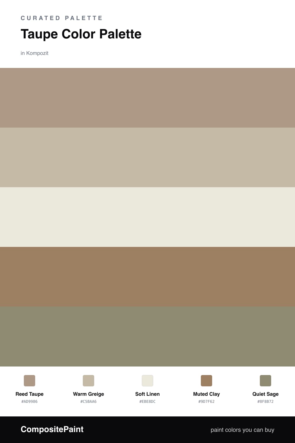
Taupe is having a real moment, and it is easy to see why. It is the neutral that does not feel cold or boring, and this scheme lets Reed Taupe lead the whole room with its soft, grounded warmth.

Around it, Warm Greige and Soft Linen keep things light and breathable, so nothing feels heavy. A touch of Muted Clay adds depth in the corners and shadows, the kind of richness you notice but cannot quite name.

For the spark, Quiet Sage brings in a whisper of nature without shouting. Use it in small doses, on a chair, a throw, or a single wall, and let the taupe do most of the talking. The result feels calm, modern, and very livable.

Buy These Colors

Each color matched to the closest real paint in every brand, by ΔE2000. Kompozit first; take any SKU to the store — these mix on demand.

Reed Taupe
#A89A86 · LRV 33 · Dominant
Kompozit Village Crier · 0190 ΔE 3.12
Backdrop Anita · BD-AN ΔE 1.65
Behr Chic Taupe · N230-4 ΔE 2.47
Benjamin Moore Downtown · CSP-165 ΔE 2.37
Clare Extra Virgin · PNT100-MD-64 ΔE 12.07
Dunn-Edwards Wooden Peg · DE6215 ΔE 0.81
Farrow & Ball Lichen · No. 19 ΔE 7.76
Magnolia Home Antiquing · JG-128 ΔE 2.87
PPG / Glidden Diversion · 1021-4 ΔE 1.6
Sherwin-Williams Threshold Taupe · SW 7501 ΔE 3.2
Valspar Land of Nod · T589 ΔE 1.55
Warm Greige
#C5B8A5 · LRV 49 · Secondary
Kompozit Soft Leather · 0336 ΔE 1.29
Backdrop Boy Meets Girl · BD-BG ΔE 11.87
Behr Basic Khaki · HDC-NT-09 ΔE 1.27
Benjamin Moore Stone Hearth · 984 ΔE 1.56
Clare Greige · PNT100-LT-13 ΔE 5.72
Dunn-Edwards Steveareno Beige · DEC766 ΔE 2.09
Farrow & Ball Jitney · No. 293 ΔE 3.46
Magnolia Home Solid Wood · JG-109 ΔE 1.88
PPG / Glidden Summer Suede · 14-14 ΔE 0.87
Sherwin-Williams Loggia · SW 7506 ΔE 0.49
Valspar Soft Stones · 6008-1C ΔE 0.88
Soft Linen
#EDE6D8 · LRV 80 · Base
Kompozit Onion Skin · 0418 ΔE 1.91
Backdrop Don't Eat the Yellow Snow · BD-DS ΔE 3.81
Behr Exclusive Ivory · HDC-MD-11 ΔE 1.59
Benjamin Moore White Down · 970 ΔE 1.2
Clare Like Buttah · PNT100-LT-62 ΔE 2.01
Dunn-Edwards Antique White · DEW351 ΔE 1.49
Farrow & Ball James White · No. 2010 ΔE 2.24
Magnolia Home Carter Crème · JG-16 ΔE 1.65
PPG / Glidden China White · 1101-1 ΔE 1.4
Sherwin-Williams Ivory Lace · SW 7013 ΔE 0.48
Valspar Cozy White · 3008-10C ΔE 0.88
Muted Clay
#9A8470 · LRV 25 · Support
Kompozit Weaver's Tool · 0177 ΔE 3.91
Backdrop Hartford · BD-HF ΔE 15.06
Behr Sturdy Brown · MQ2-48 ΔE 0.83
Benjamin Moore Woodacres · 1020 ΔE 1.17
Clare Dirty Chai · PNT100-DP-52 ΔE 6.45
Dunn-Edwards Wood Lake · DE6075 ΔE 4.17
Farrow & Ball Mouse's Back · No. 40 ΔE 3.01
Magnolia Home Reclaimed Wood · JG-124 ΔE 7.95
PPG / Glidden Locomotion · 1076-5 ΔE 2.27
Sherwin-Williams Dusted Truffle · SW 9083 ΔE 2.7
Valspar Cavern · V133-5 ΔE 1.25
Quiet Sage
#8A9079 · LRV 27 · Accent
Kompozit Burning Idea · 0373 ΔE 4.74
Backdrop Hartford · BD-HF ΔE 6.03
Behr Squirrel · 790D-5 ΔE 2.8
Benjamin Moore Secret Path · CSP-800 ΔE 1.65
Clare Shade · PNT100-MD-14 ΔE 8.02
Dunn-Edwards Stone Creek · DE6278 ΔE 4.22
Farrow & Ball Card Room Green · No. 79 ΔE 3.1
Magnolia Home Garden Party · JG-53 ΔE 4.02
PPG / Glidden Mesmerize · 1030-5 ΔE 2.4
Sherwin-Williams Bunglehouse Gray · SW 2845 ΔE 7.7
Valspar Blanched Thyme · 6001-4A ΔE 2.93

Questions

What colors go best with taupe?

Taupe loves other gentle neutrals like greige and linen, which keep it warm and easy. One soft natural accent, here a quiet sage, adds just enough life without breaking the calm.

Is taupe warm or cool?

It can go either way, but this palette leans warm with a hint of clay underneath. Warm taupe feels cozy and current, which is why it reads so well in 2026 homes.

Similar Palettes

Closest schemes by color — not by label.