CP

Cream Color Palette — Cream Mist

A soft five-color scheme led by warm cream and layered with quiet neutrals and one muted sage accent, every color matched to real paint you can buy.

By Maya Patel · Reviews Editor & Product Tester

Cream Mist
Dominant
Kompozit Chapel Wall · 0009
#F3EAD7
LRV 83
Soft Ivory
Secondary
Kompozit Yellow Page · 0286
#EADCC6
LRV 73
Warm Linen
Base
Kompozit Mineral Water · 0272
#DED1BD
LRV 65
Greige Stone
Support
Kompozit Soft Leather · 0336
#C5BAA6
LRV 50
Muted Sage
Accent
Kompozit Lucky Day · 0428
#929A7D
LRV 31
View palette in

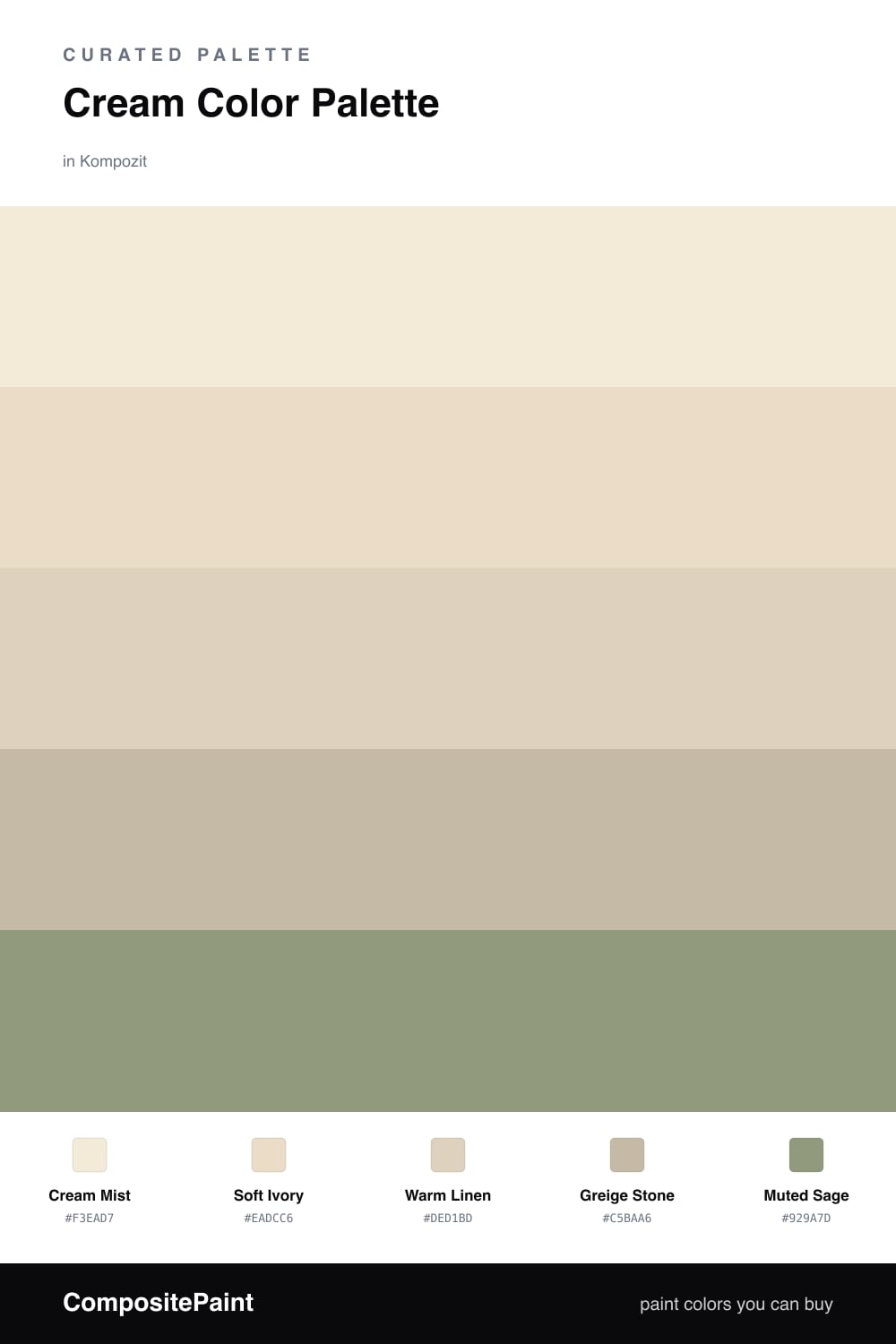
Cream is having a real moment in 2026, and this is the version I keep coming back to. Cream Mist leads the whole scheme — warm enough to feel cozy, soft enough to read almost neutral in bright daylight. Use it as your main wall color and let it do most of the talking.

Soft Ivory and Warm Linen sit just a half-step deeper, so they layer in on trim, ceilings, and built-ins without ever fighting the lead. Greige Stone is the quiet workhorse here, grounding the warmth so the room does not drift too yellow.

The one piece of color is Muted Sage — a soft, dusty green that feels current without trying too hard. Keep it to small doses and the whole palette stays calm, modern, and easy to live with.

Buy These Colors

Each color matched to the closest real paint in every brand, by ΔE2000. Kompozit first; take any SKU to the store — these mix on demand.

Cream Mist
#F2EBDA · LRV 83 · Dominant
Kompozit Chapel Wall · 0009 ΔE 1.02
Backdrop Don't Eat the Yellow Snow · BD-DS ΔE 2.54
Behr Original White · N290-1 ΔE 0.79
Benjamin Moore Linen White · 912 ΔE 0
Clare Like Buttah · PNT100-LT-62 ΔE 2.04
Dunn-Edwards White Sand · DEW336 ΔE 1.37
Farrow & Ball White Tie · No. 2002 ΔE 1.03
Magnolia Home Pearly Cotton · JG-33 ΔE 1.38
PPG / Glidden Adobe White · 1100-2 ΔE 1.05
Sherwin-Williams Classic Light Buff · SW 50 ΔE 1.18
Valspar Statuesque · 7002-5 ΔE 1.3
Soft Ivory
#E7DCC6 · LRV 72 · Secondary
Kompozit Yellow Page · 0286 ΔE 1.43
Backdrop Cookies & Cream · BD-CC ΔE 1.41
Behr Ivory Paper · MQ3-12 ΔE 1.19
Benjamin Moore Lambskin · 1051 ΔE 1.07
Clare Greenish · PNT100-LT-68 ΔE 4.11
Dunn-Edwards Cream Wave · DE6198 ΔE 0.96
Farrow & Ball Lime White · No. 1 ΔE 0.64
Magnolia Home Morning Snow · JG-167 ΔE 0.85
PPG / Glidden Irresistible · 1094-1 ΔE 1.15
Sherwin-Williams Antique White · SW 6119 ΔE 0.48
Valspar Natural Soap · T559 ΔE 0.74
Warm Linen
#DDD0BA · LRV 64 · Base
Kompozit Mineral Water · 0272 ΔE 0.84
Backdrop Real Real · BD-RR ΔE 2.86
Behr Natural Almond · PPU4-12 ΔE 0.64
Benjamin Moore Bare Essence · CSP-275 ΔE 0.47
Clare Turbinado · PNT100-LT-21 ΔE 1.64
Dunn-Edwards Inside Passage · DEC764 ΔE 1.82
Farrow & Ball Joa's White · No. 226 ΔE 0.96
Magnolia Home Ella Rose · JG-24 ΔE 7.2
PPG / Glidden Sourdough · 1084-3 ΔE 1.49
Sherwin-Williams Oyster Bar · SW 7565 ΔE 0.88
Valspar Aged Parchment · 8005-7B ΔE 0.51
Greige Stone
#C4B8A4 · LRV 49 · Support
Kompozit Soft Leather · 0336 ΔE 0.69
Backdrop Underdog · BD-UD ΔE 15.48
Behr Basic Khaki · HDC-NT-09 ΔE 0.79
Benjamin Moore Stone Hearth · 984 ΔE 1.65
Clare Greige · PNT100-LT-13 ΔE 6.24
Dunn-Edwards Steveareno Beige · DEC766 ΔE 2.82
Farrow & Ball Vert de Terre · No. 234 ΔE 6.61
Magnolia Home Solid Wood · JG-109 ΔE 2.1
PPG / Glidden Summer Suede · 14-14 ΔE 1.47
Sherwin-Williams Loggia · SW 7506 ΔE 1.15
Valspar Soft Stones · 6008-1C ΔE 0.54
Muted Sage
#8E9379 · LRV 28 · Accent
Kompozit Lucky Day · 0428 ΔE 2.56
Backdrop Anita · BD-AN ΔE 12.19
Behr Carriage Door · 770D-5 ΔE 2.97
Benjamin Moore Thayer Green · CSP-825 ΔE 2.55
Clare Shade · PNT100-MD-14 ΔE 8.68
Dunn-Edwards Fair Spring · DE6264 ΔE 1.69
Farrow & Ball Card Room Green · No. 79 ΔE 4.26
Magnolia Home Garden Party · JG-53 ΔE 4.31
PPG / Glidden Hemlock · 1125-5 ΔE 2.11
Sherwin-Williams Bunglehouse Gray · SW 2845 ΔE 7.55
Valspar Leafy Rise · 5007-4A ΔE 2.08

Questions

Why does cream work as the lead color?

Cream carries warmth without the starkness of pure white, so it makes a room feel calm and lived-in. Leaning on it across walls and trim gives you a soft backdrop that the deeper neutrals can layer onto.

How much of the sage accent should I use?

Keep it small — think roughly one-fifth of the scheme. A single cabinet, a door, or textiles in muted sage is enough to add a fresh note without breaking the cream calm.

Similar Palettes

Closest schemes by color — not by label.