CP

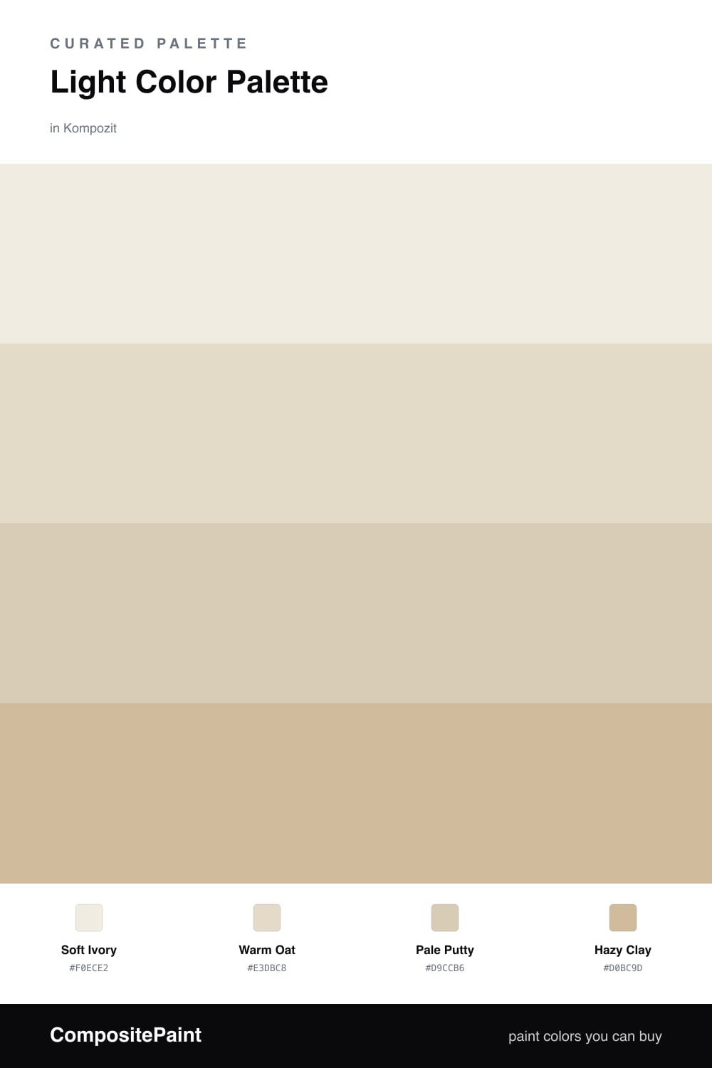
Light Color Palette — Whispered Loam

An airy four-color scheme of soft warm whites, pale putty, and a whisper of clay, kept low-contrast and bright — every color matched to real paint you can buy.

By Emily Roberts · DIY Editor & First-Timer's Guide

Soft Ivory
Dominant
Kompozit Queen Anne's Lace · 0558
#F0ECE2
LRV 84
Warm Oat
Secondary
Kompozit White Elephant · 0223
#E3DBC8
LRV 71
Pale Putty
Base
Kompozit Sandstone Palette · 0273
#D9CCB6
LRV 61
Hazy Clay
Accent
Kompozit Polished Marble · 0274
#D0BC9D
LRV 52
View palette in

This is the kind of scheme I reach for when someone tells me a room feels dark and they just want it to breathe. It’s all light, all warm, and almost no contrast — the four colors live within a few steps of each other, so nothing fights for attention.

Let Soft Ivory carry most of the walls. It’s a warm white that won’t go cold in the afternoon. Warm Oat and Pale Putty step in for trim, built-ins, or an adjoining space, adding the faintest bit of depth so the room doesn’t read as one flat color.

Save Hazy Clay for the smallest dose — a stool, a frame, a strip of cabinetry — and you’ve got that quiet, light-loam look that feels very 2026: bright and soft, but grounded enough to feel like a real home.

Buy These Colors

Each color matched to the closest real paint in every brand, by ΔE2000. Kompozit first; take any SKU to the store — these mix on demand.

Soft Ivory
#F2EDE2 · LRV 85 · Dominant
Kompozit Queen Anne's Lace · 0558 ΔE 0.6
Backdrop Jane · BD-JA ΔE 1.42
Behr Bleached Linen · PPU5-09 ΔE 1.58
Benjamin Moore Arbor White · ES-01 ΔE 1.3
Clare Wing It · PNT100-LT-24 ΔE 2.92
Dunn-Edwards Bone China · DEW339 ΔE 1.62
Farrow & Ball White Tie · No. 2002 ΔE 3.21
Magnolia Home Silos White · JG-107 ΔE 2.01
PPG / Glidden Accolade · 1208-1 ΔE 1.2
Sherwin-Williams Westhighland White · SW 7566 ΔE 0.21
Valspar Cream Delight · 7002-14 ΔE 0
Warm Oat
#E6DCC9 · LRV 72 · Secondary
Kompozit White Elephant · 0223 ΔE 1.02
Backdrop Cookies & Cream · BD-CC ΔE 2.13
Behr Ivory Paper · MQ3-12 ΔE 0.49
Benjamin Moore Lambskin · 1051 ΔE 0.88
Clare No Filter · PNT100-LT-19 ΔE 2.95
Dunn-Edwards Cream Wave · DE6198 ΔE 1.44
Farrow & Ball Lime White · No. 1 ΔE 0.88
Magnolia Home Castle Cream · JG-153 ΔE 1.31
PPG / Glidden Navajo White · 1101-2 ΔE 1.45
Sherwin-Williams Antique White · SW 6119 ΔE 1.18
Valspar Natural Soap · T559 ΔE 0.98
Pale Putty
#D9CDB8 · LRV 62 · Base
Kompozit Sandstone Palette · 0273 ΔE 0.52
Backdrop Real Real · BD-RR ΔE 2.39
Behr Bell Tower · MQ3-15 ΔE 0.39
Benjamin Moore Timson Sand · CW-140 ΔE 0.49
Clare Flatiron · PNT100-LT-17 ΔE 3.97
Dunn-Edwards Cochise · DEC761 ΔE 2.03
Farrow & Ball Joa's White · No. 226 ΔE 1.44
Magnolia Home Plaster · JG-156 ΔE 1.57
PPG / Glidden Summer Wheat · 14-10 ΔE 1.15
Sherwin-Williams Wool Skein · SW 6148 ΔE 1.04
Valspar Rattan Basket · 3007-10C ΔE 0.97
Hazy Clay
#CDB9A0 · LRV 50 · Accent
Kompozit Polished Marble · 0274 ΔE 2.3
Backdrop Boy Meets Girl · BD-BG ΔE 10.51
Behr Bauhaus Buff · BNC-01 ΔE 3.02
Benjamin Moore Sierra Hills · 1053 ΔE 0.39
Clare Greige · PNT100-LT-13 ΔE 7.81
Dunn-Edwards Rustic Taupe · DE6129 ΔE 0.8
Farrow & Ball Drop Cloth · No. 283 ΔE 3.97
Magnolia Home Solid Wood · JG-109 ΔE 4.71
PPG / Glidden Dusty Trail · 1097-4 ΔE 2.65
Sherwin-Williams Macadamia · SW 6142 ΔE 1.14
Valspar In for the Night · T569 ΔE 2.82

Questions

Will a palette this pale feel washed out?

It won't, because the colors are warm rather than cool. Warm whites and soft putties hold a little glow, so the room reads cozy and light instead of flat or sterile.

How do I keep these soft tones from blending into one beige blur?

Lean on texture and finish. A matte wall next to a satin trim, plus natural materials like linen and pale wood, gives the eye gentle steps to follow even when the colors stay close.

Similar Palettes

Closest schemes by color — not by label.