CP

Light Color Palette — Light Cloud

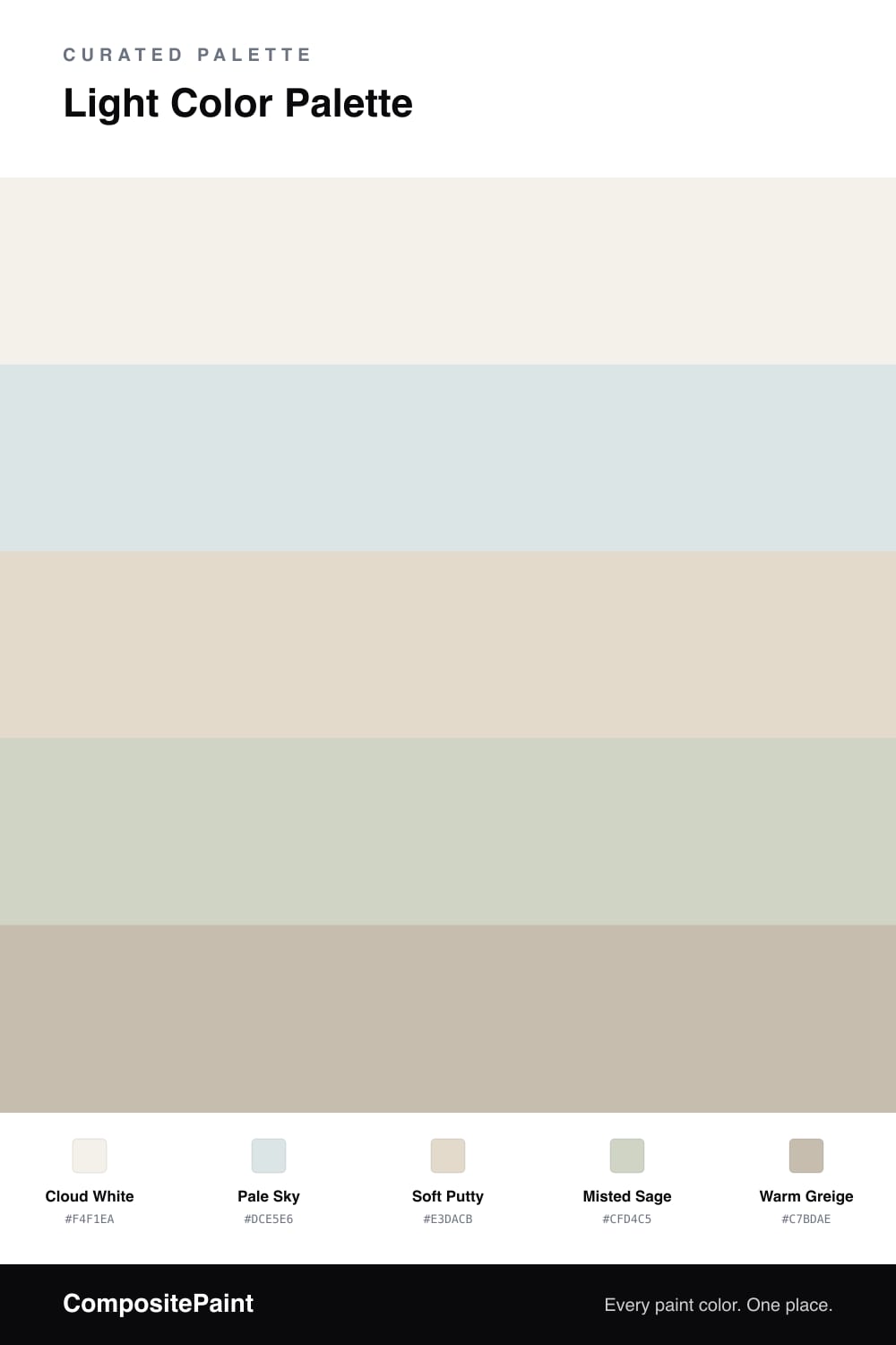
A bright, airy four-color scheme of soft cloud white, pale sky, and warm putty for a calm high-key feel, with every color matched to real paint you can buy.

By Jessica Williams · Color Stylist & Interior Editor

There is a particular hush to a morning sky just after the light comes up, when everything reads as pale and weightless. That is the feeling I chased here. Cloud White leads the whole scheme, a soft warm white that never goes stark, and Pale Sky drifts in beside it like the faintest wash of blue-gray.

The middle is held by Soft Putty and Misted Sage, two quiet tones that keep the palette from feeling flat. One leans warm, one leans cool, and together they give the lightness some dimension. A little Warm Greige does the grounding, the deepest note in an otherwise airy set.

For 2026 this kind of low-contrast, high-key scheme feels exactly right, calm and unhurried without going beige and boring. Let Cloud White do most of the work, layer the soft middle tones where you want a touch of depth, and save the greige for trim or a single grounding piece.

View palette in
Cloud White
Dominant
Benjamin Moore Gardenia · AF-10
#F3F0E9
LRV 85
Pale Sky
Secondary
Glidden Alpine Blue · PPG1149-1
#DBE4E5
LRV 76
Soft Putty
Base
Behr Varnished Ivory · MQ3-40
#E3DACA
LRV 71
Misted Sage
Support
Glidden Castaway · PPG1129-3
#CDD4C6
LRV 64
Warm Greige
Accent
Magnolia Home Solid Wood · JG-109
#C5BBAC
LRV 50

Buy These Colors

Each color matched to the closest real paint in every brand, by ΔE2000. Tap a swatch for its full guide or + to save it — take any SKU to the store, they mix on demand.

Cloud White
#F4F1EA · LRV 88 · Dominant
Sherwin-Williams · SW 9503 · ΔE 1.33
Behr · PR-W14 · ΔE 0.61
Benjamin Moore · AF-10 · ΔE 0.21
Valspar · 8007-6E · ΔE 1.18
PPG / Glidden · PPG0998-1 · ΔE 1.25
Glidden · 61YY 89/040 · ΔE 0.96
Dutch Boy · 004W · ΔE 0.51
HGTV Home by Sherwin-Williams · HGSW 4002 · ΔE 0.95
Dunn-Edwards · DE6225 · ΔE 0.48
Magnolia Home · JG-107 · ΔE 0.68
Farrow & Ball · NO. 239 · ΔE 2.02
Diamond Vogel · 0411 · ΔE 1.25
Hirshfield's · 0411 · ΔE 1.67
Rodda · R001 · ΔE 2.14
C2 Paint · C2-820 · ΔE 0.6
Clare · PNT100-LT-24 · ΔE 2.46
Portola Paints · ORIGAMI · ΔE 1.14
Annie Sloan · OLD OCHRE · ΔE 13.41
Backdrop · BD-TR · ΔE 2.02
Rust-Oleum · 285140 · ΔE 4.71
Kompozit · 0411 · ΔE 1.67
Pale Sky
#DCE5E6 · LRV 77 · Secondary
Sherwin-Williams · SW 9681 · ΔE 1.05
Behr · 790E-1 · ΔE 1.17
Benjamin Moore · 2131-70 · ΔE 0.58
Valspar · 8007-3E · ΔE 0.43
PPG / Glidden · PPG1156-1 · ΔE 1.15
Glidden · PPG1149-1 · ΔE 0.22
Dutch Boy · 336-1DB · ΔE 0.89
HGTV Home by Sherwin-Williams · HGSW 4056 · ΔE 3.76
Dunn-Edwards · DE5770 · ΔE 1.55
Magnolia Home · JG-115 · ΔE 3.39
Farrow & Ball · NO. 314 · ΔE 2.04
Diamond Vogel · 0649 · ΔE 0.44
Hirshfield's · 0586 · ΔE 2.35
Rodda · CA026 · ΔE 5.07
C2 Paint · C2-755 · ΔE 0.89
Clare · PNT100-LT-72 · ΔE 3.97
Portola Paints · GEM · ΔE 6.79
Annie Sloan · OLD OCHRE · ΔE 17.09
Backdrop · BD-JA · ΔE 6.78
Rust-Oleum · 285142 · ΔE 14.92
Kompozit · 0586 · ΔE 2.35
Soft Putty
#E3DACB · LRV 71 · Base
Sherwin-Williams · SW 7568 · ΔE 0.77
Behr · MQ3-40 · ΔE 0.43
Benjamin Moore · AF-55 · ΔE 0.55
Valspar · 8004-23A · ΔE 1.69
PPG / Glidden · PPG1024-2 · ΔE 1.52
Glidden · PPG14-07 · ΔE 1.88
Dutch Boy · 414-1DB · ΔE 0.7
HGTV Home by Sherwin-Williams · HGSW 4017 · ΔE 0.77
Dunn-Edwards · DET672 · ΔE 2.05
Magnolia Home · JG-112 · ΔE 2.38
Farrow & Ball · NO. 2009 · ΔE 1.55
Diamond Vogel · 0223 · ΔE 1.13
Hirshfield's · 0223 · ΔE 1.89
Rodda · CA024 · ΔE 1.05
C2 Paint · C2-850 · ΔE 0.88
Clare · PNT100-LT-19 · ΔE 2.42
Portola Paints · GEM · ΔE 3.34
Annie Sloan · OLD OCHRE · ΔE 7.61
Backdrop · BD-CC · ΔE 3.55
Rust-Oleum · 398641 · ΔE 8.09
Kompozit · 0223 · ΔE 1.89
Misted Sage
#CFD4C5 · LRV 64 · Support
Sherwin-Williams · SW 6190 · ΔE 1.95
Behr · N390-2 · ΔE 0.91
Benjamin Moore · 506 · ΔE 1.33
Valspar · T648 · ΔE 1.83
PPG / Glidden · PPG1129-3 · ΔE 1.27
Glidden · PPG1129-3 · ΔE 0.9
Dutch Boy · 422-1DB · ΔE 3.05
HGTV Home by Sherwin-Williams · HGSW 3257 · ΔE 1.95
Dunn-Edwards · DE6269 · ΔE 1.68
Magnolia Home · JG-55 · ΔE 2.78
Farrow & Ball · NO. 9814 · ΔE 2.26
Diamond Vogel · 0454 · ΔE 2
Hirshfield's · 0454 · ΔE 1.96
Rodda · R025 · ΔE 6.45
C2 Paint · C2-930 · ΔE 2.35
Clare · PNT100-LT-18 · ΔE 7.03
Portola Paints · FIGUEROA · ΔE 5.18
Annie Sloan · OLD OCHRE · ΔE 12.21
Backdrop · BD-RR · ΔE 5.58
Rust-Oleum · 285142 · ΔE 16.09
Kompozit · 0454 · ΔE 1.96
Warm Greige
#C7BDAE · LRV 52 · Accent
Sherwin-Williams · SW 9173 · ΔE 1.03
Behr · ECC-44-1 · ΔE 0.82
Benjamin Moore · 996 · ΔE 0.59
Valspar · 8004-26C · ΔE 3.59
PPG / Glidden · PPG15-25 · ΔE 1.28
Glidden · 40YY 51/084 · ΔE 0.95
Dutch Boy · 421-2DB · ΔE 1.99
HGTV Home by Sherwin-Williams · HGSW 2496 · ΔE 2.09
Dunn-Edwards · DEGR03 · ΔE 2.12
Magnolia Home · JG-109 · ΔE 0.52
Farrow & Ball · NO. 283 · ΔE 1.57
Diamond Vogel · 0336 · ΔE 1.33
Hirshfield's · H0109 · ΔE 1.75
Rodda · CA069 · ΔE 2.02
C2 Paint · C2-784 · ΔE 2.35
Clare · PNT100-LT-13 · ΔE 4.54
Portola Paints · TOPANGA · ΔE 4.56
Annie Sloan · PARIS GREY · ΔE 5.87
Backdrop · BD-BG · ΔE 11.98
Rust-Oleum · 285143 · ΔE 10.33
Kompozit · 0567 · ΔE 1.28

Questions

How do I keep a light palette from feeling cold or washed out?

Mix a warm tone in with the cool ones. Here Soft Putty and Warm Greige carry a little warmth, so the cool Pale Sky and Misted Sage feel fresh instead of clinical. That warm-cool balance is what makes a high-key scheme feel cozy.

Where should the strongest color go in such a soft scheme?

Use Warm Greige as your quiet anchor on trim, a built-in, or the lower third of the wall. It is the deepest tone here, so it gives the eye somewhere to land and keeps all that lightness from floating away.

KEEP EXPLORING

Similar Palettes

Closest schemes by color — not by label.