CP

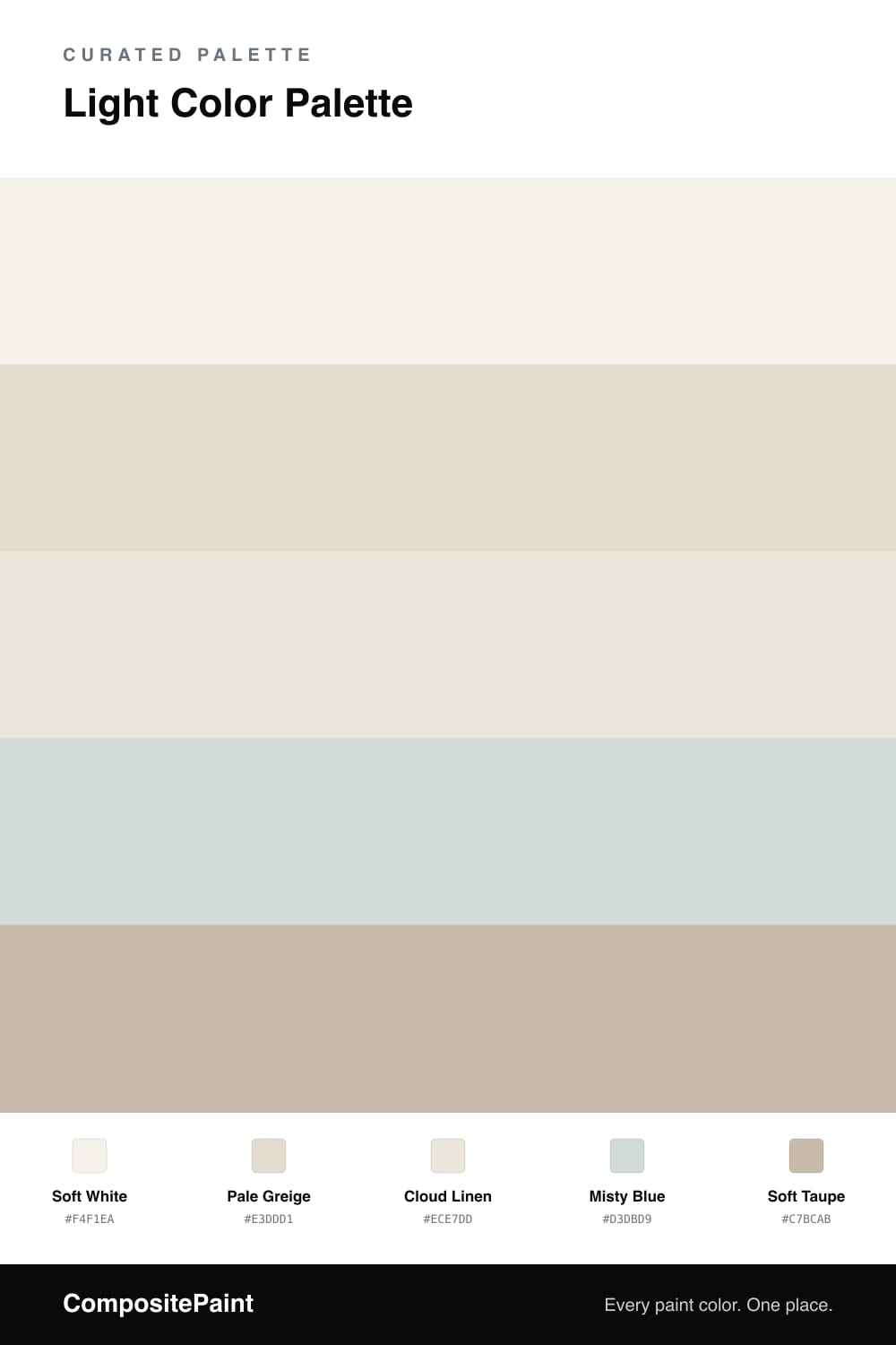
Light Color Palette — Morning Haze

A bright, airy five-color scheme of soft whites, pale greige, and a whisper of misty blue, kept low-contrast and calm — every color matched to real paint you can buy.

By Emily Roberts · DIY Editor & First-Timer's Guide

This is the kind of palette that makes a small room breathe. Soft White leads as the dominant, and instead of going stark or cool, it leans just barely warm so the light feels like early morning rather than a doctor’s office.

Around it, Pale Greige and Cloud Linen do the quiet layering — close enough in tone that walls, trim, and ceiling melt together, which is exactly the soft, seamless look people are reaching for in 2026. A Misty Blue comes in as gentle support on a wall or in textiles, adding the faintest cool whisper without breaking the calm.

When you want a little definition, reach for Soft Taupe as your accent on a frame, a stool, or a door. It is still light, so nothing shouts — it just gives your eye a soft place to land.

View palette in
Soft White
Dominant
Benjamin Moore Gardenia · AF-10
#F3F0E9
LRV 85
Pale Greige
Secondary
PPG / Glidden Southern Breeze · PPG1097-2
#E4DED1
LRV 73
Cloud Linen
Base
Kompozit Umber Style · 0208
#ECE7DD
LRV 80
Misty Blue
Support
Benjamin Moore Mountain Mist · 868
#D4DDDC
LRV 71
Soft Taupe
Accent
Sherwin-Williams Shiitake · SW 9173
#C8BCAB
LRV 51

Buy These Colors

Each color matched to the closest real paint in every brand, by ΔE2000. Tap a swatch for its full guide or + to save it — take any SKU to the store, they mix on demand.

Soft White
#F4F1EA · LRV 88 · Dominant
Sherwin-Williams · SW 9503 · ΔE 1.33
Behr · PR-W14 · ΔE 0.61
Benjamin Moore · AF-10 · ΔE 0.21
Valspar · 8007-6E · ΔE 1.18
PPG / Glidden · PPG0998-1 · ΔE 1.25
Glidden · 61YY 89/040 · ΔE 0.96
Dutch Boy · 004W · ΔE 0.51
HGTV Home by Sherwin-Williams · HGSW 4002 · ΔE 0.95
Dunn-Edwards · DE6225 · ΔE 0.48
Magnolia Home · JG-107 · ΔE 0.68
Farrow & Ball · NO. 239 · ΔE 2.02
Diamond Vogel · 0411 · ΔE 1.25
Hirshfield's · 0411 · ΔE 1.67
Rodda · R001 · ΔE 2.14
C2 Paint · C2-820 · ΔE 0.6
Clare · PNT100-LT-24 · ΔE 2.46
Portola Paints · ORIGAMI · ΔE 1.14
Annie Sloan · OLD OCHRE · ΔE 13.41
Backdrop · BD-TR · ΔE 2.02
Rust-Oleum · 285140 · ΔE 4.71
Kompozit · 0411 · ΔE 1.67
Pale Greige
#E3DDD1 · LRV 73 · Secondary
Sherwin-Williams · SW 7637 · ΔE 0.77
Behr · N340-1 · ΔE 1.14
Benjamin Moore · 971 · ΔE 0.77
Valspar · 6005-1A · ΔE 0.53
PPG / Glidden · PPG1097-2 · ΔE 0.48
Glidden · PPG1076-2 · ΔE 1.41
Dutch Boy · 441-1DB · ΔE 0.93
HGTV Home by Sherwin-Williams · HGSW 4011 · ΔE 0.91
Dunn-Edwards · DEC749 · ΔE 3.62
Magnolia Home · JG-108 · ΔE 0.57
Farrow & Ball · NO. 291 · ΔE 1.14
Diamond Vogel · 0229 · ΔE 0.9
Hirshfield's · 0229 · ΔE 0.53
Rodda · CA024 · ΔE 1.24
C2 Paint · C2-835 · ΔE 1.43
Clare · PNT100-LT-19 · ΔE 1.52
Portola Paints · GEM · ΔE 1.68
Annie Sloan · OLD OCHRE · ΔE 9.25
Backdrop · BD-CC · ΔE 4.5
Rust-Oleum · 285142 · ΔE 10.38
Kompozit · 0229 · ΔE 0.53
Cloud Linen
#ECE7DD · LRV 80 · Base
Sherwin-Williams · SW 7101 · ΔE 0.95
Behr · N330-1 · ΔE 1.16
Benjamin Moore · 855 · ΔE 1.94
Valspar · 3008-10C · ΔE 1.09
PPG / Glidden · PPG18-09 · ΔE 1.22
Glidden · PPG1074-1 · ΔE 1.39
Dutch Boy · 023W · ΔE 1.12
HGTV Home by Sherwin-Williams · HGSW 4075 · ΔE 0.97
Dunn-Edwards · DE6232 · ΔE 1.2
Magnolia Home · JG-23 · ΔE 1.27
Farrow & Ball · NO. CB9 · ΔE 0.78
Diamond Vogel · 0208 · ΔE 0.5
Hirshfield's · 0208 · ΔE 0
Rodda · CA014 · ΔE 0.97
C2 Paint · C2-964 · ΔE 0.83
Clare · PNT100-LT-11 · ΔE 1.9
Portola Paints · KASHMIR · ΔE 1.36
Annie Sloan · OLD OCHRE · ΔE 11.07
Backdrop · BD-JA · ΔE 1.89
Rust-Oleum · 329598 · ΔE 5.63
Kompozit · 0208 · ΔE 0
Misty Blue
#D3DBD9 · LRV 70 · Support
Sherwin-Williams · SW 9641 · ΔE 1.08
Behr · PPU12-13 · ΔE 1.04
Benjamin Moore · 868 · ΔE 0.73
Valspar · V117-1 · ΔE 1.74
PPG / Glidden · PPG1037-1 · ΔE 1.23
Glidden · PPG1144-1 · ΔE 1.75
Dutch Boy · 436-1DB · ΔE 2
HGTV Home by Sherwin-Williams · HGSW 1447 · ΔE 2.04
Dunn-Edwards · DE6303 · ΔE 1.75
Magnolia Home · JG-132 · ΔE 4.81
Farrow & Ball · NO. 235 · ΔE 1.54
Diamond Vogel · 0502 · ΔE 2.09
Hirshfield's · 0502 · ΔE 1.34
Rodda · CA181 · ΔE 1.39
C2 Paint · C2-739 · ΔE 2.05
Clare · PNT100-LT-69 · ΔE 3.39
Portola Paints · GEM · ΔE 5.94
Annie Sloan · OLD OCHRE · ΔE 15.56
Backdrop · BD-CC · ΔE 10.61
Rust-Oleum · 285142 · ΔE 14.05
Kompozit · 0502 · ΔE 1.34
Soft Taupe
#C7BCAB · LRV 51 · Accent
Sherwin-Williams · SW 9173 · ΔE 0.5
Behr · HDC-NT-16G · ΔE 0.81
Benjamin Moore · CSP-170 · ΔE 2.04
Valspar · 8004-26C · ΔE 3.86
PPG / Glidden · PPG15-25 · ΔE 0.5
Glidden · PPG15-25 · ΔE 0.5
Dutch Boy · 421-2DB · ΔE 1.25
HGTV Home by Sherwin-Williams · HGSW 3066 · ΔE 4.15
Dunn-Edwards · DET637 · ΔE 1.9
Magnolia Home · JG-109 · ΔE 0.85
Farrow & Ball · NO. 283 · ΔE 1.52
Diamond Vogel · 0336 · ΔE 0.78
Hirshfield's · H0109 · ΔE 1.9
Rodda · CA036 · ΔE 1.4
C2 Paint · C2-784 · ΔE 2.2
Clare · PNT100-LT-13 · ΔE 5.18
Portola Paints · TOPANGA · ΔE 4.49
Annie Sloan · PARIS GREY · ΔE 6.26
Backdrop · BD-BG · ΔE 12.06
Rust-Oleum · 285143 · ΔE 11.09
Kompozit · 0183 · ΔE 2.2

Questions

What makes this palette feel so light and airy?

Every shade sits in the same high-key range, which means they are all light with very little contrast between them. Your eye glides from one to the next instead of stopping, so the whole room reads soft and open.

Will such pale colors look washed out?

They will not, because each one carries a gentle undertone — warm greige, a hint of misty blue, a soft taupe. Those quiet undertones give the scheme depth and keep it from feeling flat or sterile.

KEEP EXPLORING

Similar Palettes

Closest schemes by color — not by label.