CP

Light Color Palette — Light Linen

A soft five-color scheme of airy linen white, warm oatmeal, and the faintest blush and sage, kept high-key and low-contrast — every color matched to real paint you can buy.

By Jessica Williams · Color Stylist & Interior Editor

Linen White
Dominant
Kompozit Bunny Cake · 0012
#F5EFE2
LRV 87
Warm Oatmeal
Base
Kompozit White Elephant · 0223
#E3DBC8
LRV 71
Pale Blush
Secondary
Kompozit Merlins Beard · 0124
#EFE2D9
LRV 78
Whisper Sage
Support
Kompozit Speak to Me · 0413
#DFDFD0
LRV 73
Soft Taupe
Accent
Kompozit Soft Leather · 0336
#C5BAA6
LRV 50
View palette in

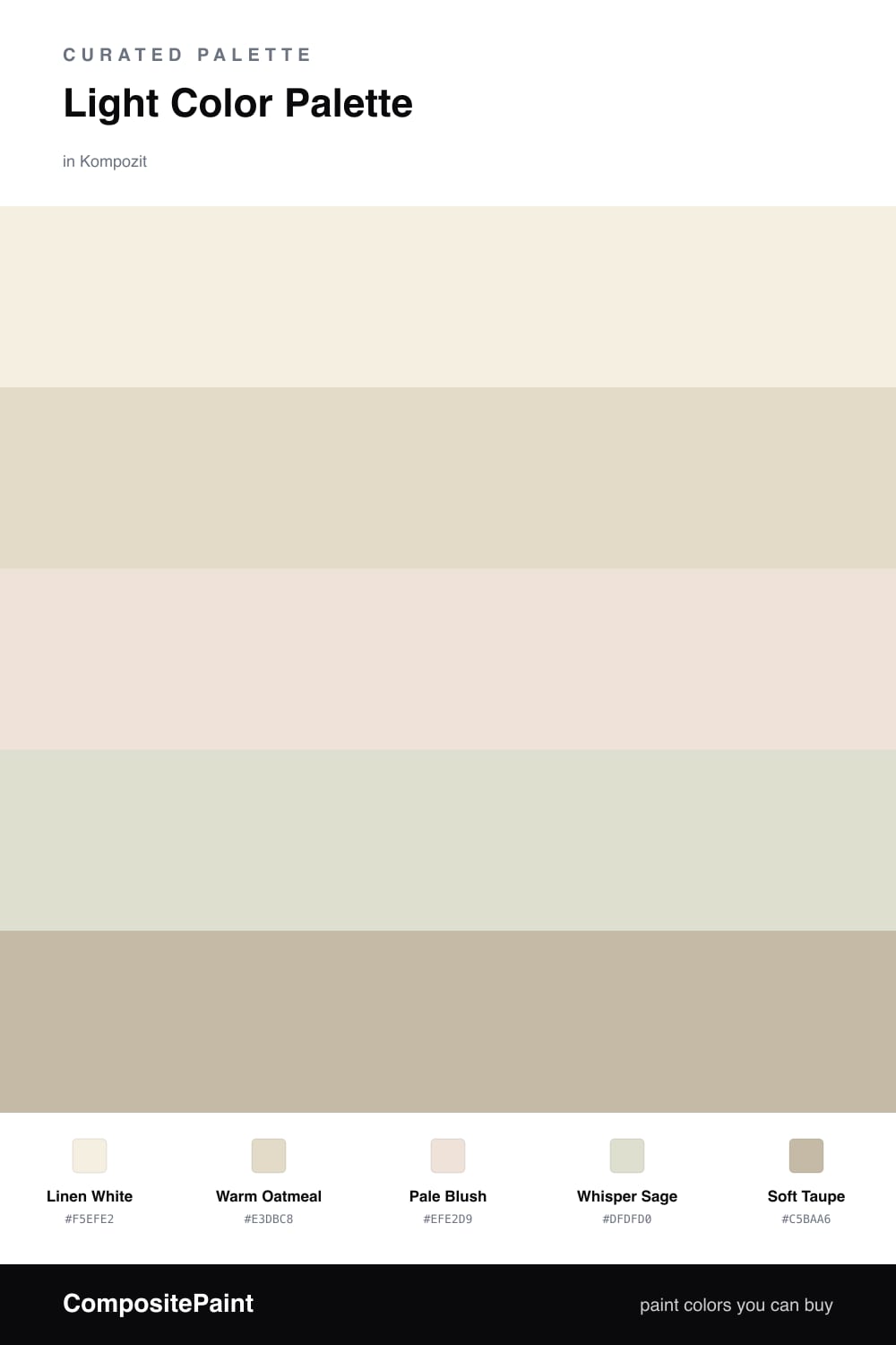
There is a particular kind of light that pools in a quiet room first thing in the morning, soft and a little hazy, and this palette is built to hold it. Linen White leads as the dominant tone, warm enough to feel like fabric rather than a cold gallery white, and Warm Oatmeal sits just beneath it as a base that gives the scheme its gentle weight.

The interest here is barely-there on purpose. Pale Blush warms a wall the way afternoon sun does, Whisper Sage cools the next one by a degree, and the two play off each other so quietly you feel the shift before you name it. This is the low-contrast, high-key direction that feels very 2026, where calm reads as confident.

To keep it from drifting too soft, let Soft Taupe do the grounding on trim, a console, or a single woven piece. Used in small doses it gives the eye a resting point, and the whole linen-and-oatmeal scheme settles into something restful instead of vague.

Buy These Colors

Each color matched to the closest real paint in every brand, by ΔE2000. Kompozit first; take any SKU to the store — these mix on demand.

Linen White
#F3EEE3 · LRV 86 · Dominant
Kompozit Bunny Cake · 0012 ΔE 0.87
Backdrop Jane · BD-JA ΔE 1.45
Behr Snowy Pine · PPU10-13 ΔE 1.49
Benjamin Moore Steam · AF-15 ΔE 1.92
Clare Wing It · PNT100-LT-24 ΔE 2.87
Dunn-Edwards Trite White · DE6204 ΔE 1.18
Farrow & Ball Pointing · No. 2003 ΔE 1.37
Magnolia Home Silos White · JG-107 ΔE 1.98
PPG / Glidden Atrium White · 1020-1 ΔE 0.95
Sherwin-Williams Westhighland White · SW 7566 ΔE 0
Valspar Wings of an Angel · V153 ΔE 0.44
Warm Oatmeal
#E6DBC7 · LRV 72 · Base
Kompozit White Elephant · 0223 ΔE 1.36
Backdrop Cookies & Cream · BD-CC ΔE 2.07
Behr Ivory Paper · MQ3-12 ΔE 0.9
Benjamin Moore Lambskin · 1051 ΔE 0.55
Clare Greenish · PNT100-LT-68 ΔE 4.17
Dunn-Edwards Cream Wave · DE6198 ΔE 0.95
Farrow & Ball Lime White · No. 1 ΔE 0.95
Magnolia Home Morning Snow · JG-167 ΔE 0.9
PPG / Glidden Almond Paste · 1103-2 ΔE 1.06
Sherwin-Williams Antique White · SW 6119 ΔE 0.76
Valspar Natural Soap · T559 ΔE 0.48
Pale Blush
#EFE0DA · LRV 77 · Secondary
Kompozit Merlins Beard · 0124 ΔE 2.01
Backdrop Jane · BD-JA ΔE 7.5
Behr Malted Milk · 700C-2 ΔE 2.19
Benjamin Moore Victorian Lace · 2100-70 ΔE 0.86
Clare Baby Soft · PNT100-LT-25 ΔE 1.86
Dunn-Edwards White Russian · DE6050 ΔE 1.2
Farrow & Ball Great White · No. 2006 ΔE 2.62
Magnolia Home Shiplap · JG-22 ΔE 7.43
PPG / Glidden Potpourri · 1058-1 ΔE 1.09
Sherwin-Williams Intimate White · SW 6322 ΔE 1.5
Valspar Bistro Napkin · M211 ΔE 2.19
Whisper Sage
#DCDFD2 · LRV 73 · Support
Kompozit Speak to Me · 0413 ΔE 1.47
Backdrop Cookies & Cream · BD-CC ΔE 6.16
Behr Whitened Sage · PPU10-12 ΔE 0.53
Benjamin Moore Going to the Chapel · 1527 ΔE 2.34
Clare No Filter · PNT100-LT-19 ΔE 3.25
Dunn-Edwards Green Mirror · DEC784 ΔE 3.33
Farrow & Ball Pale Powder · No. 204 ΔE 1.42
Magnolia Home One Horn White · JG-11 ΔE 2.21
PPG / Glidden Pinch Of Pistachio · 1126-3 ΔE 1.96
Sherwin-Williams Nonchalant White · SW 6161 ΔE 2
Valspar Luna · 5005-3A ΔE 1.29
Soft Taupe
#C7B8A5 · LRV 49 · Accent
Kompozit Soft Leather · 0336 ΔE 2.19
Backdrop Boy Meets Girl · BD-BG ΔE 10.91
Behr Windsor Tan · MQ2-26 ΔE 2.03
Benjamin Moore Shabby Chic · 1018 ΔE 1.61
Clare Greige · PNT100-LT-13 ΔE 5.62
Dunn-Edwards Steveareno Beige · DEC766 ΔE 1.37
Farrow & Ball Drop Cloth · No. 283 ΔE 2.39
Magnolia Home Solid Wood · JG-109 ΔE 2.39
PPG / Glidden Summer Suede · 14-14 ΔE 0.42
Sherwin-Williams Loggia · SW 7506 ΔE 0.93
Valspar Tailored Tan · V132-3 ΔE 1.99

Questions

Will a palette this light feel washed out?

It will not, as long as you let the tones do different jobs. Linen White carries the most surface, Warm Oatmeal grounds it with a little weight, and Soft Taupe gives your eye somewhere to land. The faint blush and sage keep things from going flat, so the whole scheme reads soft rather than empty.

How do I keep all these pale colors from blending into one another?

Lean on texture and finish instead of contrast. Use a matte for the linen walls, a slightly warmer satin for trim in Soft Taupe, and let woven or nubby materials in Warm Oatmeal catch the light. The low contrast is the point, so the small shifts between tones become what you actually notice.

Similar Palettes

Closest schemes by color — not by label.