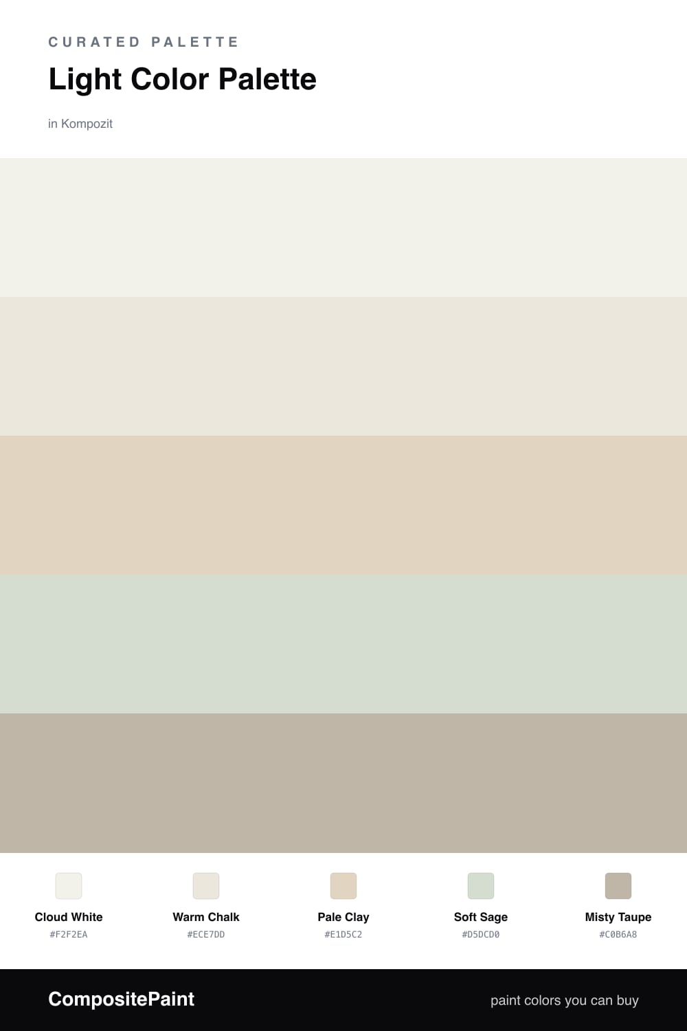
Light Color Palette — Morning Linen
A bright, airy five-color scheme built from soft whites, pale clay, and a whisper of sage, kept low-contrast and calm — every color matched to real paint you can buy.
By David Chen · Formulation Lead & Resident Chemist
Think of this scheme as a glass of water held up to the light — it looks plain until you notice the soft tones moving through it. Cloud White carries most of the space, a warm white that feels soft rather than clinical, while Warm Chalk sits just underneath it as a base that keeps the whole thing grounded.
The quiet interest comes from Pale Clay and Soft Sage. Clay leans warm and earthy, sage leans cool and green, and because both are so pale they brush against each other instead of clashing. That tiny push and pull is what makes a light room feel alive in 2026 — softness with a little dimension, not flat builder-grade beige.
Misty Taupe is your darkest note, and it is still gentle. Use it only in small doses on a door, a frame, or a piece of hardware to give your eye somewhere to land. Keep everything else bright and let the light do the work.
Buy These Colors
Each color matched to the closest real paint in every brand, by ΔE2000. Kompozit first; take any SKU to the store — these mix on demand.
Questions
Lean on warm and cool light tones instead of contrast. Pair a warm white like Cloud White with a slightly cooler Soft Sage, then let Pale Clay add quiet depth. The small temperature shifts read as soft texture rather than harsh lines, so the room stays bright but never sterile.
Let Cloud White lead on the largest surfaces, with Warm Chalk close behind. Keep Pale Clay and Soft Sage as secondary tones on trim or a single feature, and save Misty Taupe for the smallest accents so the whole scheme stays high-key and airy.
Similar Palettes
Closest schemes by color — not by label.