Light Color Palette — Quiet Dawn
A bright, airy five-color scheme of soft whites, pale blush, and the faintest blue, kept low-contrast and calm — every color matched to real paint you can buy.
By Jessica Williams · Color Stylist & Interior Editor
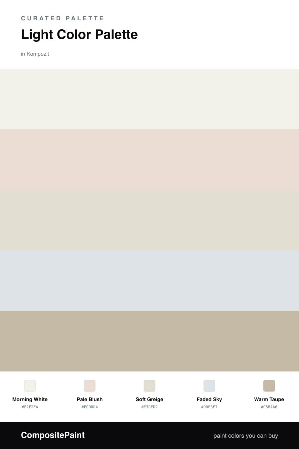
This is the palette of early light, before the day has decided anything. Morning White leads, warm and barely there, and Pale Blush drifts behind it like the first color the sun finds on a wall.
Soft Greige and Faded Sky do the quiet work between them, one warm and one cool, so the scheme stays balanced and never tips chilly. Keep these as your large surfaces and let them blur together.
A whisper of Warm Taupe is all the grounding a room like this needs. Use it sparingly on the smallest details, and the whole space feels bright, soft, and easy to live in.
Buy These Colors
Each color matched to the closest real paint in every brand, by ΔE2000. Kompozit first; take any SKU to the store — these mix on demand.
Questions
They all share a high, soft lightness and stay close in tone, so nothing jumps out. With so little contrast the eye relaxes and the whole space reads as one gentle wash of light.
Lean on the Warm Taupe as your quiet edge — use it on a frame, a table leg, or trim so there is one slightly deeper note to give the softness some shape.
Similar Palettes
Closest schemes by color — not by label.