Light Color Palette — Soft Glow
A bright, airy five-color scheme of soft whites, blush, and pale sky that stays gentle and low-contrast — every color matched to real paint you can buy.
By Emily Roberts · DIY Editor & First-Timer's Guide
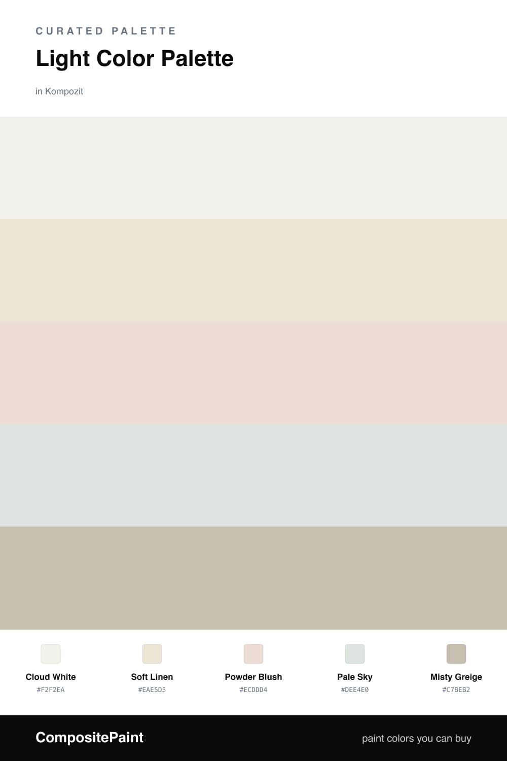
This is the kind of scheme that makes a space feel like morning light, even on a gray day. Cloud White leads, a soft white with just enough warmth to feel cozy rather than clinical, and Soft Linen sits right beside it as a base so the whites have a little depth instead of going flat.
The color comes in quietly. Powder Blush adds a barely-there pink that flatters skin and warms a room, while Pale Sky cools things back down with a whisper of blue-green. That gentle push and pull between warm and cool is what keeps a high-key, low-contrast palette like this from looking washed out.
A touch of Misty Greige grounds everything, giving your eye one soft place to rest. Use it on a trim line or a single piece of furniture and let the lighter tones carry the rest. It is a calm, current take on light for 2026 that feels airy without feeling cold.
Buy These Colors
Each color matched to the closest real paint in every brand, by ΔE2000. Kompozit first; take any SKU to the store — these mix on demand.
Questions
Lean on the small differences in warmth. Cloud White and Soft Linen carry a soft cream tone, while Pale Sky cools things down, so the room reads layered instead of flat. The Misty Greige accent gives your eye one quiet place to land.
Treat them as gentle highlights, not main events. A little Powder Blush on a bedroom wall or Pale Sky in a sunroom adds a soft glow without breaking the light, airy feel. Keep the two whites doing most of the work.
Similar Palettes
Closest schemes by color — not by label.