CP

Light Color Palette — Light Whisper

A soft, airy four-color scheme built from barely-there whites and pale tints that stay calm and low-contrast — every color matched to real paint you can buy.

By Maya Patel · Reviews Editor & Product Tester

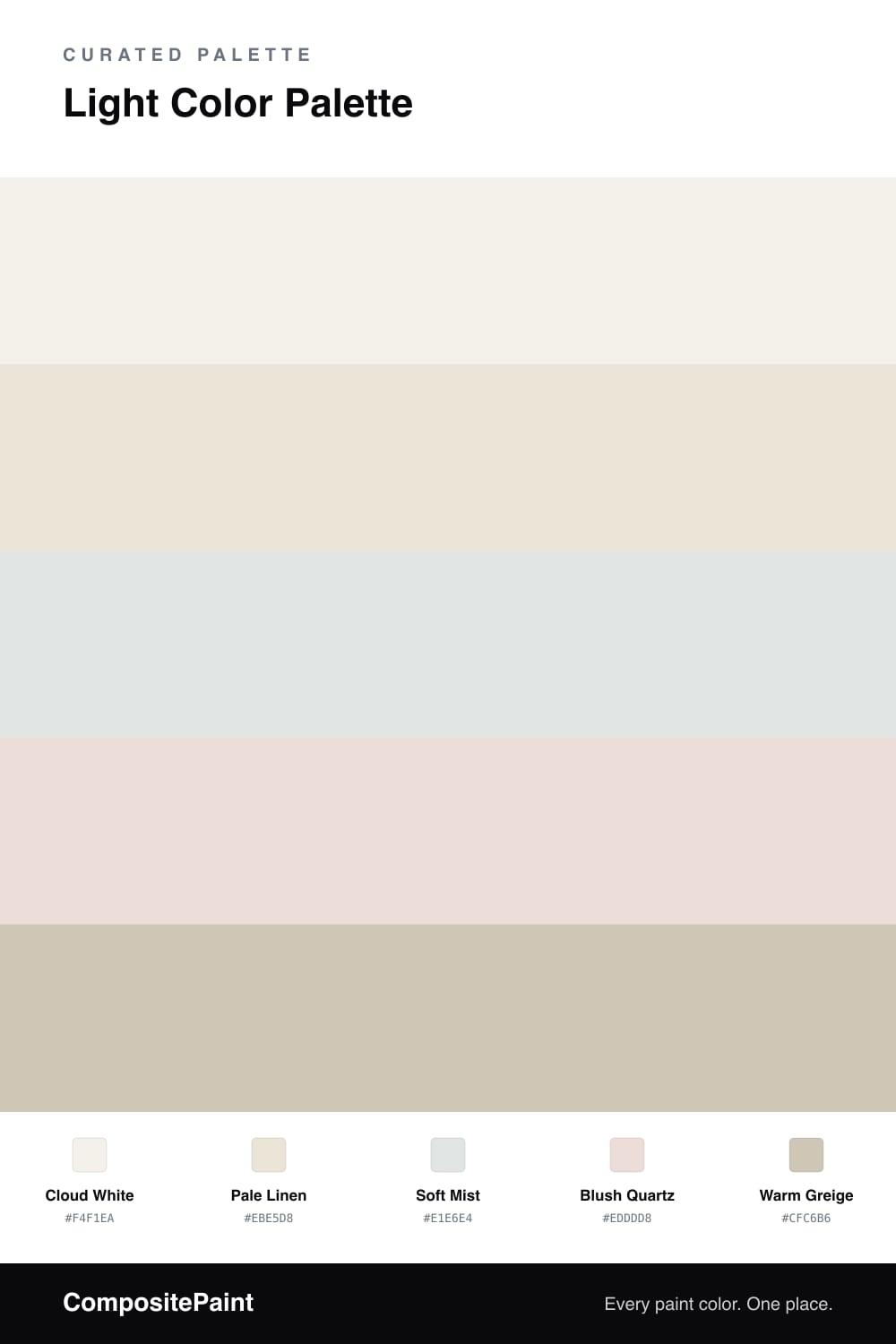
Light Whisper is the kind of scheme that feels like morning sun through a sheer curtain — bright, soft, and barely there. The whole palette lives in a narrow high-key band, so nothing shouts and every shade flatters the next. Cloud White carries most of the space with a creamy, restful warmth.

From there it is all gentle shifts. Pale Linen deepens the base just enough to cast a soft shadow, Soft Mist cools the room with a whisper of green-gray, and Blush Quartz slips in a faint pink that keeps the cool tones from feeling clinical. This warm-meets-cool play is what gives a near-white palette its quiet 2026 polish.

To ground it, Warm Greige steps in as the accent — on trim, a cabinet, or a single piece — so the lightness reads intentional rather than empty. Keep contrast low, let the undertones do the talking, and the scheme stays calm and airy in any light.

View palette in
Cloud White
Dominant
Benjamin Moore Gardenia · AF-10
#F3F0E9
LRV 85
Pale Linen
Base
Dutch Boy Antiquated Lace · 017W
#EBE5D8
LRV 79
Soft Mist
Secondary
Sherwin-Williams Ski Slope · SW 6518
#E1E5E3
LRV 78
Blush Quartz
Support
Glidden Apricot Cream · PPG1059-1
#EEDED8
LRV 75
Warm Greige
Accent
Sherwin-Williams Mushroom · SW 9587
#D0C7B7
LRV 57

Buy These Colors

Each color matched to the closest real paint in every brand, by ΔE2000. Tap a swatch for its full guide or + to save it — take any SKU to the store, they mix on demand.

Cloud White
#F4F1EA · LRV 88 · Dominant
Sherwin-Williams · SW 9503 · ΔE 1.33
Behr · PR-W14 · ΔE 0.61
Benjamin Moore · AF-10 · ΔE 0.21
Valspar · 8007-6E · ΔE 1.18
PPG / Glidden · PPG0998-1 · ΔE 1.25
Glidden · 61YY 89/040 · ΔE 0.96
Dutch Boy · 004W · ΔE 0.51
HGTV Home by Sherwin-Williams · HGSW 4002 · ΔE 0.95
Dunn-Edwards · DE6225 · ΔE 0.48
Magnolia Home · JG-107 · ΔE 0.68
Farrow & Ball · NO. 239 · ΔE 2.02
Diamond Vogel · 0411 · ΔE 1.25
Hirshfield's · 0411 · ΔE 1.67
Rodda · R001 · ΔE 2.14
C2 Paint · C2-820 · ΔE 0.6
Clare · PNT100-LT-24 · ΔE 2.46
Portola Paints · ORIGAMI · ΔE 1.14
Annie Sloan · OLD OCHRE · ΔE 13.41
Backdrop · BD-TR · ΔE 2.02
Rust-Oleum · 285140 · ΔE 4.71
Kompozit · 0411 · ΔE 1.67
Pale Linen
#EBE5D8 · LRV 79 · Base
Sherwin-Williams · SW 7013 · ΔE 0.5
Behr · N300-1 · ΔE 0.53
Benjamin Moore · 970 · ΔE 1.12
Valspar · V154 · ΔE 0.44
PPG / Glidden · PPG1101-1 · ΔE 0.5
Glidden · PPG1101-1 · ΔE 1
Dutch Boy · 017W · ΔE 0
HGTV Home by Sherwin-Williams · HGSW 4061 · ΔE 1.32
Dunn-Edwards · DET653 · ΔE 1.12
Magnolia Home · JG-16 · ΔE 1.99
Farrow & Ball · NO. 9812 · ΔE 0.81
Diamond Vogel · 0002 · ΔE 1
Hirshfield's · 0376 · ΔE 1.49
Rodda · CA016 · ΔE 0.79
C2 Paint · C2-964 · ΔE 1.1
Clare · PNT100-LT-11 · ΔE 3.05
Portola Paints · MARIPOSA · ΔE 2.2
Annie Sloan · OLD OCHRE · ΔE 9.99
Backdrop · BD-DS · ΔE 4.18
Rust-Oleum · 329598 · ΔE 5
Kompozit · 0376 · ΔE 1.49
Soft Mist
#E1E6E4 · LRV 78 · Secondary
Sherwin-Williams · SW 6518 · ΔE 0.49
Behr · BL-W02 · ΔE 0.52
Benjamin Moore · 874 · ΔE 0.52
Valspar · M319 · ΔE 0.53
PPG / Glidden · PPG1013-1 · ΔE 0.99
Glidden · PPG1012-1 · ΔE 0.56
Dutch Boy · 430-1DB · ΔE 1.35
HGTV Home by Sherwin-Williams · HGSW 4056 · ΔE 1.88
Dunn-Edwards · DE6323 · ΔE 1.08
Magnolia Home · JG-115 · ΔE 1.32
Farrow & Ball · NO. CC5 · ΔE 3.34
Diamond Vogel · 0439 · ΔE 2.44
Hirshfield's · 0628 · ΔE 1.29
Rodda · CA026 · ΔE 3.06
C2 Paint · C2-788 · ΔE 3.81
Clare · PNT100-LT-06 · ΔE 0.66
Portola Paints · ELLIE · ΔE 3.53
Annie Sloan · OLD OCHRE · ΔE 15.43
Backdrop · BD-JA · ΔE 4.76
Rust-Oleum · 285140 · ΔE 5
Kompozit · 0628 · ΔE 1.29
Blush Quartz
#EDDDD8 · LRV 75 · Support
Sherwin-Williams · SW 6315 · ΔE 0.58
Behr · N160-1 · ΔE 2.27
Benjamin Moore · 2103-70 · ΔE 0.96
Valspar · 1007-8C · ΔE 0.75
PPG / Glidden · PPG1059-1 · ΔE 1.22
Glidden · PPG1059-1 · ΔE 0.54
Dutch Boy · 206-1DB · ΔE 1.42
HGTV Home by Sherwin-Williams · HGSW 4067 · ΔE 3.92
Dunn-Edwards · DE6043 · ΔE 1.51
Magnolia Home · JG-108 · ΔE 6.34
Farrow & Ball · NO. 2006 · ΔE 4.63
Diamond Vogel · 0131 · ΔE 2.29
Hirshfield's · 0131 · ΔE 2.18
Rodda · R031 · ΔE 5.79
C2 Paint · BD4 · ΔE 4.74
Clare · PNT100-LT-25 · ΔE 1.05
Portola Paints · GEM · ΔE 7.43
Annie Sloan · OLD OCHRE · ΔE 11.85
Backdrop · BD-CC · ΔE 10.38
Rust-Oleum · 285142 · ΔE 4.58
Kompozit · 0131 · ΔE 2.18
Warm Greige
#CFC6B6 · LRV 57 · Accent
Sherwin-Williams · SW 9587 · ΔE 0.25
Behr · PPU8-16 · ΔE 0.95
Benjamin Moore · 973 · ΔE 1.9
Valspar · V146-2 · ΔE 1.97
PPG / Glidden · PPG14-32 · ΔE 0.82
Glidden · PPG1021-2 · ΔE 0.8
Dutch Boy · 419-2DB · ΔE 1.9
HGTV Home by Sherwin-Williams · HGSW 2487 · ΔE 0.85
Dunn-Edwards · DEGR22 · ΔE 2.18
Magnolia Home · JG-104 · ΔE 0.5
Farrow & Ball · NO. 9904 · ΔE 2.92
Diamond Vogel · 0217 · ΔE 0.5
Hirshfield's · 0196 · ΔE 0.82
Rodda · R032 · ΔE 1.22
C2 Paint · C2-911 · ΔE 0.5
Clare · PNT100-LT-17 · ΔE 2.62
Portola Paints · LUMIERE · ΔE 3.62
Annie Sloan · PARIS GREY · ΔE 5.66
Backdrop · BD-RR · ΔE 2.41
Rust-Oleum · 285142 · ΔE 10.88
Kompozit · 0196 · ΔE 0.82

Questions

How do I keep a light palette from looking flat or washed out?

Mix the undertones instead of repeating one. Here the warm Cloud White and Pale Linen lean creamy, while Soft Mist cools things down and Blush Quartz adds a faint pink. That quiet shift between warm and cool is what gives a near-white scheme depth without raising the contrast.

Which color should I use the most?

Lead with Cloud White as your dominant shade across the largest surfaces, then layer Pale Linen and Soft Mist in roughly equal amounts. Save Warm Greige for trim or a single grounding moment so the whole thing still reads soft.

KEEP EXPLORING

Similar Palettes

Closest schemes by color — not by label.