CP

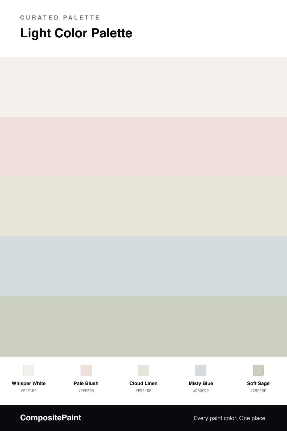
Light Color Palette — Soft Morning Haze

A bright, airy five-color scheme of soft whites and gentle pastels that feels calm and high-key, with every color matched to real paint you can buy.

By Maya Patel · Reviews Editor & Product Tester

Light schemes live or die on subtlety, and this one earns its keep. Whisper White leads as a warm, easy backdrop, and Pale Blush adds the faintest flush of color so the white never feels clinical.

Cloud Linen bridges the two as a soft base, while Misty Blue brings a cool, restful note that keeps everything from leaning too warm. Save Soft Sage for the smallest moments — a trim, a built-in, a single chair.

This is a very 2026 way to use color — quiet, tonal, and confident enough to skip the big contrast. Let the light do the work and these shades will shift gently through the day.

View palette in
Whisper White
Dominant
Benjamin Moore Opulence · 879
#F5F2ED
LRV 89
Pale Blush
Secondary
Benjamin Moore Tropical Sand · 2101-70
#EFE2DD
LRV 78
Cloud Linen
Base
Valspar Hint of Cream · M213
#EAE5DA
LRV 79
Misty Blue
Support
Dutch Boy Wales Gray · 436-1DB
#D5DBDC
LRV 70
Soft Sage
Accent
Behr Terrace View · PPF-25
#CAD0BF
LRV 61

Buy These Colors

Each color matched to the closest real paint in every brand, by ΔE2000. Tap a swatch for its full guide or + to save it — take any SKU to the store, they mix on demand.

Whisper White
#F4F1EC · LRV 88 · Dominant
Sherwin-Williams · SW 9503 · ΔE 2.26
Behr · HDC-MD-06 · ΔE 0.59
Benjamin Moore · 879 · ΔE 0.21
Valspar · 8007-6E · ΔE 1.01
PPG / Glidden · PPG1001-1 · ΔE 1.93
Glidden · PPG1001-1 · ΔE 1.93
Dutch Boy · 004W · ΔE 1.45
HGTV Home by Sherwin-Williams · HGSW 4002 · ΔE 1.91
Dunn-Edwards · DE6225 · ΔE 0.49
Magnolia Home · JG-107 · ΔE 1.32
Farrow & Ball · NO. 239 · ΔE 2.97
Diamond Vogel · 1265 · ΔE 1.22
Hirshfield's · 1265 · ΔE 1.02
Rodda · R001 · ΔE 1.59
C2 Paint · C2-852 · ΔE 1.74
Clare · PNT100-LT-24 · ΔE 2.29
Portola Paints · ORIGAMI · ΔE 0.63
Annie Sloan · OLD OCHRE · ΔE 13.89
Backdrop · BD-TR · ΔE 2.97
Rust-Oleum · 285140 · ΔE 3.85
Kompozit · 1265 · ΔE 1.02
Pale Blush
#EFE2DD · LRV 78 · Secondary
Sherwin-Williams · SW 6301 · ΔE 0.77
Behr · 700C-2 · ΔE 1.58
Benjamin Moore · 2101-70 · ΔE 0
Valspar · M211 · ΔE 1.58
PPG / Glidden · PPG1057-1 · ΔE 0.87
Glidden · PPG1057-1 · ΔE 1.16
Dutch Boy · 104-1DB · ΔE 0.83
HGTV Home by Sherwin-Williams · HGSW 4061 · ΔE 5.26
Dunn-Edwards · DE6029 · ΔE 1.52
Magnolia Home · JG-22 · ΔE 6.81
Farrow & Ball · NO. CC5 · ΔE 4.9
Diamond Vogel · 0124 · ΔE 1.73
Hirshfield's · 0124 · ΔE 2.01
Rodda · CA022 · ΔE 4.89
C2 Paint · C2-532 · ΔE 3.59
Clare · PNT100-LT-11 · ΔE 4.43
Portola Paints · ELLIE · ΔE 4.9
Annie Sloan · OLD OCHRE · ΔE 12
Backdrop · BD-JA · ΔE 6.86
Rust-Oleum · 329598 · ΔE 10.35
Kompozit · 0124 · ΔE 2.01
Cloud Linen
#E9E4D8 · LRV 78 · Base
Sherwin-Williams · SW 7009 · ΔE 0.91
Behr · OR-W13 · ΔE 0.78
Benjamin Moore · 969 · ΔE 1.2
Valspar · M213 · ΔE 0.5
PPG / Glidden · PPG1097-1 · ΔE 0.76
Glidden · PPG1085-1 · ΔE 0.84
Dutch Boy · 017W · ΔE 0.59
HGTV Home by Sherwin-Williams · HGSW 4061 · ΔE 0.91
Dunn-Edwards · DEC785 · ΔE 0.58
Magnolia Home · JG-22 · ΔE 2.05
Farrow & Ball · NO. 9812 · ΔE 0.86
Diamond Vogel · 0002 · ΔE 0.77
Hirshfield's · 0027 · ΔE 0.55
Rodda · CA016 · ΔE 1
C2 Paint · C2-964 · ΔE 0.69
Clare · PNT100-LT-11 · ΔE 2.68
Portola Paints · MARIPOSA · ΔE 2.43
Annie Sloan · OLD OCHRE · ΔE 10.28
Backdrop · BD-DS · ΔE 4.6
Rust-Oleum · 329598 · ΔE 5.33
Kompozit · 0027 · ΔE 0.55
Misty Blue
#D5DCDD · LRV 71 · Support
Sherwin-Williams · SW 9641 · ΔE 0.78
Behr · MQ3-50 · ΔE 0.65
Benjamin Moore · 2124-50 · ΔE 0.92
Valspar · 4003-3A · ΔE 1.15
PPG / Glidden · PPG1038-3 · ΔE 1.14
Glidden · PPG1037-1 · ΔE 0.53
Dutch Boy · 436-1DB · ΔE 0.48
HGTV Home by Sherwin-Williams · HGSW 2407 · ΔE 3.24
Dunn-Edwards · DE6359 · ΔE 2.36
Magnolia Home · JG-132 · ΔE 5.2
Farrow & Ball · NO. 235 · ΔE 1.04
Diamond Vogel · 0502 · ΔE 0.53
Hirshfield's · 0502 · ΔE 0.57
Rodda · CA181 · ΔE 1.63
C2 Paint · C2-739 · ΔE 0.88
Clare · PNT100-LT-69 · ΔE 4.87
Portola Paints · GEM · ΔE 6.45
Annie Sloan · OLD OCHRE · ΔE 16.07
Backdrop · BD-CC · ΔE 11.51
Rust-Oleum · 285142 · ΔE 13.43
Kompozit · 0502 · ΔE 0.57
Soft Sage
#C9CFBF · LRV 61 · Accent
Sherwin-Williams · SW 59 · ΔE 1.01
Behr · PPF-25 · ΔE 0.44
Benjamin Moore · 471 · ΔE 0.62
Valspar · 5007-3B · ΔE 1.01
PPG / Glidden · PPG1124-3 · ΔE 0.9
Glidden · PPG1124-3 · ΔE 0.95
Dutch Boy · 424-1DB · ΔE 0.45
HGTV Home by Sherwin-Williams · HGSW 3247 · ΔE 2.63
Dunn-Edwards · DE6262 · ΔE 1.36
Magnolia Home · JG-13 · ΔE 2.58
Farrow & Ball · NO. 301 · ΔE 1.9
Diamond Vogel · 0455 · ΔE 1.81
Hirshfield's · 0377 · ΔE 5.2
Rodda · CA151 · ΔE 5.65
C2 Paint · C2-930 · ΔE 2.82
Clare · PNT100-MD-47 · ΔE 1.77
Portola Paints · FIGUEROA · ΔE 5.83
Annie Sloan · OLD OCHRE · ΔE 12.44
Backdrop · BD-RR · ΔE 6.05
Rust-Oleum · 285139 · ΔE 10.91
Kompozit · 0377 · ΔE 5.2

Questions

Why does this palette feel so airy?

Every color sits in the same high, light range, so there is barely any contrast between them. That softness is the whole point — your eye glides across the room instead of stopping on any one wall.

How do I keep a light scheme from looking washed out?

Lean on texture and the faint warm-to-cool shift here. Whisper White and Pale Blush warm the room while Misty Blue and Soft Sage cool it, so the space reads layered rather than flat.

KEEP EXPLORING

Similar Palettes

Closest schemes by color — not by label.