Light Color Palette — Airy Light Drift
A bright, airy five-color scheme of soft, low-contrast whites and pales that drift together effortlessly — every color matched to real paint you can buy.
By Emily Roberts · DIY Editor & First-Timer's Guide
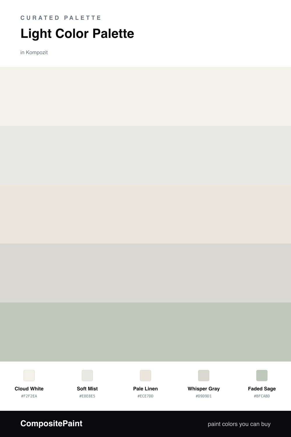
If you love a space that feels like a deep breath, this one is for you. Cloud White does most of the work here, that soft creamy white that catches light all day without ever going stark. It is the kind of shade that makes a small room feel bigger and a big room feel calm.
From there it is all gentle drift. Soft Mist and Whisper Gray add the faintest cool shadow, so walls and trim quietly separate instead of blurring into one flat wash. Pale Linen brings a warm thread through the middle, which is what keeps the whole thing feeling cozy rather than clinical.
For 2026 the move is a barely-there accent, and Faded Sage is exactly that — a whisper of green you almost have to look for. Try it on a built-in, a door, or a single piece of furniture. Used in small doses, it gives this airy palette just enough quiet personality to feel intentional.
Buy These Colors
Each color matched to the closest real paint in every brand, by ΔE2000. Kompozit first; take any SKU to the store — these mix on demand.
Questions
Each one carries a tiny hint of warmth or coolness, so they read as soft and layered rather than flat. The trick is contrast in undertone, not in lightness — your eye still finds gentle depth.
Lean on the warmer tones like Pale Linen for your biggest surfaces, then let the cooler Soft Mist and Faded Sage come in as quiet accents. That balance keeps the space airy but still cozy.
Similar Palettes
Closest schemes by color — not by label.