CP

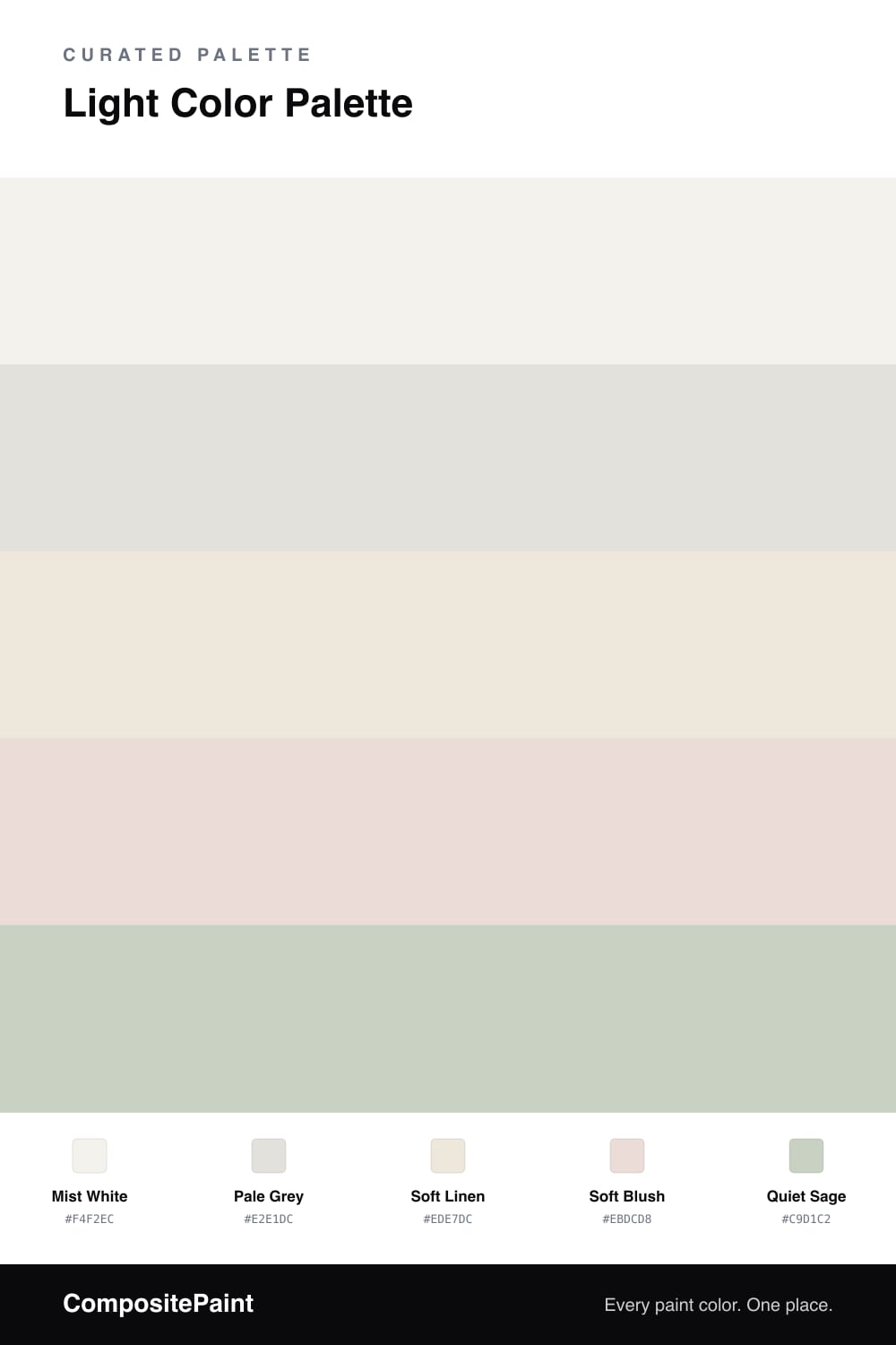
Light Color Palette — Morning Mist

A bright, airy five-color scheme of soft mist white, pale grey, and gentle blush with a quiet sage accent — every color matched to real paint you can buy.

By David Chen · Formulation Lead & Resident Chemist

Think of this scheme as morning light through a thin curtain. Mist White carries most of the room, and Pale Grey sits just a half-step behind it, the way fog sits behind a clear sky. Keeping them this close is what makes the whole space feel soft and unhurried.

Soft Linen warms things from the floor up, and Soft Blush adds the faintest pink that you feel more than you see. Both keep the cool tones from turning cold, which is the trick to a high-key palette that still feels like home.

For 2026 the move is one gentle accent instead of a bold one. Quiet Sage does that job here — a whisper of green on a shelf or a single door. Use it sparingly and the light does the rest.

View palette in
Mist White
Dominant
Behr Bit Of Sugar · PR-W14
#F4F2EC
LRV 89
Pale Grey
Secondary
Behr Silver Polish · BL-W13
#E2E2DE
LRV 76
Soft Linen
Base
Sherwin-Williams Futon · SW 7101
#EDE6DB
LRV 80
Soft Blush
Support
Benjamin Moore Strawberry Yogurt · 2104-70
#ECDCD9
LRV 74
Quiet Sage
Accent
Behr Mild Mint · PPU11-12
#C9D1C3
LRV 62

Buy These Colors

Each color matched to the closest real paint in every brand, by ΔE2000. Tap a swatch for its full guide or + to save it — take any SKU to the store, they mix on demand.

Mist White
#F4F2EC · LRV 89 · Dominant
Sherwin-Williams · SW 9541 · ΔE 0.62
Behr · PR-W14 · ΔE 0
Benjamin Moore · 879 · ΔE 0.81
Valspar · 8007-6E · ΔE 0.59
PPG / Glidden · PPG1001-1 · ΔE 1.59
Glidden · 61YY 89/040 · ΔE 1.5
Dutch Boy · 004W · ΔE 0.93
HGTV Home by Sherwin-Williams · HGSW 4002 · ΔE 1.35
Dunn-Edwards · DE6225 · ΔE 0.53
Magnolia Home · JG-107 · ΔE 0.8
Farrow & Ball · NO. 239 · ΔE 2.29
Diamond Vogel · 0411 · ΔE 1.18
Hirshfield's · 0411 · ΔE 1.53
Rodda · R001 · ΔE 1.56
C2 Paint · C2-612 · ΔE 0.79
Clare · PNT100-LT-24 · ΔE 2.84
Portola Paints · ORIGAMI · ΔE 1.12
Annie Sloan · OLD OCHRE · ΔE 13.96
Backdrop · BD-TR · ΔE 2.29
Rust-Oleum · 285140 · ΔE 4.18
Kompozit · 0411 · ΔE 1.53
Pale Grey
#E2E1DC · LRV 75 · Secondary
Sherwin-Williams · SW 9626 · ΔE 0.79
Behr · BL-W13 · ΔE 0.64
Benjamin Moore · 1590 · ΔE 1.66
Valspar · 7001-18 · ΔE 1.76
PPG / Glidden · PPG1009-1 · ΔE 1.2
Glidden · PPG1009-1 · ΔE 0.79
Dutch Boy · 406-1DB · ΔE 2.06
HGTV Home by Sherwin-Williams · HGSW 4059 · ΔE 1.9
Dunn-Edwards · DESS40 · ΔE 1.72
Magnolia Home · JG-119 · ΔE 1.65
Farrow & Ball · NO. 2001 · ΔE 0.65
Diamond Vogel · 0021 · ΔE 1.01
Hirshfield's · 0021 · ΔE 1.68
Rodda · CA027 · ΔE 1.2
C2 Paint · BD4 · ΔE 3.47
Clare · PNT100-LT-11 · ΔE 1.65
Portola Paints · GEM · ΔE 2.29
Annie Sloan · OLD OCHRE · ΔE 12.57
Backdrop · BD-CC · ΔE 7.75
Rust-Oleum · 285142 · ΔE 10.4
Kompozit · 0021 · ΔE 1.68
Soft Linen
#EDE7DC · LRV 80 · Base
Sherwin-Williams · SW 7101 · ΔE 0.53
Behr · HDC-MD-11 · ΔE 1
Benjamin Moore · 960 · ΔE 1.54
Valspar · 3008-10C · ΔE 0.57
PPG / Glidden · PPG1084-1 · ΔE 0.53
Glidden · PPG1074-1 · ΔE 1
Dutch Boy · 018W · ΔE 0.87
HGTV Home by Sherwin-Williams · HGSW 4075 · ΔE 0.56
Dunn-Edwards · DE6232 · ΔE 1.26
Magnolia Home · JG-23 · ΔE 0.9
Farrow & Ball · NO. CB9 · ΔE 1
Diamond Vogel · 0208 · ΔE 0.95
Hirshfield's · 0208 · ΔE 0.54
Rodda · CA014 · ΔE 1.48
C2 Paint · C2-964 · ΔE 1.04
Clare · PNT100-LT-62 · ΔE 3.05
Portola Paints · KASHMIR · ΔE 1.31
Annie Sloan · OLD OCHRE · ΔE 10.66
Backdrop · BD-JA · ΔE 2.21
Rust-Oleum · 329598 · ΔE 5.41
Kompozit · 0208 · ΔE 0.54
Soft Blush
#EBDCD8 · LRV 74 · Support
Sherwin-Williams · SW 6294 · ΔE 1.52
Behr · 760A-2 · ΔE 1.88
Benjamin Moore · 2104-70 · ΔE 0.73
Valspar · 1007-8C · ΔE 1.02
PPG / Glidden · PPG1061-2 · ΔE 1.52
Glidden · PPG1061-2 · ΔE 1.52
Dutch Boy · 404-1DB · ΔE 3.23
HGTV Home by Sherwin-Williams · HGSW 4067 · ΔE 3.88
Dunn-Edwards · DE6065 · ΔE 2.31
Magnolia Home · JG-108 · ΔE 6.37
Farrow & Ball · NO. 2006 · ΔE 4.31
Diamond Vogel · 0131 · ΔE 2.47
Hirshfield's · 0131 · ΔE 2.51
Rodda · R031 · ΔE 5.68
C2 Paint · BD4 · ΔE 4.71
Clare · PNT100-LT-25 · ΔE 1.24
Portola Paints · GEM · ΔE 7.35
Annie Sloan · OLD OCHRE · ΔE 12.14
Backdrop · BD-CC · ΔE 10.56
Rust-Oleum · 285142 · ΔE 4.36
Kompozit · 0131 · ΔE 2.51
Quiet Sage
#C9D1C2 · LRV 62 · Accent
Sherwin-Williams · SW 59 · ΔE 1.37
Behr · PPU11-12 · ΔE 0.4
Benjamin Moore · 471 · ΔE 0.88
Valspar · T646 · ΔE 0.54
PPG / Glidden · PPG10-31 · ΔE 2.23
Glidden · PPG1124-3 · ΔE 0.95
Dutch Boy · 329-1DB · ΔE 1.22
HGTV Home by Sherwin-Williams · HGSW 3247 · ΔE 3.49
Dunn-Edwards · DE6283 · ΔE 0.87
Magnolia Home · JG-13 · ΔE 2.61
Farrow & Ball · NO. 9814 · ΔE 2.89
Diamond Vogel · 0455 · ΔE 1.52
Hirshfield's · 0454 · ΔE 1.45
Rodda · CA187 · ΔE 6.15
C2 Paint · C2-930 · ΔE 3.51
Clare · PNT100-MD-47 · ΔE 1.46
Portola Paints · FIGUEROA · ΔE 6.41
Annie Sloan · OLD OCHRE · ΔE 13.32
Backdrop · BD-RR · ΔE 6.81
Rust-Oleum · 285142 · ΔE 17.42
Kompozit · 0454 · ΔE 1.45

Questions

Why do these light colors work together?

They all share a soft, hazy quality and sit close in brightness, so nothing jumps out. Because the contrast stays gentle, the room reads calm and open rather than busy.

How do I keep an all-light room from feeling flat?

Vary the texture and the warmth. Let the cool grey and warm linen take turns, then add the sage accent in one spot so the eye has a soft place to land.

KEEP EXPLORING

Similar Palettes

Closest schemes by color — not by label.