CP

Light Color Palette — Light Birch

A soft, airy five-color scheme of pale birch, warm linen, and the faintest blush, kept low-contrast and bright — every color matched to real paint you can buy.

By Jessica Williams · Color Stylist & Interior Editor

Birch White
Dominant
Kompozit Cyprus Spring · 0411
#F2F2EA
LRV 88
Warm Linen
Secondary
Kompozit Bleached Meadow · 0376
#EAE5D5
LRV 78
Pale Oat
Base
Kompozit Sedona · 0334
#E7E0CF
LRV 75
Soft Mist
Support
Kompozit Dream Catcher · 0481
#DAE4DC
LRV 76
Faint Blush
Accent
Kompozit Truffles · 0146
#EAD7CD
LRV 71
View palette in

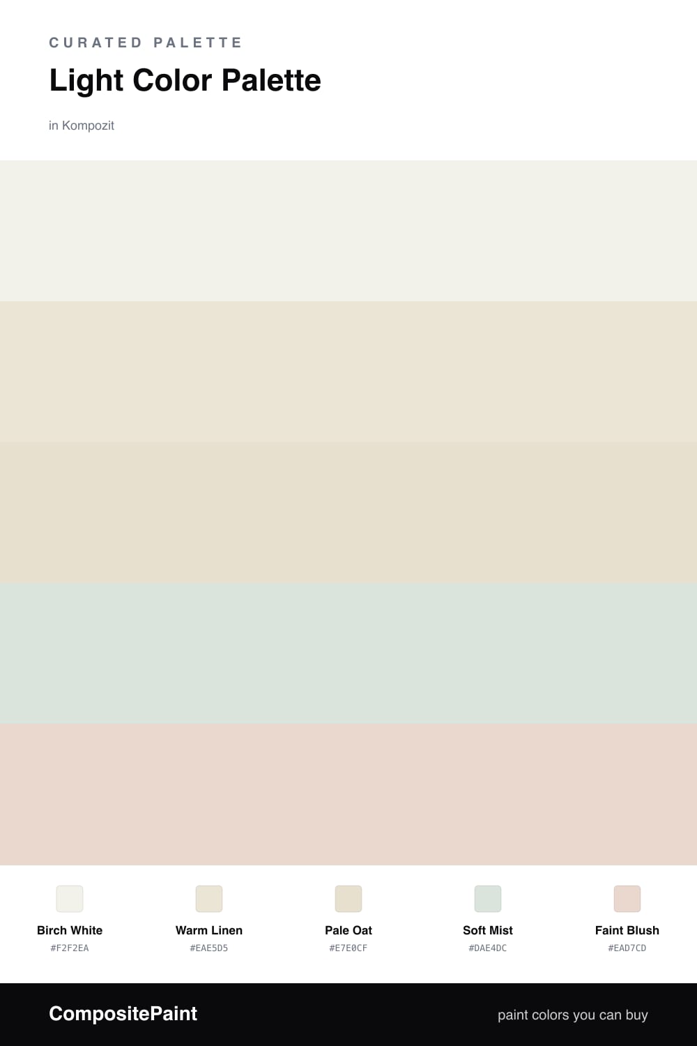
This is a palette that breathes. Birch White carries most of the space, warm enough to feel cozy and never clinical, while Warm Linen layers in just under it like afternoon light settling on a wall.

Pale Oat grounds the scheme with a soft, papery base, and Soft Mist slips in a quiet cool note so the whole thing does not read too creamy. Together they keep everything calm and bright at once.

The spark here is gentle — a Faint Blush in a cushion, a ceramic piece, or a single painted edge. In 2026 this kind of high-key, low-contrast room feels especially right — restful, unforced, and easy to live in for years.

Buy These Colors

Each color matched to the closest real paint in every brand, by ΔE2000. Kompozit first; take any SKU to the store — these mix on demand.

Birch White
#F4F1E9 · LRV 88 · Dominant
Kompozit Cyprus Spring · 0411 ΔE 1.48
Backdrop Tabula Rasa · BD-TR ΔE 1.56
Behr Solid Opal · BWC-06 ΔE 1.9
Benjamin Moore Gardenia · AF-10 ΔE 0.51
Clare Wing It · PNT100-LT-24 ΔE 2.68
Dunn-Edwards Wishful White · DE6260 ΔE 0.46
Farrow & Ball Wimborne White · No. 239 ΔE 1.35
Magnolia Home Silos White · JG-107 ΔE 0.73
PPG / Glidden Crumb Cookie · 18-01 ΔE 1.19
Sherwin-Williams White Flour · SW 7102 ΔE 1.18
Valspar Crisp Cotton · 7007-4 ΔE 1.05
Warm Linen
#EDE6D6 · LRV 79 · Secondary
Kompozit Bleached Meadow · 0376 ΔE 1.03
Backdrop Don't Eat the Yellow Snow · BD-DS ΔE 3.01
Behr Rye Flour · HDC-FL13-5 ΔE 1.8
Benjamin Moore White Down · 970 ΔE 0.93
Clare Like Buttah · PNT100-LT-62 ΔE 1.8
Dunn-Edwards Antique White · DEW351 ΔE 0.74
Farrow & Ball Dimity · No. 2008 ΔE 2.01
Magnolia Home Carter Crème · JG-16 ΔE 0.82
PPG / Glidden Little Lamb · 1112-1 ΔE 1.4
Sherwin-Williams Ivory Lace · SW 7013 ΔE 1.28
Valspar Double Scoop · V176 ΔE 0.98
Pale Oat
#E6DFCC · LRV 74 · Base
Kompozit Sedona · 0334 ΔE 0.84
Backdrop Cookies & Cream · BD-CC ΔE 1.92
Behr Canvas Luggage · N300-2 ΔE 0.93
Benjamin Moore Natural Wicker · 950 ΔE 0.92
Clare No Filter · PNT100-LT-19 ΔE 2.14
Dunn-Edwards Stucco Tan · DE6205 ΔE 2.23
Farrow & Ball Lime White · No. 1 ΔE 1.38
Magnolia Home Castle Cream · JG-153 ΔE 1.46
PPG / Glidden Vanilla Love · 1099-2 ΔE 0.72
Sherwin-Williams Polar Bear · SW 7564 ΔE 1
Valspar Dream Grass · 8003-27A ΔE 1.8
Soft Mist
#DCE2DD · LRV 75 · Support
Kompozit Dream Catcher · 0481 ΔE 2.35
Backdrop Cookies & Cream · BD-CC ΔE 9.18
Behr Frostproof · QE-41 ΔE 1.01
Benjamin Moore Horizon · 1478 ΔE 1.81
Clare Headspace · PNT100-LT-34 ΔE 2.91
Dunn-Edwards Fizzle · DE5715 ΔE 2.61
Farrow & Ball Strong White · No. 2001 ΔE 5.41
Magnolia Home Chime Gray · JG-119 ΔE 2.37
PPG / Glidden Inverness Gray · 1012-2 ΔE 1.99
Sherwin-Williams Quicksilver · SW 6245 ΔE 1.65
Valspar Seven Sisters · 8004-33A ΔE 0.99
Faint Blush
#E8D9D2 · LRV 71 · Accent
Kompozit Truffles · 0146 ΔE 1.78
Backdrop Cookies & Cream · BD-CC ΔE 9.07
Behr Vienna Lace · PPU17-07 ΔE 1.69
Benjamin Moore Wild Aster · 1240 ΔE 1.01
Clare No Filter · PNT100-LT-19 ΔE 7.28
Dunn-Edwards Gallery Gray · DE6072 ΔE 1.24
Farrow & Ball Great White · No. 2006 ΔE 2.88
Magnolia Home Soft Linen · JG-108 ΔE 5.27
PPG / Glidden Sandy Beach · 1072-2 ΔE 0.54
Sherwin-Williams Hush White · SW 6042 ΔE 1.63
Valspar Sheer Blouse · T554 ΔE 1.4

Questions

Why does such a low-contrast palette still feel interesting?

The shifts are tiny but real — a touch of warmth in the linen, a cool breath in the mist, a hint of blush in the corner. Your eye reads the subtle temperature changes even when the values stay close, so the room feels layered instead of flat.

How do I keep light colors like these from looking washed out?

Lean on texture and natural light. Soft plaster, raw wood, and a little greenery give these pale tones something to play against, and good daylight keeps them looking fresh rather than chalky.

Similar Palettes

Closest schemes by color — not by label.