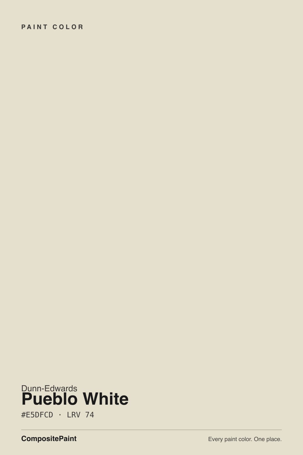
Pueblo White
Dunn-Edwards' historically accurate beige-cream, reviewed honestly: the Calabasas office Amber Lewis painted, the crisp trim that dirties it, and why four walls never pass as white.

Jessica has spec'd whites and neutrals for more than 300 rooms and keeps a sample wall of painted drawdowns in her studio. Every color review is checked against real reader rooms in the comments and re-tested when a formula changes. About the testing process →
- 1Agreeable Gray60
- 2Pale Oak69
- 3Pueblo White74
- 4Dover White83
- 5Moonlit Beach88
The Fast Verdict
Pueblo White is a creamy beige wearing a white name. At LRV 74 it has real body: yellow-beige, low chroma, enough pigment that four walls read as a finished cream, not paper. Dunn-Edwards files DET675 in the Historically Accurate half of Then, Now & Forever — a Western-architecture cream, not a gallery white — and Amber Lewis ran it on walls and ceilings through her Calabasas office with Heather on the millwork. Give it oak, plaster, and no brighter white next to it, and it behaves. Buy it hoping for white and you will see beige on the first dry wall.
Western living rooms and whole-house walls in real daylight · offices and kitchens with oak and brass · stucco that wants historically accurate cream-beige · anyone who actually wants beige-cream, not a gallery white
You actually want a white · trim is staying White Picket Fence, Warm White, or leftover builder-bright · cool grey marble, grey LVP, or cool LEDs · a dim north room with no lamps
- Honest cream-beige at LRV 74 — holds as a color instead of washing out
- Historically Accurate Western job: stucco, plaster, oak, and the Calabasas-office pairing
- Flatters oak, walnut, Saltillo, brass — every warm wood and metal
- One-color rooms work if you keep crisp whites off the millwork
- Cabinets hide scuffs better than Whisper, White Picket Fence, or any gallery white
- Not a white — buyers expecting white see beige by the second wall
- Reads dirty next to White Picket Fence, Warm White, or leftover builder trim
- West afternoon sun and cool LEDs pull the yellow-beige all the way forward
- Dim north light turns it drab, dirty-laundry cream
What Color Is Pueblo White, Really?
A soft creamy beige-white, not a white — the name is the whole trap. Dunn-Edwards files DET675 in the Historically Accurate group of the Then, Now & Forever collection, the 142 hues Architectural Resources Group signed off as Western-architecture colors, and measures it at Munsell 4.2Y, value 8.8, chroma 1.2: yellow-family, low saturation, high value. That chroma is not a whisper. Official copy calls the undertone beige and points the color at natural stone, warm woods, and handcrafted finishes. It is a workhorse at Western DE counters, not a Color of the Year and not a national default. Confirm the can says Dunn-Edwards DET675.
At LRV 74 it sits in the same neighborhood as Sherwin-Williams Shoji White and White Duck, nine points under Dunn-Edwards Swiss Coffee (LRV 83), thirteen under Whisper (LRV 87), and a full nineteen under Warm White (LRV 93). Navajo White in this deck is four points deeper at LRV 70 and a half-step more yellow. That gap is the useful part. On a wall Pueblo White holds enough beige-cream to soften shadows and flatter oak; on millwork it reads as painted woodwork rather than plastic-bright. On four walls next to a real white, the same number is the risk, because the field looks unwashed. On a chip it looks like a soft white. On a wall it looks like cream-beige.
Undertone in one line: warm yellow-beige first, cream second — never pink, never grayed enough to pass as a quiet white in strong sun. In even south or east daylight it reads as a finished cream. In west sun after about four o'clock the yellow comes forward. If your sample looks dingy, the light is cool or a brighter white is sitting next to it. If it looks buttery, that is the paint being honest about the hour. Both versions are the same can.
Where It Shines
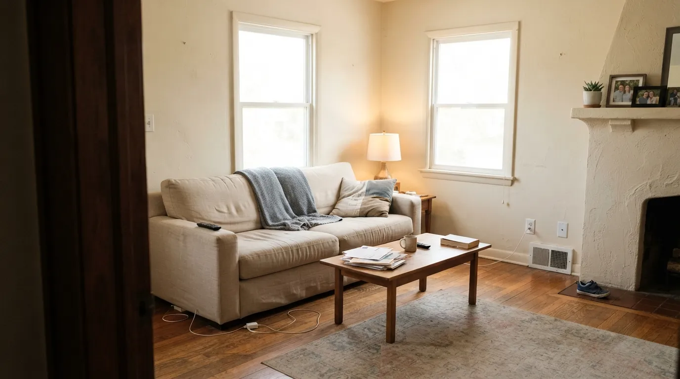
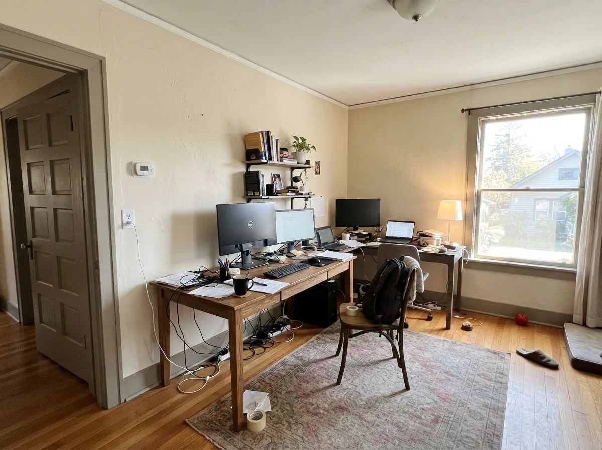
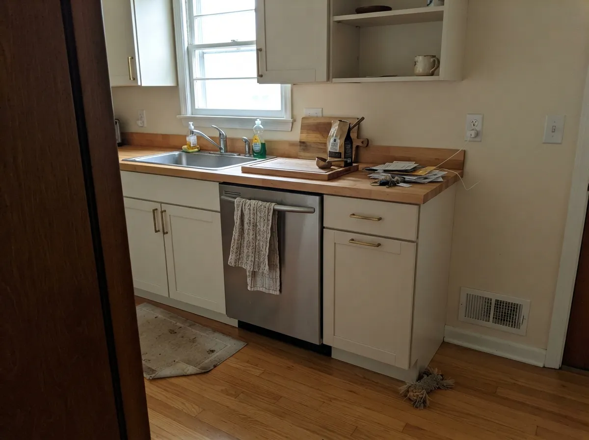
Give it real daylight, warm wood, and no brighter white in the room, and it does the job a historically accurate cream is hired for. Open living rooms with oak, plaster, and Saltillo; whole-house walls that should feel original instead of freshly painted. Amber Lewis put it on walls and ceilings through the Calabasas Amber Interiors office and parked Heather on the doors and millwork — that is the profile, not a magazine launch: cream field, deeper weathered-gray woodwork, no crisp white cutting the edge. Kitchens are the second home when the counters are warm: satin on cabinets hides knuckle marks a gallery white would broadcast, and unlacquered brass sits comfortably against the beige.
Where It Fails
Almost every regret about this color follows one of three scripts, and all three are visible on a large sample before the first gallon. None of them are a bad batch — but if your room matches one, this is not your white, and a second coat will not fix it.
The name is doing the damage. On the chip it can pass for a warm off-white. On four walls at LRV 74 the yellow-beige is unmistakable — this is a light cream-beige, closer in depth to Shoji White than to Whisper. If your goal was a white that still reads white, this is the wrong can. Whisper is Dunn-Edwards' White Dove analog; Swiss Coffee is the Southwest's default cream-white. This one is pueblo-colored.
The pairing Dunn-Edwards prints on the color page is the trap: Pueblo White walls, White Picket Fence on the millwork. White Picket Fence is the crisp workhorse white in this deck at LRV 87 — thirteen points brighter, and it wins the comparison. Pueblo White looks yellowed, dingy, slightly unwashed. Warm White (LRV 93) and leftover builder enamel do the same trick. The fix is the trim, not a second coat: Pueblo White itself in semi-gloss, or Heather (the Amber Lewis move) so the millwork steps down instead of up. If the builder white has to stay, do not use this cream.
Carrara-look quartz, grey LVP, and 4000K bulbs sit at the opposite temperature and shove the yellow-beige forward until the wall reads sour cream. Warm rugs will not rescue a whole-room clash. With cool floors or cool lamps, pick a true white — Whisper in this deck, or Chantilly Lace if you are crossing brands — and let the floor be the soft one.
Room by Room
With oak or walnut, plaster, and even south or east light it is the calm cream-beige those rooms were built around. Eggshell on the walls; same color on trim in semi-gloss, or Heather if you want the millwork a step deeper the way the Calabasas office did. A west glass wall is the 4 p.m. test, not a given.
Warm counters, brass, butcher block, terracotta — all of it loves this cream. Satin Pueblo White on shaker doors wipes clean and hides knuckle marks a brighter white would broadcast. Cool white quartz or blue-grey tile will make the boxes look more yellow by contrast — sample against the actual slab. Urethane-fortified cabinet enamel either way.
Amber Lewis ran DET675 on walls and ceilings through the Calabasas office and used Heather on doors, partitions, and millwork. That pairing is the whole lesson: keep the field creamy and the woodwork a weathered step down, not a crisp step up. Eggshell on the walls; the same color in flat on the ceiling. Real daylight is non-negotiable.
Filtered daylight and 2700K bulbs hold the cream to a glow instead of a butter wall. Eggshell; same color in semi-gloss on the millwork. Crisp white linens will make the walls look more beige than they are — stay on cream or oatmeal bedding. If the bedroom faces north and stays dim, step up to Whisper or Swiss Coffee instead.
This is a real exterior cream, unlike several of the lighter whites in the same deck. Full sun washes it brighter and a little cleaner than the indoor read, which is what you want on a Spanish, Mission, or desert-ranch body. Pair it with Sage Brush on the door and a dark trim (Iron Ore) so LRV 74 does not look unfinished from the street. Walk the shady north elevation with a sample — that side will read a full step creamier.
Semi-gloss Pueblo White under mid-tone sage, greige, or stucco-tan reads as classic painted woodwork, not a bright cut line. Do not use it as trim under a cool gray or a crisp white wall — that is where the beige looks like discoloration. One-color houses work: Pueblo White walls in eggshell, the same formula in semi-gloss on the woodwork. Heather on the casings is the pairing to sample and usually keep. White Picket Fence on the casings is the pairing to sample and usually decline.
Your Light Is the Risk
The cream-beige settles and still bounces. This is the light the historically accurate collection was mixed for — warm, finished, clearly not white.
Cool grey daylight strips the warmth and leaves a drab beige that readers of every cream at this depth call dingy. Test first, or pick Whisper.
Low warm sun pulls the 4.2Y hue forward and the wall goes distinctly yellow-cream for an hour. Sample a big board on that wall at 4 p.m. before you buy gallons.
2700K bulbs: creamier, cozier, the bedroom version. Cool white LEDs: the beige reads dirty — swap bulbs, not paint.
Most complaints about Pueblo White are a light mismatch. Upload a photo of your actual room and see it on your walls — then ask for the same wall in north light or evening lamps before you buy a single sample.
Need It From Another Brand?
Any paint counter can custom-tint Dunn-Edwards DET675 directly. If you would rather stay in one brand's own deck, these are the closest stock matches, measured as ΔE2000. Under 2 is a difference you will not see on the wall.
| Brand | Closest color | ΔE | LRV | |
|---|---|---|---|---|
| Sherwin-Williams | ArrowrooteSW 9502 · Sherwin-Williams | 1.2 | 73 | Color page → |
| Behr | Confident WhiteGR-W12 · Behr | 0.5 | 74 | Color page → |
| Benjamin Moore | Maritime White963 · Benjamin Moore | 1.1 | 72 | Color page → |
| Valspar | Dream Grass8003-27A · Valspar | 1.7 | 74 | Color page → |
| PPG / Glidden | Wright Oyster ShellFLLW999 · PPG / Glidden | 0.8 | 74 | Color page → |
| Glidden | Vanilla LovePPG1099-2 · Glidden | 0.8 | 74 | Color page → |
Similar Dunn-Edwards Colors
The nearest shades to Pueblo White within Dunn-Edwards's own range, ranked by perceptual color distance — useful when you want the same look a touch lighter, darker, or warmer.
WCAG 2.1: AA is 4.5 : 1 for normal text, 3 : 1 for large text, AAA is 7 : 1.
Pueblo White vs the Colors You're Also Considering
Every Pueblo White sample board has the same rivals on it. The numbers show the real lightness gap — then it comes down to which risk you would rather live with.
Pick this when you want the beige-cream, not the greige, and your painter is already in Dunn-Edwards.
Sherwin-Williams SW 7042 · LRV 74Shoji WhitePick this if you want the same depth with less yellow — Shoji is the greige at LRV 74, beautiful in daylight and moodier after dark.
Pick this when Whisper feels too clean and you want the cream body to show.
Dunn-Edwards DEW340 · LRV 87WhisperPick this if you actually want a white — Dunn-Edwards' White Dove analog, thirteen points brighter and grayed enough to stay white.
Pueblo White Coordinating Colors
The rule for coordinating with Pueblo White: stay on the warm side, and keep every brighter true white at arm's length. It flatters weathered greiges, dusty sages, deep navies, and warm woods — and it argues with icy blues, cool greys, and the crisp millwork DE itself suggests. These are the partners that keep showing up in rooms that work:
Then, Now & Forever: The Historically Accurate Cream
Pueblo White is not a trend white. Dunn-Edwards put DET675 in the Historically Accurate half of Then, Now & Forever — 142 colors inspired by the architecture of the American West and verified by Architectural Resources Group, a preservation firm — which is why it keeps showing up on Spanish, Mission, and desert-ranch bodies rather than on Pinterest mood boards. The brand's own page calls it a soft creamy white with beige undertones and points it at stone, warm wood, and handcrafted finishes. That is the job, not a gallery wall.
The closest thing it has to a famous room is recent and specific: Amber Lewis painted the walls and ceilings of the Calabasas Amber Interiors office in DET675 and the doors, partitions, and millwork in Heather. She described it as a perfectly creamy white with a warm, inviting softness, then built the whole office on that cream field plus texture. That is a designer using a Western workhorse, not a national launch. Honest obscurity is the rest of the story, and that is fine — the color does not need a campaign to earn a stucco house.
Pueblo White With Wood Tones and Floors
Warm wood loves it. Oak — red, white, honey — walnut, butcher block, cedar, and Saltillo all sit comfortably against Pueblo White because the beige-cream meets them halfway. If your floors are orange-leaning builder oak, this is one of the few off-whites that softens the orange instead of amplifying it. Terracotta, plaster, and unlacquered brass are its natural company.
The flooring that needs a sample first is cool grey LVP or grey-washed wood. Grey floors pull the yellow-beige into relief, and the wall can read slightly sour against them. Carrara-look quartz does the same trick on a kitchen. It is not always a dealbreaker — a large rug and brass hardware fix it in most rooms — but test a big sample above the actual floor and against the actual slab before painting the whole house.
Metals are the easy part: unlacquered brass, antique bronze, and matte black all work. Polished chrome is the one that leans cold against it. And the trim decision is made at the can, not the hardware aisle: White Picket Fence and Warm White will name the beige; Heather or a one-color sheen change will not.
Three Ready Palettes Built on Pueblo White
A color is never alone on the wall. These are complete combinations in the 60-30-10 pattern, with the reason each one holds together. Every one opens in the visualizer.
This is the pairing Amber Lewis actually used: Pueblo White on the field, Heather on the millwork so the woodwork steps down instead of snapping up. Hale Navy is the single dark note the scheme needs, and it stays navy as long as the room has light. Keep crisp whites off the casings.
Try this palette in your roomThen, Now & Forever was mixed for Western architecture, and this is that house: cream-beige stucco, a dusty sage door, and a near-black frame so LRV 74 reads finished from the street. Iron Ore is the best black for a whole house if you respect LRV 6 — do not wash it out with a bright trim white.
Try this palette in your roomSwiss Coffee is the warmest Swiss Coffee of the bunch and the Southwest's default, so the field stays lighter and the boxes stay cream, not beige-on-beige. Satin Pueblo White hides knuckle marks; Hale Navy is the one dark plane. Keep the counters warm — cool quartz will yellow the cabinets.
Try this palette in your roomPueblo White FAQ
Is Dunn-Edwards Pueblo White actually white?
No. At LRV 74 it is a yellow-beige cream. The name is inherited, not a description. On four walls nobody will call it white unless the rest of the house is tan. If you want a white in this deck, that is Whisper (LRV 87) or Swiss Coffee (LRV 83).
What trim color goes with Pueblo White walls?
Pueblo White itself in semi-gloss, or Heather if you want the millwork a step deeper — that is the Calabasas-office pairing. A brighter trim white is the most common mistake: White Picket Fence is the coordinating trim on the DE color page, and it is a crisp workhorse white at LRV 87 that makes the walls look dingy. Warm White (LRV 93) does the same trick. Sample Heather or stay one-color.
How is it different from Navajo White in the same deck?
Same family, different depth. Navajo White (DEC772) sits at LRV 70 and is the deeper, more clearly yellow-beige HOA-stucco workhorse. Pueblo White is four points lighter at LRV 74, slightly quieter, and filed as Historically Accurate rather than Classics. Do not treat them as interchangeable — sample both on the same wall at 4 p.m.
Is it good for kitchen cabinets?
Yes, if the counters are warm. Satin Pueblo White on shaker doors flatters butcher block, oak, and unlacquered brass, and it hides scuffs better than Whisper or White Picket Fence. Cool white quartz or grey tile will make the boxes look more yellow. Use a urethane-fortified cabinet enamel.
Does it work on exteriors?
Yes — it is a real stucco cream in a collection built for Western architecture. Expect it to read brighter and a touch cleaner in full sun than indoors. Pair it with Sage Brush or another dusty green on the door and a dark trim (Iron Ore), and walk the shaded north side with a sample before you commit. Do not frame it with White Picket Fence on a shady elevation.
Will it look yellow in west light?
For about an hour in the late afternoon, yes. The hue is 4.2Y, so low western sun pulls the yellow-beige forward. Most people who wanted cream like the shift; if yellow is your dealbreaker, test a big board on that wall at 4 p.m. before you buy gallons. Cool LEDs do a meaner version of the same trick after dark.
Have you painted with Pueblo White?
Rate it — one tap helps the next reader decide.
Ask a Question