Headspace
The airy teal-mint Clare owners keep expanding to the next room, reviewed honestly: where it goes spa, where it goes candy, and what to pick instead.

Jessica has spec'd whites and neutrals for more than 300 rooms and keeps a sample wall of painted drawdowns in her studio. Every color review is checked against real reader rooms in the comments and re-tested when a formula changes. About the testing process →
- 1Heirloom Shade63
- 2First Star69
- 3Headspace74
- 4Alabaster82
- 5Chantilly Lace91
The Fast Verdict
Headspace is the light spa blue-green Clare owners fall for on a swatch and then keep buying: bedrooms, bathrooms, a dining room that quietly becomes the foyer and the stairs. In daylight it reads teal; under warm lamps it goes mint. That shift is the whole color. If you can live with both versions — and you are not secretly shopping for a gray-green — it is one of the easiest calm colors in the Clare deck.
Bedrooms and bathrooms with real daylight · dining rooms, foyers and stairs · south- and east-facing rooms · anyone who wants spa calm without going gray
You wanted a true blue with no mint in it · honey-oak floors are staying · the room runs on warm lamps and little daylight · you actually wanted a gray-green like Sea Salt
- Light enough (LRV 74) to keep rooms airy while still reading as color
- Teal in daylight, spa-calm in bathrooms and bedrooms
- Clare bestseller with unusually consistent owner love
- Covers well and pairs cleanly with cool whites
- The teal-to-mint shift is readable — most owners like both
- Too mint for people who sampled it as a blue
- Warm lamps and west sun pull the green hard
- Fights honey oak and orange wood
- Will not pass as a gray-green neutral
What Color Is Headspace, Really?
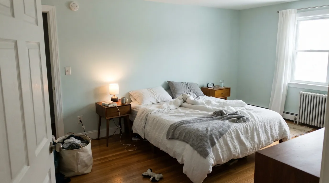
A soft, airy blue-green that sits right on the line between teal and mint — not a gray, not a white, not a black. On the chip it can look almost like a tinted pale, which is how people talk themselves into it for a whole room. On four walls it is clearly a color: spa in a tiled bath, fresh in a bedroom, a little more present than the card promised. Clare has sold it as a bestseller and fan-favorite for years, and the owner photos match the pitch more often than they don't.
At LRV 74 it is genuinely light. Sea Salt sits at 63, Palladian Blue at 60, Rainwashed at 59 — Headspace is a full step airier than the famous spa cousins, which is why it keeps small bathrooms and guest rooms from closing in. That lightness is also why it never passes as a greige. Put it next to Snow Day and you see body; put it next to a mid-tone sage and it reads like a cool wash of water. It reflects enough light to brighten a room while still holding a blue-green you can name.
Undertone in one line: cool blue-green — teal in daylight, mint in warmth, never gray. If your sample looks gray, you are looking at a different color. If it looks candy-mint, that is west sun or 2700K bulbs doing exactly what this paint does. Both reads are the same can being honest about the room.
Where It Shines
Give it daylight and a cool white and it is the spa color people keep photographing. Bathrooms with white tile and chrome or brushed nickel are its easiest win; bedrooms with linen, pale oak and a real window are the second. One owner started in the dining room, waited six months, and ran it up the foyer and stairs because it felt joyful without taking over the house — that is the typical good story. Designers have used it on an accent ceiling when they wanted airy blue-green overhead instead of another white. Pair it with Snow Day trim, light wood, and simple metals and it looks finished rather than themed.
Where It Fails
Almost every shrug or return on Headspace follows one of three scripts, and all three are visible on a big sample before you open a gallon. None of them are a bad batch — but if your room matches one, this is not your color, and a second coat will not mint-correct it.
The honest 4-star review is one line: great paint, color too minty. In warm or low light the green comes forward and the spa teal you fell for on a noon swatch turns toothpaste. If mint is a dealbreaker, do not buy this hoping daylight will save a lamp-lit room — test it at 7pm on the actual wall.
Yellow-orange sits across the wheel from blue-green, so honey oak floors, orange builder trim and golden vanities all push Headspace toward mint while the wood goes more orange. Both sides lose. Pale white oak, walnut, painted wood and a big rug are the fixes; wall-to-wall honey oak is the reason to pick a greige instead.
No real daylight plus 2700K lamps is the mint machine. The teal never shows up, the walls read candy-green, and owners who sampled it by a window feel bait-and-switched. Cooler LEDs keep more teal but can go a little hospital. If the room is a cave, this is the wrong light color — you wanted depth, not a pale mint wash.
Room by Room
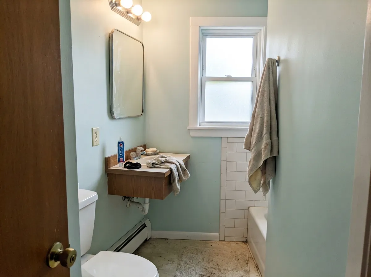
White tile, a window, and Headspace is the spa bath people mean when they say spa bath. Eggshell on the walls, semi-gloss on the trim and the door. Chrome, nickel and unlacquered brass all work; honey-oak vanities are the one argument. Powder rooms without a window need a sample under the actual bulbs first.
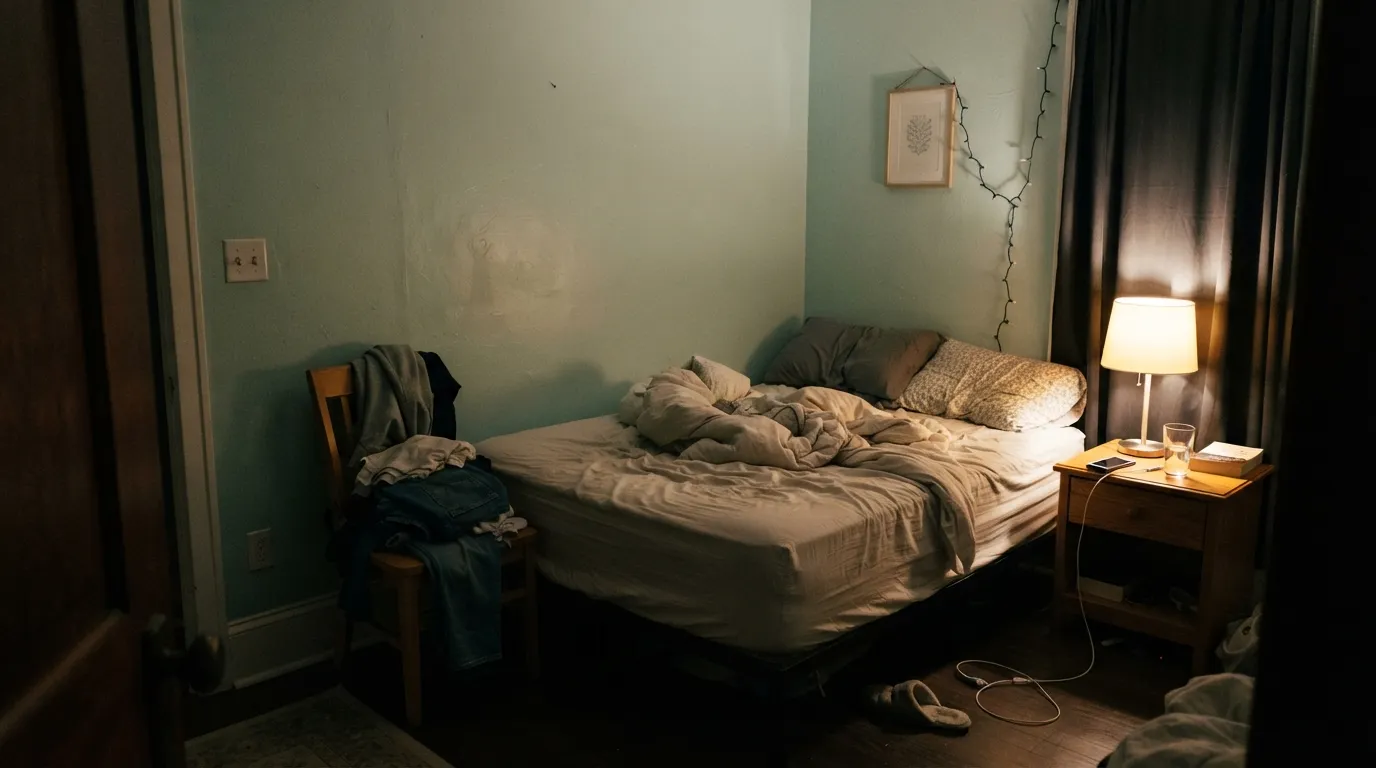
A guest room is how a lot of people meet it, and the color earns the stay: calm in the morning, a little mintier under the lamp at night, never loud. South or east light is the easy version. A north bedroom will keep more teal but can feel flat unless you add a warm lamp on purpose and like the mint that comes with it.
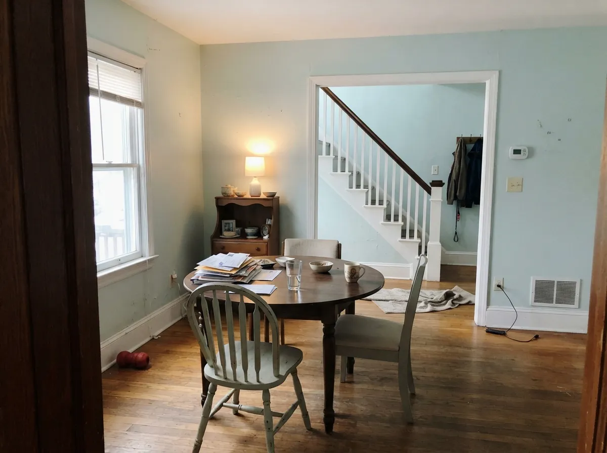
This is the room-to-room test it keeps passing. Light enough to run a hall and a stair without closing the volume, present enough that the dining room does not look unfinished. Eggshell on walls, the same color in semi-gloss on the stair rail if you want one-color quiet. A navy or slate door at the entry keeps it from going too sweet.
Beautiful in a south-facing living room with linen, pale oak and a cool white trim. Riskier in an open plan that dumps into a honey-oak kitchen, where the mint will pick a fight with the cabinets. If the living room is the darkest room in the house, sample after dark before you commit the whole floor.
A Headspace island under Snow Day walls is a coastal wink; a full kitchen of mint-teal cabinets is a 1950s commitment, and it only works with white or pale-wood boxes, not orange oak. Semi-gloss on anything that gets wiped. If the backsplash is warm cream, test — the wall will read greener against it.
This is an interior color. Full sun would bleach an already-light blue-green toward mint siding, and Clare sells Headspace as wall and trim paint for inside. The one almost-exterior move is a porch ceiling in a related spa tone; do not put Headspace on the body of the house.
Your Light Is the Risk
Bright natural light keeps the cool undertone forward: a clear, crisp blue-green with the teal quality the swatch promised. This is the spa read.
Dim rooms and warm light drop the teal and leave mint. If the room lives on lamps from late afternoon on, you are buying the green version.
The color moves. Morning and midday hold more teal; late-day west sun flushes the green. Most owners like the change — sample at 6pm if you do not.
2700K lamps: mintier, softer, sometimes too sweet. Cool white LEDs: sharper teal, a little clinical. Swap bulbs before you repaint.
Most complaints about Headspace are a light mismatch. Upload a photo of your actual room and see it on your walls — then ask for the same wall in north light or evening lamps before you buy a single sample.
Need It From Another Brand?
Any paint counter can custom-tint Clare PNT100-LT-34 directly. If you would rather stay in one brand's own deck, these are the closest stock matches, measured as ΔE2000. Under 2 is a difference you will not see on the wall.
| Brand | Closest color | ΔE | LRV | |
|---|---|---|---|---|
| Sherwin-Williams | DewySW 6469 · Sherwin-Williams | 1.9 | 73 | Color page → |
| Behr | Sterling780E-3 · Behr | 0.0 | 74 | Color page → |
| Benjamin Moore | Ewing BlueCW-585 · Benjamin Moore | 2.1 | 73 | Color page → |
| Valspar | Cool Tide8004-35A · Valspar | 1.0 | 73 | Color page → |
| PPG / Glidden | Morning BreezePPG1136-3 · PPG / Glidden | 0.6 | 74 | Color page → |
| Glidden | Morning BreezePPG1136-3 · Glidden | 0.4 | 74 | Color page → |
Similar Clare Colors
The nearest shades to Headspace within Clare's own range, ranked by perceptual color distance — useful when you want the same look a touch lighter, darker, or warmer.
WCAG 2.1: AA is 4.5 : 1 for normal text, 3 : 1 for large text, AAA is 7 : 1.
Headspace vs the Colors You're Also Considering
Every Headspace sample board has the same rivals on it. The numbers show the real lightness gap — then it comes down to which risk you would rather live with.
Pick this when you want a clearer blue-green that never pretends to be gray.
Sherwin-Williams SW 6204 · LRV 63Sea SaltPick this if you want the famous gray-green that can still pass as a soft neutral when the light agrees with it.
Pick this for the lighter, airier, more mint-teal version of the same spa idea.
Benjamin Moore HC-144 · LRV 60Palladian BluePick this if your painter is already in Benjamin Moore and you want more body — it is the best-behaved spa color in that deck, if you accept the green.
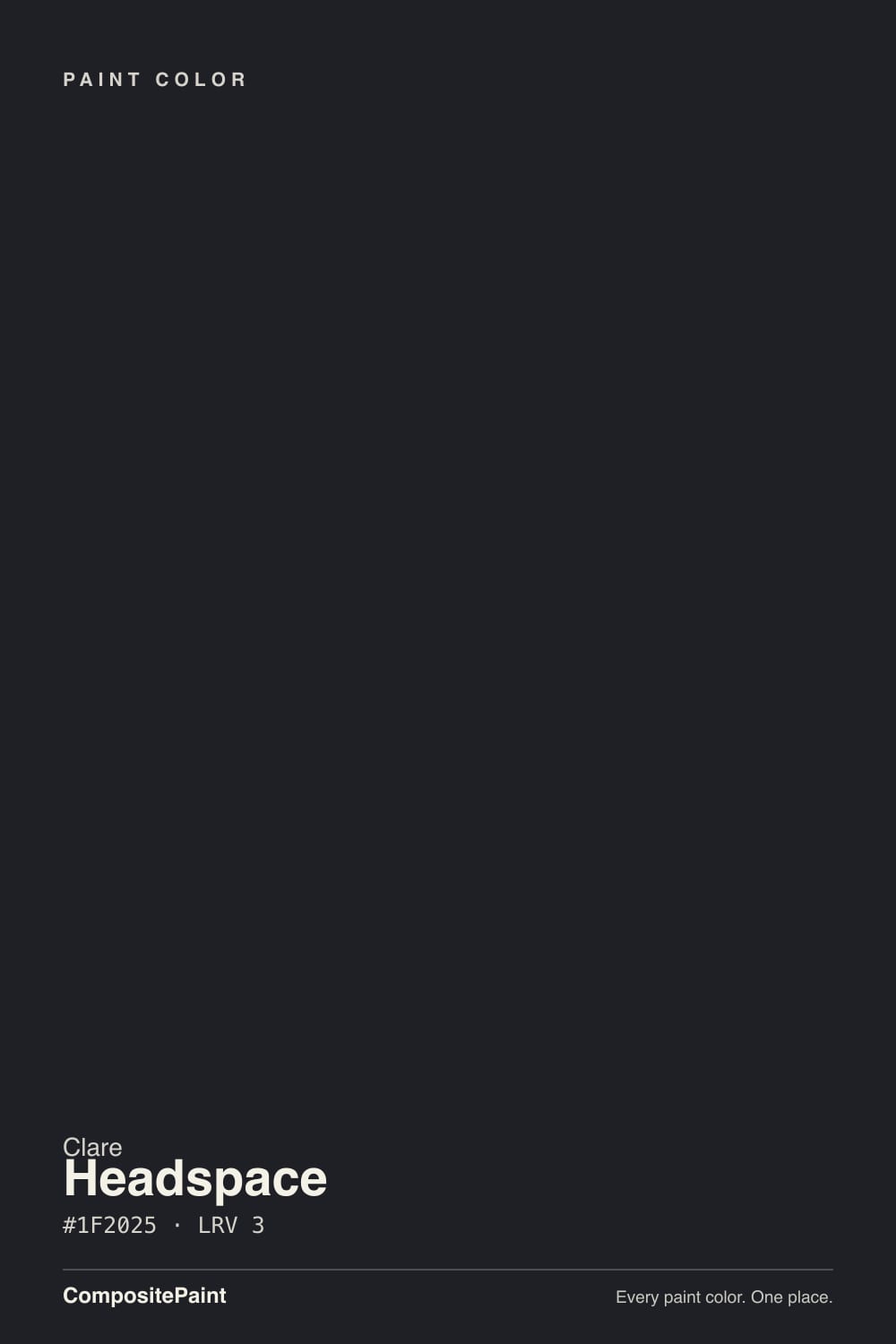
Clare's other dark neutrals are lighter and read more as very deep grays than as true black. Blackish (PNT100-DP-54) at LRV 6 and Blackest (PNT100-DP-55) at LRV 8 both sit a step or two up the scale from Headspace's LRV 3. On a door or cabinet, that gap means Blackish and Blackest hold a little more visible gray in daylight and never fully disappear into black the way Headspace does.
Goodnight Moon (PNT100-DP-42) at LRV 11 is different again: it is clearly a dark shade rather than a black, so it shows more color and more light movement across the day.
Choose Headspace when you want the darkest, cleanest black and maximum contrast. Choose Blackish or Blackest when you want a black-adjacent look that stays a touch softer and lets a hint of gray show. Reserve Goodnight Moon for when you actually want to read a deep tone, not black.
Headspace Coordinating Colors
The rule for coordinating with Headspace: stay cool at the edges and let one darker slate or navy do the grounding. Cool whites keep the spa; creamy whites make the mint louder. These are the partners that keep showing up in rooms that work:
Why Headspace Became a Clare Bestseller
Headspace is not a Color of the Year and does not need to be. It has sat in Clare's blues as a fan-favorite — 4.9 stars across a couple hundred verified reviews — because it does a specific job better than a gray-green: it makes a bathroom or a bedroom feel rinsed with air without asking you to live in beige. Owners describe coverage as better than expected; more than one person primed a heavy existing color and needed fewer finish coats than they budgeted.
The uses that stuck in public are small and repeatable, not celebrity rooms. A 2019 craftsman-house makeover put it on an accent ceiling and called it the soft airy blue-green they could not stop looking up at. A Strategist writer used it in a guest room next to Snow Day elsewhere in the house. An owner started in the dining room and six months later the foyer and stairs were the same color. That is the pattern: people sample it for one calm room and then keep going, as long as the mint shift does not bother them.
Headspace With Wood Tones and Floors
Pale wood is the easy yes. White oak, ash, light maple, and painted-wood floors all sit comfortably under this blue-green because they share the cool-clean register. Walnut and espresso are the sophisticated version — the dark red-brown makes the teal read intentional instead of beachy. White tile, stone-look LVP in gray-beige, and simple seagrass rugs are all safe.
The honest no is golden. Honey oak, orange-stained builder floors, yellow pine, and warm cherry all pull the mint forward and then look more orange for the trouble. If that floor is staying, put a large rug between it and the wall, or choose Sea Salt and accept a grayer spa. Brass is fine; unlacquered brass next to Headspace looks coastal rather than traditional. Chrome and nickel are the spa default. Oil-rubbed bronze works if the rest of the room is walnut, not honey oak.
Three Ready Palettes Built on Headspace
A color is never alone on the wall. These are complete combinations in the 60-30-10 pattern, with the reason each one holds together. Every one opens in the visualizer.
Snow Day is the cool white that keeps Headspace spa instead of sweet; a bright warm cream would push the mint. Stargazer adds one dusty slate-blue note for evening, so the room has a place to land after the daylight teal clocks out.
Try this palette in your roomThe classic spa sandwich: airy blue-green, a crisp cool white, and one midnight slate so the little room does not float away. Goodnight Moon on the door or a vanity reads custom against Headspace; white tile and nickel or brass finish the argument.
Try this palette in your roomThis is the expansion scheme owners accidentally build: Headspace through the dining room and into the hall, Snow Day on every edge, one navy door so the entry has a dark note. Hale Navy stays the safest navy as long as the foyer gets some light.
Try this palette in your roomHeadspace FAQ
Is Headspace blue or green?
Both, on purpose. In daylight it reads as a soft teal blue-green; in warm or low light the green comes forward and it goes mint. It is never gray. If you need a color that will only ever be blue, this is the wrong can — Frozen-territory icy blues are the other direction, and they are a different product.
What trim white goes with Headspace?
A cool, bright white. Snow Day is the in-family default; Chantilly Lace is the Benjamin Moore equivalent if your painter is already there. A creamy white (Beach House, Swiss Coffee) will push Headspace mintier by contrast. Semi-gloss on the trim, eggshell on the walls.
Is it good for a bathroom?
It is the best room for it. White tile, a window, and Headspace is the spa bath the name is aiming at. Use eggshell on the walls if the room is well ventilated; Clare's semi-gloss trim paint on the door, window, and any vanity. Sample under the vanity lights — those bulbs decide mint vs teal.
Will Headspace look minty in my room?
If the room is warm-lit, west-facing, or mostly lamps after 4pm — yes, and that is not a defect. South and east daylight hold more teal. Stick a peel-and-stick on the wall and look at it at noon and at 7pm. If the evening mint bothers you on a swatch, it will bother you on four walls.
Does Headspace work with oak floors?
Pale, ashy, or white oak: yes. Walnut: yes. Honey oak and orange builder stain: the honest no. Blue-green and yellow-orange amplify each other, so the floor goes pumpkin and the walls go mint. A large rug can buffer a small run of honey oak; wall-to-wall golden floors want a greige, not this.
Is Headspace a Color of the Year?
No. It is a long-running Clare bestseller and fan-favorite, not a Color of the Year. That is useful: you are not buying a timestamp, you are buying a spa blue-green the brand has sold steadily because bathrooms and bedrooms keep asking for it.
Have you painted with Headspace?
Rate it — one tap helps the next reader decide.
Ask a Question