Cameo Stone
Behr's quiet warm stone neutral, reviewed honestly: the whole-house rooms where it just works, the light that flattens it, and what to pick instead.

Jessica has spec'd whites and neutrals for more than 300 rooms and keeps a sample wall of painted drawdowns in her studio. Every color review is checked against real reader rooms in the comments and re-tested when a formula changes. About the testing process →
- 1Heirloom Shade63
- 2First Star69
- 3Cameo Stone75
- 4Alabaster82
- 5Chantilly Lace91
The Fast Verdict
Cameo Stone is a very pale, very quiet warm neutral — a stone-beige near-white at LRV 75 with just enough warmth to keep it from feeling clinical. It has no Color of the Year run, no design-blog fame, and almost no real owner reviews online; Behr sells it in three different product lines (wall paint, Premium cabinet/door/trim enamel, and the Marquee line) without ever pushing it as a headline color. That is the whole story: a genuinely well-behaved off-white that most shoppers scroll past on the way to Blank Canvas or Swiss Coffee, purely because they have never heard of it.
Whole-house walls in a home with decent daylight · kitchens, since Behr sells it as a matching cabinet and trim enamel too · hallways that need to carry the same warm neutral room to room · anyone who wants warmth without committing to a color with a personality
You want a true white or a true cool gray · your only light is cool white LED in a north-facing room · your trim runs stark white or your counters are cool grey stone · you want a color with a track record of real-room reviews to check your gut against
- A genuinely versatile warm neutral that fits almost any room in the house
- LRV 75 keeps a room bright without going stark or cold
- Sold as wall paint AND a matching cabinet/trim satin enamel — rare for one color
- Flatters brass, cream linens, warm wood and unlacquered metal
- A well-made, honestly under-the-radar pick in Behr's off-white wall
- Reads flat and lifeless under cool LED light or in a dim north room
- Too much warmth for anyone who actually wants a true white or true gray
- Clashes with bright white trim and cool grey stone
- Almost no real-room reviews online to check your gut against before buying
What Color Is Cameo Stone, Really?
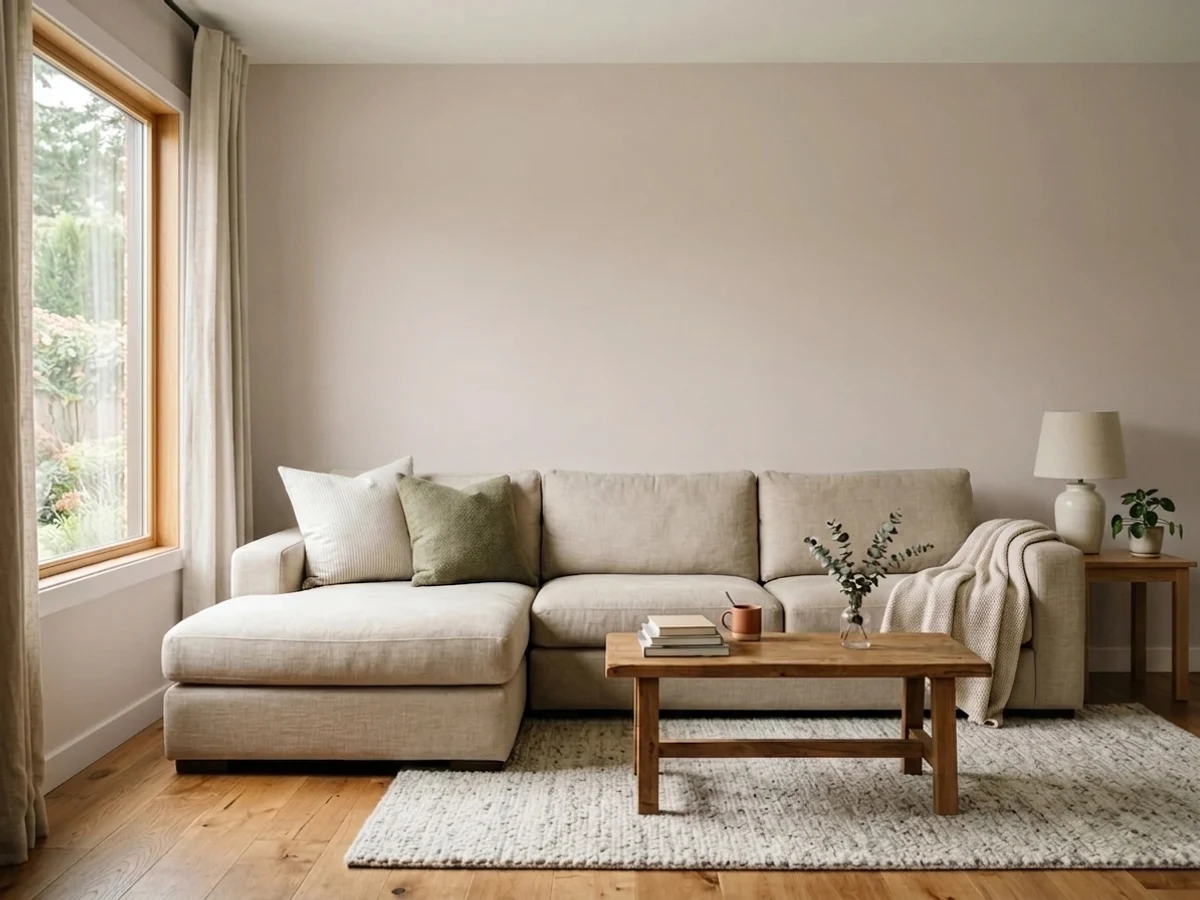
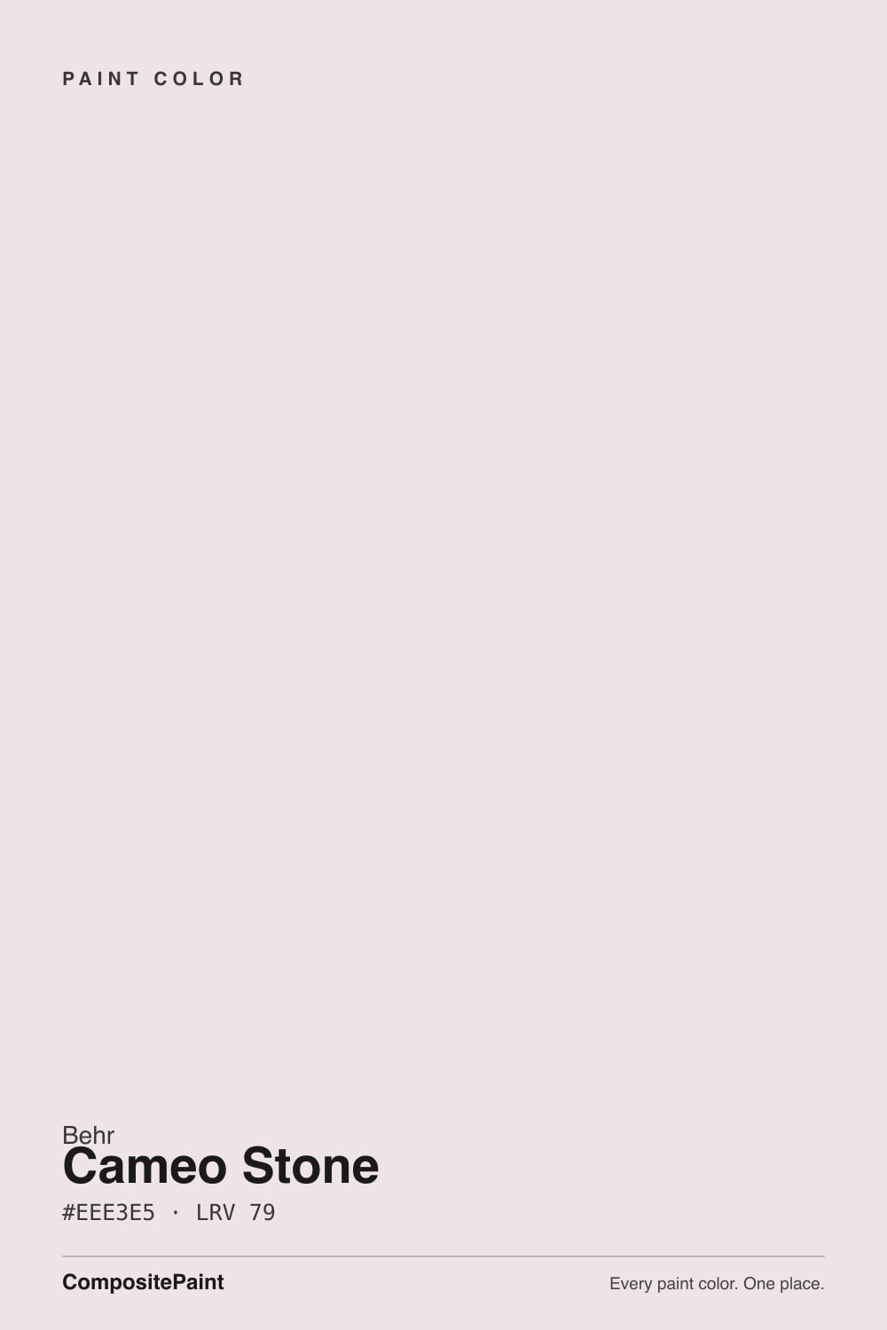
Cameo Stone sits in Behr's core deck as an easy, warm neutral — the name gives it away before the paint does. This is not a designer-buzzword mauve or a trendy greige; it is a very pale, very warm stone-beige, close enough to white that Behr lists it for nearly every room in the house: living rooms, bedrooms, kids' rooms, hallways, kitchens, bathrooms — plus doors, windows, trim, cabinets and shutters, because it is sold both as a standard wall paint and as a Premium satin enamel built for cabinets and trim. There is no famous backstory here. It has never been a Color of the Year, it does not show up in "most popular paint colors" round-ups, and a search for real owner experiences with it comes back almost empty — this is an honestly obscure color, not a quietly beloved one, and that is worth saying plainly rather than dressing up.
At LRV 75 it reflects most of the light that hits it, which is exactly why the warmth stays subtle rather than loud. Set it beside a true near-white like Whipped Cream (LRV 91) and Cameo Stone shows a visible warm, slightly stony cast; set it beside a deeper warm beige and it reads almost neutral. That narrow, quiet band is the whole appeal: enough color to feel finished, not so much that anyone would call the room "a color."
Undertone in one line: warm stone-beige first, with the faintest whisper of red-mauve underneath in flat or cool light — never a true taupe-gray, never orange, never a color you would actually call pink on the wall. A couple of automated color-database sites tag the hex as a pale dusty pink, and our own site's color-matching engine happens to file it under the purple family for the same reason (more on that below) — but Behr's own room photography, its own naming, and the LRV all agree: on a real wall, this reads as a warm stone neutral, not a pink one.
Where It Shines
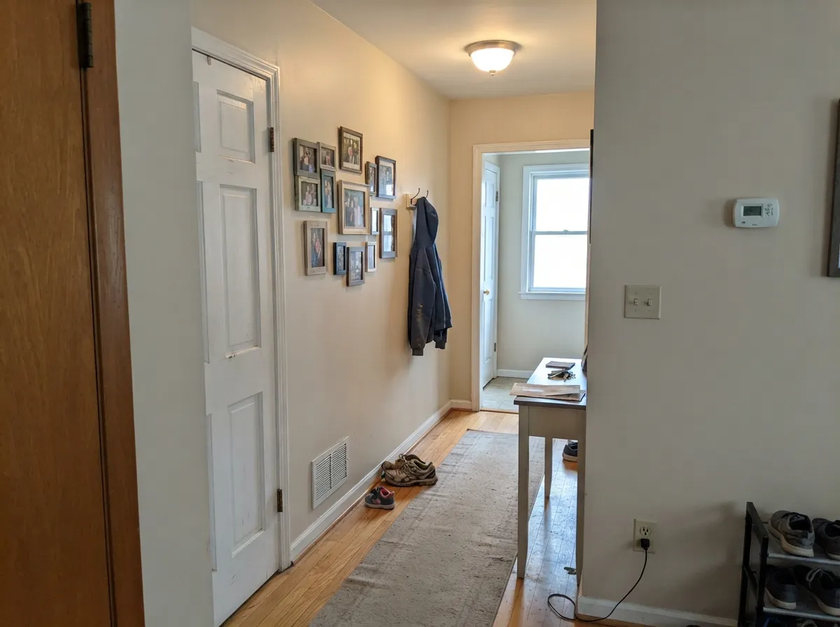
Give it real daylight and it does exactly what a quiet whole-house neutral should: soften a room without announcing itself. It is genuinely good in the plain, everyday rooms Behr built it for — a family room, a hallway, a kitchen with white cabinetry and brushed nickel hardware — where a stronger color would need more commitment than most people want to make. Warm wood, brass, cream linens and unlacquered metals all sit comfortably next to it, and because Behr sells the same color as a cabinet and trim enamel, it is one of the few off-whites that can genuinely run walls, trim and cabinets without a second can of a slightly different color.
Where It Fails
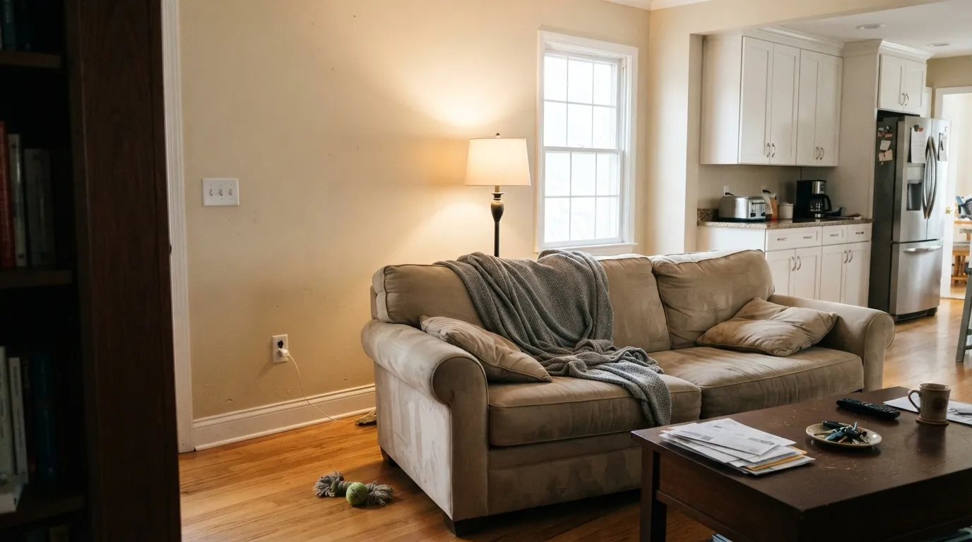
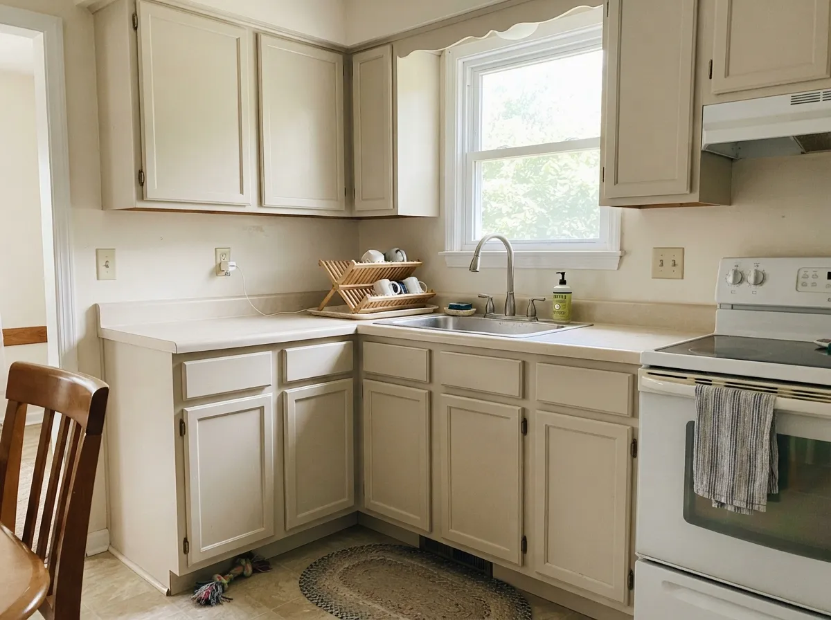
The handful of real complaints about Cameo Stone all trace back to one of three predictable situations. None of them are the paint's fault — they are what happens when a very pale, light-dependent neutral meets the wrong room or the wrong neighbor color.
In good daylight the warmth is unmistakable next to a genuine cool white or gray — this is not a stealth neutral. If the goal was a plain, colorless wall, sample Whipped Cream or a true gray instead and skip the guesswork.
Cold light drains the warm pigment fast, and the wall flattens into a dull, slightly lifeless off-white that reads more "unfinished" than "soft." Warm 2700K bulbs bring the stone warmth back; test the paint under your actual bulbs before blaming the color.
Set next to a stark white like Extra White, Cameo Stone's walls look dingy by comparison — the same trap that catches every pale warm neutral. Cool grey quartz or marble does the same thing from the other direction, pushing the warmth toward muddy. Pair it with a soft, warm trim white and warm-toned stone or wood instead.
Room by Room
The color earns its keep here: soft enough to be calming, warm enough to feel finished, light enough not to fight a small window. Eggshell wipes clean; keep the bulbs at 2700K in the evening.
Behr's own kitchen guidance pairs it with white cabinetry and brushed nickel hardware, and because Behr sells this exact color as a Premium satin enamel for cabinets and trim, you can run walls and cabinets in one color without a second, close-but-not-quite can. Satin on the cabinets; eggshell on the walls.
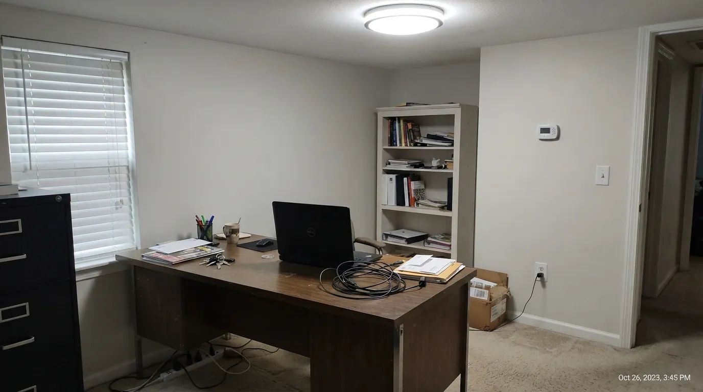
A warm neutral that carries room to room without clashing is exactly what a hallway needs, and Cameo Stone is quiet enough to do it without drawing attention to itself along the way.
A gentle, welcoming color for a room that needs to feel calm rather than dramatic. Pair with cream bedding and warm wood; a north-facing bedroom with no lamps will read closer to plain, quiet white most of the day.
With warm stone, wood vanities and brass it is genuinely pretty. With cool grey marble or blue-grey tile, the warmth argues with the stone — sample both together before committing.
There is no real track record of this color being used outside, and full sun plus rain streaking is a harder test than any interior room gets. Keep it indoors, in rooms where you control the light, until you have sampled it outside first.
Your Light Is the Risk
South or west sun brings the stone warmth forward — soft, quiet, unmistakably tinted rather than plain white. This is the light Behr built it for.
Cold bulbs and overcast north daylight drain the warm pigment fast; the wall flattens into a dull, slightly lifeless off-white. Test before committing a whole room.
Warm and stony at the sun hours, paler and quieter once the light moves on. The shift is gentle — most people don't notice it happening in real time.
2700K lamps keep the warmth glowing after dark. Cool white LEDs pull it back toward plain, slightly flat off-white — bulb choice matters more than usual with this one.
Most complaints about Cameo Stone are a light mismatch. Upload a photo of your actual room and see it on your walls — then ask for the same wall in north light or evening lamps before you buy a single sample.
Need It From Another Brand?
Any paint counter can custom-tint Behr N160-1 directly. If you would rather stay in one brand's own deck, these are the closest stock matches, measured as ΔE2000. Under 2 is a difference you will not see on the wall.
| Brand | Closest color | ΔE | LRV | |
|---|---|---|---|---|
| Sherwin-Williams | Faint CoralSW 6329 · Sherwin-Williams | 1.6 | 75 | Color page → |
| Benjamin Moore | Savory Cream2105-70 · Benjamin Moore | 0.6 | 77 | Color page → |
| Valspar | Je M'Apelle Missy8004-10A · Valspar | 1.4 | 75 | Color page → |
| PPG / Glidden | TouchablePPG1017-1 · PPG / Glidden | 0.5 | 75 | Color page → |
| Glidden | TouchablePPG1017-1 · Glidden | 0.4 | 76 | Color page → |
| Dutch Boy | Queen Conch306-1DB · Dutch Boy | 1.6 | 75 | Color page → |
Similar Behr Colors
The nearest shades to Cameo Stone within Behr's own range, ranked by perceptual color distance — useful when you want the same look a touch lighter, darker, or warmer.
WCAG 2.1: AA is 4.5 : 1 for normal text, 3 : 1 for large text, AAA is 7 : 1.
Cameo Stone vs the Colors You're Also Considering
Every Cameo Stone sample board has the same rivals on it. The numbers show the real lightness gap — then it comes down to which risk you would rather live with.
Pick this for the plainer, quieter warm stone — less peach, more neutral.
Behr DC-003 · LRV 79Blank CanvasPick this for the exact same LRV in the same Behr line, with a warmer, more visible peach cast than Cameo Stone's quieter stone neutrality.
Pick this for a touch more warmth and body than Silky White's brighter, plainer read.
Behr PPU7-12 · LRV 83Silky WhitePick this for a slightly brighter, plainer warm white in the same Behr line — Cameo Stone's quieter, slightly stonier cousin.
The Behr neighbors are separated by a point or two of LRV and a small shift in direction. Cloud Nine 730A-2 at #EBE5E9 and LRV 80 is cooler and slightly more violet. Prelude To Pink PR-W6 at #EDE5EA and LRV 80 does the same. Patience PR-W11 at #E9E4E3 and LRV 78 is the greyest and reads closest to plain off-white. Victorian Pearl W-B-120 at #F3E4E2 and LRV 80 is the warmest and pinkest of the set.
Across brands, Glidden Just Blush PPG18-17 at LRV 78 and deltaE 0.75, Sherwin-Williams Rosily SW 6574 at LRV 79 and deltaE 0.87, Dutch Boy Sugar Pie 102-1DB at deltaE 0.87, and PPG Lavender Pearl PPG1252-1 at deltaE 0.9 are all true matches. Benjamin Moore Rosemist 1366 at LRV 77 and deltaE 1.33 is visually identical in normal room light. Dunn-Edwards Cloudy Gray DE6036 at LRV 73 and deltaE 2.36 and Farrow and Ball Middleton Pink No. 245 at LRV 81 and deltaE 2.78 are very close, so sample first. Valspar Winter Dawn 7004-1 at deltaE 4.22 is close but visibly greyer side by side.
Cameo Stone Coordinating Colors
The rule with Cameo Stone is the same as with any pale warm neutral: keep the trim soft, not stark, and keep everything else warm. It pairs best with creamy whites, deep near-blacks for contrast, and warm greiges in the next room over — cool grays and icy whites are the two things that make it look accidental instead of chosen.
An Honestly Overlooked Color
Cameo Stone doesn't have a story in the usual sense. It has never been a Color of the Year, it doesn't show up in "most popular paint" lists, and searching for real owner experiences with it comes back nearly empty — no viral before-and-afters, no design-blog features, just product listings and color-database entries. Behr sells it quietly across three product lines — standard wall paint, Premium satin cabinet/door/trim enamel, and the Marquee line — without ever giving it a marketing push, sitting next to dozens of other pale, barely-there neutrals competing for the same shelf space. It's easy to see why most shoppers walk past it toward a name they already recognize, like Blank Canvas or Swiss Coffee.
That obscurity is worth being upfront about rather than dressing up: this is not a color with a proven fan base you can lean on. It is, on its own technical merits, a well-built pale warm stone that does exactly what its LRV and undertone promise. If you're the kind of buyer who wants social proof before you commit a whole room, that absence should factor in — sample it big, on your actual wall, before you trust it over something with a track record.
One more honest note: our own site files this color under the purple family, and one or two automated color-database sites describe it as a pale dusty pink. That comes from the exact hex carrying the faintest, mathematically-detectable red cast at very low saturation — real, but nearly invisible in practice. On the wall, next to Behr's own description, its own room photography, and how most people will actually experience it, it reads as a warm stone neutral, not a pink or a purple. Don't let the category label steer you if you're shopping for a true purple accent or a true blush pink; this isn't either one.
Cameo Stone With Wood Tones and Metals
Because the color holds so little pigment, it is unusually forgiving with wood. Honey oak, walnut, white oak and even cool grey-washed floors all sit comfortably next to it — none of the violent clashes that catch deeper, more saturated warm colors. The one thing to watch is stacking two warm, low-saturation neutrals with slightly different undertones directly against each other — a warm-beige rug against Cameo Stone walls can read muddy rather than layered if the two don't share the same warmth.
Metals are equally easy. Unlacquered brass and warm gold are the classic partner and the reason it works so well in a kitchen or a family room, but matte black, bronze and even brushed nickel — Behr's own recommended pairing — all work fine at this LRV. The color is too pale and too quiet to fight with any of them.
Three Ready Palettes Built on Cameo Stone
A color is never alone on the wall. These are complete combinations in the 60-30-10 pattern, with the reason each one holds together. Every one opens in the visualizer.
Cloud White's warm cream trim avoids the bright-white trap that makes pale warm neutrals look dingy by contrast; Wrought Iron gives the house one grounding dark note so the whole floor reads calm and considered rather than plain.
Try this palette in your roomBecause Behr sells Cameo Stone as a cabinet and trim enamel, this is the rare pairing where the same can does two jobs — cabinets in the warm stone, walls a shade brighter in Silky White, and one navy island for contrast. Brushed nickel hardware finishes the look Behr itself recommends.
Try this palette in your roomAgreeable Gray anchors the main floor while Cameo Stone gives the hallway and a guest room their own lighter warmth instead of a matching greige. Cloud White trim runs through both without clashing with either undertone.
Try this palette in your roomCameo Stone FAQ
Is Cameo Stone warm or cool?
Warm — a quiet stone-beige. At LRV 75 it is so pale that in flat or cool light it can pass for a plain, slightly muted off-white, but in real daylight the warmth is unmistakable next to a true white or gray.
Is Cameo Stone actually a pink color?
Not really. A couple of automated color sites tag its hex as a pale dusty pink, and our own site's color engine files it under the purple family for the same technical reason, but Behr's own description, its room photography and the LRV all agree it reads as a warm stone neutral on the wall — not a pink one. If you specifically want a soft blush pink, look elsewhere.
What trim white goes with Cameo Stone?
A soft, warm white like Cloud White or Silky White — something with a little cream in it. A stark, bright white trim makes the walls look dingy by contrast, the same trap that catches most pale warm neutrals.
Is it good for kitchen cabinets?
Yes — Behr sells this exact color as a Premium satin enamel for cabinets, doors and trim, and its own kitchen guidance pairs it with white cabinetry and brushed nickel hardware. It is one of the easier off-whites to match across walls and cabinets for that reason.
Will it look dull in a north-facing room?
It can. Cool, indirect north light drains the warm pigment and flattens the color toward a duller off-white. It's not ruined — some people like the quieter, near-neutral version — but if you specifically wanted the warmth, test a sample on the actual wall first.
How is it different from Behr Blank Canvas?
They share the same LRV 75, but the undertone splits them: Blank Canvas leans warm peach, Cameo Stone leans quieter warm stone with only a whisper of anything else. Side by side they read like two different off-whites, not two versions of the same one.
Have you painted with Cameo Stone?
Rate it — one tap helps the next reader decide.
Ask a Question