CP

Light Color Palette — Morning Wren

A soft, airy five-color scheme of pale linen, warm putty, and a whisper of sage and clay — every color matched to real paint you can buy.

By David Chen · Formulation Lead & Resident Chemist

Pale Linen
Dominant
Kompozit Nilla Vanilla · 0003
#F1EBE0
LRV 83
Warm Putty
Secondary
Kompozit White Elephant · 0223
#E3DBC8
LRV 71
Soft Cloud
Base
Kompozit Sugar Dust · 0011
#F8F6ED
LRV 92
Quiet Sage
Support
Kompozit Marble Green · 0454
#CBD4C8
LRV 64
Faded Clay
Accent
Kompozit Cave Painting · 0147
#D3BAAE
LRV 52
View palette in

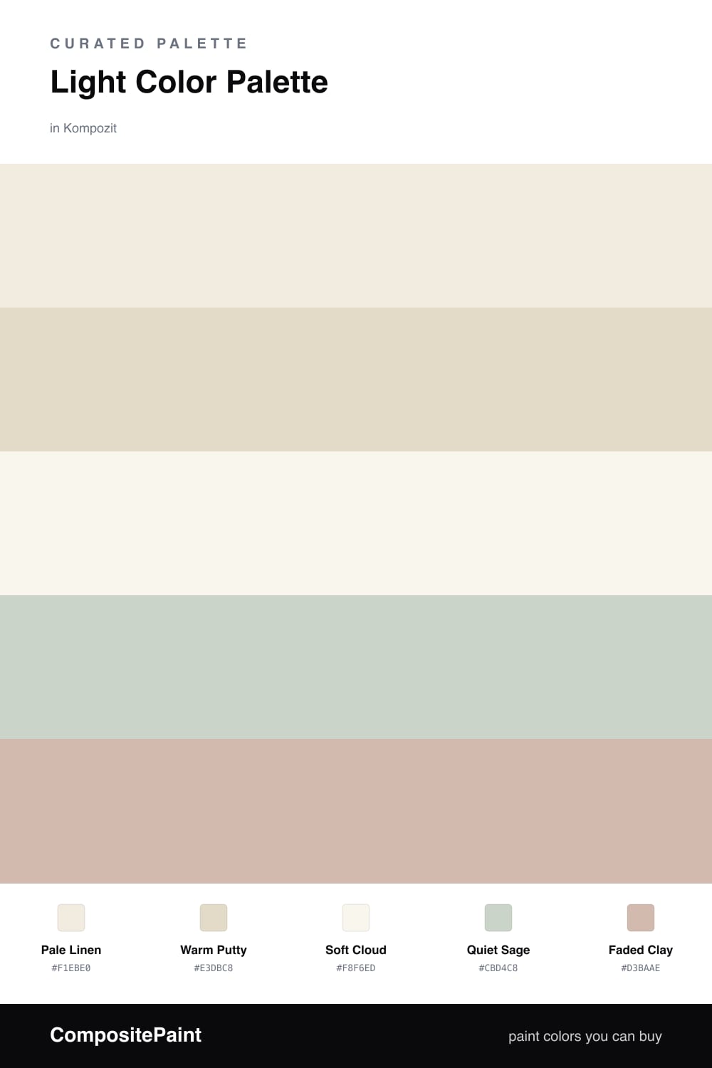
Think of this one as a held breath. Pale Linen leads, a warm off-white that carries light around a room without ever glaring, and Warm Putty layers in underneath it like a slightly deeper echo of the same idea.

I like to picture the undertones as a family that all share a face. Soft Cloud is the brightest, almost a clean white, so it works on trim and ceilings to lift everything. Quiet Sage brings the faintest cool note — just enough green to keep the warmth honest — and Faded Clay is your single spark of color.

For 2026 this kind of high-key, low-contrast scheme is right on trend. Keep your boldest move small, let the Faded Clay show up in a chair or a vase rather than a whole wall, and let the rest stay soft and quiet.

Buy These Colors

Each color matched to the closest real paint in every brand, by ΔE2000. Kompozit first; take any SKU to the store — these mix on demand.

Pale Linen
#F2ECE0 · LRV 84 · Dominant
Kompozit Nilla Vanilla · 0003 ΔE 0.49
Backdrop Jane · BD-JA ΔE 1.9
Behr Bleached Linen · PPU5-09 ΔE 1.63
Benjamin Moore Arbor White · ES-01 ΔE 1.13
Clare Wing It · PNT100-LT-24 ΔE 3.05
Dunn-Edwards Bone China · DEW339 ΔE 1.29
Farrow & Ball White Tie · No. 2002 ΔE 2.73
Magnolia Home Pearly Cotton · JG-33 ΔE 2.23
PPG / Glidden Candlelit Beige · 1207-1 ΔE 1.21
Sherwin-Williams Greek Villa · SW 7551 ΔE 1.09
Valspar Cream Delight · 7002-14 ΔE 0.57
Warm Putty
#E3D8C7 · LRV 70 · Secondary
Kompozit White Elephant · 0223 ΔE 2
Backdrop Cookies & Cream · BD-CC ΔE 3.29
Behr Adobe Sand · N240-2 ΔE 1.17
Benjamin Moore White Sand · 964 ΔE 1.68
Clare Neutral Territory · PNT100-LT-20 ΔE 2
Dunn-Edwards Sandcastle · DEC740 ΔE 1.32
Farrow & Ball Shadow White · No. 282 ΔE 2.65
Magnolia Home Morning Snow · JG-167 ΔE 1.87
PPG / Glidden Bone White · 1085-2 ΔE 1.24
Sherwin-Williams Neutral Ground · SW 7568 ΔE 1.4
Valspar Gentle Lamb · V177 ΔE 0.43
Soft Cloud
#F6F4EF · LRV 91 · Base
Kompozit Sugar Dust · 0011 ΔE 1.91
Backdrop Tabula Rasa · BD-TR ΔE 2.82
Behr Whisper White · HDC-MD-08 ΔE 0.54
Benjamin Moore Chantilly Lace · 2121-70 ΔE 1.98
Clare Timeless · PNT100-LT-04 ΔE 1.64
Dunn-Edwards Droplets · DEW381 ΔE 0
Farrow & Ball Wimborne White · No. 239 ΔE 2.67
Magnolia Home True White · JG-21 ΔE 1.51
PPG / Glidden Delicate White · 1001-1 ΔE 1.54
Sherwin-Williams High Reflective White · SW 7757 ΔE 1.32
Valspar Cuddle Down · 8007-6F ΔE 1.22
Quiet Sage
#CBD2C0 · LRV 63 · Support
Kompozit Marble Green · 0454 ΔE 2.49
Backdrop Real Real · BD-RR ΔE 6.55
Behr Mild Mint · PPU11-12 ΔE 1.58
Benjamin Moore Tea Light · 471 ΔE 0.59
Clare All The Sage · PNT100-LT-70 ΔE 1.77
Dunn-Edwards Glass Tile · DE6262 ΔE 1.96
Farrow & Ball Cromarty · No. 285 ΔE 4.12
Magnolia Home Stoneware Pieces · JG-55 ΔE 4.19
PPG / Glidden Merry Music · 1127-3 ΔE 0.9
Sherwin-Williams Frostwork · SW 59 ΔE 1.87
Valspar Mellow Spring · 5007-3B ΔE 0.6
Faded Clay
#D8B9A6 · LRV 52 · Accent
Kompozit Cave Painting · 0147 ΔE 2.98
Backdrop Boy Meets Girl · BD-BG ΔE 4.46
Behr One To Remember · MQ1-23 ΔE 2.02
Benjamin Moore Groundhog Day · 1166 ΔE 1.1
Clare Meet Cute · PNT100-LT-60 ΔE 3.93
Dunn-Edwards Kraft Paper · DE6109 ΔE 2.6
Farrow & Ball Oxford Stone · No. 264 ΔE 5.49
Magnolia Home Solid Wood · JG-109 ΔE 8.51
PPG / Glidden Cinnamon Ice · 1071-4 ΔE 0.69
Sherwin-Williams Classic Sand · SW 56 ΔE 1.83
Valspar Milk Toast · 3001-10B ΔE 2.1

Questions

Why does this palette feel so calm?

The colors all sit close together in lightness, so nothing jumps out. Low contrast like this reads as restful, and the warm undertones keep it cozy rather than cold.

How do I keep a light scheme from looking flat?

Lean on texture and a single quiet accent. Here the Faded Clay adds just enough warmth, while different finishes — a matte wall against a soft sheen — give the eye something to catch.

Similar Palettes

Closest schemes by color — not by label.