CP

Beige Color Palette — Linen Fold

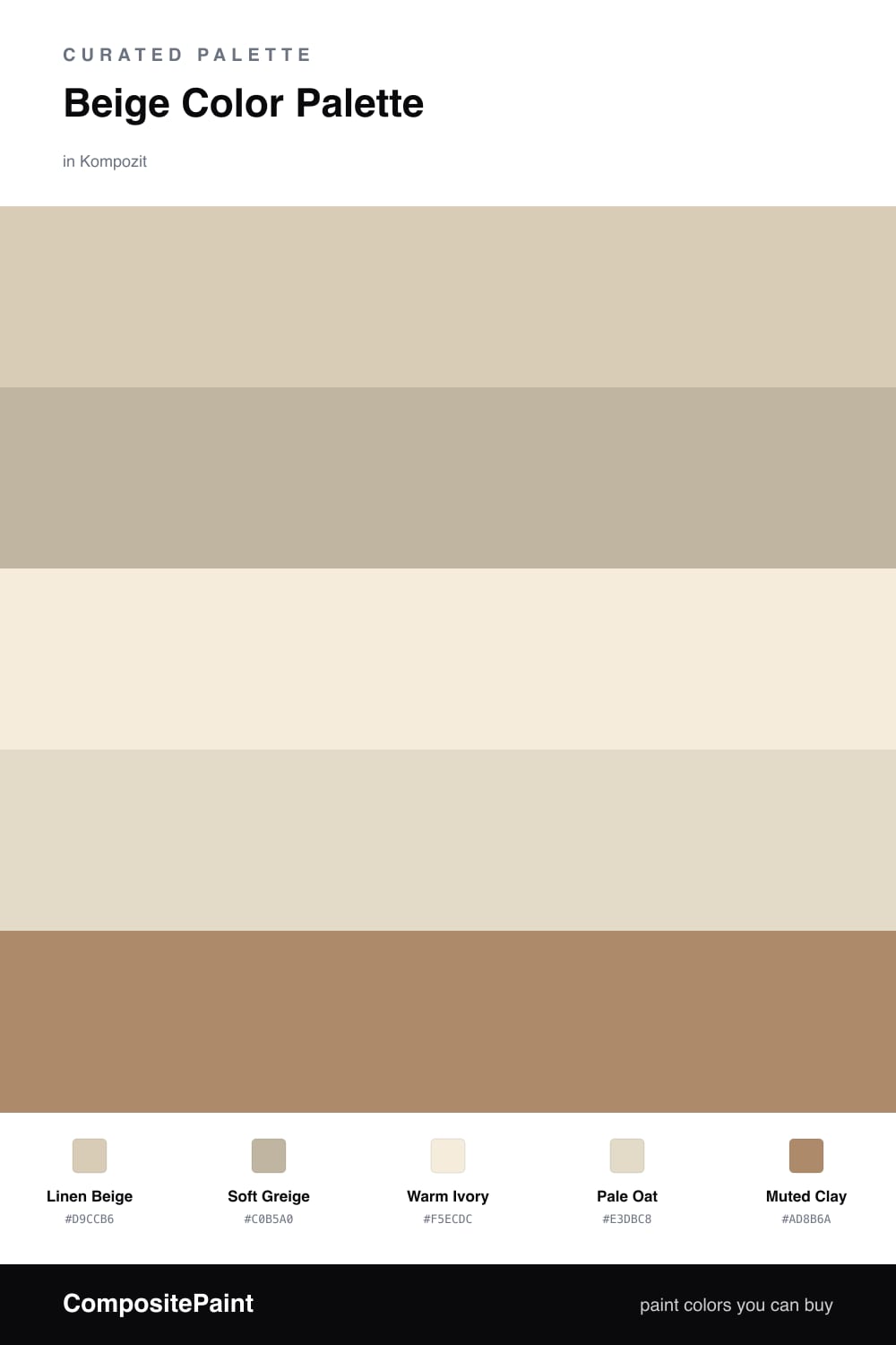
A soft five-color scheme led by warm linen beige with quiet greige and ivory neutrals and one muted clay accent — every color matched to real paint you can buy.

By Emily Roberts · DIY Editor & First-Timer's Guide

Linen Beige
Dominant
Kompozit Sandstone Palette · 0273
#D9CCB6
LRV 61
Soft Greige
Secondary
Kompozit Roman Ruins · 0225
#C0B5A0
LRV 47
Warm Ivory
Base
Kompozit Kiara · 0005
#F5ECDC
LRV 85
Pale Oat
Support
Kompozit White Elephant · 0223
#E3DBC8
LRV 71
Muted Clay
Accent
Kompozit Spiced Rum · 0240
#AD8B6A
LRV 28
View palette in

Beige gets a bad rap for being boring, but it is having a real moment in 2026 — warm, lived-in, and the opposite of cold gray. This scheme leans on a creamy Linen Beige as the star, the kind of shade that feels like soft fabric on a sunny morning.

Around it, Soft Greige adds just enough depth to keep things interesting, while Warm Ivory and Pale Oat stretch the look out so it never feels heavy. These three do the quiet work in the background.

Then comes the fun part — a little Muted Clay for warmth and contrast. It is earthy without being loud, so a small dose goes a long way. Let the beige lead, sprinkle the clay where you want the eye to land, and you get a room that feels calm but never flat.

Buy These Colors

Each color matched to the closest real paint in every brand, by ΔE2000. Kompozit first; take any SKU to the store — these mix on demand.

Linen Beige
#D9CBB3 · LRV 61 · Dominant
Kompozit Sandstone Palette · 0273 ΔE 0.75
Backdrop Real Real · BD-RR ΔE 3.53
Behr Estate Limestone · QE-27 ΔE 0.95
Benjamin Moore Everlasting · 1038 ΔE 0.9
Clare Flatiron · PNT100-LT-17 ΔE 4.98
Dunn-Edwards Cochise · DEC761 ΔE 1.05
Farrow & Ball String · No. 8 ΔE 2.31
Magnolia Home Plaster · JG-156 ΔE 2.42
PPG / Glidden Summer Wheat · 14-10 ΔE 1.03
Sherwin-Williams Softer Tan · SW 6141 ΔE 0.95
Valspar Rattan Basket · 3007-10C ΔE 1.21
Soft Greige
#C3B6A1 · LRV 48 · Secondary
Kompozit Roman Ruins · 0225 ΔE 1.06
Backdrop Rosita · BD-RO ΔE 16.14
Behr Basic Khaki · HDC-NT-09 ΔE 0.47
Benjamin Moore Glacial Till · AF-390 ΔE 2.15
Clare Money Moves · PNT100-MD-48 ΔE 8.11
Dunn-Edwards Pigeon Gray · DE6214 ΔE 0.66
Farrow & Ball Jitney · No. 293 ΔE 3.95
Magnolia Home Sunday Stroll · JG-19 ΔE 4.37
PPG / Glidden Best Beige · 1085-4 ΔE 2.16
Sherwin-Williams Pavilion Beige · SW 7512 ΔE 1.91
Valspar Soft Stones · 6008-1C ΔE 0.27
Warm Ivory
#F2ECDD · LRV 84 · Base
Kompozit Kiara · 0005 ΔE 1.37
Backdrop Jane · BD-JA ΔE 2.43
Behr Parchment Paper · 710C-1 ΔE 0.74
Benjamin Moore Arbor White · ES-01 ΔE 0.56
Clare Like Buttah · PNT100-LT-62 ΔE 2.54
Dunn-Edwards Bone China · DEW339 ΔE 0.21
Farrow & Ball White Tie · No. 2002 ΔE 1.74
Magnolia Home Pearly Cotton · JG-33 ΔE 1.21
PPG / Glidden Spun Cotton · 1203-1 ΔE 0.52
Sherwin-Williams Classic Light Buff · SW 50 ΔE 0.58
Valspar Statuesque · 7002-5 ΔE 0.53
Pale Oat
#E4DAC6 · LRV 71 · Support
Kompozit White Elephant · 0223 ΔE 0.92
Backdrop Cookies & Cream · BD-CC ΔE 1.76
Behr Chartreuse Frost · MQ3-17 ΔE 0.73
Benjamin Moore Spring in Aspen · 954 ΔE 1.49
Clare Greenish · PNT100-LT-68 ΔE 3.72
Dunn-Edwards Exclusive Ivory · DE6191 ΔE 0.62
Farrow & Ball Shadow White · No. 282 ΔE 1.92
Magnolia Home Morning Snow · JG-167 ΔE 0.46
PPG / Glidden Bone White · 1085-2 ΔE 0.52
Sherwin-Williams Neutral Ground · SW 7568 ΔE 1.54
Valspar Daybreak · 6008-3A ΔE 0.79
Muted Clay
#B08968 · LRV 28 · Accent
Kompozit Spiced Rum · 0240 ΔE 1.75
Backdrop Anita · BD-AN ΔE 9.15
Behr Syrup · MQ2-2 ΔE 1.6
Benjamin Moore Jackson Tan · HC-46 ΔE 1.92
Clare Pink Sky · PNT100-MD-28 ΔE 14.47
Dunn-Edwards Dark Sepia · DE6138 ΔE 2.52
Farrow & Ball Mouse's Back · No. 40 ΔE 8.5
Magnolia Home Vintage Crown · JG-152 ΔE 3.87
PPG / Glidden Caramel Kiss · 1083-6 ΔE 2.75
Sherwin-Williams Yearling · SW 7725 ΔE 0.96
Valspar Café Miel · 2008-7C ΔE 1.78

Questions

Why does this beige palette feel warm instead of flat?

Beige can read dull when it stands alone, so this scheme layers a few warm tones together. The linen and oat give a soft glow, the greige adds a little shadow, and the clay accent keeps the whole thing from feeling washed out.

How much of the clay accent should I use?

Keep it small — think one-fifth of the space at most. Use it on a single wall, a door, or trim so it pops against all that beige rather than competing with it.

Similar Palettes

Closest schemes by color — not by label.