Cream Color Palette — Cream Dusk
A soft five-color cream scheme layered with warm neutrals and one quiet clay accent, every color matched to real paint you can buy.
By Emily Roberts · DIY Editor & First-Timer's Guide
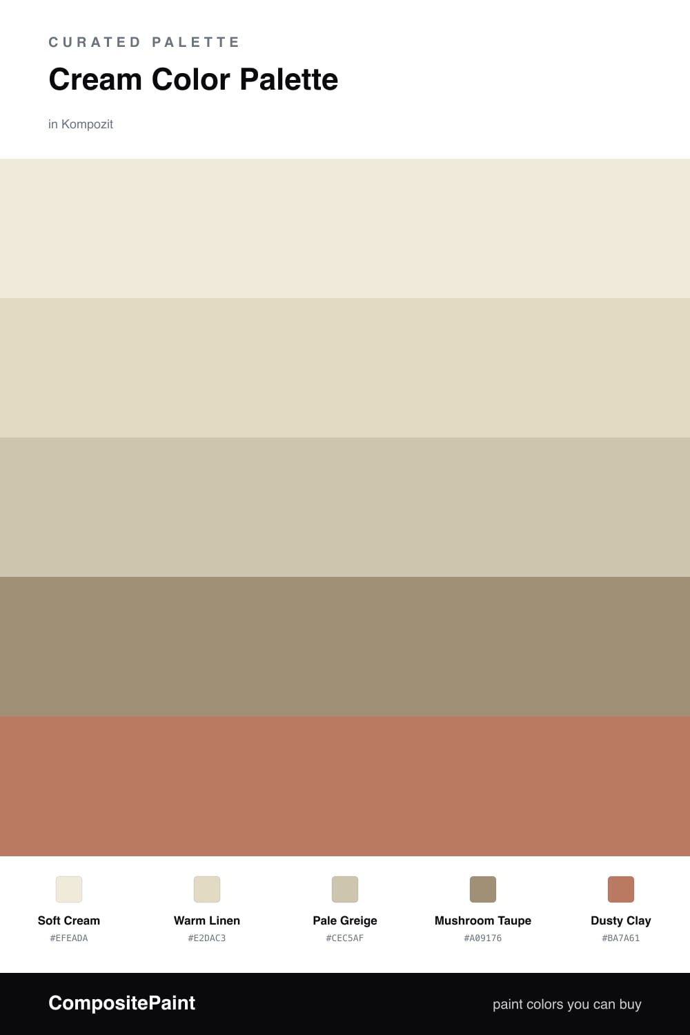
This is a calm, easy-living scheme built around Soft Cream — a warm off-white that feels like late afternoon light. It leads the whole room, so use it on your walls and let everything else gather around it.
Warm Linen and Pale Greige step the color up gently, while Mushroom Taupe adds a little weight so the space does not float away into one flat tone. These three do the quiet work and keep things from feeling too plain.
Then there is Dusty Clay, the one warm spark. Use it in small doses — a cushion, a vase, a bit of art — and it pulls the whole cream palette into something soft, modern, and grown-up.
Buy These Colors
Each color matched to the closest real paint in every brand, by ΔE2000. Kompozit first; take any SKU to the store — these mix on demand.
Questions
Cream is soft and warm, so it fills a room with light without feeling cold or stark the way pure white can. It also flatters almost any wood, fabric, or metal you already own.
Keep it small — think one chair, a few throws, or a single piece of art. Roughly one-fifth of what you see should be the warm clay so it feels like a spark, not the whole story.
Similar Palettes
Closest schemes by color — not by label.