Cream Color Palette — Cream Glow
A soft five-color scheme led by warm cream and layered with quiet neutrals and a gentle bronze accent — every color matched to real paint you can buy.
By David Chen · Formulation Lead & Resident Chemist
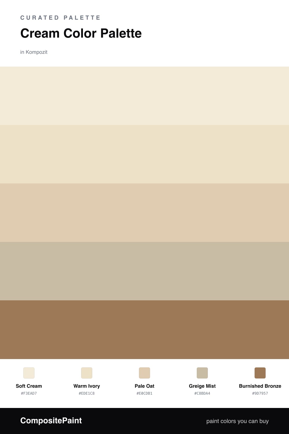
Cream is one of my favorite colors to talk about because it does so much quiet work. Think of it as white that has spent an afternoon in the sun — it holds a little yellow, a little warmth, and it softens every bit of light that touches it. This scheme leans all the way into that feeling, with Soft Cream leading and Warm Ivory close behind to keep things glowing.
To stop a tone-on-tone palette from going flat, I build in small steps. Pale Oat deepens the cream just enough to read as a real layer, and Greige Mist adds a grounded, contemporary edge that keeps the look from feeling dated. These are the colors doing the steady background work.
Then comes the spark. Burnished Bronze is the one place I let the palette get rich, and a little goes a long way — a frame, a fixture, a single piece of furniture. That one warm accent is what turns a soft cream room into something that feels intentional and current for 2026.
Buy These Colors
Each color matched to the closest real paint in every brand, by ΔE2000. Kompozit first; take any SKU to the store — these mix on demand.
Questions
Cream carries a touch of yellow and a hint of warmth in its base, so it bounces light back softly instead of sharp and cold. That small shift is what makes a room feel calm rather than clinical.
Stack closely related tones and lean on texture and a single deeper accent. Here the bronze gives the eye a place to land, while the oat and greige add depth without breaking the soft mood.
Similar Palettes
Closest schemes by color — not by label.