Color spec
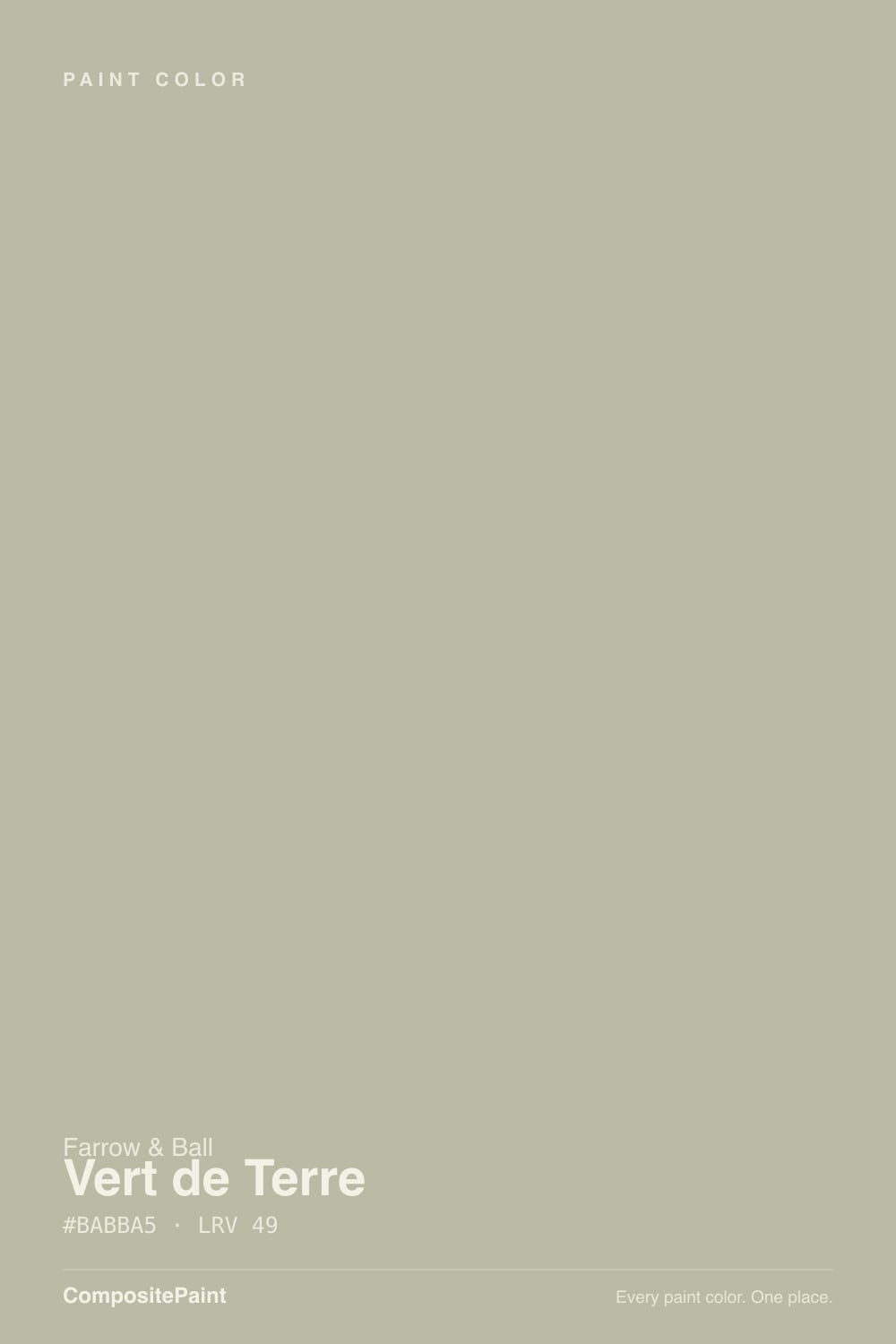
| Brand | Farrow & Ball |
| Name | Vert De Terre |
| SKU | No. 234 |
| Hex | #B7BAA4 |
| RGB | 183, 186, 164 |
| HSL | 68°, 14%, 69% |
| LRV | 48 |
| Undertone | warm yellow tone |
| Family | Green |
About Farrow & Ball Vert De Terre
Vert De Terre sits in the mid-range at LRV 48, so it shifts visibly through the day — lighter and more open in morning light, deeper and moodier after dark. Its yellow undertone is the part to watch: it gets picked up by whatever sits next to it, so test it against your trim, floor and the room's main light before committing. South-facing rooms will pull it lighter and warmer, while north light cools it down.
Vert De Terre is versatile enough for full rooms but has enough depth to anchor a space, so it suits living rooms, bedrooms and cabinetry alike. Greens bridge indoors and out, so they suit living rooms, kitchens and sunrooms.
Closest matches by brand
18 brands within ΔE 5The closest matches per brand by ΔE2000, computed against each brand's full deck. Only colors within ΔE 5 (close enough to substitute on a wall) are shown — brands with no real match are left off. Tap any swatch for its full single-color spec; tap the brand title to browse all green from that brand.
Sherwin-Williams
Behr
Benjamin Moore
Valspar
PPG / Glidden
Glidden
Dutch Boy
HGTV Home by Sherwin-Williams
Dunn-Edwards
Magnolia Home
Diamond Vogel
Hirshfield's
Rodda
C2 Paint
Clare
Portola Paints
Annie Sloan
Backdrop
Similar Farrow & Ball colors
closest in the Farrow & Ball deckThe nearest shades to Vert De Terre within Farrow & Ball's own range, ranked by perceptual color distance — useful when you want the same look a touch lighter, darker, or warmer.
Coordinated palette
Generated by hue-rotating #B7BAA4 in HSL space. Pair Vert De Terre with one accent and one neutral — the swatches below are starting points, not final picks.
Accessibility (WCAG contrast)
WCAG 2.1: AA = 4.5:1 normal text · AA Large = 3:1 large text · AAA = 7:1 normal text.
Farrow & Ball Vert De Terre Equivalents at Other Brands
Matching Vert De Terre from a different paint counter? Below is the single closest color in each major US deck and how close it really is. Remember that any paint store can also custom-tint Farrow & Ball No. 234 directly — these equivalents are for when you'd rather stay inside one brand's own deck.
Sherwin-Williams Equivalent of Vert De Terre
Sherwin-Williams's nearest match is Softened Green (SW 6177), visually identical in normal room light (ΔE 1.2). It sits at the same lightness (LRV 49 vs 48) and carries a warm yellow undertone, so it substitutes for Vert De Terre without repainting risk. See the full Softened Green swatch →
Behr Equivalent of Vert De Terre
Behr's nearest match is Pebble Stone (750D-4), visually identical in normal room light (ΔE 1.45). It sits at the same lightness (LRV 49 vs 48) and carries a warm yellow undertone, so it substitutes for Vert De Terre without repainting risk. See the full Pebble Stone swatch →
Benjamin Moore Equivalent of Vert De Terre
Benjamin Moore's nearest match is Tree Moss (508), visually identical in normal room light (ΔE 1.39). It sits at the same lightness (LRV 47 vs 48) and carries a warm yellow undertone, so it substitutes for Vert De Terre without repainting risk. See the full Tree Moss swatch →
Valspar Equivalent of Vert De Terre
The closest Valspar equivalent of Vert De Terre is Mossy (T628). At ΔE 0.36 the two are indistinguishable on a wall — it carries the same warm yellow undertone and sits at the same lightness (LRV 47.9 vs 48). If Valspar is your counter, order Mossy and you'll get the same color. See the full Mossy swatch →
PPG / Glidden Equivalent of Vert De Terre
PPG / Glidden's nearest match is Pine Crush (PPG1028-3), visually identical in normal room light (ΔE 1.3). It sits at the same lightness (LRV 47 vs 48) and carries a warm yellow undertone, so it substitutes for Vert De Terre without repainting risk. See the full Pine Crush swatch →
Glidden Equivalent of Vert De Terre
Glidden's nearest match is Pine Crush (PPG1028-3), visually identical in normal room light (ΔE 1.54). It sits at the same lightness (LRV 47 vs 48) and carries a warm yellow undertone, so it substitutes for Vert De Terre without repainting risk. See the full Pine Crush swatch →
Dutch Boy Equivalent of Vert De Terre
At Dutch Boy, the closest color to Vert De Terre is Saged Green (326-3DB) — very close at ΔE 2.48, though not an exact twin. It sits at the same lightness (LRV 47 vs 48) and carries a cool green undertone; sample both side by side if the room gets strong natural light. See the full Saged Green swatch →
HGTV Home by Sherwin-Williams Equivalent of Vert De Terre
HGTV Home by Sherwin-Williams's nearest match is Softened Green (HGSW 3246), visually identical in normal room light (ΔE 1.2). It sits at the same lightness (LRV 49 vs 48) and carries a warm yellow undertone, so it substitutes for Vert De Terre without repainting risk. See the full Softened Green swatch →
Dunn-Edwards Equivalent of Vert De Terre
The closest Dunn-Edwards equivalent of Vert De Terre is Tickled Crow (DEC780). At ΔE 0.43 the two are indistinguishable on a wall — it carries the same cool green undertone and runs slightly darker (LRV 45 vs 48). If Dunn-Edwards is your counter, order Tickled Crow and you'll get the same color. See the full Tickled Crow swatch →
Magnolia Home Equivalent of Vert De Terre
At Magnolia Home, the closest color to Vert De Terre is Flower Jar (JG-46) — very close at ΔE 2.85, though not an exact twin. It sits at the same lightness (LRV 47 vs 48) and carries a cool green undertone; sample both side by side if the room gets strong natural light. See the full Flower Jar swatch →
Diamond Vogel Equivalent of Vert De Terre
Diamond Vogel has no exact twin of Vert De Terre. The nearest is Dewkissed Rain (H073) at ΔE 3.61 — close, but the difference shows next to trim and in side light. It runs slightly darker (LRV 46 vs 48). Compare large swatches before substituting. See the full Dewkissed Rain swatch →
Hirshfield's Equivalent of Vert De Terre
Hirshfield's has no exact twin of Vert De Terre. The nearest is Morning Dew (H0073) at ΔE 4.12 — close, but the difference shows next to trim and in side light. It sits at the same lightness (LRV 47 vs 48). Compare large swatches before substituting. See the full Morning Dew swatch →
Rodda Equivalent of Vert De Terre
At Rodda, the closest color to Vert De Terre is Feldspar (CA177) — very close at ΔE 3.49, though not an exact twin. It sits at the same lightness (LRV 47 vs 48) and carries a cool green undertone; sample both side by side if the room gets strong natural light. See the full Feldspar swatch →
C2 Paint Equivalent of Vert De Terre
At C2 Paint, the closest color to Vert De Terre is Balsam (C2-684) — very close at ΔE 2.5, though not an exact twin. It sits at the same lightness (LRV 47 vs 48) and carries a cool green undertone; sample both side by side if the room gets strong natural light. See the full Balsam swatch →
Clare Equivalent of Vert De Terre
Clare's nearest match is Money Moves (PNT100-MD-48), visually identical in normal room light (ΔE 1.17). It sits at the same lightness (LRV 47 vs 48) and carries a cool green undertone, so it substitutes for Vert De Terre without repainting risk. See the full Money Moves swatch →
Portola Paints Equivalent of Vert De Terre
Portola Paints has no exact twin of Vert De Terre. The nearest is Sevilla (SEVILLA) at ΔE 4.97 — close, but the difference shows next to trim and in side light. It sits at the same lightness (LRV 47 vs 48). Compare large swatches before substituting. See the full Sevilla swatch →
Annie Sloan Equivalent of Vert De Terre
Annie Sloan has no exact twin of Vert De Terre. The nearest is Paris Grey (PARIS GREY) at ΔE 4.05 — close, but the difference shows next to trim and in side light. It runs slightly lighter (LRV 52 vs 48). Compare large swatches before substituting. See the full Paris Grey swatch →