Greige Color Palette — Pearl Drift
A soft five-color greige scheme layered with warm white, dove gray, and a whisper of taupe, finished with a smoky bronze accent — every color matched to real paint you can buy.
By Jessica Williams · Color Stylist & Interior Editor
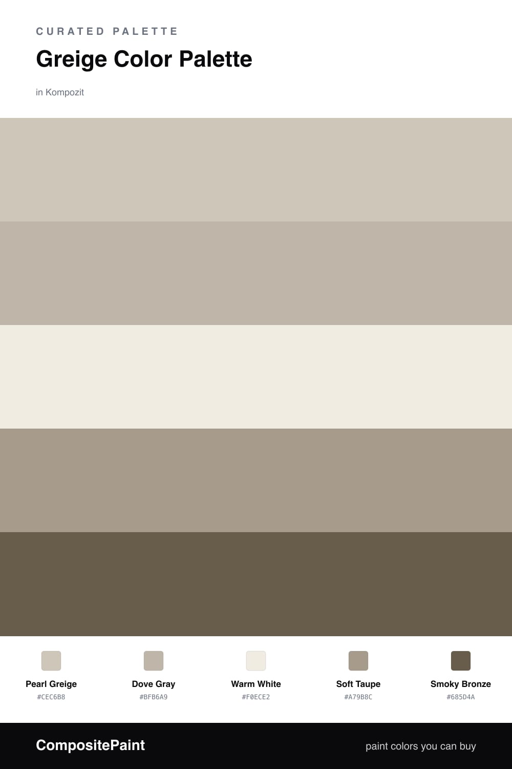
Greige is the neutral everyone keeps coming back to, and for good reason. It carries the softness of beige with the calm of gray, so it flatters almost any light. This scheme lets Pearl Greige lead, a gentle mushroom tone that feels warm in the morning and cool at dusk.
Around it, Dove Gray and Warm White keep things light and open, while Soft Taupe adds a grounding layer that stops the palette from drifting too pale. Use these three to wrap a room in quiet, then let the colors breathe.
The Smoky Bronze is your accent, and a little goes a long way. Bring it in through a leather chair, a matte fixture, or a single painted door. It gives this soft, contemporary greige scheme just enough weight to feel intentional rather than washed out.
Buy These Colors
Each color matched to the closest real paint in every brand, by ΔE2000. Kompozit first; take any SKU to the store — these mix on demand.
Questions
Greige sits right between gray and beige, so it never reads too cool or too warm. That in-between quality is what makes a room feel settled and easy to live in.
Layer a few close tones rather than one flat color, then add a deeper accent like the bronze here. The slight shifts in warmth give the space quiet depth.
Similar Palettes
Closest schemes by color — not by label.