Taupe Dining Room Palette — Morning Taupe & Walnut Brown
A warm five-color dining room scheme led by a soft morning taupe, layered with cream, crisp white, walnut brown, and a deep clay accent — every color matched to real paint you can buy.
By Emily Roberts · DIY Editor & First-Timer's Guide
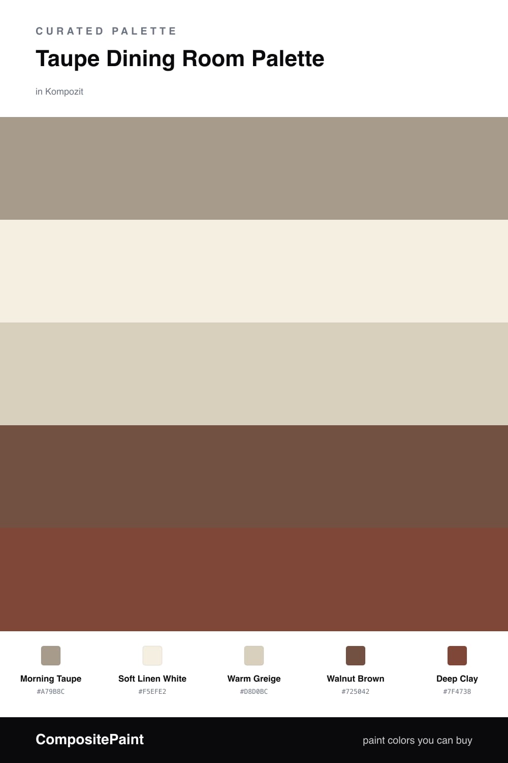
A dining room is where you want people to slow down and stay a while, and taupe does exactly that. This scheme puts a soft Morning Taupe on the walls — warm enough to glow under a pendant light, neutral enough to let your table and art take the lead.
To keep it fresh and a little contemporary, I paired it with a clean Soft Linen White on the trim and ceiling, and a Warm Greige for any built-ins or a sideboard. Those three do the quiet work and make the room feel layered instead of beige-on-beige.
Then comes the depth. Walnut Brown shows up in your floors and table for richness, and a Deep Clay accent — think a single feature wall, chair backs, or even napkins and a vase — adds just enough warmth to make the whole room feel intentional. Use the taupe everywhere, the clay sparingly, and you cannot go wrong.
Buy These Colors
Each color matched to the closest real paint in every brand, by ΔE2000. Kompozit first; take any SKU to the store — these mix on demand.
Questions
Taupe is a soft, warm gray-brown that flatters skin tones and candlelight, so people look good and food looks inviting. It feels calm and grown-up without going cold.
Lean on contrast — let the walnut floors and a few deep clay touches break up all that soft taupe so the space has depth instead of one quiet wash.
Similar Palettes
Closest schemes by color — not by label.