CP

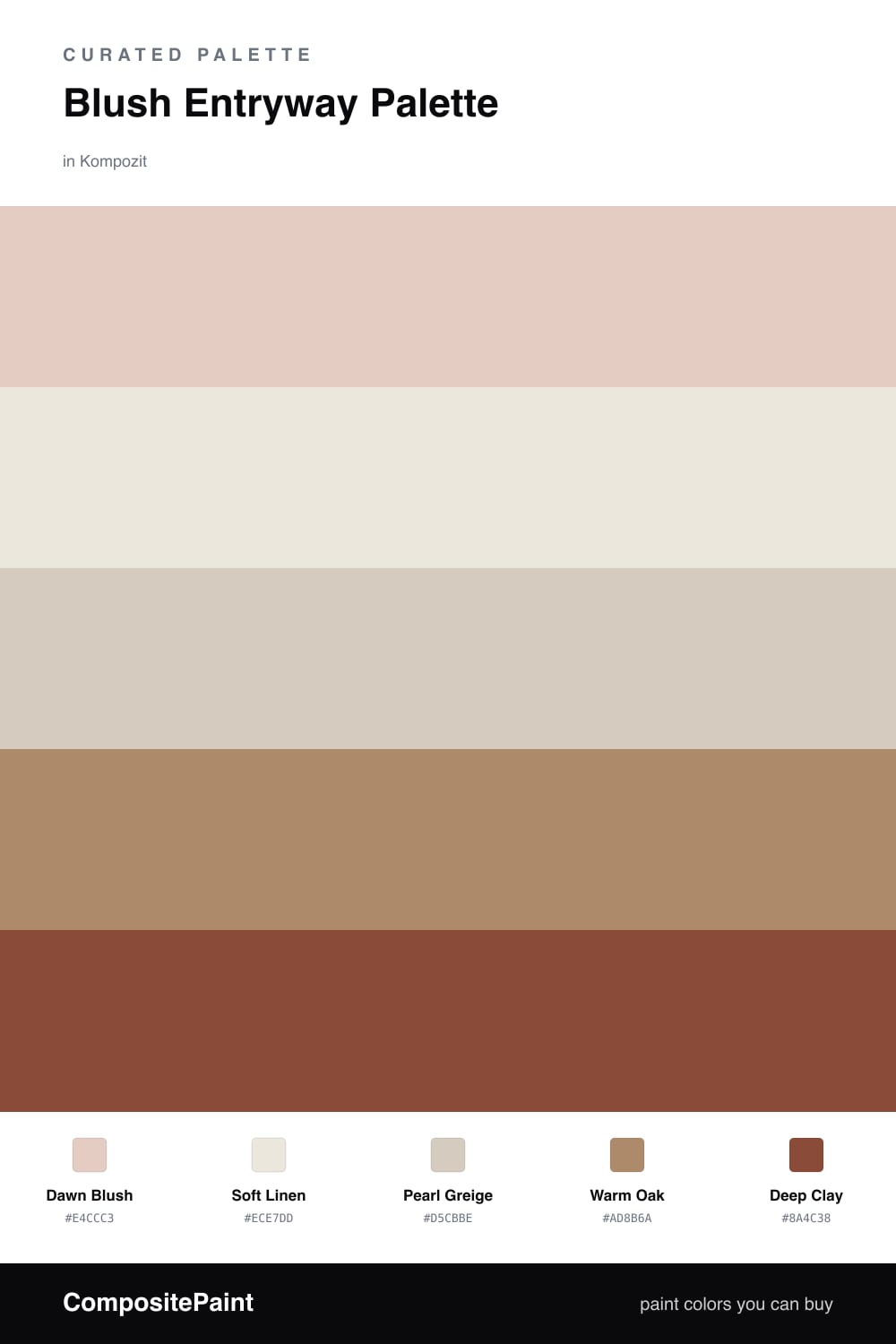
Blush Entryway Palette — Dawn Blush & Soft Linen

A welcoming five-color entryway scheme led by soft blush, balanced with warm linen, crisp trim white, oak, and a deep clay accent — every color matched to real paint you can buy.

By David Chen · Formulation Lead & Resident Chemist

Dawn Blush
Walls
Kompozit Pout · 0125
#E4CCC3
LRV 64
Soft Linen
Trim & Ceiling
Kompozit Umber Style · 0208
#ECE7DD
LRV 80
Pearl Greige
Cabinets or Vanity
Kompozit Awakening · 0560
#D5CBBE
LRV 61
Warm Oak
Wood & Floors
Kompozit Spiced Rum · 0240
#AD8B6A
LRV 28
Deep Clay
Accent
Kompozit Remaining Embers · 0053
#8A4C38
LRV 11
View palette in

An entryway sets the tone for the whole house, so I like to think of it like the opening note of a song. Dawn Blush on the walls does that gently — it is a soft, lightly grayed pink that catches morning light and holds onto warmth even after the sun moves on. Pair it with Soft Linen on the trim and ceiling, a creamy white that keeps the edges crisp without going stark.

The trick with blush is keeping it grown-up. Pearl Greige on a built-in bench or console nods to the pink without copying it, and Warm Oak underfoot brings the natural, earthy weight that makes a small space feel settled.

For the spark, a touch of Deep Clay on a door, a mirror frame, or a single bench cushion gives the eye somewhere to land. Use the blush as your dominant color and let the clay show up in small doses — that balance is what keeps this palette feeling fresh and current for 2026.

Buy These Colors

Each color matched to the closest real paint in every brand, by ΔE2000. Kompozit first; take any SKU to the store — these mix on demand.

Dawn Blush
#E7CFC6 · LRV 66 · Walls
Kompozit Pout · 0125 ΔE 0.71
Backdrop August · BD-AU ΔE 3.73
Behr Soft Shoe · MQ3-37 ΔE 3.09
Benjamin Moore Rose Accent · 1177 ΔE 0.71
Clare Neutral Territory · PNT100-LT-20 ΔE 6.1
Dunn-Edwards Pale Berries · DE6051 ΔE 1.97
Farrow & Ball Calamine · No. 230 ΔE 1.55
Magnolia Home Ella Rose · JG-24 ΔE 2.16
PPG / Glidden Honeysweet · 1065-3 ΔE 1.38
Sherwin-Williams Romance · SW 6323 ΔE 1.6
Valspar Tender Shell · 1006-10C ΔE 1.82
Soft Linen
#EDE6DA · LRV 80 · Trim & Ceiling
Kompozit Umber Style · 0208 ΔE 1.09
Backdrop Don't Eat the Yellow Snow · BD-DS ΔE 4.66
Behr Exclusive Ivory · HDC-MD-11 ΔE 0.79
Benjamin Moore White Down · 970 ΔE 1.88
Clare Like Buttah · PNT100-LT-62 ΔE 2.53
Dunn-Edwards Finest Silk · DE6127 ΔE 2.21
Farrow & Ball James White · No. 2010 ΔE 2.96
Magnolia Home Antique Rose · JG-23 ΔE 0.86
PPG / Glidden Pearls And Lace · 1074-1 ΔE 0.79
Sherwin-Williams Futon · SW 7101 ΔE 0.45
Valspar Cozy White · 3008-10C ΔE 0
Pearl Greige
#D8CDBF · LRV 62 · Cabinets or Vanity
Kompozit Awakening · 0560 ΔE 0.72
Backdrop Real Real · BD-RR ΔE 2.78
Behr Aged Beige · PPU7-09 ΔE 1.53
Benjamin Moore Cedar Key · 982 ΔE 1.25
Clare Flatiron · PNT100-LT-17 ΔE 1.42
Dunn-Edwards Fine Grain · DE6213 ΔE 1.06
Farrow & Ball Cromarty · No. 285 ΔE 5.03
Magnolia Home Stoneware Pieces · JG-55 ΔE 5.33
PPG / Glidden Bermuda Sand · 1074-3 ΔE 2.46
Sherwin-Williams Modern Gray · SW 7632 ΔE 1.56
Valspar Rabbit's Foot · 8004-9B ΔE 2.02
Warm Oak
#B08D67 · LRV 29 · Wood & Floors
Kompozit Spiced Rum · 0240 ΔE 1.66
Backdrop Anita · BD-AN ΔE 8.45
Behr Poncho · S240-5 ΔE 2.27
Benjamin Moore Scarecrow · 1041 ΔE 2.81
Clare Good as Gold · PNT100-DP-59 ΔE 7.09
Dunn-Edwards Rocky Ridge · DE6145 ΔE 2.31
Farrow & Ball Mouse's Back · No. 40 ΔE 8.18
Magnolia Home Vintage Crown · JG-152 ΔE 2.46
PPG / Glidden Caramel Kiss · 1083-6 ΔE 1.33
Sherwin-Williams Baguette · SW 6123 ΔE 1.82
Valspar Char Latte · M128 ΔE 0.64
Deep Clay
#8C4A3C · LRV 11 · Accent
Kompozit Remaining Embers · 0053 ΔE 2.52
Backdrop Buenos Aires · BD-BA ΔE 12.62
Behr Spiced Red · QE-14 ΔE 1.41
Benjamin Moore Rustic Brick · 2091-20 ΔE 1.19
Clare Vintage · PNT100-DP-67 ΔE 7.26
Dunn-Edwards Cherry Cola · DEA156 ΔE 1.63
Farrow & Ball Eating Room Red · No. 43 ΔE 5.63
Magnolia Home Home At Last · JG-30 ΔE 3.4
PPG / Glidden Burled Redwood · 1067-7 ΔE 1.67
Sherwin-Williams Flower Pot · SW 6334 ΔE 2.1
Valspar Rusted Earth · 2002-7A ΔE 3.41

Questions

Why does blush work so well in an entryway?

Blush carries a quiet warmth, like the first light at dawn, so it greets people without shouting. Keeping it soft and slightly grayed stops it from reading sweet or childish, which is exactly what you want in the first room a guest sees.

How do I keep the blush from feeling too pink?

Lean on the neutrals to ground it. Warm Oak floors and a Deep Clay accent pull the blush toward earth tones, so the whole space feels warm and lived-in rather than candy-colored.

Similar Palettes

Closest schemes by color — not by label.