Herb Cornucopia
The muted olive-khaki Behr sells as both a cabinet paint and an exterior enamel, reviewed honestly: the light where it turns green, the light where it turns muddy, and what to pick instead.

Jessica has spec'd whites and neutrals for more than 300 rooms and keeps a sample wall of painted drawdowns in her studio. Every color review is checked against real reader rooms in the comments and re-tested when a formula changes. About the testing process →
- 1Essex Green6
- 2Vintage Vogue12
- 3Herb Cornucopia17
- 4Sage Green22
- 5Evergreen Fog30
The Fast Verdict
Herb Cornucopia is a gray-yellow olive-khaki with almost no public track record — no flood of reviews, no viral rooms, nothing to check before you buy it. What it does have is real utility: Behr sells this exact color as both a one-coat interior eggshell and a full exterior semi-gloss enamel, so a kitchen island and a front door can match down to the can. Warm light turns it a genuine, grounded olive-green; cool light flattens it toward khaki-gray. Know which light your room gets and it is a dependable, low-drama color.
Kitchen cabinets and islands · home offices and dens with real daylight · mudrooms and entryways with black hardware · front doors, shutters and trim on light-colored siding
You want a true grass-green, not khaki · your only light is cool white LEDs or a shaded north window · you're drenching a whole open-plan floor without a sample first · you want a color with a track record of reviews to check
- A genuine olive-khaki with a warm gray-yellow undertone — reads earthy, not minty or neon
- Sold by Behr in both an interior one-coat eggshell and an exterior semi-gloss enamel — cabinets and the front door can match exactly
- Mid-dark LRV 17 holds its color in real daylight instead of washing out pale
- Backs up warm wood, brass and black hardware without an argument
- Quiet enough to anchor a kitchen island or front door without shouting for attention
- Almost no public track record — no reviews, no design features, no forum threads to check first
- Cool LEDs and shaded rooms flatten it toward a muddy khaki-gray
- Strong sun on a yellow-toned exterior can push it toward a 1970s avocado some readers won't want
- Too low-chroma to read as a true 'green' from across a room — expect 'olive' or 'khaki' comments, not 'green'
What Color Is Herb Cornucopia, Really?
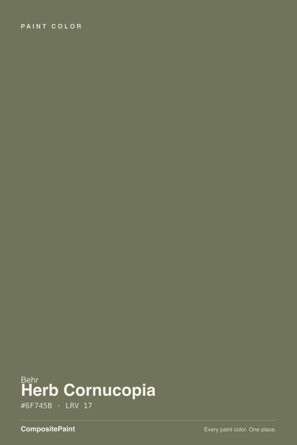
Herb Cornucopia is a muted olive-khaki. Behr's own materials tie the name to kitchen herbs and produce, and the color backs that up: a gray-yellow undertone that keeps it earthy and warm rather than the cooler blue-green of a true sage. At LRV 17 in our deck (Behr's own site rounds it to 16 — the same color, a rounding difference, not a real conflict) it sits mid-dark, deep enough to read as a deliberate color choice rather than a pale accent.
Behr files it under the MQ6 code range — the same block that holds Mountain Olive (MQ6-1), a deeper, more assertive olive a few numbers over in the same family. Herb Cornucopia is the quieter sibling: less saturated, more gray, easier to live with across four walls or a full kitchen of cabinets than its darker relative.
Undertone in one line: gray-yellow, olive-khaki — never a cool blue-green and never a true grass green. In flat or cool light it drifts toward khaki-taupe; in warm sun or under warm bulbs it pulls into a deeper, more recognizable olive-green.
Where It Shines
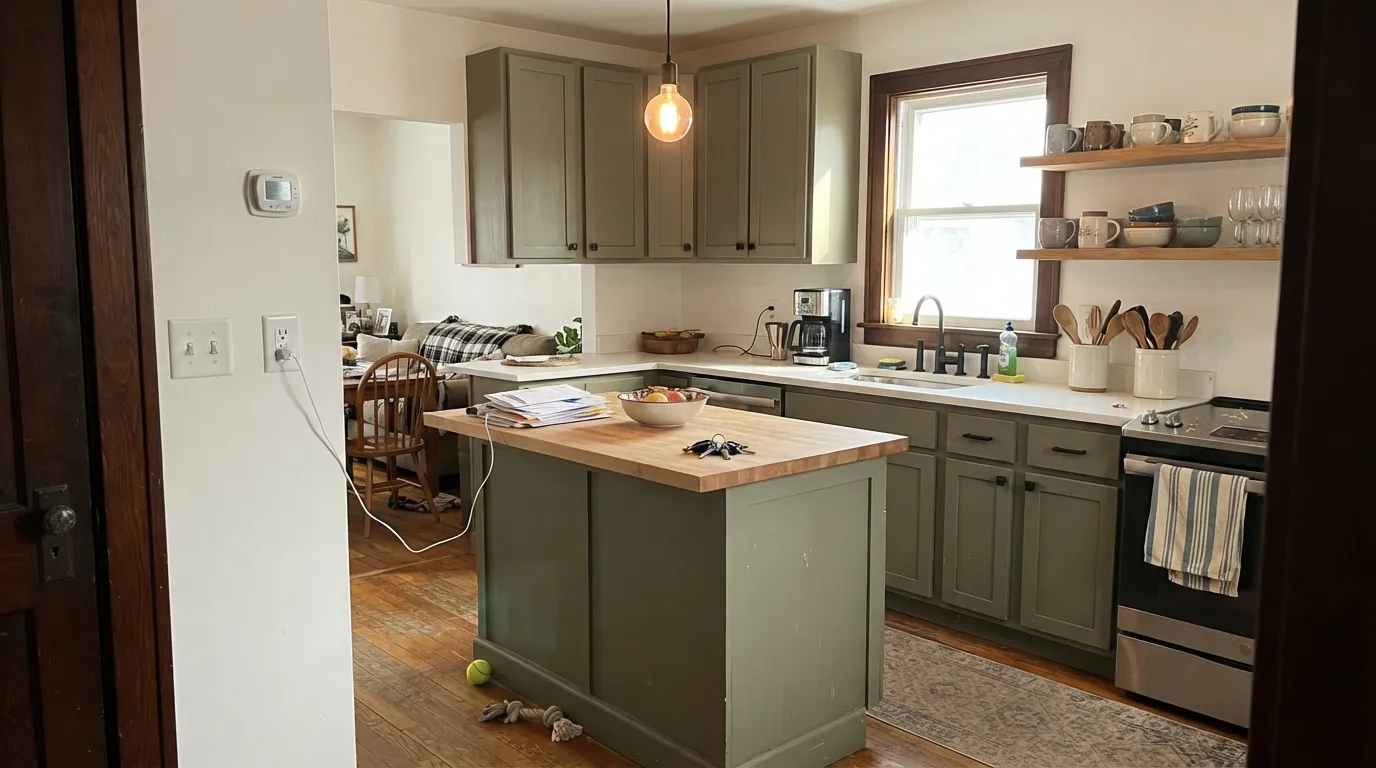
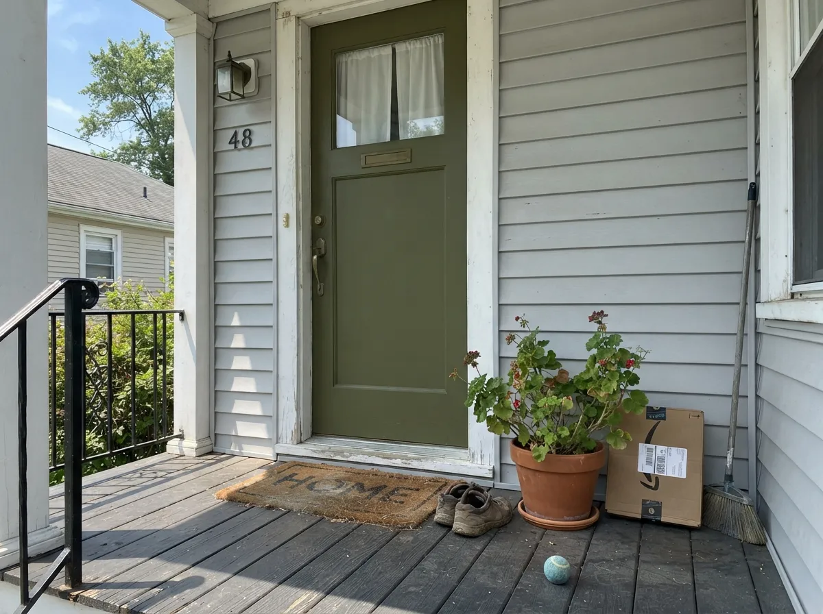
Give it real daylight or warm task lighting and it earns its keep two ways at once — Behr sells this exact color in both a one-coat interior eggshell (Marquee) and a full exterior semi-gloss enamel (Marquee), so a kitchen island and a front door can be the same can. Indoors it is at its best on cabinets and islands under warm pendant light, where the yellow undertone reads as intentional and grounded rather than dated. Outdoors, on a shutter or door against light siding, full sun turns it into a confident, unmistakable olive-green.
Where It Fails
There is almost no public track record for this color to check before you buy — no wave of Home Depot reviews, no Reddit threads, no design-blog features. That silence is itself useful information: nobody is chasing this off a viral photo, so any regret is far more likely to trace back to one of three honest, predictable light-and-undertone problems every low-chroma olive shares.
The green in Herb Cornucopia comes from its gray-yellow undertone, and cool light cancels the yellow half of that equation. Without warmth to carry it, the wall reads as a flat, muddy khaki-gray rather than a green at all. Swap in 2700K bulbs before deciding the color is wrong.
The same undertone that reads earthy indoors can push deeper toward an avocado-green outside, especially against yellow-beige stucco or vinyl siding. Against white, gray or brick it reads as a clean olive instead — sample it on the actual siding before committing a gallon to shutters.
This is a khaki-olive, not a grass green or a forest green — the chroma is low by design. If you pictured something closer to Kelly green or emerald, the wall will disappoint; if 'olive' or 'khaki' were ever in your search terms, this is closer to what you meant.
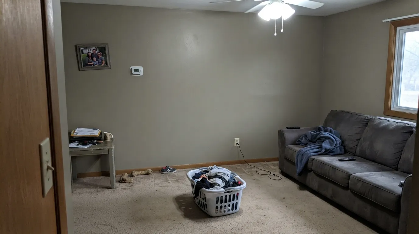
Room by Room
Under warm pendant or under-cabinet lighting the olive reads grounded and intentional, and Behr's one-coat Marquee eggshell formula is built for exactly this use. Pairs cleanly with butcher block, brass and black hardware.
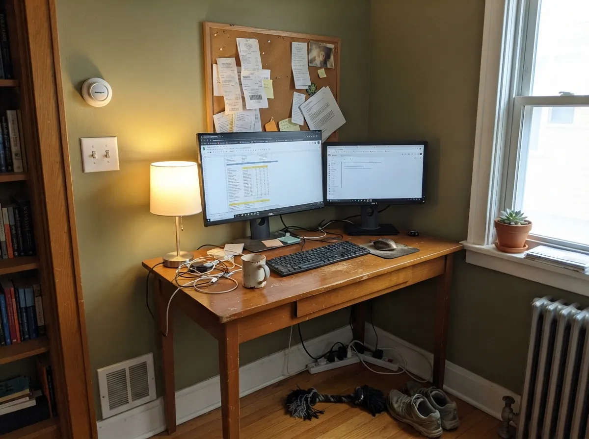
A believable, calming backdrop for a room used mostly by day. Skip it for a windowless basement office running only on cool overhead light.
Handsome on a single wall or a built-in with cream trim and warm wood; riskier drenched across an open-plan main floor, where it has to hold its own against every neighboring color and light source at once.
Under warm lamps at night it goes cozy and grounded; under cool morning light in a north-facing room it can read closer to gray-khaki than the calm green most bedrooms want. Sample on the actual wall before committing.
Small, often windowless bathrooms run on cool overhead light — exactly where this color performs worst. With real daylight and warm-toned fixtures it can work on a vanity; otherwise pick a color that doesn't depend on warm light to look right.
Behr sells this exact color as a 5-gallon exterior semi-gloss enamel, which is a real signal it's meant for outdoor trim work. Best against white, gray or brick siding in real sun; test first against yellow-beige exteriors.
Your Light Is the Risk
Midday and afternoon sun bring the yellow undertone forward and the color reads as a confident, genuine olive-green — its best light indoors or out.
Without warmth to carry the yellow half of the undertone, it flattens into a muddy khaki-gray. The single most common way to misjudge this color.
Cooler and more khaki-brown in flat morning light, deeper and greener as the sun warms up through the afternoon.
2700K lamps deepen it into a grounded, cozy olive. Cool white LEDs gray it out — change the bulb before you repaint.
Most complaints about Herb Cornucopia are a light mismatch. Upload a photo of your actual room and see it on your walls — then ask for the same wall in north light or evening lamps before you buy a single sample.
Need It From Another Brand?
Any paint counter can custom-tint Behr MQ6-53 directly. If you would rather stay in one brand's own deck, these are the closest stock matches, measured as ΔE2000. Under 2 is a difference you will not see on the wall.
| Brand | Closest color | ΔE | LRV | |
|---|---|---|---|---|
| Benjamin Moore | In the GardenCSP-805 · Benjamin Moore | 3.7 | 17 | Color page → |
| PPG / Glidden | Dark SagePPG1124-6 · PPG / Glidden | 2.1 | 17 | Color page → |
| Glidden | Dark SagePPG1124-6 · Glidden | 1.9 | 17 | Color page → |
| Dutch Boy | Olive You!325-5DB · Dutch Boy | 0.8 | 16 | Color page → |
| Dunn-Edwards | Secret PathDE6252 · Dunn-Edwards | 4.0 | 15 | Color page → |
| Farrow & Ball | DyrehavenNO. 9819 · Farrow & Ball | 4.5 | 16 | Color page → |
Similar Behr Colors
The nearest shades to Herb Cornucopia within Behr's own range, ranked by perceptual color distance — useful when you want the same look a touch lighter, darker, or warmer.
WCAG 2.1: AA is 4.5 : 1 for normal text, 3 : 1 for large text, AAA is 7 : 1.
Herb Cornucopia vs the Colors You're Also Considering
Every Herb Cornucopia sample board has the same rivals on it. The numbers show the real lightness gap — then it comes down to which risk you would rather live with.
Pick this for the warmer, more olive-khaki version — Herb Cornucopia carries a yellow undertone Conifer Green doesn't.
Behr PPU10-19 · LRV 18Conifer GreenPick this if you want it cooler and grayer with the yellow dialed back — Conifer Green leans forest-green-charcoal.
Pick this if you're already in the Behr deck, or want more yellow warmth in the undertone.
Benjamin Moore HC-125 · LRV 18Cushing GreenPick this if you're painting Benjamin Moore and want the same grayed depth, slightly greener and less yellow.
Pick this for a color that also comes in an exterior-rated enamel — Basil is sold mainly as a cabinet paint.
Sherwin-Williams SW 6194 · LRV 15BasilPick this for cabinets specifically — Basil is Sherwin-Williams' version of the same earthy depth, a shade darker and greener.
Arrowhead N320-6 at LRV 16 is #6B735A against Herb Cornucopia's #6F745B, a difference small enough that the two behave as the same color on a wall. Amazon River BXC-20 at LRV 17 is #677658, noticeably greener and less khaki. Palm Desert N310-6 at LRV 17 is #767552, which pushes further into yellow and reads more like a true olive drab. Pepper Mill BXC-44 at LRV 17 is #687763, the coolest of the group.
Across brands, Dutch Boy Olive You! 325-5DB at LRV 16 has a deltaE of 0.76, which is a genuine match with no visible difference. Glidden Dark Sage PPG1124-6 at LRV 17 is 1.87 and Hirshfield's Boardman H0089 at LRV 18 is 2.19, so the first is visually identical in normal light and the second is very close but worth sampling.
Benjamin Moore In the Garden CSP-805 at LRV 17 is 3.68 and Farrow and Ball Dyrehaven No. 9819 at LRV 16 is 4.53, both close but visibly different side by side.
Herb Cornucopia Coordinating Colors
The rule for coordinating with Herb Cornucopia is simple: stay warm. It flatters warm whites, warm taupes, black hardware and warm wood — and it goes muddy next to anything stark and cool. These are the partners that keep it looking intentional:
One Can, Two Jobs: Indoors and Out
The most useful real fact about Herb Cornucopia isn't a design trend — it's a catalog detail. Behr sells this exact color in a Marquee one-coat eggshell for interior walls and cabinets, and separately as a Marquee semi-gloss enamel rated for exterior siding, trim, doors and primer coverage. Most muted olives in a paint deck are interior-only or exterior-only; this one is formulated for both.
That matters if you want a kitchen island and a front door — or an interior mudroom wall and the exterior trim it faces through a window — to match precisely rather than approximately. It also means the color has been engineered to hold up outdoors: real UV and mildew resistance, not just a tinted version of the interior can.
Herb Cornucopia With Wood Tones and Metals
Warm wood is the easy pairing: butcher block, oak, walnut and cedar all sit comfortably against the gray-yellow undertone because the warmth meets in the middle. Black iron and matte black hardware are the natural metal partner — they supply the contrast the low-chroma olive needs without introducing a competing color. Brass works too, though it reads more vintage-kitchen than modern-farmhouse.
The pairing to test first is cool gray-washed wood or polished chrome — both sit at the opposite temperature and can make the olive look duller by comparison. A warm rug or a brass accent usually settles the argument.
Three Ready Palettes Built on Herb Cornucopia
A color is never alone on the wall. These are complete combinations in the 60-30-10 pattern, with the reason each one holds together. Every one opens in the visualizer.
Swiss Coffee's warmth keeps the room from feeling closed in around a dark cabinet color, and Carbon supplies one near-black note near hardware so the olive doesn't have to do all the contrast work alone.
Try this palette in your roomMountain Olive shares the same MQ6 family as Herb Cornucopia, so door and shutters read as two depths of one color rather than a mismatched pairing. Polar Bear siding gives both the light background they need to read as green instead of black.
Try this palette in your roomAlabaster's warm undertone keeps the trim from fighting the olive walls, and Dry Brown ties the woodwork and shelving into the same earthy family instead of introducing a colder gray.
Try this palette in your roomHerb Cornucopia FAQ
Is Herb Cornucopia green or khaki?
Both, depending on the light — it's a genuine low-chroma olive-khaki with a gray-yellow undertone. Warm light and warm bulbs pull it toward a recognizable olive-green; cool light and shade flatten it toward khaki-gray. If you want a color that reads clearly "green" in every light, this isn't it.
Will it look too dark in a small kitchen?
At LRV 17 it is mid-dark, not black — on cabinets under real light it reads as a rich color choice, not a dim one. In a windowless galley kitchen with only cool overhead light, expect it to look flatter and murkier than the chip promised.
Is it good for a front door?
Yes — Behr sells this exact color as a 5-gallon exterior semi-gloss enamel, built for doors, shutters and trim. It performs best against white, gray or brick siding in real sun; sample it first if your siding is yellow-beige.
What white trim goes with Herb Cornucopia?
A warm white or off-white — Swiss Coffee or Alabaster — keeps the pairing calm. A stark, cool bright white can make the olive look muddier by contrast; a warm neutral lets the yellow undertone read as intentional.
Does it work on kitchen cabinets?
It's arguably the color's best job. Behr's Marquee interior formula is a one-coat eggshell enamel built for cabinets, and the olive flatters butcher block, brass and black hardware under warm pendant lighting.
Why can't I find reviews for this color?
Herb Cornucopia genuinely has almost no public track record — no wave of Home Depot reviews, no viral design features, no active Reddit threads. That's not a red flag; it's simply an under-the-radar Behr color. This review is grounded in Behr's own color data and the color's real light behavior rather than borrowed owner stories.
Have you painted with Herb Cornucopia?
Rate it — one tap helps the next reader decide.
Ask a Question