Moroccan Sky
The copper-terracotta everyone assumes is blue from the name alone, reviewed honestly: the light that makes it glow, the front doors and cabinets it was actually built for, and the four-wall commitment it can't handle.

Jessica has spec'd whites and neutrals for more than 300 rooms and keeps a sample wall of painted drawdowns in her studio. Every color review is checked against real reader rooms in the comments and re-tested when a formula changes. About the testing process →
- 1Rookwood Terra Cotta14
- 2Rusty Gate19
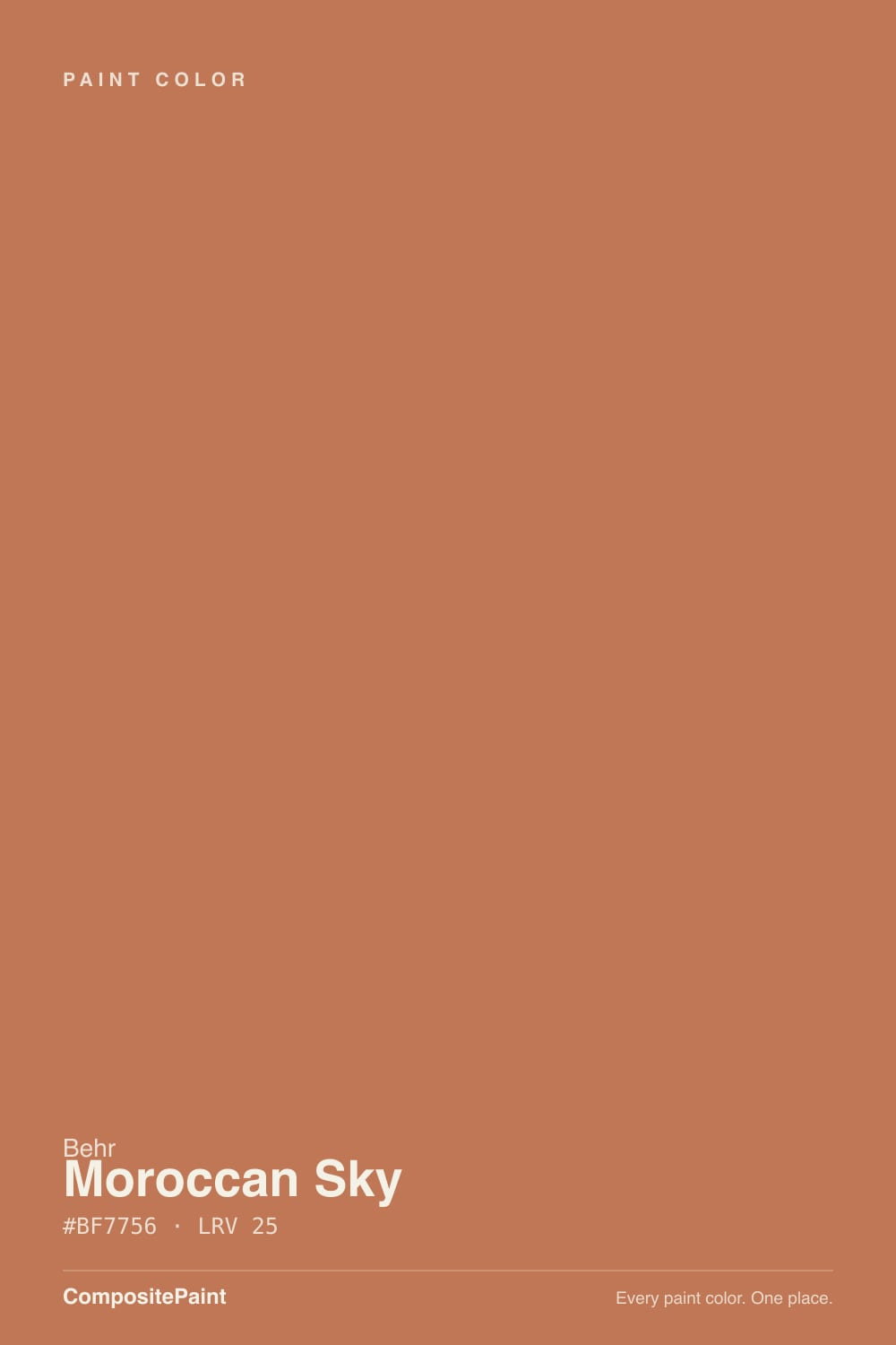
- 3Moroccan Sky25
- 4Caramelized35
- 5Venetian Plaster42
The Fast Verdict
Moroccan Sky is not blue, and that trips up more first-time buyers than any other single fact about this color. It is a medium-dark copper-orange with a red undercurrent — closer to a desert sunset than a daytime sky — and Behr backs that up by selling it across an unusually wide range of products: flat and semi-gloss exteriors, cabinet-and-trim enamel, front-door finishes. That versatility is real and rare. What it is not built for is four ordinary walls; this is a doses color, and in cool or flat light the glow drops out and it turns a dull rust-brown.
One accent wall in a living or dining room · front doors and exterior trim · kitchen islands and cabinet doors · anyone who wants real warmth without tipping into brown
You pictured an actual sky-blue when you read the name · your room runs on cool north light with no lamps · you want it on all four walls of a small room · you need something safe, quiet and forgettable
- A genuinely radiant copper-orange in direct warm light — not a flat, one-note orange
- Rare in the Behr deck for spanning exterior, interior and cabinet-and-trim product lines
- Reads global and intentional with wood, rattan and brass rather than costume-y
- Deep enough (LRV 25) to hold its own as a real accent, not a pastel suggestion
- A genuinely versatile job description: front door, cabinets, island or accent wall all work
- The name promises blue and delivers orange — a real source of buyer surprise
- Loses its glow fast in cool or flat light, sliding toward dull rust-brown
- Too saturated and too warm for four walls in most rooms
- Needs direct light or warm bulbs to look like the swatch; a north room won't show you the color's best side
What Color Is Moroccan Sky, Really?
Nothing about the name prepares you for the color. Moroccan Sky (PPU3-01, hex #BF7756) is a warm copper-orange with a distinct red undercurrent — Behr's own material describes it as carrying a subtle red base under the orange, which is exactly what you see on the wall: not a candy orange, more like burnished clay or a glowing ember. Presumably the name points at a desert sky at sunset rather than noon, but Behr doesn't spell that out anywhere public, so treat the connection as a guess, not a fact — what matters is the paint in the can, and the paint in the can is orange, not blue.
At LRV 25 it sits in the medium-dark range, deep enough to read as a real color statement rather than a pastel accent. The undertone is straightforward: orange first, red close behind, no yellow drift and no pink confusion. In direct warm daylight it looks genuinely radiant, almost lit from within; that same depth means it also absorbs a lot of light, so anywhere the light is thin or cool, the color loses its glow fast and slides toward a flatter rust-brown.
What sets Moroccan Sky apart from most single-purpose accent colors is how many Behr product lines carry it: Premium Plus and Ultra flat exterior, Marquee and Dynasty exterior paint-and-primer, a Behr Pro low-luster exterior, and a Premium semi-gloss enamel rated for interior or exterior cabinets, doors and trim. That is a genuinely wide footprint for one hue — Behr is telling you, through its own catalog, that this color is meant to move between a front door, a set of cabinets and an accent wall, not stay boxed into one job.
Where It Shines
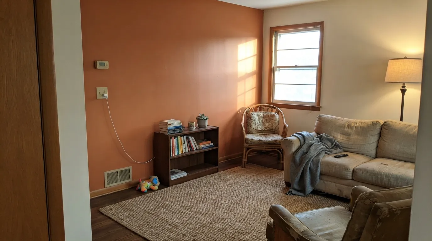
This color earns its keep in small, sunlit doses. A single accent wall that catches afternoon light, a front door under direct sun, a kitchen island next to plenty of white — in all of these the copper comes forward and the red undertone gives it real depth instead of flatness. It is also, unusually for an accent orange, a genuine exterior color: Behr sells it in stain-blocking and low-luster exterior formulas specifically because it holds up and reads well outdoors. Pair it with natural wood, rattan, brass or black iron and it looks intentional and global, not like a leftover craft-paint orange.
Where It Fails
Almost every disappointed review of a color like this comes down to one of three mismatches, and all three are avoidable if you sample honestly before you commit to a wall, a door or a set of cabinets.
Buyers who order by name alone — especially online, without a swatch in hand — are routinely surprised that Moroccan Sky is a warm orange-red, not any shade of blue. If you searched for a sky-blue accent and landed here on the name, this is the single most common regret with this color, and it has nothing to do with how it performs on the wall.
This is an LRV-25 saturated color; on a single accent wall it reads bold and intentional, but wrapping a whole room in it — especially a small bedroom or bathroom — turns the space cave-like and the glow that makes it appealing on one wall becomes heavy and closing-in on all four.
A north-facing room, an overcast climate, or cool LED bulbs strip the warmth out fast. Without direct warm daylight or 2700K bulbs to carry it, the copper drops out and what's left reads as a dull, muddy rust-brown — still orange in family, but none of the glow that sold you on it in the first place.
Room by Room
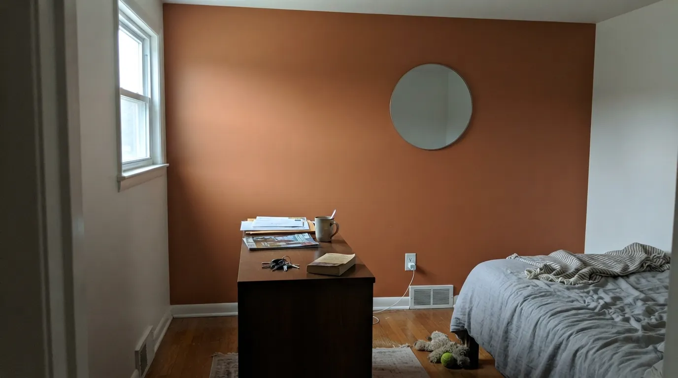
One accent wall that catches afternoon sun is the classic, reliable use. Keep the other three walls a warm white or cream so the color has somewhere to breathe, and bring in rattan, walnut or brass to match its global-warm energy.
A dining room with evening lamp light and a west or south window lets the color do its best trick: glowing copper by day, cozy ember by night. Pair with a wood table and warm metals rather than chrome.
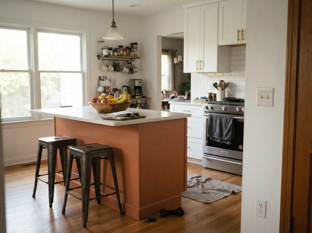
Behr rates this in cabinet-and-trim enamel for a reason. A single island or a run of lower cabinets against white uppers and a light counter is genuinely striking; a full kitchen of it fights the room for attention.
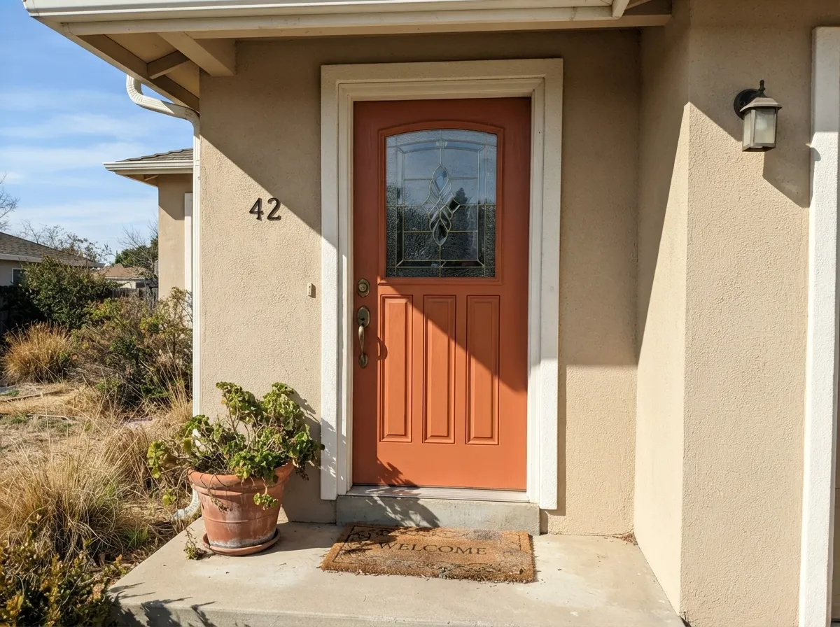
This is one of the few accent-wall colors that is also a serious exterior color: Behr sells it in exterior paint-and-primer and low-luster Pro finishes specifically for doors, shutters and trim. Against a beige, taupe or white house it reads warm and welcoming rather than loud.
The warmth is genuinely cozy in evening lamplight, but this is a stimulating, high-energy color for a room meant to calm down at night. Reserve it for a headboard wall rather than the whole room, and expect it to dominate.
Small, often north-facing, frequently lit by cool overhead fixtures — bathrooms combine most of this color's weak spots at once. If you love it, use it on a vanity rather than the walls, where you control the light source directly.
Your Light Is the Risk
This is the light Moroccan Sky was built for — the copper comes fully forward and the color reads radiant, almost warm-lit from within. Sample on a wall or door that gets real afternoon sun before you commit.
Cool, indirect light drains the warmth and leaves a flatter, muddier rust-brown. If your only light source is a dim north window, this color will not look like the can.
Bright and clay-like at midday, it deepens and warms further as the sun lowers, and by evening — especially under lamp light — the red undertone takes over and it reads almost ember-like.
2700K warm bulbs keep the red undertone alive after dark and are close to essential for this color at night. Cool white LEDs flatten it toward a duller brown-orange with none of the glow.
Most complaints about Moroccan Sky are a light mismatch. Upload a photo of your actual room and see it on your walls — then ask for the same wall in north light or evening lamps before you buy a single sample.
Need It From Another Brand?
Any paint counter can custom-tint Behr PPU3-01 directly. If you would rather stay in one brand's own deck, these are the closest stock matches, measured as ΔE2000. Under 2 is a difference you will not see on the wall.
| Brand | Closest color | ΔE | LRV | |
|---|---|---|---|---|
| Sherwin-Williams | Baked ClaySW 6340 · Sherwin-Williams | 1.8 | 26 | Color page → |
| Benjamin Moore | Sienna Clay104 · Benjamin Moore | 2.1 | 24 | Color page → |
| Valspar | Clove Bud2004-5B · Valspar | 1.5 | 26.2 | Color page → |
| PPG / Glidden | Brown ClayPPG1199-6 · PPG / Glidden | 2.1 | 27 | Color page → |
| Glidden | Amber Coast50YR 23/365 · Glidden | 2.3 | 23 | Color page → |
| Dutch Boy | Bonfire Brown309-6DB · Dutch Boy | 1.0 | 24 | Color page → |
Similar Behr Colors
The nearest shades to Moroccan Sky within Behr's own range, ranked by perceptual color distance — useful when you want the same look a touch lighter, darker, or warmer.
WCAG 2.1: AA is 4.5 : 1 for normal text, 3 : 1 for large text, AAA is 7 : 1.
Moroccan Sky vs the Colors You're Also Considering
Every Moroccan Sky sample board has the same rivals on it. The numbers show the real lightness gap — then it comes down to which risk you would rather live with.
Pick this for the bolder, more saturated copper-orange punch — Moroccan Sky commits harder to warm.
Sherwin-Williams SW 7701 · LRV 24Cavern ClayPick this if you want the same depth in a dustier, less saturated terracotta that leans on the right light to glow.
Pick this when you want the fuller, more saturated statement instead of a muted version of it.
Behr S210-4 · LRV 36Canyon DuskPick this for a lighter, dustier version of the same terracotta family — the 2021 Behr Color of the Year, and a gentler four-wall option.
Pick this when you want the color to read unmistakably orange, with no pink drift at all.
Sherwin-Williams SW 9081 · LRV 27Redend PointPick this if you want the trendier clay-pink version everyone's been arguing about online.
Pick this for the warm terracotta half of the pairing; the two work together as a Moroccan-tile accent-and-partner combo.
Behr BXC-36 · LRV 25Aegean BluePick this if you actually want a color named for the sky to look like the sky — same LRV, but genuinely blue instead of orange.
Moroccan Sky Coordinating Colors
The rule for coordinating with Moroccan Sky: warm creams to give it room to breathe, real wood and brass to match its global-warm energy, and one true blue if you want to lean into the Moroccan-tile mood on purpose. Keep cool grays and stark whites at a distance — they make the terracotta look muddy by contrast rather than rich.
A Color Built for More Than One Job
Most single-hue accent colors live in one product line and one use case. Moroccan Sky doesn't: Behr carries it across Premium Plus and Ultra flat exterior paint-and-primer, Marquee and Dynasty exterior formulas, a Behr Pro low-luster exterior line, and a Premium semi-gloss enamel rated for interior or exterior cabinets, doors and trim. That's an unusually wide catalog footprint for one color, and it tells you something practical: this was built from the start to move between a front door, a cabinet run and an interior accent wall, not to sit in one lane.
That versatility is also why it shows up so often in real projects as a small, deliberate dose — a door here, an island there — rather than as a whole-room commitment. Treat that pattern as a guide, not a limitation: it's a color designed to be used exactly the way most owners already use it.
Moroccan Sky With Wood Tones and Metals
Warm woods are this color's natural company: walnut, rattan, cane and reclaimed pine all deepen its global, sunset feel rather than competing with it. Pale, cool-toned woods and gray-washed floors mute the effect and can make the orange feel slightly out of place next to them.
Metals split cleanly: unlacquered brass, aged bronze and matte black all read warm and intentional against it. Polished chrome and bright nickel are the one clear mismatch — their coolness fights the color's warmth instead of grounding it.
Three Ready Palettes Built on Moroccan Sky
A color is never alone on the wall. These are complete combinations in the 60-30-10 pattern, with the reason each one holds together. Every one opens in the visualizer.
The classic Moroccan-tile combination in paint form: a warm cream field, one full-strength terracotta wall, and a small dose of true blue to play against it. Keep the blue to a single small surface — a shelf, a niche, a piece of furniture — so the terracotta stays the star.
Try this palette in your roomA plain warm-beige body lets the door do all the work. The near-black shutters anchor the palette so the door reads as a deliberate color choice rather than a mismatch, and both the beige and the black are calm enough to resell easily if a future buyer wants to repaint just the door.
Try this palette in your roomWhite Dove uppers keep the kitchen bright, the island carries all the color, and a stained-wood-toned open shelf in Rookwood Brown ties the terracotta back to real wood without adding a second competing paint color.
Try this palette in your roomMoroccan Sky FAQ
Is Moroccan Sky blue or orange?
Orange — a warm copper-orange with a red undercurrent, not any shade of blue. The name is genuinely misleading if you're shopping by name alone online; always check the swatch or hex (#BF7756) before ordering, since more than a few buyers have been surprised.
Why is an orange color called Moroccan Sky?
Behr doesn't publish the reasoning, so this is a reasonable guess rather than a confirmed fact: the name likely points at a desert sky at sunset — full of warm copper and red — rather than a daytime blue sky. Whatever the intent, the paint itself is unmistakably orange on the wall.
Does it work on a front door?
Yes — this is one of its strongest, best-supported uses. Behr sells it in multiple exterior formulas built for doors, trim and shutters, and against a beige, taupe or white house it reads warm and welcoming rather than loud.
Can I use Moroccan Sky on kitchen cabinets?
Yes. Behr offers it in a semi-gloss enamel rated for interior or exterior cabinets, doors and trim. It works best on an island or a single run of lower cabinets against white uppers rather than a full kitchen of cabinetry.
What white trim goes with Moroccan Sky?
A warm white or cream — Swiss Coffee or White Dove rather than a stark, cool white. A blue-leaning white makes the terracotta look muddier by contrast; a warm white lets the copper glow the way it's meant to.
Will it look good in a north-facing room?
Not at its best. North light is cool and indirect, and this color depends on warm, direct light to hold its glow. In a north-facing room without warm bulbs it tends to read as a flatter, duller rust-brown rather than the vivid copper on the chip.
Have you painted with Moroccan Sky?
Rate it — one tap helps the next reader decide.
Ask a Question