Red Color Palette — Red Meadow
A red-led scheme that pairs a deep brick red with warm earthy neutrals and a soft sage accent, every color matched to real paint you can buy.
By David Chen · Formulation Lead & Resident Chemist
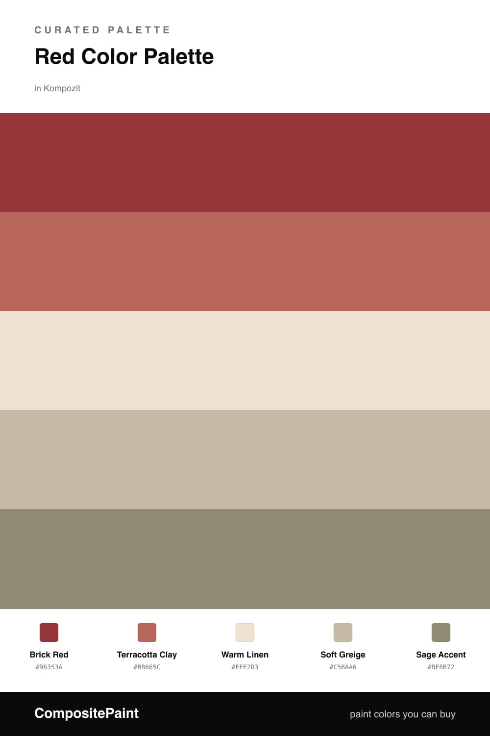
Red gets a bad reputation for being hard to live with, but most of that comes from picking a red that is too pure. This scheme starts with Brick Red, a deep, slightly dusty red that reads more like fired clay than a fire engine. It carries the whole room without shouting.
From there I let the temperature ease off slowly. Terracotta Clay is the same family turned softer and warmer, so it feels like a natural step down rather than a second loud voice. Warm Linen and Soft Greige are the breathing room — quiet, sun-bleached neutrals that let the reds feel intentional instead of overwhelming.
The move that makes this feel current is the Sage Accent. A muted green sits across the wheel from red, so even a small dose makes the brick look richer and a little more alive. Keep it to trim, a chair, or a single wall, and the whole palette lands warm, earthy, and very 2026.
Buy These Colors
Each color matched to the closest real paint in every brand, by ΔE2000. Kompozit first; take any SKU to the store — these mix on demand.
Questions
Red is the warmest, most forward color on the wheel, so it naturally pulls the eye and takes charge. Surrounding it with quiet earth tones gives that energy somewhere to rest, which keeps the whole scheme grounded instead of loud.
Let red lead but not flood the space — aim for roughly half on the dominant brick, with the terracotta as a softer echo, the linen and greige doing the calm background work, and just a touch of sage to keep it fresh.
Similar Palettes
Closest schemes by color — not by label.